How to Make the Color Purple

The Hypnotic And Rich Historical Backstory Of How Simple Purple Became Periwinkle, Indigo, Maroon, And Lavender Color.

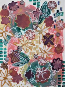
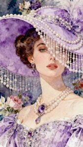
The color purple is a mesmerizing hue and has captured the imagination of artists, designers, and enthusiasts for centuries. The color purple is a color of intrigue, luxury, creativity, and spirit. And it comes in many shades, tints, and tones, from mauve to grape to a stunning pastel lavender color.

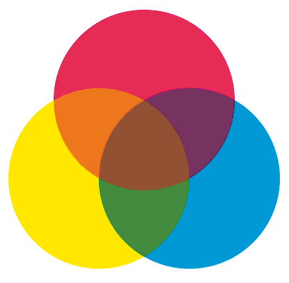
According to color theory, purple is a secondary color and a mixture of red and blue. But I think it’s much more than that, and I think you do too. Let’s get into the mysteries of the color purple.

the color purple lily flower drawing by Kathleen Fiorito with vibrant lavender color
Drawing by Kathleen Fiorito

In this article, we’ll explore the world of the color purple: its rich history, the art of mixing and creating it, and its significance in various industries. We’ll also explore a spectrum of 30 distinct shades of purples, violets and lavender color, from periwinkle to plum, and where you can find them in different aspects of our world.

A Journey Through Art History: the Royal Past of the color purple

The regal reputation of the color purple goes back centuries. In ancient times, the production of purple dye was a laborious and costly process, making it a symbol of wealth and status.

Phoenician traders extracted violet dye from the glands of mollusks in the Mediterranean Sea. The product was called “Tyrian purple.”

This exhibit in the Museum of Natural History in Vienna features fabrics dyed from different species of sea snail, similar to how ancient people extracted the purple color.

In fact, according to an article by Kristine Ballard, over 9,000 snail mollusks produced a single gram of the precious Tyrian purple dye. This rarity made the color purple especially valuable.

The term “purple” comes from the Greek πορφύρα (porphura) and Latin purpura.

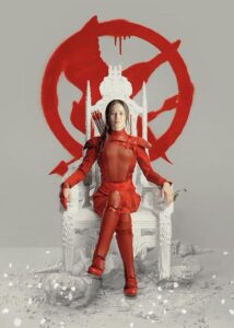
The Romans reserved the color purple for emperors and high-ranking officials. Similarly, the Byzantine Empire used purple as a privilege exclusively for the imperial family.

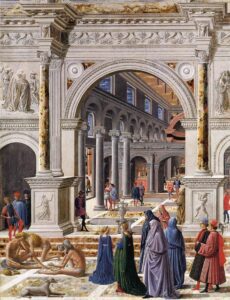
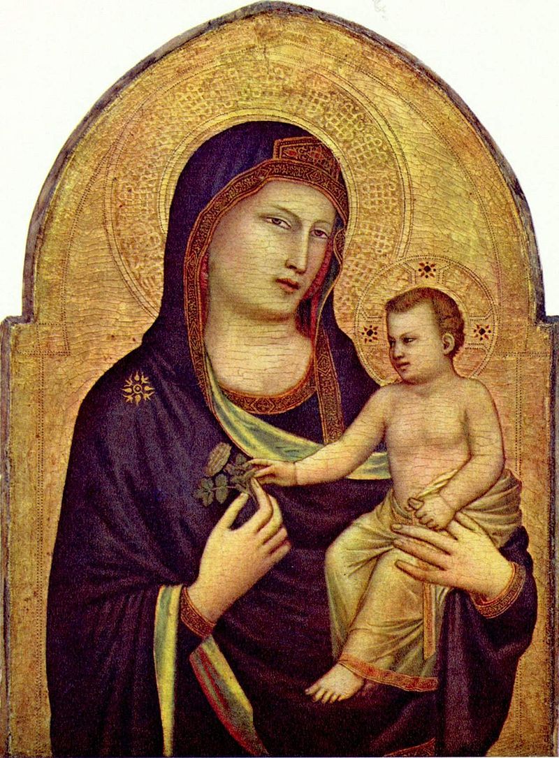
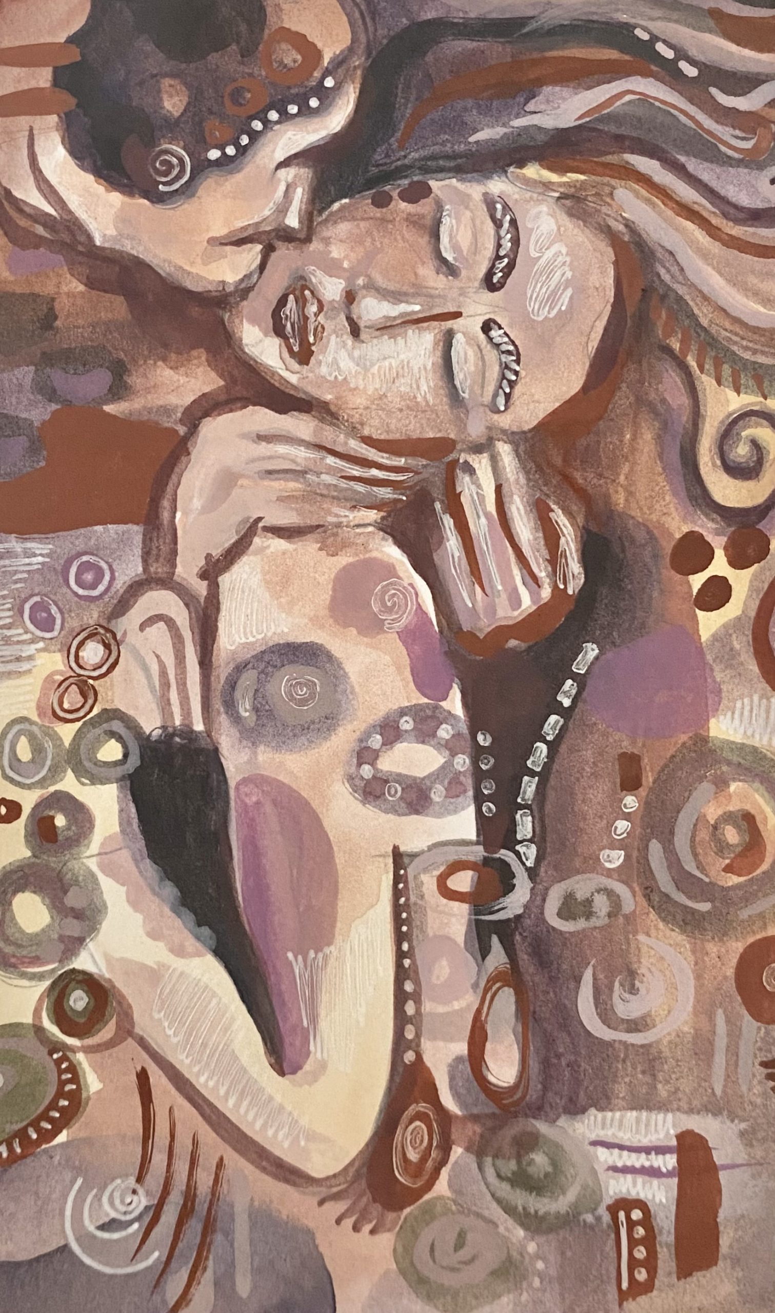
During the Renaissance, artists like Leonardo da Vinci, Titian, and Veronese utilized various shades of lavender color in their works to symbolize nobility and spirituality. In the 18th and 19th centuries, purple represented mysticism and the spiritual, often appearing in paintings with religious or symbolic themes.

During the Renaissance Violet featured throughout many religious paintings. Angels and the Virgin Mary were often portrayed wearing violet robes. Many painters of the 19th century experimented with the uses of the colour violet to capture the subtle effects of light.
Madonna and Child by Giotto. Tempera on panel, 1320-30.

The Perfect Purple, Maroon, or Lavender Color

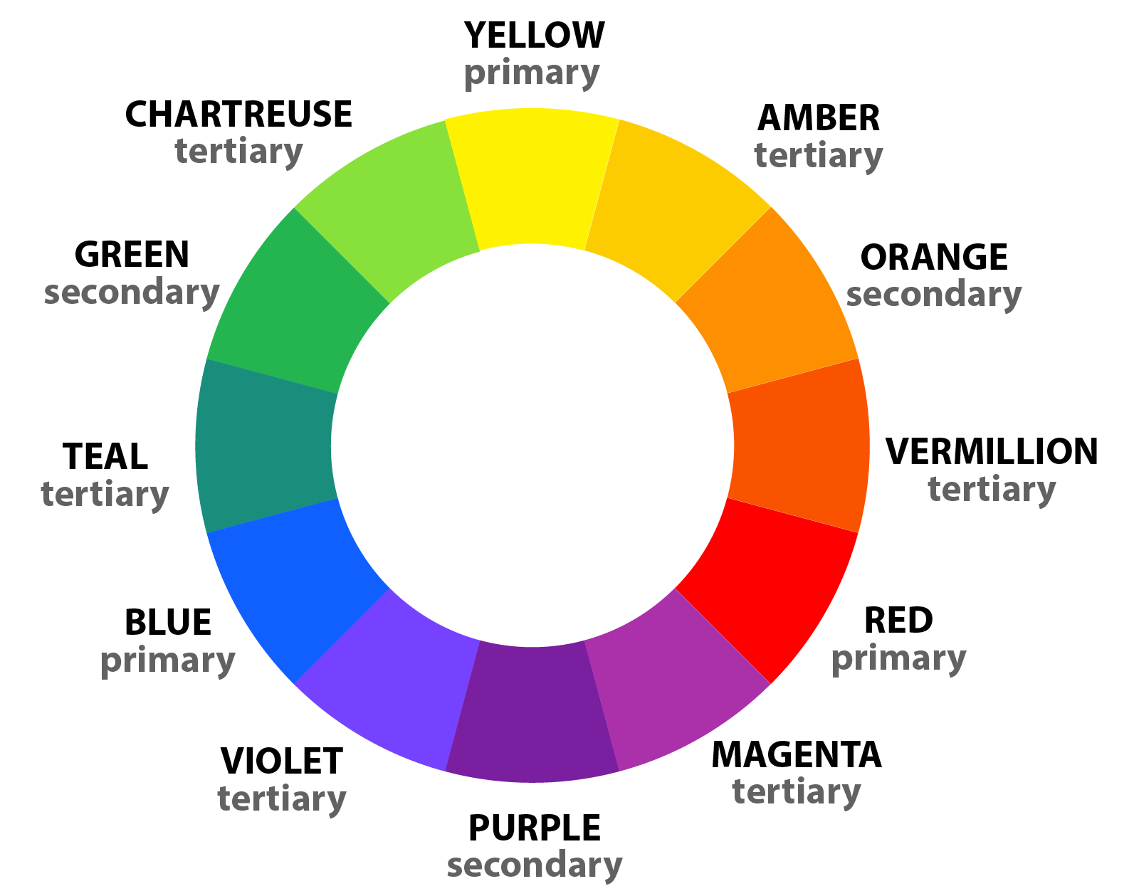
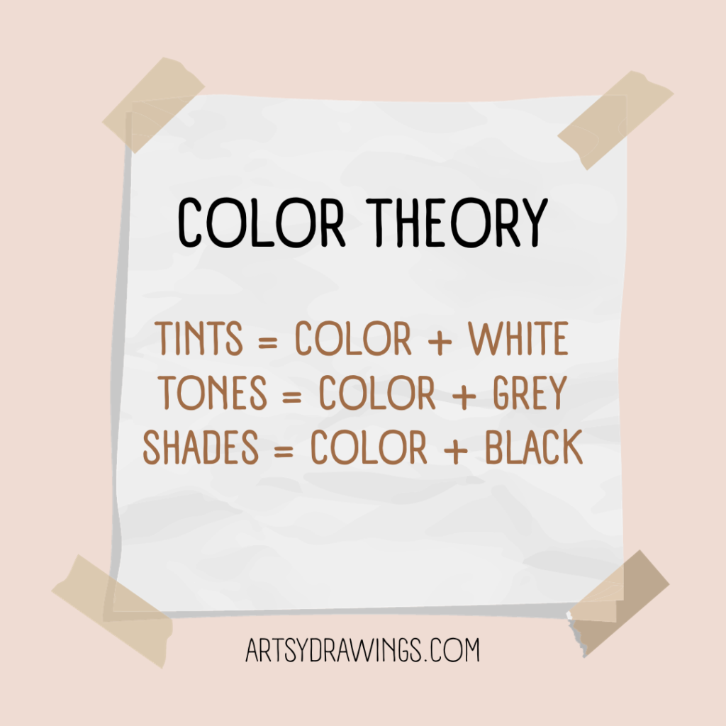
To create the perfect shade of purple, one must combine red and blue. As discussed in a preliminary article regarding color theory and the color wheel, you must mix two primary colors to produce a secondary color, like purple.

The proportion of each color will determine the tone, from a delicate lavender to a deep violet. Experiment with different ratios to achieve your desired hue. Introducing white will lighten the shade, while black or optical black will darken it. You can also adjust the tone, saturation and vibrancy using other colors on the wheel. Keep in mind that the specific red and blue you use will influence the final result.

For more color theory tips and tricks, check out these artsy articles on color knowledge tips and color theory for beginners.

colorful pink and the color purple cow surreal gouache paint painting with orange sky
Sweet Cow by Brianna Eisman
4″x6″ acrylic on paper

The Many Shades of the color Purple and Their Applications

Depending on how you choose to mix the color purple, the outcome can be very different. Even though you mix red and blue colors, your purple can vary significantly. Next, I’ll determine the differences between 30 different colors of purple and their origins.

Overall, it’s important to keep in mind that colors are extremely variable. The hue derived from the origin, like a flower or fruit, may not match the HEX or color code exactly. Likewise, you may interpret the color differently in your head than how I interpret the color in this article.

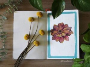
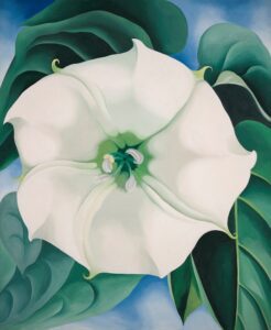
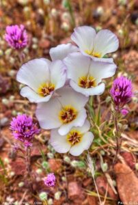
There are so many lavender color flowers!

Firstly, the best way to organize these colors is by their origin. I found nine of out 30 come from flowers, so let’s start with the color purple derived from plants and flowers.
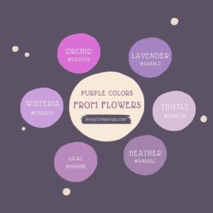
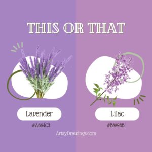
Lavender: #A684C2

This light purple is often associated with tranquility and can be seen in interior design for bedrooms and spa settings. Like its namesake flower, the lavender color provides a calm feeling with its pastel quality and slightly bluer hue.

Lilac: #B889BB

A soft, pale purple used in springtime floral arrangements. Similar to the lavender color, the name lilac originates from the flower’s color. I think lilac is slightly more red and pink than the lavender color, though.

Periwinkle: #CCCCFF

A soft and charming, periwinkle is the color purple shade used in children’s products and fashion.

Heather: #A484AC

A muted purple with a gray undertone, often found in interior design.

Iris: #5D3FD3

A medium purple, perfect for adding a pop of color to clothing or accessories.
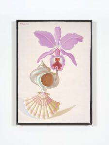
Orchid: #DA70D6

This vivid and exotic shade is sourced from the vibrant flower and used in cosmetics and fashion. Additionally, clothing designer Halston was known for populating his studio with live orchid flowers as inspiration. He had a $150,000 yearly orchid budget! Aside from their brilliant pinky-purple hue and meanings of love, luxury, beauty and strength, orchids are innately provocative, much like Halston’s lines.

Thistle: #D8BFD8

A pale purple with a touch of gray, ideal for sophisticated design projects.

Pansy: #78184a

A vibrant and bold purple often found in gardening and horticulture.

Wisteria: #c9a0dc

A pale and delicate purple often used in weddings and floral design.

What are Spectral Colors?

Next, violet and indigo deserve their own sub-section as these are some of the most pure colors in the human visible light spectrum.

Both violet and indigo colors are found on the visible light spectrum.
Both violet and indigo are on the visible light spectrum.
Violet: #8F00FF

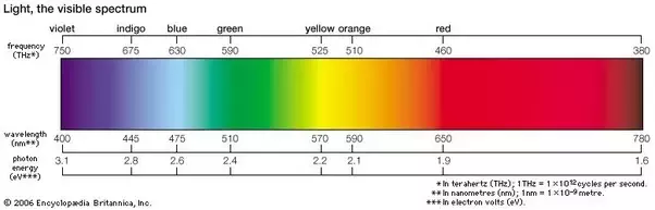
Violet is a type of flower and what is known as a spectral color. The hue has its own wavelength at the end of the spectrum of light identified by Isaac Newton.

In the art community, the color violet is often interchangeable with “purple.” This confusion comes from the formal color wheel, Roy G. Biv, where the last two letters stand for indigo and violet. This original color wheel was created by Isaac Newton himself in 1666.

Visually, a purple marker and violet marker are the same color. Scientifically, violet is a spectral color with a wavelength of 400nm and purple is a combination of two spectral colors, red and blue, and has no wavelength.

Indigo: #4B0082

Indigo is another spectral color with its own wavelength. It is a deep, dark purple-blue, perfect for textiles and dyeing. According to Muzli Colors, indigo dye is derived from the Indigofera tinctoria plant and its first recorded use was in 1289.

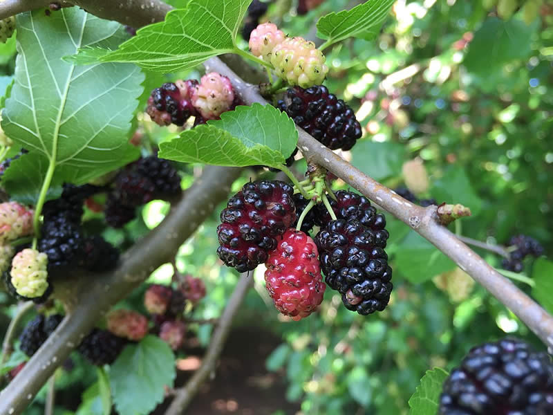
Purple berries, fruits, and sweet treats!

Many purple colors come from berries and fruit in nature. These hues tend to be darker in color, but are definitely still classified as purple.
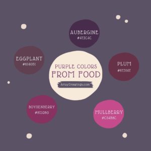
Eggplant: #614051

A rich and dark purple often used in cooking and home décor.

Aubergine: #472C4C

A rich and elegant shade found in gourmet cuisine and interior design. Actually, color wise, aubergine is the same color purple as eggplant. The difference is merely regional. ‘Eggplant’ is the term in American English, while ‘aubergine’ is used in British English.

Plum: #673147

A deep and luxurious purple often used in clothing and accessories. As expected, this color gets its name from the sweet fruit.

Mulberry: #c54b8c

A dark, reddish-purple shade often found in autumn-themed artwork.

Purple colors from food items like mulberry fruit on vines.
Mulberry purple comes from the mulberry fruit.
Boysenberry: #873260

A dark and fruity purple often found in food products and branding.

Grape: #6f2da8

This is really close to what I envision when I immediately think of the color purple. Even though the name of this color matches the fruit, this is not the color of grapes. Instead, the color purple ‘grape’ represents branding for candy in this flavor. It’s nostalgic for me in a sense. This color purple is a vibrant and playful purple used in branding for sweets and children’s products.

Fashion Forward Lavender Color

These colors typically more artificial and fabricated specifically for fashion and products. They can be perceived as more vibrant and rich than floral or berry purples.
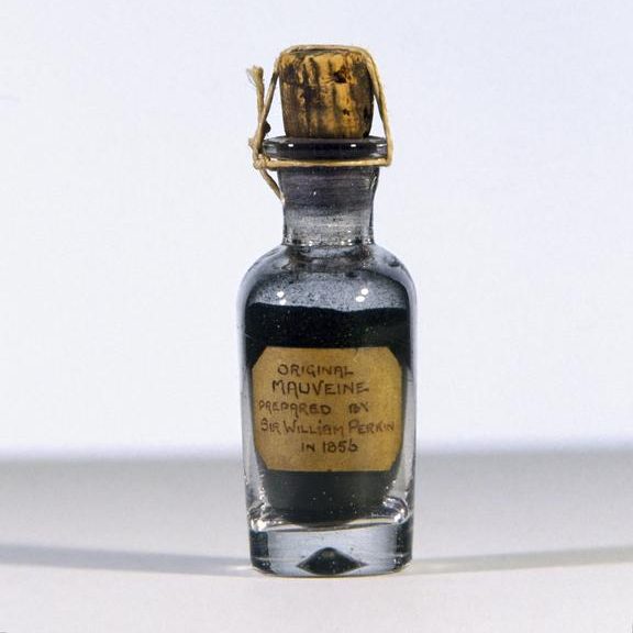
Mauve: #C77398

This color purple is a dusty purple often used in fashion for a vintage, romantic feel. Mauve is actually the color of the first synthetic dye, created in 1856 by 18-year-old William Perkin. Within five years of the chemical creation, 28 dye factories opened, revolutionizing the fashion world and forever changing color production. Today, according to The American Scholar, there are over 10,000 synthetic dyes, from clothing to car paint to children’s’ toys and even shampoo.
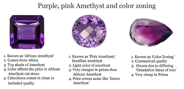
Mauve is a dusty purple often used in fashion for a vintage, romantic feel. Mauve is actually the color of the first synthetic dye, created in 1856 by 18-year-old William Perkin. Within five years of the chemical creation, 28 dye factories opened, revolutionizing the fashion world and forever changing color production. Today, according to The American Scholar, there are over 10,000 synthetic dyes, from clothing to car paint to children's' toys and even shampoo.
Perkin’s original mauve dye from 1856.
Amethyst: #9966cc

Probably the most natural purple on this list, amethyst is a deep and vibrant purple taken from the crystal with the same name. Often used in jewelry design, this color has a more regal and wealthy appearance.

Probably the most natural purple on this list, amethyst is a deep and vibrant purple taken from the crystal with the same name. Often used in jewelry design, this color has a more regal and wealthy appearance.
While the gemstone comes in a variety of colors, typically, the color amethyst most closely resembles the popular African Amethyst (first image).
Magenta: #FF00FF

A bold and intense purple often found in advertising and packaging. While magenta is typically categorized as a pink, it is created by mixing blue and red, and can fall into the category of purple colors.

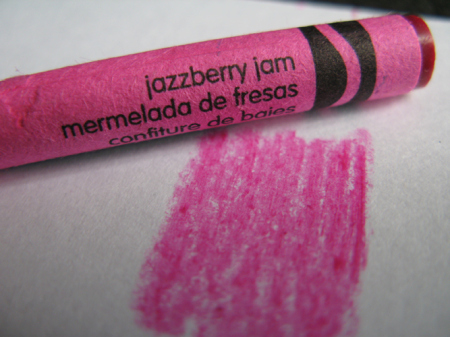
Jazzberry Jam: #a50b5e

I love the name of this color! Jazzberry jam is a playful, intense purple-pink commonly found in children’s products. Crayola has a crayon in this vibrant color.

A playful, intense purple commonly found in children's products. Crayola has a crayon in this vibrant color.
Jazzberry Jam is a fun pinky-magenta purple color with the Hex code #A50B5E.
Heliotrope: #df73ff

A soft and romantic purple used in cosmetics and fashion.

Grape Soda: #b498aa

Unlike the grape color, Grape Soda is manufactured by Kelly Moore paints and is typically used as house or wall paint. Kelly Moore describes the color as a “medium light shade of magenta-pink.”

Liseran Purple: #DE6FA1

Probably closer to a pink, this color is a bright, synthetic purple-pink used in textiles and plastics.

Regalia: #522d80

A rich, royal purple often found in academic regalia and ceremonial attire.

Taylor Swift in regalia purple attire speaking at NYU graduation
Taylor Swift wore a regalia purple attire when speaking at Spring 2022 NYU graduation ceremony.
Royal Purple: #7851a9

Historically, royal purple is associated with royalty. Similar to ancient Tyrian purple, the color is used in ceremonial and regal settings.

Byzantium: #702963

A dark, imperial purple used in art and historical reenactments.

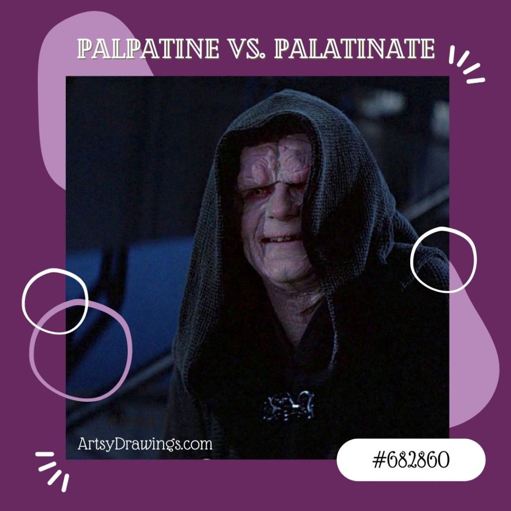
Palatinate Purple: #682860

Not to be confused with Emperor Palpatine, palatinate purple is a bright, eye-catching purple. It’s used in sports branding and uniforms, as well as university ceremonial robes.

Remember that Emperor Palpatine is not palatinate purple!
Electric Purple: #bf00ff

A striking and intense shade, this brilliant hue generally appears in technology and digital design.

Blue-Purple (Cool Purple): #8a2be2

A cool-toned purple often used in contemporary design and art.

The Significance of the color Purple in the Modern World

The color purple still holds a unique place in our lives. It signifies creativity, individuality, and extravagance. Plus, it’s pretty!

For this gesture drawing, I chose a purple themed color scheme. I chose indigo, magenta, and peach colored soft pastels to create the illusion of a rich regalia violet color. This was created by Brianna Eisman for Artsy Drawings.
Purple Gesture Drawing by Brianna Eisman

For this gesture drawing, I chose a purple themed color scheme. I chose indigo, magenta, and peach colored soft pastels to create the illusion of a rich regalia violet color.

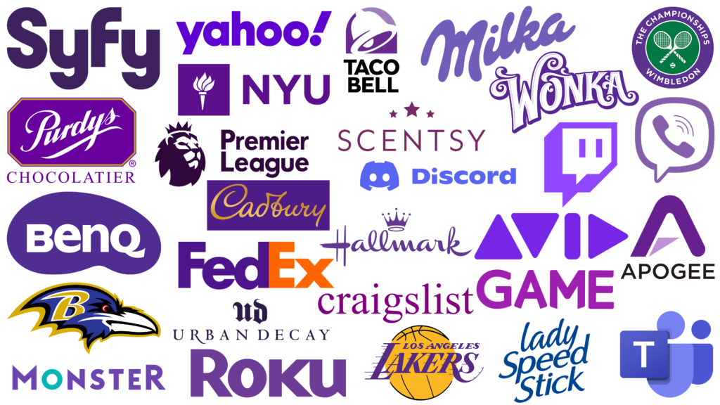
In branding, purple and lavender color invokes a sense of luxury, elegance, spirituality, creativity and uniqueness. So, you’ll find brands like Cadbury and NYU in deep rich regal purples. In the same way, you’ll see brands like Discord and Teams in more indigo and electric blue-purples.

In art and design, the color purple conveys a wide range of emotions and moods, from serenity to drama.

Purple lavender color is used in a variety of branding logos.
Purple is used in a variety of branding logos.

By all means, the color purple is more than just a color; it’s a symbol of history, luxury, and creative expression. Understanding the various shades of lavender and magenta and their intrinsic value to design and history can allow artists and creators to better utilize the color purple in their work.

As you explore the world of the color purple, remember the rich history, the art of creating the hue, and the ever-present mystique of this enchanting lavender color in our lives.

How to Make the Color Purple Read More »

Color Knowledge Tips That Will Make You a Better Artist

Introduction to color knowledge

Color knowledge is a fundamental aspect of art that has the power to evoke emotions, convey messages, and create captivating compositions. Whether you’re an aspiring artist or a seasoned pro, a deep understanding of color can significantly enhance your creative endeavors, and in turn, make you a better artist.

If you are new to the art world, I suggest you take a look at this article on color theory for beginners.

In this artsy article, we’ll dive headfirst into color knowledge, covering essential principles of color theory like primary, secondary and tertiary colors, how to create an effective color scheme, and basics of color mixing.

Color Theory: The Foundation of Creativity

Color Knowledge tip 1: Primary Colors are Red, Blue, and Yellow

Color Knowledge image of primary colors mixing in triple venn diagram to create secondary colors
Red, yellow and blue are the starting point to create more colors like orange, green, and violet.

Primary colors are the foundational hues in the world of color theory, consisting of red, blue, and yellow. These three colors are considered “primary” because they cannot be created by mixing other colors together.

On a computer, these inks are called magenta, yellow, blue, and black. Though, you’ll notice if you run out of black ink, the computer will offer an alternative to mix magenta, yellow, and blue. This mixture is “optical black” in the painting world. I’ll talk more about optical black in the section about mixing paint colors together.

Different combinations of the primary colors create all other colors on the color wheel. The primary colors are essential color knowledge for artists and designers.

If you mix two primary colors, you get secondary colors. For instance, if you mix even parts red and yellow, you will get orange. Blue and red make violet. Yellow and blue make green.

Color Knowledge tip 2: memorize The Color wheel

The color wheel further expands with tertiary colors, created by mixing primary and secondary colors. There are endless possibilities for color exploration in art and design.

Color Knowledge image of the color wheel showing primary, secondary, and tertiary colors
This color wheel shows primary, secondary, and tertiary colors.

Great, now that you’ve grasped the basic concept of the Roy G. Biv color wheel, let’s move on to relationships between colors. For more beginner friendly tips, check out this article on color theory for beginners!

Color Knowledge tip 3: Understand Color Harmony

Next, let’s learn about color harmony schemes like complementary, analogous, and triadic colors. Choosing the right color scheme can add a lot of visual and metaphorical depth to your art.

Complementary color schemes involve pairing colors that are located directly opposite each other on the color wheel. They are literal compliments, such as red and green or blue and orange. This scheme creates strong visual contrast and can make each color appear more vibrant when placed next to its complement. This color scheme is often seen in comic books, illustrations, logos, and even signage on the side of the road.

Color Knowledge image of complementary colors in everyday media like Christmas card, football team, and soda logo
Complementary colors contrast one another and tend to “pop” off the page.

Analogous color schemes use colors that are adjacent to each other on the color wheel, such as yellow, yellow-green, and green. This scheme creates a sense of harmony and cohesion. The analogous color scheme is ideal for creating a peaceful or monochromatic color palette in art or design.

Both The Kiss by Gustav Klimt and my painting inspired by the same work use analogous color schemes to create a sense of calm and peaceful harmony.

Triadic color schemes involve selecting three colors evenly spaced around the color wheel, forming an equilateral triangle. For example, red, blue, and yellow form a triadic color scheme. This scheme offers a balanced and dynamic contrast of colors. Triadic color schemes create visually striking and vibrant compositions.

Spiderman showing a tertiary color scheme of red, yellow and blue
This image shows the selected colors used in the comic book about Spiderman. Red, blue, and yellow make a triadic color scheme.

Color Knowledge tip 4: Know the difference between tint and shade

Saturation and value are essential aspects of color theory illustrated through the use of tints, shades, and tones.

Tints and shades determine values. Tints are created by adding white to a color and shades are formed by adding black to a color. Saturation is determined by tone, in which grey is added to the pure hue to mute the color.

Tints, shades, and tones showing color knowledge
Tints, shades, and tones change the color depending on how much white, black or grey you add to the hue, respectively.

Tints and shades alter both the brightness (value) and intensity (saturation) of colors. The level of darkness or lightness is crucial for creating depth in your artwork and originality in your color schemes.

Color Knowledge tip 5: Color temps (Warm vs. Cool Colors)

Color temperature is a fundamental color knowledge tip that helps convey emotion and moods.

Warm colors, such as reds, oranges, and yellows, are associated with warmth, energy, and excitement. Typically seen in the foreground of the composition, warm colors evoke feelings of passion and vibrancy.

In contrast, cool colors, like blues, greens, and violets, are calming and associated with serenity, tranquility, and a sense of distance. They tend to recede in a composition and can evoke feelings of calmness and introspection.

During Pablo Picasso’s Blue Period, the artist used a predominantly cool color palette. This color scheme included shades of blue (obviously) and blue-green as dominant hues. This deliberate choice of colors conveyed a sense of melancholy, sadness, and emotional turmoil in his artworks.

Color Knowledge image of Pablo Picasso's blue period about how color schemes can help convey emotions
Pablo Picasso’s Blue Period (1901-1904) is one of the most well known artistic uses of how color can signify emotion.

Color can serve as a powerful tool for expressing complex emotions and capturing the human condition.

One of my favorite moments of artists being angsty and non-conformists is the controversy surrounding “Blue Boy.” Painted by English portrait artist Thomas Gainsborough, the 1770 painting includes the unconventional use of blue as the dominant color for the subject’s attire, rather than as a background hue.

One of my favorite moments of artists being angsty and non conformists is the controversy surrounding "Blue Boy" by English portrait artist Thomas Gainsborough. The 1770 painting includes the unconventional use of blue as the dominant color for the subject's attire rather than as a background hue.
Blue Boy by Tomas Gainsborough challenged norms of its time by using blue in the foreground of the painting.

This departure from traditional portraiture raised eyebrows in its time. I find that something I love about learning art history is how artists challenge conventional norms. Sparking debate about artistic choices leads to innovation and change and progress.

Likewise, try to understand the interplay between warm and cool colors. This part of color knowledge is crucial for creating balanced and emotionally resonant color palettes in art and design.

COLOR MIXING

Color Knowledge tip 6: learn to mix Optical black

Color mixing techniques can greatly enhance the range and depth of your artwork. This section will focus on the important concept of “optical black.”

In this painting, I mixed phthalo (Phthalocyanine) blue with burnt umber to create this super dark optical black background to show color knowledge
I mixed phthalo (Phthalocyanine) blue with burnt umber to create this dark optical black background.

Optical black is a “fake black” which looks like black, but is instead created using color.

In art school, we were not allowed to buy or use black paint in our paintings. Turns out, creating optical black teaches you color theory and color mixing much better than simply using black.

Remember back to when we were discussing value and saturation?

Color theory is easy with a cute visual.

So then if Optical Black = Orange + Blue then Shades = Optical Black + Orange + Blue.

Whoever said art doesn’t include math was just a silly-billy.

Anyways, mixing complementary colors can create the visual appearance of black, despite no actual black pigment used.

To start, mix complementary colors from the color wheel. From there, continue to add colors until you reach the optical black that looks best for your chosen color scheme.

For example, if your painting uses yellow highlights, you may want your optical black to look more violet. How does this work?

Using complementary colors trick the color receptors in your eyes to believe the color is black, and not dark violet. This technique achieves rich, natural and deep shadows in your artwork without resorting to flat-looking black paint.

The same effect is achieved when you wear colored ski-goggles.

“[Ski-goggles] are often orange so at the end of the day the orange receptors are tired and the world looks blue.”

stoopidusername

Disney World also uses this technique to make their colors seem more vibrant. The sidewalks are painted red to trick the color receptors in your eye to make the grass and trees seem greener.

Disney World uses complementary colors in their park. The red sidewalks make the grass and trees look greener.

Color Knowledge tip 7: Use complementary colors for desaturation

Additionally, complementary colors tone down the saturation of a color. When you mix a color with its complementary color, the result is a desaturated, or less vibrant, version of the original color.

In the below painting of a skull still life, I chose a color scheme that included a golden yellow ochre and a muted violet. To achieve many of the greyish mid-tones, I chose to mix the yellow and violet together using varying amounts of each color.

This acrylic painting of a skull illustrates the use of optical black in learning color knowledge for painting.
In addition to making optical black using violet and yellow, I chose those same complementary colors as a base color scheme for this painting.

For example, if you have a highly saturated red and you want to reduce its intensity, mix it with a bit of green, its complementary color. The resulting mixture will be a less vibrant shade of red, leaning more towards a neutral gray or brown, depending on the proportions used.

I tend to love using complementary color schemes in my artwork. For this work, I started with a red wash and red base painting, then added the green layers on top to really push the color.
I tend to love using complementary color schemes in my artwork. For this work, I started with a red wash and red base painting, then added the green layers on top to really push the green color forward.

When using complementary colors to desaturate, it’s essential to be mindful of the proportions of added colors. Adding too much of the complementary color can cause the mixture to become too muddy or dark. This is particularly evident in watercolor painting as it is more difficult to lighten the painting back (for watercolors you paint light to dark).

Experimentation and practice will help you develop an intuitive sense of how to mix colors. Color knowledge like optical black and using complementary colors to adjust saturation and intensity can help you become a better artist.

Color Knowledge tip 8: Physically mix colors

Mixing colors is an essential skill for any artist expanding their color knowledge. For this section, we will focus on mixing paint.

Begin with a clean palette and brushes. I also like to have a paper towel handy to dry my brushes. Then, squeeze small amounts of your chosen paint colors onto the palette. I like to use a paper plate as a paint palette, and I place the paint in a circle around the outer edge of the plate.

For example, the photo below features one of the paper plate palettes I used. Notice how I tried to keep the main paint colors clean and mixed my paint towards the center of the plate. You will also notice, I did not use black paint — I mixed an optical black using a dark blue and burnt umber.

I used this paper paint palette for a 4’x4′ garden painting with a lot of colorful flowers.

Next, use a palette knife or brush to blend the colors together gradually, starting with the lightest color and adding small increments of the darker color until you achieve the desired shade. Remember to test your mix on a scrap surface or a corner of the canvas itself to ensure it matches your vision before applying it to your artwork. Practice and experimentation will help you become proficient in creating custom colors for your art.

Follow my social media and newsletters for more tips on how to create a wider array of hues and tones, adding depth and complexity to your work through color knowledge.

Concluding color knowledge for now…

Color knowledge is a powerful tool for artists, allowing us to express ideas more effectively and create art that resonates with audiences. By mastering color theory, you can elevate your art to new heights. So, embrace the world of color, experiment fearlessly, and let your creativity flourish on the canvas of your imagination.

Understanding color theory and mixing colors is like having an artist’s secret toolkit. Whether you’re gently blending opposite, or complementary, colors to tone down the saturation or using clever mixtures to create “optical black,” these techniques are simply invaluable. I do want to remind you art lovers that there is so much more to know about color. If this is something that really interests you, please comment, message me, or join my newsletter to read more! I love color!!!

By grasping these fundamentals, you not only make your artwork visually engaging but also open doors to express intricate emotions and stories through color. So, dive into the world of color knowledge, and watch your art flourish with richer, more meaningful color scheme choices.

This is a super easy exercise for testing your markers to show what colors work and which markers have dried out. It also uses color knowledge to arrange the colors in a rainbow style order.

I realized this article was getting long, so I had to chop it up to allow for more in depth discussion of color knowledge. Trust me, there will be more color themed articles!

Color Knowledge Tips That Will Make You a Better Artist Read More »

My 5 Favorite Artistic Mediums: How to Paint and Draw like a Pro

Art is a powerful means of self-expression that allows individuals to convey emotions, ideas, and experiences. Within the vast realm of art, various artistic mediums offer unique possibilities for artists to translate their visions onto the canvas.

In this Artsy Drawings blog post, we delve into five fascinating artistic mediums that have captured the hearts of many: acrylic, mixed media, watercolor, pencil, and gouache. I chose the order by which are my personal favorite artistic mediums. So, let’s explore the distinct qualities and creative potential of each of the five artistic mediums and discover why they are beloved by artists worldwide.

I also created a list of my Favorite Art Supplies, from brush pens to gouache paint.

Acrylic – my all time favorite of the artistic mediums

  1. Acrylic: Versatility and Vibrancy

I want to start with my favorite artistic medium: acrylic paint. This medium is becoming increasingly popular due to its versatility and vibrant color range. Many artists, like myself, appreciate the quick drying time of acrylics, which allows for layering and blending techniques. Rather than waiting around all day, (approximately 24 hours) for oil paint to dry, I can work much faster with acrylic paint, which can dry within 20-30 minutes. For example, the painting below, Pretty Plants #2, was completed in four total hours, mostly because I didn’t want to waste paint.

pretty green fern style plant painting in acrylic on canvas with red to white gradient background
Pretty Plants #2 by Brianna Eisman is part of an acrylic on canvas series featuring different plants on gradient backgrounds.

Also, I love the versatility of acrylic paint. You can change the consistency by adding water or acrylic mediums. These additions allow you to create transparent glazes or thick impasto textures. The fast-drying nature of acrylics makes it easier to correct mistakes or make alterations during the painting process.

This technique is great for impressionist styles. I had to use it often for paintings during my art classes, as I had limited time to work. When the class ended, I had to clean up quickly so my paints wouldn’t dry out. As a result, my early paintings had a lot of small strokes layered on top of each other, giving them an impressionist look. For example, the painting below, inspired by Edgar Degas’s dancers, has multiple layers of colors and strokes, especially in the tutu skirts, creating depth with a light yellow base and blues and pinks added on top.

Not sure what your art style resembles? Check out this art style quiz to help you find which historical art style matches your artwork!

this is a acrylic painting on canvas of two dancers wearing black leotards and fluffy white blue tutus. The dancers are stretching while seated on a wooden bench. The style is similar to Edgar Degas. The painting describes the use of favorite artistic mediums in which acrylic is one of my favorites for its impressionistic abilities.
Dancers Stretching by Brianna Eisman was inspired by impressionist painter Edgar Degas. I used acrylic paint on stretched canvas for this painting.

One of the key advantages of acrylics is its ability to mimic other artistic mediums. It can resemble watercolor when diluted or take on the characteristics of oil paint when applied with a heavy body. Acrylic paint can be used on a variety of surfaces, including canvas, wood, paper, and even glass or metal. These broad possibilities add acrylic paint to the list of favorited artistic mediums for many artists.

For me, I have built my acrylic paint arsenal over many years of experience. I prefer Liquitex Basics for my white paint (I use Titanium White more than any other color). I also like Lukas CRYL Studio Paints, although they’re a little more expensive.

Lastly, I like DecoArt Acrylic Paints for projects under 24″x 36″. DecoArt paint typically comes in smaller containers, but I find they are easier to store than larger tube style paints. The brand also just released an environmentally friendly acrylic paint set!

Mixed Media – Making me a trash monster, one sticker at a time

  1. Mixed Media: Limitless Creativity

Mixed media art involves the combination of different artistic mediums and techniques to create unique visual experiences. This next medium truly puts “artistic” in the artistic mediums list. Mixed media encourages artists to think beyond the boundaries of traditional artistic approaches. Mixed media, literally mixes artistic mediums. It allows for the incorporation of diverse elements such as paper, fabric, found objects, photographs, and even digital media. You can also classify the use of both paint and pens in the same piece as mixed media, as you are ‘mixing’ the artistic mediums.

Many of my sketchbooks use mixed media. Sometimes, I feel like a trash monster. I collect fortune cookie quotes and receipts and ticket stubs and stickers. I arrange them all in specific sketchbooks as a document of my life, my mental health, and my travels.

Hand of God by Brianna Eisman is a mixed media work featuring watercolor paint, ink, magazine cutouts, and stickers. This piece was created for Artsydrawings.com at Artsy Drawings. The reference material is for the blog about mixed media and favorite art mediums.
Hand of God by Brianna Eisman is a mixed media work featuring watercolor paint, ink, magazine cutouts, and stickers.

The beauty of mixed media art lies in its limitless possibilities and the freedom it provides for artistic expression. Artists can explore texture, depth, and layers, creating rich and multidimensional artworks with an unlimited number of artistic mediums.

I also think mixed media is one of the most environmentally friendly types of art. As I mentioned above, I sometimes feel like a trash monster, but you really can save money on art supplies by using mixed media. My colleague Emily wrote a great article about how to thrift art supplies, and I think second-hand art supplies could make for the best type of textured found-object artwork.

These limitless mixtures of artistic mediums invite experimentation and encourages artists to step outside their comfort zones, leading to innovative and thought-provoking creations.

Watercolor

  1. Watercolor: Elegance and Serenity

Watercolor paint has an ethereal and delicate quality, often capturing the essence of light, translucency, and fluidity. Artists love the subtle nuances and atmospheric effects achieved with this medium. So, the transparent nature of watercolor allows for luminous washes and seamless gradients.

I also find watercolor to be one of the more accessible art mediums. I absolutely love my cheap Crayola watercolor paints! All you need for watercolor is the paint kit, water in a cup, a brush, and maybe a paper towel or two.

This painting was done in my sketchbook in watercolor paint by Brianna Eisman for Artsy Drawings for Artsydrawings.com. The painting features my desk with my laptop open, clock, pens, sticky notes, water cup, phone, and salt lamp. The study was a quick exercise while watching a movie and I like it a lot.
Desk in Watercolor by Brianna Eisman was painted on a lonely night when all I wanted to do was paint and watch a rom-com on my computer. So I did just that.

Watercolor’s unpredictability adds an element of spontaneity and excitement to the painting process. The artist must adapt and work with the flow of water and pigment, resulting in charming imperfections and unique characteristics. This medium is perfect for capturing landscapes, still life arrangements, and expressive portraits, evoking a sense of tranquility and serenity.

Pencil Drawings

  1. Pencil: Timeless Precision

Pencil is one of the most fundamental artistic mediums, cherished for its simplicity and versatility. With just a simple pencil and paper, artists can create intricate drawings, detailed sketches, and realistic portraits. Likewise, the graphite shades offer a wide tonal range, enabling artists to achieve a remarkable level of precision and detail.

The following image features Design 3, the third design commissioned for a custom floral engagement ring. The patron chose a graphite medium to show fine details and edit the design as needed throughout the workflow of the project.

The following image features Design 3, the third design commissioned for a custom floral engagement ring. The patron chose a graphite medium to show fine details and edit the design as needed throughout the workflow of the project.
Design 3 by Brianna Eisman is a graphite sketch for a custom engagement ring design.

Pencil drawings possess a timeless quality, and the monochromatic nature of graphite pencil adds a sense of elegance and understated beauty. Overall, this medium is perfect for capturing textures, shading, and creating stunning grayscale compositions. Pencil art allows artists to focus on the essentials, emphasizing form, and exploring the interplay of light and shadow. It is also a good starting point for many artists, making it one of the most popular artistic mediums.

Gouache

  1. Gouache: Boldness and Opacity

Last but not least, is gouache paint! Gouache is still new to me, but one of the more powerful artistic mediums. I see this medium growing in popularity and I want to experiment with it more. Gouache paint combines aspects of both watercolor and acrylic and allows for many opaque layers added on throughout the process, especially at the end with a fine tip brush.

The following painting by me, inspired by the infamous Klimt masterpiece, uses gouache paint and features a couple embracing in a beautiful and intimate kiss. I bought this exact gouache paint set and I really loved it for a starter set. I will admit that I used the white quickly, but I always use white paint more than any other color. For the price and ease, this is a great paint set for any artist wanting to get into gouache.

Inspired by the Kiss by Gustav Klimt, this painting was created in gouache paint and features a couple embracing in a beautiful and intimate kiss. the style has many dots and lines, a stylistic technique I enjoy. This painting is done by Brianna Eisman as part of Artsy Drawings.
The Kiss by Brianna Eisman was inspired by the Kiss by Gustav Klimt.

Gouache’s unique opacity and matte finish give it a distinct aesthetic appeal. Gouache has this masterful ability to provide solid, vibrant colors. Artists can easily apply the paint to various surfaces, including paper, canvas, and illustration boards. The opaque nature of gouache allows artists to correct mistakes or make revisions by simply layering additional paint over the existing layers. Gouache allows for layering and reworking, making it ideal for illustrative works.

One of the key advantages of gouache is its versatility in creating both fine details and bold, graphic elements. Artists can achieve crisp edges, intricate patterns, and precise lines, making it a popular choice among illustrators and designers.

Beautiful Forest by Brianna Eisman was painted using gouache in a sketchbook. The painting was done through Artsy Drawings on artsydrawings.com. The painting shows a green dense forest with large mossy trees and lots of foliage. There is a single brown trail leading through the forest.
Beautiful Forest by Brianna Eisman uses gouache in a sketchbook.

Another noteworthy aspect of gouache is its rewetting properties. As a sustainable artist, this is one of my favorite parts! Unlike acrylics or oil paint, gouache can be reactivated with water, even after it has dried. This makes it possible to rework areas of the painting or blend colors seamlessly, providing artists with greater control and flexibility.

Furthermore, gouache’s quick-drying nature makes it convenient for artists who prefer to work in layers or require shorter drying times for their projects. This quality allows for efficient workflow, enabling artists to build up layers of color and detail without extended waiting periods.

I bought this exact gouache paint set and I really love it!

Conclusion – Favorite Artistic Mediums

Each of these artistic mediums possesses its own unique qualities and appeal, attracting artists with different preferences and artistic goals. Acrylics offer versatility and vibrancy, mixed media enables limitless creativity, watercolor exudes elegance and serenity, pencils provide timeless precision, and gouache showcases boldness and opacity.

These favorite artistic mediums — acrylic, mixed media, watercolor, pencil, and gouache — have captured the hearts of countless artists worldwide, including my own heart. Their distinct characteristics, creative potential, and ability to evoke emotions and narratives make them powerful tools for artistic expression. Please check out my Favorite Art Supplies list and comment below your favorite supplies!

Whether you are drawn to the vibrant colors of acrylics, the multidimensional possibilities of mixed media, the ethereal beauty of watercolor, the precise detailing of pencils, or the boldness of gouache, each medium offers a unique journey of artistic exploration. So, pick up your preferred medium, let your creativity flow, and embark on a captivating artistic adventure.

Not sure which artistic medium matches your art style? Take this quick quiz to better understand your art style!

My 5 Favorite Artistic Mediums: How to Paint and Draw like a Pro Read More »

5 Easy Drawing Tips For Beginners and Intermediate Artists

Are you wondering how to get started as a beginner drawing artist? You may have searched drawing tips for beginners, lineart tips, shading with pencil techniques, or drawing tips and tricks.

Welcome to Artsy Drawings where you will learn those drawing tips for beginners.

Welcome to the world of art, young grasshopper.

a pencil drawing of a horse helps express drawing tips for beginners
Elegance by Giacomo Burattini

Welcome to the incredible world of art at ArtsyDrawings.com! We are happy to welcome creative spirits, aspiring artists, painters, drawers, photographers, sculptors, printmakers, and lovers of art. It is my hope to teach, inspire, and applaud you for taking steps into the creative realm!

The purpose of this article is to teach drawing tips for beginners and intermediate artists. We will go step by step and cover a myriad of art tips, tricks, and techniques.

We will start with choosing a medium, discuss creating value and using the line weight technique, warn against the dreaded furry kitty, and remind you that drawing and lineart is mark making. Let’s get into these drawing tips for beginners!

Drawing Tips for Beginners 1: Pick a Pencil

Drawing is one of the best ways to get your foot in the door because you can use a wide variety of mediums. You can use graphite pencils and expensive drawing paper or a ballpoint pen and a napkin. Drawing is the underlying foundation of art, and a great place to start.

In fact, I recommend all artists know how to draw, no matter if they are a sculptor, printmaker, or painter. Drawing is a universal language and contributes to many factors that can make you a more successful artist. Check out this article about why drawing can make you a more successful artist.

Certain mediums and materials can enhance the quality of your artwork simply by using them the right way to get a certain effect. Will we discuss picking a pencil in this drawing tip for beginners.

<img loading=
Pencil Hardness

Letter and Numbers on your Pencils

This drawing tip for beginners has to do with those letters and numbers on your graphite pencils.

You have seen HB, 4B, 2H, and R2D2, and unless you’re a Star Wars fan, you probably won’t recognize the odd man out. The letters and numbers represent the hardness of the lead in the pencil.

They work on a scale in which HB is in the perfect center and stands for “Hard Black.” This is the typical #2 pencil you probably used in grade school, and a perfectly reasonable tool for extreme calculus problems or drawing artsy drawings.

On opposite ends of the scale are 8H and 8B. I think I’ve come across a 10B somewhere, but honestly, I haven’t found much difference after 8B.

If H stands for “Hard” and B stands for “Black,” an 8H is the hardest lead in the pencil and will create the lightest line.

I have a heavy hand so I typically use a 2H or 4H pencil for my under-drawing and work my way up to the 8B as I add in my shadows and dark tones. I use the drawing technique of working light to dark. The B pencils are softer and can create a darker value because more of the lead is pushed into the paper.

James Portrait – Black and White Detail by Brianna Eisman

Mechanical vs. Wood Pencils

“Mechanical pencils are usually better suited for precision, while traditional pencils are great for laying down large areas of texture.”

Time Von Rueden
a pencil drawing by Tim Von Rueden of a man with many arms stretching out from his abdomen. This drawing shows drawing tips for beginners
Silent King by Tim Von Rueden

Pencil and graphite artist Tim Von Rueden creates stunning detailed drawings that you can see in the example above titled Silent King and on his website. He has a great perspective on mechanical pencils saying they are “usually better suited for precision, while traditional pencils are great for laying down large areas of texture.”

Personally, I do agree with this statement. Most mechanical pencils are classified as an HB #2 pencil. Mechanical pencils are a great option for the under drawing before you add a lot of dark tones and shading. In my opinion as someone recommending drawing tips for beginners, I suggest investing in a pencil set with light and dark pencils.

If you do decide to use an HB mechanical pencil throughout the entirety of the piece, it may leave permanent marks in the paper, a shiny finish in the dark shaded areas, and you could accidentally poke a hole in the paper.

All in all, the medium is still up to the artist. You run the show here. It’s your creation and art is about breaking boundaries and trying new things.

Drawing Tips For Beginners 2: Create Value

What is value? I don’t mean the price of the artwork, though I would hope everyone here becomes a famous artist one day.

Value is an element of design that refers to the lightness and darkness of a subject. The illusion of value in a work of art is what makes it look three-dimensional. Value provides the illusion of form.

There are many ways to draw and many more ways to successfully create value.

a pencil drawing by Mariah that features a woman’s face with her hands folded in front of her. This drawing helps express drawing tips for beginners
Fourteenth for JKPP by Mariah

Creating Value with Sketching

My drawing tip for beginners is to focus on finding your own drawing techniques to create value. Some may prefer smoother transitions while others like stippling, hatching, crosshatching and more sketching techniques, where you can clearly see the lines and marks that shade the subject.

a pencil sketch shows drawing tips for beginners featuring 7 square boxes horizontally lined up to show the differences in styles including stippling, hatching, and curved marks
Hatching by Salgood Sam

I recommend playing around with different styles including organic, structured, simple, complex, and making value scales (light to dark gradients) to practice these techniques.

a pencil sketch that features gradients of crosshatching, hatching, stippling (pointillism), and blending to provide drawing tips for beginners that focus on learning value
Value Scale 11 by Julianna Kunstler

Drawing Tips For Beginners 3: Use Line Weight to your Advantage

The next drawing tip for beginners is to use line weight to your advantage to create value.

I started drawing with what’s called “a heavy hand.” My lines were beautiful, clean and uniform, until I realized the portrait head I just drew was disproportionate to the rest of the body so I would have to completely erase it and start over. It is very challenging to erase when you draw hard.

I am not Michelangelo or Picasso, I can’t get away with intentional disproportions in my 2D drawings. Many drawings were lost to the abyss due to inaccurate proportions. Once I had erased and redrawn the piece, you could still see the under-drawing where I had pressed my pencil a little too hard into the paper and created a ghost texture, forever imprinting my mistake into the artwork.

Gesture Drawing

One solution to this issue is drawing a gesture first.

A gesture drawing is a quick, fluid, blog of shapes that resemble your subject. Many times my human subjects will not have details like jewelry or facial expressions. Instead, the focus is on the form of the body, the way the clothes drape, and the subject’s pose. When you’re creating a gesture drawing, it’s supposed to be quickly done, with as few strokes as possible to create the general idea of your subject.

this drawing shows four gesture drawings of the same figure and pose. Each drawing has progressively more line work, detail, and shading to express drawing tips for beginners that focus on learning value and gesture drawing.

In gesture drawing, the repeated lines create value as you form the shape of the figure.

My next drawing tips for beginners is to practice line weight to gain control. This was a practice I really enjoyed in art school. We used line weight to create form in a 2D drawing.

Use graphite or pencil to start.

You start drawing very light and gradually press harder on the pencil creating a value scale line until the mark is as dark as it will go. This is your gradient scale to start your drawing. If you’re drawing a sphere, press harder to create a darker shade for the shadow and lighten your pressure for the lighter side of the sphere.

Below is a photo of four shell drawings I did using line weight. The “head” of the shell where the ridges come together was the most in shadow, so I pushed my pencil harder into the paper to create a darker line for that area.

Weighted line practice with the subject of shells helps express drawing tips for beginners
Weighted Line Shells by Brianna Eisman

When you’re choosing a subject for this practice, focus on something with a lot of form and a range of light to dark value. Shells provide organic and wavy lines showing value, making them the perfect subject to practice this technique.

Drawing Tips FOr Beginners 4: Avoid the Furry Kitty  

One of the first drawing tips for beginners I learned in art school was to avoid drawing a furry kitty.

At first I thought my teacher hated cats. Then, she explained that ‘furry kitty’ is a drawing technique. She wanted me to improve my linework by avoiding a poor drawing technique.

‘Furry Kitty’ is a technique using short strokes to create the shape. The result is a scratchy sketchy-like drawing that often gives an unfinished appearance.

Not only is ‘fur’ a distraction, but it uses a lot of graphite material and can lead to easy smudging. We don’t like accidental smudging and fingerprints on your artwork! It’s messy!

Visual Confidence in Art

Avoiding the furry kitty is also a lesson in becoming more confident in your line work, and by extension, your creations.

Imagine drawing a circle. Whether the circle is for a character’s head, a joint in their arm, or the wheel of a car, circles make up the basis of many forms in our worlds. If your drawing of a circle turns out like an oval or some type of warped sad potato, that’s okay!

Draw your “circle” again over that sad potato. The more you draw the circle over and over again (lightly!), it will eventually look symmetrical enough to actually look like a circle. This method is also the main theory behind gesture drawings.

Gesture Drawings of figures sitting and doing normal human things.

Gesture drawings are quick sketches to improve line quality, hand-eye coordination, and an easy way to get better at art quickly. This method will also help with your drawing and painting skills in the long run.

The artist Love Life Drawing talks about his strategies and suggestions for becoming a better artist in his article here. I really like how he encourages ‘smart’ practice and advises gesture and figure drawings to learn how to draw.

Drawing Tips for Beginners 5: Drawing is about Mark Making

One of my favorite responses when I show people my art is “Wow! I can’t even draw a stick figure!”

Creating a drawing is all about mark making, and that includes drawing stick figures. It is the act of putting the pen to paper, pushing and pulling down on the utensil, and actively guiding the pen to create a work of art. It about being deliberate in creation, as Salgood Sam states in his blog Deliberate Focused Practice.

To accommodate proper practice attitudinally, I make a point that there is a difference between Doing, and Practicing.

Salgood Sam

Do not be afraid to make marks.

Artists are pioneers, explorers, scientists. I’ve spent way too long watching a blank canvas, trying to figure out what to draw. Honestly? If you are ever stuck with artists block, remember that art is about mark making.

a page of marks to express the drawing tips for beginners that drawing can be as easy as putting squiggles on a page. It has heavy, light, straight, curvy, zigzag, and circle marks

Once you start drawing, it’s much harder to stop. So pick up a sketchbook and be inspired:

  • Make a page of intentional marks: curly, straight, squiggles, zigzags, thick, thin, scratchy and smooth.
  • Practice line weight
  • Practice using different pencil leads.
  • Try out different shading techniques using the same subject (like a sphere or egg)
  • Draw a chair, a plant, your hand, your dog
  • Draw yourself in a mirror
  • Look up things to draw
  • Create a drawing upside down
  • Trace an image using a window to work on your line work

Learning art is work. It takes time and practice and perseverance.

But, through it all, it is extremely rewarding. To look back as a work of art that you created is the most incredible feeling of accomplishment and pride.

Someone said a passion is what you enjoy doing that has no purpose except to make you happy. I know you’re passionate about art, that’s why you’re here. Let’s do something about it and start creating.

5 Easy Drawing Tips For Beginners and Intermediate Artists Read More »

33 Easy Crafts That Trick Your Brain Into Feeling Productive

There are two types of people in this world:

People who wake up at

  • 5:55AM
  • drink green juice
  • complete a full morning routine

…and then there’s the rest of us, who consider moving a cup from the nightstand to the sink a relocation project.

If you’re here, I’m guessing you want to feel productive, without actually doing anything that feels like effort.

Welcome to ArtsyDrawings.com, you’re in a safe place.

This article will list out some easy crafts that are basically little mind tricks. They are small, low-effort wins that convince you to get off your lazy butt and be productive. These are the kinds of simple easy crafts that anyone can do, from adults to kids, even if you “can’t even draw a stick figure.”

And just so we’re all aligned: These low-effort, easy crafts are perfect when you want to feel productive without committing to a big project.

✨ Low Effort, High Satisfaction✨

1. Color-Sort Your Markers
I call this task a Marker Test in my bullet journal, but essentially you go through your markers and pens and see if they still work. Throw out anything that is no longer to your liking and try to align the colors in a fun way.

2. Do a Photoshoot by Yourself
Brush your hair, put on an outfit you feel confident in, and take some photos of yourself. Play around with perspective, props, and pops of color. Worst case scenario, you hate all the photos and delete them later, best case you got some cute and creative photos of yourself.

3. Paint Over an Old Canvas
Remember that terrible painting that you never finished? It’s time to pick your favorite color of paint and give that canvas a fresh coat. Color over all your mistakes and allow a new beginning to take root. You may still see some of the markings from the previous painting, but these scars tell your art’s history.

4. Make a Tiny Collage
Grab some old magazines or junk journaling scraps from your last vacation and glue them together into a tiny masterpiece. It’s chaotic, it’s cute, it’s one of the best easy crafts to do at home when your brain is fried. Allow yourself to simply create without any expectations. To me, the best glue for junk journaling are glue sticks!

artsy and creative crafty ideas for easy crafts to do when your bored and want to be productive and creative but are really tired
Draw silly faces, they don’t have to be good, just silly

5. One-Line Drawing
Draw something without lifting your pen. It will look weird, but that’s the whole point. We love abstract art and no one can stop us.

6. Decorate a Notebook Cover
Turn something boring into something that screams “I journal” (even if you don’t). It’s functional and aesthetic, making it one of the best productive and easy crafts.

7. Make a Playlist
Go through some of your favorite songs and arrange a playlist based on how you’re currently feeling. Some of my favorite playlists came out of boredom and 30 minutes of simply sitting on a bench, watching the sunset, and listening to music I think would mix well together. It seems so simple, but can feel so productive to create.

8. Do a 5-Minute Sketch
Set a timer and draw anything you can see in your direct view. Stop when the timer goes off and go about the rest of your day. To expand on this easy craft, you can always plan to do multip0le short drawings. Jump from 1 minute to 3 minutes to 5 and 10.

9. Go on a Color Hunting Walk
Choose a color and follow it on a walk around your neighborhood. Chase the red tulips to the stop sign and turn when you see a red truck. Sometimes easy crafts require you to walk away from the desk and get some new inspiration.

10. Create Tiny Art Prints
Fold a paper into small sections and fill each one with a mini drawing or design. Tiny art feels less intimidating and way more doable. It’s giving productivity… but in snack form.

🧃 Tiny Tasks That Feel Weirdly Impressive🧃

11. Coffee Stain “Vintage” Paper
Why in the world would you ever buy coffee-stained paper for journaling or scrapbooking, when you can literally just make a mess yourself. Spill some coffee, or tea, or watercolors. Design paper to use for scrapbooking. For easy crafts like this, I do recommend you buy some heavier quality paper like this Canson XL Watercolor Paper on Amazon.

12. Reorganize your Closet by Style & Color
Not all easy crafts require drawing or painting, sometimes it’s enough to just be creative. Spring is the perfect time to re-sort your closet, so throw out what no longer serves you, and refresh your wardrobe with easy crafts that don’t feel like work.

artsy and creative crafty ideas for easy crafts to do when your bored and want to be productive and creative but are really tired
Organize your closet by color, it’s aesthetically pleasing and productive!

13. Paint Simple Patterns
Stripes, dots, wavy lines… that’s it. That’s the craft. This is one of those simple craft ideas that looks weirdly aesthetic with minimal effort. Fill a whole page and suddenly it looks intentional, like you had a plan the entire time (you didn’t, and that’s okay). Here’s a watercolor set under $20.

14. Sponge or Finger Painting
If a brush feels like too much responsibility, grab a sponge or even a paper towel. Heck, use your fingers for easy crafts like this. Dab paint around and call it abstracted texture. It’s impossible to mess up because there is no standard.

15. Tape-Resist Art
Put fun washi tape down in random lines, paint over everything, then peel it off. Boom—clean lines with zero actual control. This is one of those easy crafts at home that tricks people into thinking you’re precise and detail-oriented. We won’t correct them.

artsy and creative crafty ideas for easy crafts to do when your bored and want to be productive and creative but are really tired
Journal Idea by @linalovespages

16. Press Flowers in a Book
Go outside, touch grass (briefly), grab a few flowers, and stick them in a heavy book. Wait a few days and then try to remember the page number you chose to be delicate and poetic. Minimal effort now, max main-character-manic-pixie-dream-girl energy later.

17. Curate a “Pretty Corner”
Pick one tiny area of your space, it can be your desk, a shelf, even your nightstand. I want you to rearrange the space to be Pinterest-worthy: stack cute books, add a candle, lean a random piece of art against the wall. Will the rest of your room still be chaotic? Yes. But this one corner? Beautiful and organized.

18. Edit & Delete Photos on Your Phone
Go through your camera roll and edit a few photos, delete duplicates, and clear out your virtual storage. Often clutter isn’t always material, it can be digital. Easy crafts don’t have to be physical either.

artsy and creative crafty ideas for easy crafts to do when your bored and want to be productive and creative but are really tired
At Least 10 Beautiful Fish.

19. Draw the Same Thing 10 Times
It can be anything, from an egg to a ping pong ball to 10 different types of fish. Draw something over and over until you have 10 of them that fill the page. Are you happier with 10 fish?

20. Sticker Collage Something
Whether it be a laptop, the outside of a notebook, or a camping table, just use your stickers and decorate anything. Check out these cute granola-hiker-outdoorsy girl stickers.

🧠 Productivity Illusions 🧠

(we love being delulu)

21. Organize Your Sketchbook Pages
Flip through your sketchbook and add dates, titles, or little notes. You’re not making new art, but suddenly everything feels curated. Like a gallery. Like you planned this.

22. Finish One Old Drawing
Not five. Not all of them. Just one. Add a little shading, a background, maybe even your signature in the lower right hand corner. Closure is productive and, while not every artist is emotionally stable, it feels good to finish a project.

23. Label Your Supplies
You now own labeled items. That’s basically a personality trait and one of the best easy crafts. Also check out this fancy schmancy label maker!

24. Digitize One Piece of Art
Take a photo or scan a piece of art you’ve already made. Digitizing your art is one of those extra tidbits that is definitely still work but not as fun as making the actual painting. And yes, it’s still considered on the easy crafts list.

artsy easy crafts - wash your dirty paint brushes u silly artist
Wash your paint brushes!

25. Clean Your Brushes
This is a gentle reminder that you paid good money for those brushes and they’ve been sitting in water for way too long. Clean your freaking paint brushes!!

26. Set Up a “Perfect” Art Space
Figure out the best lighting, arrange your tools and easel, and set up everything to prep for your next few easy crafts. Will you use it immediately? Maybe not. But creating the space feels productive enough to count.

27. Photograph Your Old Artwork
Lay out your artwork, find good, flat lighting, and take multiple shots of that painting you worked so hard to finish. You’re documenting your work, which feels official and important. Because it is. Look at you, doing easy crafts, archiving actual artwork.

28. Make a Tiny Art Routine List
Write down 3 embarrassingly small creative tasks. I’m talking: “draw a circle,” “use one color,” “open my sketchbook without fear.” Keep it so easy it feels almost insulting. The goal is not discipline—it’s momentum. There’s something weirdly powerful about seeing a list, even if the list is basically “be a person for 4 minutes.” You trick your brain into thinking you have structure, which then makes you slightly more likely to do the thing. And if you don’t? Congrats, you still made a list. That’s administrative productivity. We’re counting it.

🌀Easy Crafts For When Your Brain Is Completely Offline🌀

29. Draw with Your Non-Dominant Hand
Lower your expectations immediately. This is not about skill—it’s about letting go. It will look bad, and that’s the entire point. Easy crafts are sometimes ugly, and that’s ok.

30. Blind Contour Drawing
Look at your subject, not your paper, and just draw. The results will humble you. But also? It’s one of the best beginner friendly art ideas because there’s literally no pressure to be good. For more beginner drawing tips, check out my article: 5 Easy Drawing Tips For Beginners and Intermediate Artists.

easy crafts for creative people

31. Scribble and Fill It In
Make a chaotic scribble, then color in all the little shapes it creates. It’s like turning nonsense into something structured. Accidental productivity is still productivity. Easy crafts are still easy.

32. Tear Paper for a Textured Collage
No scissors. No clean edges. Just rip paper and glue it down. It’s messy in a controlled way, which is honestly the goal for most of us right now.

33. Close Your Eyes and Draw Shapes
Shut your eyes, draw random lines, then open them and build something from it. It’s like collaborating with your subconscious… who may or may not know what it’s doing.

🧵Were we Productive ?🧵

easy crafts for creative people

Here’s the thing no one tells you: productivity doesn’t have to be big, impressive, or Instagram-worthy.

Sometimes it’s just doing a tiny creative thing instead of doom-scrolling for two or three or four hours. These easy crafts, DIY projects and beginner friendly art ideas aren’t about becoming the most disciplined version of yourself. They’re about reminding you to create rather than consume. Once you realize that creating is healthier than consuming, you’ll feel better, trust me, I’m an artist.

Remind yourself that you can still create, even on low battery mode. So go through the list again and just pick one: tear some paper, delete some photos, go on a walk, or swatch all your markers and throw out the ones that have died. At the end of the day, doing something small is still doing something.

33 Easy Crafts That Trick Your Brain Into Feeling Productive Read More »

Art Is Never Neutral

Art is never neutral.

From ancient murals to protest posters. Or Banksy’s contemporary graffiti. Art is expressive and has always told a story of power, resistance, value, and rebellion. In the tense political climate in the United States, artists are once again confronted with a choice: remain silent or create bravely.

“Somewhere along the way, art went from ‘let’s disrupt the government’ to ‘will this match my living room?’”
B. Eisman, February 2026
Tweet

To make art is to reveal what you believe — and history shows that when society shifts, art becomes both a witness and a weapon.

Intro: Just a quick art history lesson…

Picasso questioned what a portrait was supposed to look like. Banksy’s work “influence[s] the viewer…or simply opens someone’s eyes to contemporary problems,” expertly put by Sara M. White in her analysis of concrete rebellion.

Artists have always been at the forefront of movements for justice, equality, and freedom, using their work to highlight societal issues and provoke action. The Harlem Renaissance of the 1920s is a perfect example of this. This cultural movement was not just about creating beautiful works of art; it was about redefining African American identity, celebrating Black culture, and challenging the racist stereotypes that had dominated American society for centuries.

This kind of art isn’t just about aesthetics—it’s about challenging people to question their assumptions and consider new perspectives. Whether it’s through paintings, music, literature, or performance, art inspires change, making it an essential tool for building a better, more just society.

Art is Pink vs. Black

Stuart Semple and Anish Kapoor even turned color into a debate about ownership and access.

Kapoor is maybe most well known for the Chicago Bean sculpture, known by less as Cloud Gate in Millennium Park Plaza, Chicago. Kapoor decided he wanted to own a color, so he acquired exclusive artistic rights to a super-black paint material called Vantablack

In natural petty artist fashion, Semple rebelled the idea that a single artist could own a color. Semple made it his “mission to democratize art materials and make vibrant colors available to everyone,” according Hustle Culture paints. So in late 2016, Semple released a paint and called it “PINK – the world’s pinkest pink paint” and then subsequently banned Kapoor from ever purchasing the paint.

My favorite part of the story: In June 2024, Semple legally changed his name to Anish Kapoor.

Pinkest Pink by Anish Kapoor aka Stuart Semple

Real artists don’t just decorate. They question systems. They challenge expectations.

Art is trying new methods even when it makes people uncomfortable.

Art is tension pushing culture forward.

Art is Challenging Power

Art is inherently political because it either supports existing systems or resists them.

There really isn’t a neutral middle. Even when art claims to be “just beautiful,” it still reflects who funded it, who it was made for, and whose story it tells.

During the Renaissance, much of the most celebrated work was funded by the Church and European monarchies. Those paintings weren’t random acts of creativity — they reinforced religious authority, divine right, and hierarchy. They shaped how people understood God, power, and obedience. We call them masterpieces now, but at the time they functioned as messaging tools. Propaganda existed long before the word did (check out my other article on Brainrot Art & Jackson Pollock).

Lady Liberty Leading the People - Delacroix political art
Liberty Leading the People by Delacroix

Art is progress

Art moves forward because artists ask hard questions.

  • Why does this have to be done this way?
  • Who decided that?
  • Who benefits?

Maria Brito, a New York–based art advisor and curator, has said that art has always been political because it comes down to choice: Who gets to make it? Who gets to show it? Who gets to own it? Those aren’t neutral questions. They’re about power.

Being an artist isn’t just about making something that looks interesting. It’s about deciding what to say and how to say it. Every creative choice reflects something about the world around us. I know engineers who call themselves artists because they design or code in ways that translate information differently. That shift in communication — choosing to present something in a new way — is creative work.

Real artists don’t just decorate. They question systems. They challenge expectations. They try new methods even when it makes people uncomfortable. That tension is what pushes culture forward. What starts as disruption often becomes growth. And that’s how progress happens.

Art is a form of rebellion

When revolutions began reshaping the Western world, art shifted with them. During the American and French Revolutions, engravings, paintings, and prints circulated images of liberty, martyrdom, and resistance. They were documenting change and giving it fire. Liberty is designed to unify people around an idea.

  • Francisco Goya’s The Third of May 1808 did something different. Instead of glorifying war, it exposed its brutality. The faceless firing squad, the terrified civilian with raised hands — it documented state violence in a way that refused to romanticize it. It forced viewers to confront what power looks like when it turns violent.
  • Diego Rivera’s murals carried politics onto public walls. He painted workers, factories, farmers — elevating laborers to heroic scale. His work centered class struggle and economic injustice at a time when those conversations were volatile. Because they were public murals, they were accessible. They belonged to the people, not just collectors.
  • During World War II, posters became direct tools of persuasion. Governments used bold graphics and slogans to build national identity, encourage enlistment, ration supplies, and shape public morale. Art became strategy. It wasn’t subtle.
  • In the Civil Rights Movement, photography shifted public opinion in ways speeches alone could not. Images of peaceful protesters facing violence, children confronting segregation, marchers crossing bridges — those photographs made injustice undeniable. They moved people who might otherwise have looked away.
make art not war shepard fairey political poster
Make Art Not War by Shepard Fairey

Across centuries, the pattern is clear: Art is either strengthening those in power or challenging them.

Art shapes belief and documents truth. It persuades. It resists.

Whether hanging in a cathedral, printed on a poster, painted on a wall, or captured through a camera lens, art has always been part of the political conversation. Art has always reflected who holds power — and who is fighting it. It tells us who matters and who doesn’t. It decides what stories get preserved.

So if art has always been tied to power, what does that say about today?

The Modern U.S. Political Climate & Fears around Speaking out

@odesso

made out of the redacted parts. 113 layers, made in photoshop. #dubaichocolate #digitalcollage #collage

♬ Dancing and Blood – Low

Today’s political climate in the United States is tense.

Opinions waver. Headlines escalate. Families disagree. Communities split along ideological lines.

In this kind of environment, making art can feel complicated. The pressure isn’t always loud, but it’s there — in what we choose to say, what we avoid saying, and how much of ourselves we’re willing to reveal.

And social media has done nothing but amplify that pressure.

Artists can reach thousands instantly, but they can also face backlash just as quickly. The fear of being misunderstood, misquoted, or “canceled” is real. One post can shift an audience. One image can spark outrage. When your work lives online, it doesn’t just hang quietly in a gallery — it circulates, it’s screenshotted, it’s debated. That reality makes silence feel safer.

Neutrality feels strategic.

At the same time, corporate branding and monetization shape creative decisions in subtler ways.

Many artists rely on partnerships, sponsorships, or algorithms to sustain their work. That dependence can influence what feels “safe” to create. Artwork that is aesthetic, pleasing, and broadly palatable is rewarded. Artwork that is more vocal or politically specific can feel risky.

Abolish ICE Iron-On Patch
Cool Patch for purchase at Humboldt House

Art is Protest in visual form

And yet, outside curated feeds and brand guidelines, protest continues to take visual form.

Women’s marches fill streets with handmade signs. Racial justice movements transformed plywood-covered storefronts into murals. LGBTQ+ rights demonstrations flood timelines with bold graphics and reclaimed symbols. Reproductive rights protests carry typography that spreads across cities in hours.

Protest art today is immediate — cardboard, spray paint, digital illustration, viral design.

It travels fast. It speaks before policy changes.

Artists express culture, even when it is divided and reactive. Photographers capture history that reminds us that art can emerge from instability. War, revolution, civil unrest — these periods have repeatedly produced work that was urgent, uncomfortable, and necessary. The art that endures is rarely the art that tried hardest to offend no one.

Silence can feel protective in a polarized moment. It can preserve followers, partnerships, reputation. But art that avoids discomfort often risks becoming decorative instead of meaningful. To create honestly now requires courage and clarity. But remember, risk has always been played a part in the artist’s role.

To publish, post, exhibit, or even quietly share work that reflects conviction means accepting that not everyone will approve.

B. Eisman, world renowned photographer

@editsbyelsa

Alysa Liu, you’re a genius 🖼️✨ · Promise – Laufey 🕰️ —— #alysaliuedit #alysaliu #laufey #laufeyedit #mixedmedia —— @laufeyland @frigouscigous @laufeyfan

♬ son original – elsa

How Our Culture Has Changed in How We Value Art

Somewhere along the way, art went from “let’s disrupt the government” to “will this match my living room?”

Paintings are now investment assets and creativity is filtered through Instagram algorithms. ChatGPT gently whispers in your ear, “Have you considered making this more millennial grey?” and you say back “I need acrylic paint markers to be a real artist.”

Art is now optimized, branded, ai generated, and a/b market tested. Essentially, neutralized. Creativity is monetized and “if you don’t make money then you aren’t a real artist.”

Good thing I make money as an artist.

The Shape of Content, by Ben Shahn

I recently finished a book that discusses this idea of an artist’s role to push boundaries. It’s called The Shape of Content by Ben Shahn.

It’s a book of essays based on lectures by the artist at Harvard in 1957. However old, the ideas are not outdated, and I actually found them to be more relevant than ever in 2026. Shahn makes a case that all artists have an unavoidable responsibility to society, and I agree with many online reviews that anyone studying art should make an effort to read this book.

I have always believed that the character of a society is largely shaped and unified by its great creative works, that a society is molded upon its epics, and that it imagines in terms of its created things—its cathedrals, its works of art, its musical treasures, its literary and philosophical works.

Ben Shahn, The Shape of Content

It’s a reminder that art is not just an aesthetic exercise—it’s how we make meaning, shape memory, and build a shared imagination. It’s how we record what mattered to us, even when words fall short. When the world feels overwhelmed by noise, art quietly insists on depth. It challenges, comforts, questions, and preserves.

Shahn’s essays argue that artists don’t just reflect the world—they help shape its future. And in reading his words, I felt reminded that creativity isn’t a luxury or a hobby, it’s a responsibility. It’s how we leave something behind that speaks for us when we’re no longer here. It’s how we process the destruction of art and the value we assign it.

So paint on big canvases that don’t match couches. Make drawings that aren’t aesthetically pleasing. Force art to elbow its way through sponsorship emails and dashboards to stay alive and keep on kicking.

Conclusion: Art is never neutral

Art remembers what we try to forget. It remembers the injustice. It remembers the courage. It remembers who spoke and who stayed silent.

When we look back at history, we do not remember the neutral. We remember the brave.

There is something quietly tragic about realizing that every era believes it is too complicated, too divided, too fragile for bold expression.

And yet, history moves forward because someone painted anyway.

Someone wrote anyway.

Someone marched anyway.

annish kapoor
Sky Mirror by Anish Kapoor

Maybe the real question is not whether art is political.

Maybe the question is whether we are willing to let our art be our voice.

And years from now, when someone looks back at this moment in the U.S., what will they see? Silence? Or a voice?

Art Is Never Neutral Read More »

100 Inspiring Quotes About All Types of Art

Art has a way of saying the things we can’t quite put into words.

Whether you’re sketching in the margins of a notebook, layering paint on canvas, editing photos at midnight, or wandering through a museum just to feel something shift inside you, art meets us where language falls short. Sometimes, all it takes is a single sentence to unlock a new way of seeing—or to remind us why we started creating in the first place.

That’s where quotes about art and painting come in. They capture the shared experience of artists across time: the doubt, the obsession, the joy, the quiet persistence. These quotes aren’t just decorative words—they’re creative compatriots. They sit beside you in the studio, whisper encouragement when a piece isn’t working, and remind you that uncertainty is part of the process.

This collection of quotes about art and painting is designed to inspire artists of every kind—painters, illustrators, photographers, designers, sculptors, journalers, and creatives who don’t fit neatly into one box. You’ll find well-known voices alongside lesser-known artists whose words feel deeply lived-in and honest. Whether you’re here to spark an idea, find motivation, or simply feel less alone in your creative practice, this page is meant to be returned to again and again.

“Photographers capture the truth of light.”

B. Eisman 2026
peru amazon jungle photography by brianna eisman
Camping in the Amazon jungle in Northern Peru by Brianna Eisman

Quotes About Art & Drawing

“Drawing is the honesty of the art. There is no possibility of cheating.” — Salvador Dalí

“A line is a dot that went for a walk.” — Paul Klee

“Drawing is not what one sees, but what one can make others see.” — Edgar Degas

“Drawing is thinking on paper.” — Saul Steinberg

“Every artist was first an amateur.” — Ralph Waldo Emerson

“Sketching is a way of asking questions without needing immediate answers.” — Jessica Hische, lettering artist

“Drawing teaches you how to really look.” — Dana Schutz

“Your sketchbook is a place to be wrong safely.” — Austin Kleon

“Drawing connects the hand to the mind in a way nothing else does.” — Peter Han, concept artist

“Sometimes the sketch holds more truth than the finished piece.” — Cathy Johnson, artist and art educator

Quotes About Art & Painting

“I dream my painting, and then I paint my dream.” — Vincent van Gogh

“Painting is poetry that is seen rather than felt.” — Leonardo da Vinci

“A painting is never finished—it simply stops in interesting places.” — Paul Gardner

“I shut my eyes in order to see.” — Paul Gauguin

“Color is my day-long obsession, joy, and torment.” — Claude Monet

“I shut my eyes in order to see.” — Paul Gauguin

“Painting is about trusting yourself enough to begin.” — Lisa Congdon

“Every canvas is an opportunity to forgive the last one.” — Chuck Close

“Paint what you feel, not what you think you should.” — Cecily Brow

“Art should comfort the disturbed and disturb the comfortable.” — Banksy (Check out my photos of Banksy’s work)

“Painting is an act of faith.” — Gerhard Richter

Quotes About Art & Sculpture

“I saw the angel in the marble and carved until I set him free.” — Michelangelo

“Sculpture is the art of the intelligence.” — Pablo Picasso

“Sculpture is made by taking away.” — Antoine-Louis Barye

“Materials have their own opinions.” — Eva Hesse

“Clay remembers every touch.” — Peter Voulkos, ceramic artist

“Sculpture exists in the space we share with it.” — Antony Gormley

“Form is emotion slowed down.” — Barbara Hepworth

“Sculpture teaches patience through resistance.” — Andy Goldsworthy

“You learn by listening to the material.” — Isamu Noguchi

“Space is as important as solid form.” — Henry Moore

Quotes About Art & Photography

“A photograph is a secret about a secret.” — Diane Arbus

“The camera is an instrument that teaches people how to see.” — Dorothea Lange

“Photography is the story I fail to put into words.” — Destin Sparks

“You don’t take a photograph, you make it.” — Ansel Adams

“Light makes the photograph.” — George Eastman

“Photography is about paying attention.” — Alex Webb

“Sometimes the blur tells the truth.” — Jonathan Topping, film photographer

“A camera is a diary with no eraser.” — Henri Cartier-Bresson

“Blur can be more honest than sharpness.” — Daido Moriyama

“Photographs feel like memories we didn’t live.” — Gregory Crewdson

Quotes About Art & Graphic Design

“Design is intelligence made visible.” — Alina Wheeler

“Good design is obvious. Great design is transparent.” — Joe Sparano

“Design is thinking made visual.” — Saul Bass

“White space is breathing room.” — Khoi Vinh

“Design is how it works, not just how it looks.” — Steve Jobs

“Clarity beats cleverness.” — Ellen Lupton

“Design is problem solving with empathy.” — Mike Monteiro

“A logo is not a brand—it’s a doorway.” — Debbie Millman (Check out her podcast, Design Matters! It’s one of the first, longest running and most respected podcasts in the world)

“Consistency is a form of respect.” — Pentagram Design Group

“Design should feel effortless, even when it isn’t.” — Paula Scher

Quotes About Art & Game Design

“Games are the most elevated form of investigation.” — Albert Einstein

“A game is a series of interesting choices.” — Sid Meier

“Play is the highest form of research.” — Stuart Brown

“Players remember feelings, not mechanics.” — Jenova Chen

“Game design is empathy expressed through systems.” — Eric Zimmerman

“Failure should be fun.” — Raph Koster

“Games teach through experience, not instruction.” — Jane McGonigal

“A good game respects the player’s intelligence.” — Shigeru Miyamoto

“Design for curiosity first.” — Brenda Romero

“Rules create meaning.” — Jesper Juul

Quotes About Art & Art History

“Art is a lie that makes us realize truth.” — Pablo Picasso

Every artist is shaped by their time.” — Ernst Gombrich

“Art history is a conversation, not a timeline.” — Linda Nochlin

“The past is never silent.” — John Berger

“To study art is to study humanity.” — E.H. Gombrich

“Movements are born from resistance.” — T.J. Clark

“Style is a response to culture.” — Rosalind Krauss

“Art history is full of rule breakers.” — Griselda Pollock

“Context changes everything.” — Hal Foster

“Nothing radical exists in isolation.” — Aby Warburg

Quotes About Art & Museums

“Museums are time machines.” — Orhan Pamuk

“Art belongs to everyone.” — Ai Weiwei

“You don’t have to understand art to feel it.” — Agnes Martin

“Museums teach us how to look slowly.” — Teju Cole

“Galleries are spaces for listening.” — Hans Ulrich Obrist

“Museums remind us we are not alone in time.” — Rebecca Solnit

“Every wall has a voice.” — Thelma Golden

“Museums hold questions, not answers.” — Glenn Lowry

“Art needs space to breathe.” — Ellsworth Kelly

“A gallery visit is a conversation across centuries.” — Jerry Saltz

Quotes About Art, Journaling, & Creative Reflection

“Your journal is a judgment-free zone.” — Lynda Barry

“Creativity grows in private first.” — Julia Cameron

“Write what you notice.” — Natalie Goldberg

“A journal is where art begins quietly.” — Keri Smith

“Messy pages are honest pages.” — Austin Kleon

“Reflection is part of the practice.” — Sark

“Your sketchbook is allowed to be imperfect.” — Danny Gregory

“Pages are patient.” — Anne Lamott

“Journaling is drawing with words.” — Shauna Niequist

“Your thoughts deserve space.” — Brené Brown

How to Create Your Own Inspirational Paintings

If reading quotes about art and painting sparks the urge to create, lean into it. You don’t need expensive tools, just a few reliable supplies and permission to experiment.

Here are my suggestions for art supplies to create a painting in acrylic paint:

Try painting one quote as a visual concept—use color, shapes, or mood instead of literal words. Let the quote guide the feeling, not the outcome. This is about expression, not perfection.

Final Thoughts on Quotes About Art

Quotes don’t replace practice, but they can reignite it. The right words can pull you out of a creative rut, soften your inner critic, or remind you that every artist you admire once stood exactly where you are now. These quotes about art and painting are proof that uncertainty, experimentation, and growth are universal parts of making art.

Creativity isn’t a straight line, and it was never meant to be. Some days you’ll feel inspired and confident; other days, you’ll question everything. Let these quotes serve as gentle reminders that showing up matters more than perfection—and that your work doesn’t need to look like anyone else’s to be meaningful.

Bookmark this page. Highlight your favorites. Paint from them. Journal about them. Let them sit quietly in the background of your studio or creative space. Art is made in moments both loud and subtle, and sometimes inspiration arrives simply by reading the words of someone who understands the process.

Most of all, remember this: your perspective is already enough. Keep creating, keep experimenting, and keep trusting that your voice—like the artists quoted here—deserves to exist in the world.

Like this article? Get Updated when I write the next one:

Subscription Form

AI AI art art art advice art drawings art history Artificial intelligence artsy artsy drawings artsydrawings art tips artwork Banksy brianna eisman bujo bullet journal color wheel Contemporary art craft crafting crafts Creativity Cubism design diy drawing drawings drawing tips drawing tips for beginners eisman Impressionism Inspiration journal landscapes painting paintings painting tips pencil scrapbooking sketchbook social media Surrealism Traditional art visual art words to describe art

100 Inspiring Quotes About All Types of Art Read More »

The Ins & Outs of 2026: Artsy Trends Forecast

Every January, the internet hits refresh and somehow finds a new “right” way to make art. A right aesthetic. A right color palette. A right overpriced art supplies. Sure, it’s fun to check out Pinterest’s artsy trends and laugh at the irony of Pantone’s 2026 Color of the Year. But if the internet brought you here, I think you’re looking for something a little more than just artsy trends.

At Artsy Drawings, we’re starting 2026 with intention to create art that moves and communicates. Please still make fun silly crafts, but please do it in a way that saves you time, energy, and money. I’m not going to give advice or say the artsy trends are to buy the next new art kit, because let’s face it — your craft drawer/room is already bursting with supplies.

This is the year you reuse what you already have, make art that feels good to you, and stop side-eyeing yourself (or others) for not keeping up. You don’t have to participate in every trend to be a “real” artist, just like you don’t have to consistently make good art every single time.

Consider this your official Artsy Drawings permission slip as we ring in the new year (cue confetti made of scrap paper!) These are the 2026 Artsy Drawings Ins & Outs—not as commandments, but more like artsy trends guidelines. Take what resonates. Leave what doesn’t. Carry the good energy into the next chapter and have a Happy New Year!

winter solstice ins and outs of 2026 artsy trends

Artsy Trends OF 2026

IN #1: Craft Just for Fun

Not everything needs a deep backstory about your trauma. Sometimes it’s really fun to make art that is pretty, and that’s it. Crafts are meant to spark joy and comfort. From making homemade cards to making silly paintings of your summer slushie, crafts are expressively fun and lighthearted and sometimes that’s all you need. This year, we’re officially done pretending fun needs justification. If it makes you smile while you’re making it, it’s doing its job.

IN #2: Create Imperfect sketchbooks

Your sketchbook or journal is not a performance. It’s not supposed to look like it was printed in a factory or photographed for a brand deal. Smudges, ink spills, coffee marks, and tears mean you used it. Crooked lines mean you are human. Misspelled headers mean you were thinking faster than your pen could keep up. The more “imperfect” your sketchbook is, the more honest it probably is, and for 2026’s artsy trends, honesty beats aesthetic pressure every single time.

IN #3: Reuse Supplies for Multiple Projects

One paint set does not have a single destiny, and I think I still have acrylic paint from high school hiding away because I despise using Cadmium Red.

The new year artsy trends include reusing your art supplies! Using the same supplies across multiple projects isn’t lazy, it’s resourceful, creative, and makes you iconic and sustainable. It forces you to problem-solve and experiment instead of constantly buying something new. Supplies that look worn, ink-stained, and a little chaotic are proof they’re being loved.

IN #4: Be an Artist who Supports Artists

Art thrives in community, not competition. Sharing another artist’s work, tagging designers, crediting inspiration, and buying from small arts markets and shops keeps the creative ecosystem alive. No one loses when artists support each other, everyone grows. This year, we’re choosing collaboration over comparison and cheering louder for people doing cool things.

Speaking of, go check out some of my favorite artists I found this year:

Vahid Fazel – Vahid is an Iranian-Canadian visual artist, filmmaker, and illustrator based in Toronto. According to his website, his artwork “bridges cultural narratives and universal themes through animations, compelling illustrations, and prints.”

Annie Raymond – Annie is a wildly talented Georgia-based artist who works mainly with felt, making colorful, layered pieces that feel playful and a little nostalgic. With a background in teaching elementary art, she draws on that playful spirit and curiosity in everything she makes.

Lauren Gross – Lauren is the incredible artist behind Send Love Studio who makes warm, heartfelt pieces full of color, texture, and everyday beauty. Her work feels playful and personal with little calligraphy reminders of joy, connection, and faith.

IN #5: Know the Basics of art

Know the basics. Learning color theory, the principles and elements of design, and the rule of thirds gives your art a solid foundation to build on. These tools help you make intentional choices about balance, contrast, and composition, so your work communicates the way you want it to. Mastering the basics doesn’t limit creativity, it frees it, letting your ideas shine while still feeling cohesive and visually satisfying. Even small shifts, like adjusting where a focal point sits or experimenting with complementary colors, can make your pieces feel more polished and intentional without losing their spark.

If you’re interested in learning more about color theory, I recommend you take a look at Easy Color Theory for Beginners and Color Knowledge Tips that will Make you a Better Artist. Likewise, the article How to Create an Artist Statement discusses words you can use to make you sound more like an artist, including the elements and principles of design. You can also learn about perspective in the article titled Making Mountains Small and Worms Feel Tall.

OUT #1: Using a Whole Sheet of Paper for a Tiny Cut-Out

If the final shape is the size of a coin, the paper sacrificed should not be the size of a notebook page. This year’s artsy trends are about thinking ahead, trimming scraps first, and respecting materials. Your future self (and your scrap bin) will thank you.

OUT #2: Buying Art Supplies Just Because They’re Trending

Artsy trends move fast. Your preferences don’t, and trust me, that’s a good thing. If you didn’t like gouache last year, a viral video isn’t going to magically change that. The same goes for acrylic paint pens, chunky oil pastels, gel printing plates, alcohol markers, or the latest “must-have” sketchbook everyone is suddenly obsessed with.

Buying supplies you don’t enjoy using doesn’t make you more creative; it just makes your art supply drawers more crowded and your wallet lighter. That expensive set of markers won’t fix the fact that you actually prefer pencil. The ceramic palette won’t help if you hate cleaning it. Spend money on tools that fit your process, your habits, and your style—not someone else’s aesthetic, not a TikTok cart haul, and definitely not guilt.

For the thrifty artist, check out these artsy articles on How to Thrift Art Supplies and No-Buy DIY Crafts Using Stuff You Already Own.

OUT #3: Copying other artists’ work

It should be obvious at this point, but don’t copy other artists’ work. You can gather inspiration, but if it feels wrong in the pit of your heartless soul, it most likely is wrong.

Another topic has come up more frequently lately and I want to reiterate an important note: AI art does not steal artist’s work. I know this is a controversial take, but as an artist myself, I believe AI art is not inherently art. An AI model doesn’t understand the nuances behind creating art, it just predicts what it thinks the audience wants. Artists don’t just reproduce — we choose, edit, and improvise. Artists can problem solve and come up with creative solutions and intentions behind creating a painting or an image or whatever. Artificial intelligence lacks this very human internal pursuit to express.

OUT #4: Gatekeeping Techniques & Styles

Art is not a secret club with hidden rules. People are allowed to ask questions, try things the wrong way and learn in public. Gatekeeping doesn’t protect art, it limits it. The more people feel welcome to create, the richer the art world becomes.

OUT #5: Hustle Culture Disguised as “Motivation”

You do not need to turn every sketch into a product or every hobby into a brand. Not all artsy trends need to be photographed and posted. Rest is productive. Play is productive. Burnout is not proof of dedication, it’s a warning sign. In 2026, we’re letting creativity breathe instead of abusing it for some hustler output.

If you are a burnt-out artist, I recommend you taking a peak at my artsy article: How to Avoid Burnout: 13 Tips from A Tired Artist.

IN #6: Visit Museums & Galleries

In 2026, we are visiting art houses like museums, galleries, arts markets, and small shops!

Experiencing art in person, whether timeless classics or contemporary pieces that look like splatter paint brain rot, connects you to the history and evolution of creativity. Learning and experiencing art history in person helps you understand how artists use color, composition, and storytelling to communicate ideas. Seeing how others solve visual problems gives you tools to make smarter, more confident choices in your own work. Even one painting or sculpture can inspire new approaches, spark fresh ideas, and deepen your creative perspective.

IN #7: Warm up Your Artsy Muscles & Practice

Warm up your artsy muscles, not the ones you flex in the mirror when no one is looking, but the ones that actually builds your art skills. Quick sketches, doodles, or small studies get your hand and eye in sync, loosen your style, and make it easier to dive into bigger projects with confidence.

Every sketch, every brushstroke, every “failed” piece is a step forward, teaching you something your brain can’t learn any other way. Progress doesn’t happen in big leaps. it happens in the small, repeated motions, in showing up day after day. Embrace the messy, the awkward, and the imperfect, that’s where real growth and skill live.

IN #8: Draw/Paint from Life

Draw and paint from life whenever you can, it will seriously help your hand-eye coordination. Observing real people, objects, or landscapes trains your eye to see shapes, light, and color in ways photos can’t. Start with simple still lifes like a bowl of fruit or a vase of flowers. You can also sketch people in a cafe to learn posture, gesture, and proportion.

Artists like John Singer Sargent mastered this approach, capturing movement and life in every brushstroke. Working from life teaches you to notice subtle details that make your art feel alive and immediate and real.

IN #9: Be a Professional

In the words of Paige Mills and Simone Christen with the Artwork Archive, “in order to be successful in the art world, the demands on an artist are high. Therefore, it’s crucial to run the administrative side as efficiently and professionally as possible.”

Calling yourself a professional artist means taking ownership of your marketing, sales, and online presence, and treating them with the same care you give your work. Developing your style and listening to your inner voice is vital, but so is building professionalism through social media, a website, an online portfolio, and consistent branding. Being a professional artist also means cultivating resilience: setbacks and frustrations are part of the process, and maintaining a positive, curious, and experimental mindset will keep your creativity, and your career, moving forward.

IN #10: Remembering the Artist’s Role

An artist’s role is more than slinging paint and getting messy: it’s about reflecting society and casting a glow of change.

Artists get the choice to create a message and determine how it could be understood and interpreted. I know engineers who consider themselves artists because they design or code in a way that helps translate the data in a different way. This choice, to not only communicate, but to do so in a new or different way, is what really pushes a true artist. They rebel against the norms or challenge ways of communicating, and in turn, this turmoil is reflected positively in society as experimentation and eventually, progress.

perspective in art artsy drawings brianna eisman worms eye view ins and outs of 2026
Not everything has to be seen from eye level. Looking up, literally and creatively, changes everything. Worm’s-eye view perspectives invite curiosity, drama, and storytelling. They remind us that art doesn’t have to be safe or expected to be interesting.

OUT #6: Consuming more than you Create

A lot of new art doesn’t hit as hard because it’s made for an audience that’s used to quick swipes and fast likes. We’ve been trained to scroll past things in seconds, even when they’re beautiful or meaningful. It’s not really our fault—we’re just overwhelmed. But that’s the problem: art is getting lost in the noise. People don’t take time to sit with it, to think about what it’s saying or what went into it. It’s like eating a steak in two bites and wondering why it didn’t taste like anything. When everything is content, art starts to lose its weight. It becomes something to consume, not something to connect with.

OUT #7: Art Hauls

You don’t need 47 versions of the same brush. You need time, practice, and permission to slow down.

Art hauls are out. Watching someone unbox dozens of supplies might feel satisfying, but owning a pile of stuff doesn’t make you a better artist. Inspiration doesn’t come from quantity, it comes from using what you have, experimenting, and figuring out what actually works for you.

OUT #8: Pretending You’re “Too Late” to Start

There’s no deadline for creativity. That feeling of being “behind” is just fear sneaking in. Your ideas, sketches, and experiments are unfolding exactly when they should—there’s always time to start, and you’re right on schedule.

OUT #9: Destroying Art

Art is being destroyed. The accused “war crimes” include “intentionally directing attacks against buildings dedicated to religion and historic monuments.”

When art starts to feel disposable, it’s easier to destroy. Not just by ignoring it, but by literally erasing it—through war, censorship, or indifference. If people can’t recognize the value of a painting or sculpture in peace, what happens to that art in times of conflict? The less we appreciate it, the less we fight to protect it.

I know that what’s happening is wrong and from an artist’s standpoint, the destruction of art, history, and society feels like a step backwards for humans. But, what can I do? I’m a 25-year-old U.S. painter with internet access and a sink full of dishes. I should stop worrying about things outside my control, so I buy eggs when they drop below $4 and dye them silly colors in the summertime, because I couldn’t afford eggs during Easter.

I know how to hold a paintbrush better than a gun. My hands were made for color, not combat.

OUT #10: Fear of “Ruining” a Page

Pages exist to be used. Sketchbooks are tools, not heirlooms. The only truly wasted page is the one you’re too afraid to touch. Messy pages mean momentum.

One of my favorite artsy tips to avoid burnout is learning to overcome perfectionism. As an artist, I see perfectionism at both the beginning and end of my projects. To start, I fear failing or messing up or marking the wrong mark on the page. I procrastinate or over-plan to the point that sometimes I have to tell myself “oh my goodness, just paint!!!” I see the same emotions pop up at the end of a project when I struggle with deciding when the piece is truly finished. I even debate varnishing paintings just in case I want to go back in and edit something. I’m stressing myself out when I should be simply enjoying making art.

Art is not valuable because it’s polished or impressive. It’s valuable because it meant something to the person who made it. Expression will always matter more than perfection.

artsy trends bujo 2026 ins and outs bullet journal december art journal sketchbook

Final Thoughts on 2026 Artsy Trends

As we move into 2026, the most important thing to remember about artsy trends is that you get to choose how (and if) you participate in them. Artsy trends can be inspiring, playful, and even motivating—but they’re not rules, and they’re definitely not requirements. The goal isn’t to do more art or buy more supplies. The goal is to make art more thoughtfully.

Being intentional with what you’re crafting means slowing down long enough to ask: Do I actually enjoy this? Will I use this? Does this align with how I want to create? Intentional design is about purpose over pressure. Choose materials that last, reuse what you already have, and design projects that feel meaningful instead of performative.

Sustainability isn’t just about the environment (though that absolutely matters). It’s also about sustaining your creativity. When you reuse supplies, avoid overconsumption, and let go of hustle culture, you create space for ideas to grow naturally. When you take inspiration without copying, give credit generously, and support other artists openly, you help build a creative community that actually lasts.

So take inspiration from artsy trends, but don’t let them dictate your process. Let them spark ideas, not your anxiety. Create with curiosity, design with intention, and treat kindness as a non-negotiable part of your practice. That’s the kind of trend worth sticking with, this year and every year after.


Join my Monthly Newsletter for more Artsy Trends

Subscription Form

The Ins & Outs of 2026: Artsy Trends Forecast Read More »

25 Date Night Christmas Crafts: Cozy Ways to Spice Up The Holidays

With the holidays practically here already, let’s get into my list for the best artsy holiday crafts of 2025.

This is officially the 2025 Date Night Christmas Crafts List—full of soft, silly, easy projects perfect for making memories. Try them solo, with your people, or with someone you’re trying to impress with your fantastic artsy crafting skills. I decided to come up with 25 crafts, so if you are really a competitive crafter, you could do one of these date night Christmas crafts every day til December 25th!

To start, I want to include a little disclaimer. Life is too short not to be silly and have fun. I wanna do stupid things and love big and create for the sake of creating, not because it’s meant to be something. Lately, I’ve been very busy and I’ve been putting off creating art. I’ve even missed October‘s newsletter. Here’s a shameless plug to subscribe to my monthly newsletter:

Sign up for my artsy newsletter!

Name
Email
The form has been submitted successfully!
There has been some error while submitting the form. Please verify all form fields again.

At the end of the day, I find myself consuming more than I create. And I think that may be my life lesson.

When you create, you feel a deeper pull into the project. It’s a sense of accomplishment because you know that what you’ve done is truly and irrevocably yours. It could be a beautiful turkey Thanksgiving dinner or a cozy Christmas coloring book page or beautiful photograph taken on your phone. Your creation is the combination of intention, task, and talent.

Now that all that sappy stuff is over, let’s go through my 2025 Date Night Christmas Crafts list!

Twenty Five Date Night Christmas Crafts for 2025:

1. Felt Gingerbread Ornaments – They’re adorable, easy, and don’t require me to preheat anything. You can try out this holiday themed felting kit or try your hand at making it from scratch with brown felt sheets, brown and white embroidery floss, needles, and maybe some white puff paint to bring your gingerbread man to life.

Date Night Christmas Crafts #1: Felt Gingerbread Ornament

2. Gold-Leaf Anything – Apply fake gold leaf to literally anything. You can get a good bottle of gold leaf paint for under $10.

3. New Year Vision Board – Collage photos and stickers to manifest the life you want in the new year. You can choose to make separate ones, or one combined relationship mood board.

4. Sustainable Velvet Ribbon Garland – Tie velvet ribbon together for a cozy, zero-waste garland. Check out this velvet ribbon set that’s perfect for your Christmas aesthetic! Also, make sure you glue them together with hot glue or glue dots.

Date Night Christmas Crafts: Holiday Paper Garland

5. Googly-Eyed Santa Claus – Go to a relative’s home and put googly eyes on as many Santa and Snowmen figurines as you can find. Get googly eyes with sticky backs like these: 500 Self Adhesive Googly Eyes!

6. Custom Printed Wrapping Paper – This girl on TikTok printed wrapping paper with her cat’s face on it for Christmas this year. I think this date night Christmas craft is adorable and fully customizable.

7. “Slay Bells” Christmas Banner – String cute felt flags that spell out “SLAY BELLS.” You could choose whatever you want it to spell out, but be silly with it! I recommend felt paper for the flags and letters, jute or ribbon to string it, and maybe some embroidery floss to add a cute sewed edge.

8. DIY Champagne Cork Reindeer – Add eyes, pipe cleaners, tiny scarf. Boom. Boozy Rudolph.

9. Salt Dough Lucky Charms – Make mini charms out of salt dough for New Year’s good luck, like stars or clovers. If you want to support a small business, you can also buy these charms from Lovely Crafting Mama’s Etsy shop. For crafting, I recommend everyone interested in making charms, earrings, or keychains get a full jewelry making kit. Trust me, it will make your life easier to buy it once.

10. Snowy Pinecone Place Cards – Frosty pinecones with name tags so no one fights over chairs this year. You can use spray snow to give that frosted effect.

11. Clay Peppermint Coasters – Swirl red and white polymer clay into peppermint circles and bake them. You can also get this 5 lb tub of airdry clay and paint the red swirl on with some gold leaf accent. Just make sure you seal your coasters with a nice varnish. To make this craft easier, you can also use acrylic paint pens to draw on the clay.

12. Build a Gingerbread House – Work together and try not to fight when someone eats the décor. You can also get this cute gingerbread village so everyone gets to decorate their own house.

13. Hand Sewed Holiday Scrunchies – Sew scrunchies with prints like gingerbread, reindeer, or cute elves. For a less in-your-face Christmas theme, opt for red and green gingham fabric, sparkles, or snowflake prints! Check out this tutorial for a no-sew scrunchie: LittleRedWindow.com/how-to-make-scrunchies-with-no-sewing/

14. Airdry Clay Magnets – From Nutcrackers to holly branches to snowmen, you could make a whole army of holiday themed magnets. I especially love these painted floral magnets made of airdry clay! I suggest you get this 5 lb tub of airdry clay, this sheet of magnet paper, and for a special holiday sparkle, go for this gold leaf paint.

15. Magnetic Advent Calendar Tiles – You can make it RedBull themed if you want. You can also use small envelopes, boxes, or fabric pouches filled with treats or sweet notes. I especially like this wooden advent calendar that you can fill with whatever you want!

16. DIY Velvet or Satin Ribbon Statement Bows – Easy and sustainable, this date night Christmas craft is definitely on my to-do list this year. Also, make sure you glue them together with hot glue or glue dots.

Christmas Crafts for Girls Night - DIY Hair Bow Christmas Tree date night christmas crafts

17. Love Letter Ornaments – Write tiny notes to each other and tuck them inside clear ornaments. You can use this 12 piece set of clear ornaments, or buy a couple from your local craft store.

18. Stamped Gift Bags & Wrapping Paper – One of my favorite sustainable stamp hacks is to carve a potato and use it as a custom stamp! This creator used a potato stamp to make checkered wrapping paper.

19. Memory Jar with Date Prompts – Decorate a mason jar with ribbons and jute string and fill it with written date ideas for the next year. This jute string set has some really cute options.

20. Pressed Orange Slice Chimes – Boho and festive, this craft uses dried orange slices and other random items you can find, like bells, feathers, cinnamon sticks and evergreen branches, to create a beautiful and sustainable holiday decoration. Also, if you dry out your oranges long enough, you can keep your chime for next year! For more ideas for what to do with your dried oranges, check out this article about Elegant & Cozy Dried Orange Christmas Decorations.

21. Holiday Friendship Bracelets – Channel your inner Christmas Swiftie with cute holiday bracelets! You could even use red and green beads to spell out “SLEIGH” or “HO HO HOMIES.”

22. Recycled Paper Bag Origami Stars – Fold and cut Trader Joe’s paper grocery bags to create really cute hanging stars for the holidays. Here’s a quick TikTok to follow along: www.tiktok.com/@its.kimberlyrodriguez/video

@its.kimberlyrodriguez

Don’t throw away your paper grocery bags! Instead make them into dreamy ornaments! Turning my @Trader Joe’s grocery bags into 3D stars this holiday season ✨🎄 #christmasdiy #papercrafts #holidaydecor #christmasdecor #christmascrafts

♬ Main Title (From “Elf”) – Dominik Hauser

23. Jingle Bell Keychains – Clip jingle bells to a keyring so everyone hears you arriving… or escaping. I recommend everyone interested in making charms, earrings, or keychains get a full jewelry making kit. Trust me, it will make your life easier to buy it once.

24. Spotify Wrapped Bullet Journal Page – With Spotify Wrapped about to drop, it’s basically begging to be turned into date night Christmas crafts. Design a Spotify Wrapped spread in your bullet journal to remember and look back on the wildly musical year you had. Bonus points if you listed to the Wicked soundtrack more than once!

spotify wrapped date night christmas craft artsy drawings brianna eisman bullet journal bujo

25. Holiday Simmer Pot – Slice oranges, and add cinnamon sticks and cloves to boiling water. I adore simmer pots this time of year, they smell fantastic, are more affordable than a candle and last longer. Check out this recipe for a Winter Solstice simmer pot.

Date Night Christmas Crafts

And that’s the lineup. Cute, easy, zero-pressure date night Christmas crafts that don’t require a personality change or an art degree. Use these date night Christmas crafts to make memories, make a mess, or just make it look like you tried this year. Whatever you choose, happy crafting and happy cuddling.


If this list of Date Night Christmas Crafts isn’t enough for you crafty artists, check out this other list I put together last year of 55 DIY Crafts to Do in December.

Hey, if you liked this article, go check out my other ones! ArtsyDrawings.com is for artists, by artists. From graffiti to journalling to pixel art and why I think people hate modern architecture, you can find some pretty cool reading material at my blog: https://artsydrawings.com/art-advice/. Enjoy!

25 Date Night Christmas Crafts: Cozy Ways to Spice Up The Holidays Read More »

Why Did the CIA Fund Brainrot Art? The Messy Truth of Jackson Pollock

If you scroll through the online artsy backrooms in 2025, you’ll run into two of my favorite art conspiracies:

  1. Jackson Pollock was secretly bankrolled by the CIA to serve as a weapon in the Cold War.
  2. Brainrot art is being idolized by wealthy cultural gatekeepers/money launderers.

Which one is true? Both? Neither? In this artsy article, I wanna take a winding, tortuous pathway through splatter paint’s journey from admired social activism to the embarrassing reality of being compared to children’s scribbles. Let’s critically judge some art, not to decide if it’s good or bad, but to attempt to find the truth behind brainrot art.

However thoughtful, I know some of you are only here to find brainrot art. And for you silly little brainrot artists, I have found you coloring pages with the worst memes on the internet. Enjoy: https://coloriagevip.com/en/coloriage-steal-a-brainrot/?img=37

The uncomfortable Story of the CIA, Abstract Expressionism, & A Chilly War

In the late 1940s and 1950s, Abstract Expressionism became the flagship avant-garde artistic style in the United States. Artists like Jackson Pollock, Willem de Kooning, Mark Rothko shaped the era. It was chaotic, expressive, often nonfigurative, the complete opposite of realism. Meanwhile, on the other side of the Iron Curtain, Socialist Realism reigned and art was required to depict workers, heroic scenes, factories, revolution, etc.

So you had an ideological clash: expression, freedom, individualism (in the West) versus collectivism, order, narrative (in the Russian Soviet bloc). Pollock was called a “rotten rebel from Russia” and according to co-curator of the Royal Academy exhibition, “Rothko said he was an anarchist.”

The U.S. government wasn’t immediately obsessed with splatter paint, but they quietly liked the idea that art could embody “freedom”— even if that meant non-representational squiggles.

Did the Government actually fund Brainrot Art?

Yes, there is credible evidence that U.S. intelligence and cultural agencies secretly funded or channeled money into promoting abstract art exhibitions as a form of “soft power.” They wanted to show that Americans could afford and enjoy “meaningless art,” implying they live in a freer, more prosperous society.

brainrot art on artsydrawings.com about jackson pollock

However, it may be a stretch to say Jackson Pollock personally cashed CIA checks. The funding was often indirect, via foundations, sponsors, international cultural exchanges. But the broader narrative is supported by many art historians: the U.S. used Pollock’s style as propaganda.

In 1973, Max Kozloff argued Abstract Expressionism was “a form of benevolent propaganda,” (Artforum.com) hinting at the impact of the art movement on changes in American culture. He wasn’t the only one to notice this change and eventually the true story started to leak out.

How did they do it?

So, how did the government get away with funding Pollock’s work? If they weren’t handing out splatter paint checks, how did these artists make any money? Here’s a quick history lesson:

The Cold War started in 1944 and in 1947, the U.S. created the CIA. Within the CIA was a special dedicated group called the Propaganda Assets Inventory. This group was responsible for managing a network of over 800 publications, organizations, and other entities to spread pro-American messages globally. They used psychological warfare in the form of modern art.

One such group was called the Congress for Cultural Freedom (CCF) and was known as “an anti-Communist advocacy group active in 35 countries.” The important part is that the CIA “helped to establish and fund” the CCF. According to Alastair Sooke’s BBC article, this group went on to bankroll a number of artistic platforms including a liberal anti-Communist magazine, the Boston Orchestra to perform in Paris, and “several high-profile exhibitions…including The New American Painting [tour]. This European art exhibit toured eight countries between 1958 and 1959, and our favorite brainrot artist was one of the stars! Below, you can see a clear image of Jackson Pollock’s work on display in The New American Painting exhibit.

The New American Painting ” Exhibition by Soichi Sunami. Photographed May 28, 1959–September 8, 1959, sourced from The Museum of
Modern Art Archives, New York.

Why did they choose Abstract (brainrot art)?

So, the CCF funded these galleries across the world. This still doesn’t explain why they chose the subject of abstract art.

From the Soviet side, abstract art was ideologically dangerous: it looked like chaos, it didn’t commit to narratives or legible messages, and it spoke of the individual’s inner life more than of the collective cause. A state that demands uniformity can’t fully comprehend ambiguity in art. So this Western “freedom art” was a cultural arrow pointed at the very heart of socialist doctrine.

Art critics and Soviet officials often ridiculed abstract expressionism as “decadent,” “bourgeois nonsense.” The tension was political, not just aesthetic.

If you’ve actually read a few of my more poignant articles, you know I enjoy art created for political reasons. Picasso challenged what it means to paint a portrait, Basquiat challenged tagging and street art norms, Stuart Semple and Anish Kapoor challenged color itself. Art is progress because artists consciously ask “why” and “how.”

If you are interested in reading more of my artsy articles with this level of cynicism and brattiness, I recommend you check out Why do people hate minimalist architecture?, The Destruction of Art., and Is AI art to be a valuable future or a scary end of originality?.

Maria Brito is an art advisor, curator, and author based in New York City. She believes art has always been political “because art, at its core, is about choices. Who gets to make it? Who gets to show it? Who gets to own it? These are all political questions.”

The story I believe is that art has always been political, whether it was financed by the church, the Medici, or the US government. Art sends a message and typically the rich decide what that message says. So, even though the art may look like splatter paint from a toddler, “brainrot art” was political for the time and context of which it was created. This is the truth behind art and many people struggle with this idea that art is not always pretty or aesthetic to what you want it to be in the present day.

Brainrot art in 2025: How to Judge Art for what it is

Now let’s jump a few decades forward to brainrot art in today’s world. The same Jackson Pollock that was once used as a moral and ideological emblem is widely dismissed as “paint splatter” and compared to that of a child’s drawings. Why would you pay over $100 million for something a toddler can make?

Here’s where things get tricky. I am a 25 year old artist with a little bit of an attitude. I want you, my dearest reader, to not only feel my angst around brainrot art, but to understand that it’s okay to judge art and to not like everything you see in a gallery.

1. Art is born in a context

You can’t just judge Pollock by your 2025 meme filters. You need to ask: what was happening in 1950, socially, politically, culturally? Who funded it? What audiences saw it?
To reject context is lazy criticism.

2. Intent, funding, and “authorship” matter

If a painting is partly propped up by propaganda, that doesn’t erase the artist’s vision — but it does shift how you interpret it. Every painting lives in a web: patronage, politics, fashion, personality. Disentangle where you can, acknowledge what you can’t.

3. Meaning is not fixed

In 1952, someone might see cosmic energy, Jungian spontaneity, or existential angst in Pollock. In 2025, someone might see chaos catered to white institutions. While both judgements are technically accurate, they speak to different viewers. Be humble in your judgment and remember that meanings change over time.

4. Humor and cynicism help

Let’s be real: lots of art gets overblown hype. Hype doesn’t disprove value — but healthy skepticism keeps us honest. It guards against the “emperor’s new clothes” effect.

brainrot art on artsydrawings.com about jackson pollock

Conclusion: Pollock as a Mirror, Not a Masterpiece or Meme

jackson pollock brainrot art

So, was Jackson Pollock really funded by the CIA? Absolutely, and art historians have traced enough circumstantial paths to take that question very seriously. But, does that automatically make his work a propaganda tool? No…?

In 2025, seeing Pollock’s splatter paintings as “brainrot art” is partly backlash: pushback against art-world gatekeeping, elitism, and all that fancy art jargon. But that rejection can also reduce the complexity of what abstract art was trying to do in a fraught political era.

My hope is that future artists and critics keep both their ambition and skepticism. Honor the context without worshipping the myth. Please judge art harshly and directly, but don’t forget about the context in which it was made. Laugh at Renaissance drawings of cats and then try to draw a cat from memory without a reference photo.

Remember that brainrot art used to be just art and trends will ebb and flow, but the joy of a good meme will never die.


Why Did the CIA Fund Brainrot Art? The Messy Truth of Jackson Pollock Read More »

Perspective in Art: Making Mountains Small and Worms Feel Tall

Introduction to Perspective in Art

Ever wondered why your mountain sketches look a little flat, almost like cardboard cutouts stacked on top of each other? The secret isn’t that you’re bad at art, but you may need some fine tuning when it comes to perspective.

Basically, this article is all about gaslighting.

How do you convince your viewer that a flat sheet of paper is a immersive world, filled with distance, depth, and atmosphere? Perspective in art is that magical mix of size, placement, color and contrast that makes your drawings feel lifelike. Without perspective, you’re stuck with paper cutouts or a very sad painting.

In this artsy article, I’ll break down the best tips for drawing depth in landscapes, using mountains as our main example. You’ll learn how to use atmospheric perspective (light, contrast, and color shifts), as well as linear perspective (vanishing points and angles) to create believable spaces. We’ll explore bird’s-eye view, worm’s-eye view, one-point and two-point perspective, and reference resources from other artists to give you a foundation you can actually use. Still not convinced? Check out this other article about why drawing is important.

Art Supplies for Learning Perspective (Most to Least Essential)

As a professional artist of over 20 years, I feel as though I can fairly accurately provide insight and advice for those wanting to purchase art supplies. I have drawn with mechanical pencils, #2 pencils, professional graphite sets, raw graphite, and chalk. For a list of my favorite art mediums, check out my article listing out my top art supplies.

Of course, take my advice with a grain of salt. Not everything that works for me will work for you. Be an artist, experiment with your materials and find what works best for you.

  1. Graphite Pencils Set – Core tool for sketching all types of perspective. Affordable sets are widely available and versatile. This Faber Castell 6 pack will last you years.
  2. Sketchbooks – Essential for practicing consistently. Spiral-bound, acid-free options are reasonably priced for students. They come in all shapes, sizes and paper types. Use what works best for you, but I like this sketchbook brand.
  3. Erasers – Kneaded and precision erasers are inexpensive but crucial for correcting mistakes while learning perspective. Try out this Prismacolor kneaded rubber eraser.
  4. Rulers & Triangles – Simple, inexpensive tools that make drawing straight lines and accurate angles much easier. This ruler/protractor/geometry kit comes in its own cute box. A yard stick comes in handy for bigger projects!
  5. Colored Pencils or Markers – Helps teach depth and atmospheric perspective; moderate cost and highly versatile. Prismacolor is the best on the market. Get the 24 count and expand from there. Trust me.
  6. Drawing Pens & Fine line Pens – Optional for adding crisp lines or refining perspective sketches; mid-range price. For expert level, I suggest the Faber Castell Pitt or the YISAN drawing set for a more affordable versatile set under $10.

The Greatest Hits of Perspective in Art

Claude Lorrain (c. 1600 – 23 November 1682) was a French painter, etcher, and draughtsman of the Baroque era.
According to Wikipedia, in French, the name “le Lorrain” is sometimes used for him.

Here’s a guide to the main types of perspective in art and how artists can use them to make the viewer feel like looking through a window to another reality.

Artists have long experimented with these techniques to evoke emotion, guide the viewer’s eye, or highlight certain elements. Claude Lorrain, for example, used atmospheric perspective in his golden-hued landscapes, letting hazy light and softened edges create a sense of infinite distance and tranquility. His skies often bleed into the horizon with delicate warmth, making the viewer feel as if they’re peering into an endless, sunlit world.

One-Point Perspective

“Le pont de l’Europe” by Gustave Caillebotte c. 1876

With one-point perspective in art, all lines in a drawing lead to a single vanishing point on the horizon, to create the illusion of depth (see? gaslighting.) Picture a road stretching straight for miles until it disappears into the horizon. Think about how everything from trees and fences to shadows all seem to funnel back to that one spot.

It’s a simple trick, but it makes a flat surface feel like a real space.

Two-Point Perspective

two poiint perspective in art artsy drawings brianna eisman
two point perspective cityscape drawing

Two-point perspective in art uses two vanishing points on the horizon, which is perfect for showing objects at an angle. Imagine a mountain ridge stretching off in two directions, or a cabin set in front of the peaks—everything seems to recede toward two separate spots. It’s a simple way to make angled views feel realistic and grounded.

I also recommend you take a look at this article on architectural sketches or why I think people hate modern architecture.

The magic of two-point perspective in art is how it makes a scene feel alive. Even simple lines and shapes suddenly suggest space, movement, and depth. By guiding the viewer’s eye along two vanishing points, artists can create tension, drama, or even a quiet sense of harmony. It’s like giving your drawing a heartbeat, showing that every edge and corner exists in a real, believable world.

Three-Point Perspective

How To Draw Simple City in 3 Point Perspective by
BudisArch on Youtube

Three point perspective in art is a type of linear perspective in art in which parallel lines along the width of an object meet at two separate points on the horizon and vertical lines on the object meet at a point on the perpendicular bisector of the horizon line. It makes a triangle.

The thrill of three-point perspective is how it transforms ordinary scenes into something cinematic. Buildings soar, mountains plummet, and even a simple street corner can feel like it’s alive with scale and drama. By adding that extra vanishing point, artists can control not just distance but vertical tension, making viewers feel tiny, grand, or entirely disoriented—all at once. It’s a bold tool, but when used well, it makes a drawing feel like a world you could step into.

Bird’s-Eye View

perspective in art artsy drawings brianna eisman
Traditional Chinese painters like Fan Kuan mastered this type of perspective in art—his Travelers Among Mountains and Streams layers peaks and valleys from above.

The German phrase “Vogelperspektive architektur” translates to bird’s-eye view architecture. It refers to an aerial view of a building or a city, as if seen from a great height like a bird. This type of perspective in art is essentially looking down from above. You see ridges, valleys, rivers, even how mountains chain together.

Fan Kuan is often seen as one of the great masters of Chinese landscape painting. His work captures how atmosphere, weather, and the changing seasons shape the natural world. His masterpiece, Travelers Among Mountains and Streams, embodies this vision—it’s a monumental scene that conveys the solemn grandeur of towering mountains and the smallness of humanity within them.

In art, this technique is powerful because it instantly changes scale—mountains shrink into patterns, cities turn into grids, and people become small figures in a vast space. It’s often used to show the relationship between objects and their surroundings, giving a sense of overview and grandeur. Artists and illustrators love the bird’s-eye view because it tells the story of space itself, not just the subject inside it.

“You see ridges, valleys, rivers, even how mountains chain together.”
B. Eisman, multi-media painter
Tweet

Worm’s-Eye View

perspective in art artsy drawings brianna eisman
Disney’s concept art for ‘Bug Land‘ shows an incredible worm’s eye view perspective.

“Froschperspektive” translates from German to English as “worm’s-eye view” or “frog’s-eye view.” Figuratively, it can also mean a “blinkered view” or a narrow outlook, suggesting a limited perspective. In film and photography, it refers to a low-angle shot taken from below the subject.  So, in this type of perspective in art you would be looking up from below.

Think about how mountains look monstrous, looming, like they could squash you with a single explosion from Yellowstone volcano. You’re insignificant, an ant. Now remember why you’re an artist and use that power for good. Your hands were made for color, not combat.

Example: Stand at the base of Yosemite’s El Capitan, look up, and try not to faint.

Artists: Romantic painters (hello again, Friedrich) milked this for drama.

Atmospheric (Aerial) Perspective

Will Turner Artist Calais Pier 1803 - Atmospheric Perspective in art
Calais Pier by Will Turner c. 1803

According to art auction house Invaluable.com, “The term was first coined by [Leonardo] da Vinci, who observed in his Treatise on Painting that colors “become weaker in proportion to their distance from the person who is looking at them.” In other words, objects that are further away have blurry edges and appear lighter in color.” What does that mean? It means its not about lines and annoying rulers, it’s about air. The farther away something is, the lighter, bluer, and softer it looks.

“[Colors } become weaker in proportion to their distance from the person who is looking at them.”
Leonardo da Vinci on atmospheric perspective, Treatise on Painting
Tweet

Example: Foreground mountains have crunchy detail; distant peaks fade into pastel smudges.

Artists: From Leo’s silly metaphoric artistry to any romantic painter, including one of my all time favorite artists (Will Turner!!)

Some say Turner’s foggy landscapes are textbook. Though, personally, I think J.M.W. Turner’s landscapes are ethereal and soft. One of my favorite artists, English painter WILLIAM Turner (yes, like Orlando Bloom’s pirate alter ego) was a central figure of the Romantic era. He is often regarded as one of the greatest English Romantic artists, whose work embodied the movement’s themes of emotion, individualism, and the sublime power of nature.

Bonus: Overlapping Planes


 When closer to the subject, the image will be larger, and when
further away from the subject, the image will be smaller or subject size.

Overlapping planes, while technically not a type of perspective, is still a good technique for creating depth (if all else fails). You create the illusion of depth and dimension on a flat surface by having one object partially or completely cover another.

Sometimes overlooked, but vital. When one mountain covers part of another, boom—instant depth. For example, you could layer three different ranges (foreground, middle, background) and you’ve created a believable world.

How to Use These Types of Perspective in Your Own Work

Once you know the menu, you can mix and match. You don’t need to use all seven at once. Pick the perspective that tells the story you want, and go from there.

  • Start with a horizon line to set your eye level.
  • Decide your viewpoint (bird, worm, or human-on-a-hike).
  • Block in overlapping mountain ranges.
  • Use linear perspective for paths, fences, or valleys that guide the eye back.
  • Apply atmospheric perspective to knock back the distant peaks.
  • Add details up front; let the background breathe.

Seasonality in Perspective

While I was researching perspective in art for this artsy article, I noticed a weird trend. Google searches for “perspective drawing” and “perspective in art” spike in August, September, and October way more than any other time of year. Likewise, the search traffic dips in June and July.

For those of you who know my background, you know I love some good seasonal analysis. Likewise fi you don’t know my background, check out my About page!

Over the past 15 years in the U.S., Google searches for “examples of perspective,” “types of perspective,” and “perspective in art” consistently spike in fall and spring, then drop off in summer and winter breaks when schools are out.

Here’s my theory for the seasonality in perspective in art: the jumps in searches correlate with when school is in session. During August, September and October, every art teacher from Utah to Florida is cracking open the “How to Draw Perspective” chapter. I also recommend you take a look at this article on architectural sketches or why I think people hate modern architecture.

Let’s take a look at Google searches over the past 15 years in the U.S. for “examples of perspective,” “types of perspective” and “perspective in art.” Seasonally, these keywords spike in fall and again in spring way more than any other time of year. Likewise, the search traffic dips in June and July and the last two weeks of December, typically when most schools are out for the summer and winter breaks.

It makes sense, perspective is one of those fundamentals that gets hammered in early, so the internet fills up with frantic students Googling “why are my boxes broken” and “two-point perspective easy.” Honestly, I think it’s kind of cool how search data mirrors the school year. If you are a student wrestling with perspective right now, comment below or DM me on social media, I’d love to see if my theory holds up.

Also, if you are struggling to even get in the right mindset to make art, you may like this article: How to Avoid Burnout: 13 Tips from A Tired Artist.

And trust me, I get it. I absolutely struggled through perspective lessons in school. My sketchbook was full of warped drawings of buildings that looked like they’d been microwaved. But now, as a landscape painter, I use perspective in art constantly, especially atmospheric perspective to push mountains back or linear perspective when sketching paths that lead into a valley. It’s funny how the thing that once gave me headaches is now second nature in my artwork. Perspective in art is just one of those lessons that feels painful when you’re learning it, but eventually, you realize it’s the backbone of nearly everything you draw.

Conclusion to Perspective in Art

Perspective in art is not just about rulers and geometry—it’s about storytelling. Perspective in art is what decides whether your mountains look grand, serene, intimidating, or flat as pancakes. By experimenting with one-point, two-point, three-point, bird’s-eye, worm’s-eye, atmospheric, and overlapping planes, you start to see depth not as a mystery but as a set of tools you can play with.

Remember these tips for noticing and using perspective in art:

  • Foreground = detail, background = vibes/bokeh.
  • Squint at your reference photo: what vanishes first? That’s what needs to be lightest and softest.
  • Use three planes (foreground, middle-ground, background).
  • Warm colors pop forward, cool colors recede. Vincent Van Gogh’s fields vs. his skies? (I won’t talk about Gainsborough here but you can read about why he’s a baddie here.)
  • Don’t overwork your background. Turner didn’t, he just let the fog do the work.

So grab your pencil and ask yourself: Am I going for towering drama, wide-open serenity, or misty mystery? Once you pick the perspective, the mood falls into place. Because at the end of the day, perspective isn’t about rules—it’s about deciding how you want your viewer to experience your world.

And remember: perspective isn’t a prison of rules, it’s a playground. Once you understand it, you can bend it, break it, or exaggerate it like the best artists always have.

Perspective in Art: Making Mountains Small and Worms Feel Tall Read More »

Yellowing of AI: The Golden Hour Before Sunset

When I visit home, I love flipping through old photo albums. From ski trips to vacations to Disney and every birthday in between, my mom has collected dozens of filled photo books. Recently, she realized the photos are taking on a yellow varnish, simply from being 20+ years old. To preserve these memories, she started a detailed and extensive project to digitally scan the collection.

Of course, paper yellows, photographs fade, varnish cracks. Time fades memories as much as we try to hold onto them.

But, I noticed a funny similarity between the photos Mom scanned and the AI images created online. And, if you’re here, I think you noticed it too: AI is yellowing.

Artificial intelligence seems to be skipping ahead in the aging process. The yellowing of AI was first noticed over the past few months where images generated by models like DALL-E, Midjourney, and ChatGPT appear glowing with a yellow haze. It’s always golden hour, and my theory is that AI is close to sunsetting.

Yellowing of AI: Yellowing in History

The irony is that visual art and photography have wrestled with yellowing for centuries. Early photographs often took on a sepia look as chemicals oxidized. Paintings varnished in the Renaissance turned amber with age, muting stunning blue skies into a mustard yellow.

Many museums spend years restoring blues swallowed by time. Over time, many paintings start to yellow, which hides bright colors like blue. Museums use careful restoration to clean away the discoloration and bring those original colors back. Restoring the blue isn’t just about looks—it helps people today see the artwork as the artist meant it to be seen.

Conservation efforts, whether through careful restoration, climate regulation, or digital archiving, allow art to keep speaking, generation after generation. Without preservation, we risk losing not just the work itself, but the voice, struggle, and spirit behind it.

If you are interested in the restoration and preservation of art, you may like this other article I wrote on The Destruction of Art.

The “why” behind all this is even more mysterious.

One theory for this yellowing is the use of linseed oil in oil painting. According to George O’Hanlon and Painting Best Practices, “this phenomenon occurs due to the oxidation and polymerization of the oil.” But, it seems this yellowing is reversible by sun-bleaching your oil painting, as seen in the experiment visualized below.

Unfortunately, the mystery of why paints yellow has yet to be solved. Numerous environmental factors play into testing materials, contributing to complicated chemistry behind the mustard-ization of artwork over time. Sarah Sands with JustPaint.org lists these environmental factors including the following:

  • “Humidity,
  • temperature,
  • the amount and type of light,
  • periods of darkness,
  • exposure to chemicals,
  • the pigments used,
  • the type of oil and the method of processing it,
  • presence of impurities,
  • the thickness of the paint,
  • use or lack of driers,
  • added mediums,
  • differences in formulations,
  • and a host of other variables…”

Yellowing of AI: The Color Theory Problem

If you ask a color theorist, yellow can be tricky. As the lightest primary color, yellow can sometimes dominate a piece when it’s unbalanced, just like bananas in smoothies.

An artist knows the general basics of the color wheel and easy color theory: you mix blue and yellow to get green. A more developed artist like a watercolor painter knows to mix 90% yellow with 10% blue to create a green smoothie that doesn’t taste solely like bananas.

They also know that warmer colors are pushed forward while cooler colors are pushed back. It’s why Gainsborough was such a baddie.

blue boy by Gainesborough The painting is notable for its use of the color blue, which was unusual for the time
The Blue Boy by Thomas Gainsborough
A great mastery of color theory and artistic ego and spunk

All this to say, an artist understands the principles, elements, theories, and nuances of art. A human understands the need for art and how it makes humanity better. AI does not.

In AI’s case, it isn’t a painter reaching for cadmium—it’s a statistical hiccup. Are we really surprised that the robot favors warmth?

Yellowing of AI: Ouroboros

In late March and early April 2025, the AI art world noticed this new quirk and called it “the yellowing of AI.” Images created from DALL-E, Midjourney, and especially ChatGPT kept showing up with a yellow tint, as if every canvas had been washed in yellow ochre. Subreddits like /r/ChatGPT and /r/ChatGPTPro first noticed the trend, and it’s grown more popular since.

While the possibilities for this golden hiccup are unknown, I have my theories.

Matt Verges dragon eating its own tail to show the yellowing of AI
Ouroboros by Matt Verges

The first theory is that AI models are trained on yellow images. If you put in old, sepia photos and filtered Instagram posts, you may see them circulate back to you. The models are fed information from all over, most notably the free and public internet. If the AI can’t differentiate an old image from a heavily filtered image, then it may believe that both photos come from the same time period and are actively relevant.

Another theory is that AI is chewing on its own leftovers. As more generated images feed back into training sets, the flaws are exponentially exaggerated. If half those images lean yellow, the model doubles down, convinced it has discovered the truth of beauty. The ouroboros metaphor is almost too perfect: the AI swallows its tail, burps out more golden sludge, and calls it progress.

In project management terms, AI’s golden hour isn’t shining. It’s sunsetting.

Yellowing of AI: Do Artists Still Matter? P.S. They Do!

A painter knows when to glaze a yellow to add warmth and that sunset glow to a landscape painting. A photographer knows to run outside to capture the golden hour at the perfect moment. An AI model doesn’t know the nuances of creating art, it just predicts what it thinks the audience wants.

When every image comes out mustard, it reminds us why actual artists are irreplaceable. We don’t just reproduce—we choose, edit, and improvise. The yellowing glitch is proof that craft and judgment can’t be automated away.

The Yellowing of AI Art by Brianna Eisman

The real question we need to be asking is whether AI models will learn and evolve to comprehend and create true art. Personally, I think this process will take time, but it may be inevitable. And its not because the AI will get smarter, though that is true. AI will learn to comprehend and create art because we as a species and as a society are failing human artists.

A beautiful painting is created, but if no one sees it, is it art?

I can write article after article about this, but if no one reads them, do they matter?

We live in a time where creativity is everywhere, but meaning feels harder to find. I think about this a lot when I watch a video of an artist paint the Mona Lisa in 30-seconds, but it’s buried under trends, or dismissed as “just content.” Somewhere along the way, we stopped giving art the space it deserves.

During the Renaissance, fine art was meant to challenge people. It questioned power, religion, and beauty in ways that made people feel uncomfortable. It meant something. But now, fine art feels like it’s everywhere and nowhere at the same time. It’s not that people don’t care about art, it’s just that so much of it is made to be content, not to be felt.

Yellowing of AI: Why Actually Nothing Matters

When art starts to lose its value, it tends to start to disappear. We scroll past talent, overlook technique, and straight up ignore beauty. And what happens if people can’t recognize the value of a painting or sculpture in peace, what happens to that art in times of conflict? The less we appreciate it, the less we fight to protect it.

When artists are threatened and AI can develop a complex emotion visually better than you can create it on paper, do you choose the path of least resistence? Or do you fight for the art you love? Do you give in to technology and progress because AI said it was “progressive?”

Obviously I can’t answer these questions without sounding like a hypocrite, so I will leave it here for your own judgement. The truth is that AI is yellowing. Images created by AI models are turning mustard and you can choose to see it as a pretty sunset or a sick and twisted death.

Are we watching a golden revolution in art—or just the longest sunset in history?

Yellowing of AI: The Golden Hour Before Sunset Read More »

Scrapbooking & Sangria: The Best Booze for Every Artsy Craft

Think of it like wine and cheese, but for your inner grandma who loves hot glue and glitter. Whether you’re deep into scrapbooking memories or trying not to superglue your fingers together, the right drink can elevate your crafting session, and make it a little bit more silly and whimsical.

Think of this article as your guide to matching alcohol with your favorite artsy crafts! These crafts are perfect for girls nights, chill bachelorette evenings, or even a quiet night by yourself. No matter the reason, spend your time creating and consuming.

For more fun artsy crafts, check out my crafting articles: 55 Creative DIY Craft Ideas for Girls Night and 31 No-Buy DIY Crafts Using Stuff You Already Own!

Remember: sip, snip, and sparkle responsibly!

Artsy Crafts & Mixed Drinks 🍸

Mixed drinks are like artsy potions—fun, flavorful, and just chaotic enough to inspire creativity. Whether you’re into sparkly mood boards or hand-stitching questionable embroidery, there’s a cocktail here to match your artsy craft vibe. Pick your poison, grab your supplies, and let the crafting (and the sipping) commence.

Sangria – Scrapbooking
Fruit, memories, and mild stickiness everywhere. Sangria is the scrapbook of drinks—everything thrown together, but somehow it works. You could even scrapbook with cocktail stickers!

Espresso Martinis – Embroidery
You’ll need the caffeine and the patience. Fancy, focused, and slightly jittery. Check out this beginner embroidery kit!

artsy craft for drinking and crafting with artsydrawings.com
Or even better, embroider an espresso martini while enjoying an espresso martini!

Mojitos – Mosaic Making
Fresh, minty, and kind of messy—just like smashing tiles and trying to make something beautiful out of tiny, chaotic pieces. Alternatively, you can make these super cute mosaic style coasters!

Piña Coladas – Poolside Painting
Tropical drink, tropical vibes. You’re outside, pretending to be on vacation, casually painting pineapples or seashells or who even cares—it’s the aesthetic.

Daiquiri – DIY Decor
Fruity, extra, and a little bit gaudy (in the best way). Perfect for when you’re hot gluing pompoms onto a mirror or beading a boho curtain for your doorway. Check out Lauren Quigley‘s great tutorial for beaded curtains!

Palomas – Painting Rocks
Citrusy and refreshing—perfect for outdoor rock painting sessions where you’re technically crafting but mostly sunbathing. These paint pens are perfect for drawing on rocks!

Margarita – Making Bracelets
Classic and fun, just like making friendship bracelets at summer camp—but with tequila and way less supervision. Plus, these glass beads are gorgeous!

Cosmopolitan – Mood Boards
Channel your inner magazine editor. Cosmo in hand, you’re curating aesthetic. Mood boards = vibes.

Whiskey Sour – Bullet Journaling
A little sharp, a little sweet. This combo is for people who like control but still want to feel something. I’m tempted to get this high quality bullet journal!

Aperol Spritz – Watercolor Painting
Light, bubbly, and forgiving—like watercolor, this drink lets you mess up gracefully.

artsy craft for drinking and crafting with artsydrawings.com by Jonathan Borba
Image by Jonathan Borba

Old Fashioned – Woodburning
A rugged craft needs a rugged drink. You’re playing with fire, might as well sip something smoky. I personally haven’t tried this artsy craft, but if I did want to get into it, I would get this woodburning kit for under $50.

Rum & Coke – Bracelet Making (Again)
Because you made one bracelet, got tipsy, and decided to make 12 more for your entire friend group.

Artsy Crafts & Beer & Wine 🍺🍷

Not every artsy craft needs a fancy cocktail—sometimes you just need a cold beer or a glass of wine to keep things low-key. This section is for chill crafting with minimal effort and maximum comfort. Crack open a drink, dig into your project, and embrace your lazy little artisan era.

Stout – Building a Puzzle
Slow, heavy, and serious. You’re not here to play—you’re here to find that edge piece.

Lager – Painting by Numbers
Steady and reliable. A chill beer for a chill craft that requires zero creativity and all the satisfaction. This 2-pack paint by numbers kit is only $20!

Hard Cider – Pumpkin Carving
Fall vibes only. You’re out here living your cottagecore dreams, and cider is basically required. You can also paint your pumpkins with these acrylic paint pens!

Sours – Shrinky Dinks
Weird, tangy, and unpredictable—just like baking plastic in your oven for fun. Plus, shrinky dinks paper is relatively cheap!

Bud Light – Explore r/Place
Low effort, high reward. Not technically crafting, but pixel art on the internet counts. Sort of.

IPA – Assembling IKEA Furniture
Technically a craft. It’s bitter, it’s complex, and you will cry at some point.

Imported Beer – Origami
Fancy beer for a fancy fold. Precision meets pretension (but like, in a fun way). Get your origami paper here.

Red Wine – Knitting
Cozy, slow, and slightly seductive. You’re in your granny era, and she drinks Merlot.

White Wine – Lego Building
Delicate wine + brutalist bricks = balance. Your pinky’s up but you’re swearing under your breath. Artsy craft bonus points if you get the ship in the bottle set!

artsy craft for drinking and crafting with artsydrawings.com by Jonathan Borba
Image by Jonathan Borba

Sparkling Wine – Holiday Card Making
You’re in the festive spirit and making sparkly chaos with glitter glue. Cheers to that. More card crafting at my article here!

Rosé – Flower Pressing
Feminine, fun, and slightly romantic. You’re preserving nature and pretending to be in a Victorian novel.

Artsy Crafts & Other Fun Drinks🍶

This is where things get weird. From soju-fueled sticker binges to hot cocoa candle nights, these drinks don’t fit neatly in a category—and that’s the point. If you’re crafting off the beaten path, there’s a drink here for your quirky project and your even quirkier creative spirit.

Soju – Sticker Collaging
Small, sneaky, and suddenly you’re surrounded by a thousand frog stickers and no regrets. You could even use cocktail stickers!

Sake – Painting Ceramics
Zen vibes. You’re delicate, intentional, and probably painting a tiny cat-shaped bowl. It’s your artsy craft, but you do get bonus points if you can drink alcohol out of the ceramic mug.

Tequila Shots – Bedazzling Literally Anything
No explanation needed. Take a shot, grab the rhinestones, and let chaos reign. This bedazzler kit has it all!

Hot Chocolate with Baileys – Candle Making
Cozy drink, cozy craft. You’re basically a Hallmark movie now. Stephanie Pollard and Hello Nest has a great tutorial for how to create dried flower candles.

Mimosas – Vision Boarding
Daytime drink for a dreamy craft. You’re manifesting your future, one champagne bubble at a time. And it may taste better with these champagne flutes.

Spiked Lemonade – Tie-Dye T-Shirts
Summer craft = summer drink. You’re spilling dye and lemonade and that’s okay. I promise I didn’t make this up, but this pastel tie dye kit has a color called “lit as lilac!”

Mulled Wine – DIY Ornaments
Peak holiday mode. With this artsy craft you’re sipping spiced wine while wielding glitter and glue like a festive warrior. Check out this article for more holiday themed artsy crafts!

Irish Coffee – Cross Stitching
Cozy and caffeinated. The drink for when you’re stitching swear words into cute patterns.

Bloody Mary – Pottery
Earthy and slightly spicy, just like the clay under your nails. Extra olives = extra creativity.

artsy craft for drinking and crafting with artsydrawings.com curse word embroidery
Created by u/YouComfortableLiar on Reddit

That’s all folks!

So there you have it—artsy crafts and cocktails, the dynamic duo you didn’t know you needed. Honestly, life’s too short to be stone-cold sober while decoupaging a mason jar or gluing rhinestones to literally anything. Whether you’re crafting with your besties or just hanging out with your cat and a glue gun, the right drink makes everything a little more magical (and a little more glittery).

Mix, sip, create, repeat. That’s the motto. And if your artsy craft project turns out a little… abstract after your third mimosa, who cares? You’re not submitting it to the Louvre. You’re having fun, making memories, and maybe ending up with a new coaster or two.

Craft responsibly. Drink responsibly. And always keep the hot glue gun far away from the wine glass. Cheers!


Like this article? My Artsy newsletter has even more!

I promise to send you fun crafting ideas, commentary on art, and all things artsy!

*

Scrapbooking & Sangria: The Best Booze for Every Artsy Craft Read More »

Scroll to Top