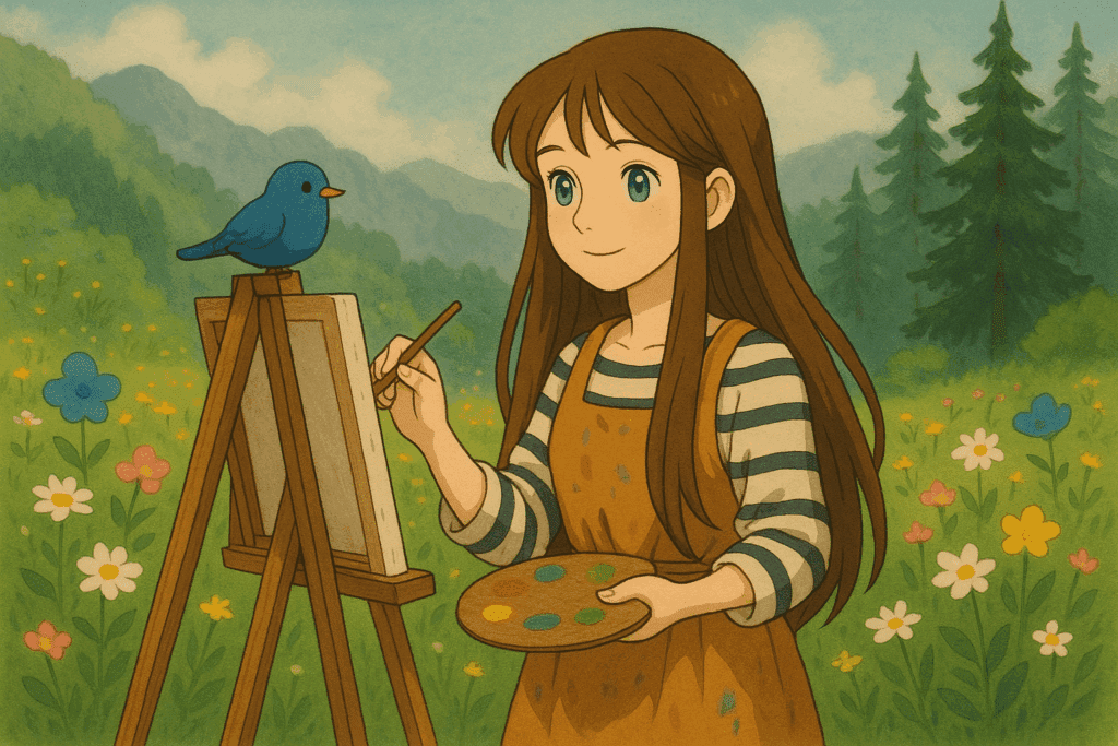
The Art of the Junk Journal: Passion Over Perfection
I was recently posed with a question while on the side of a mountain on a sunny Thursday morning: is a junk journal considered art?
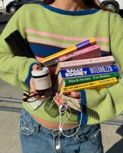
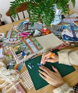
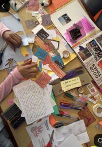
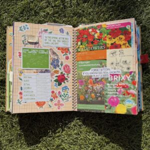
For my young grasshopper artists, a junk journal is exactly as it sounds: a sketchbook filled with every little receipt, sticker, ticket stub, or cute napkin you pick up as you go about life. Mine is currently so full that I have to have multiple rubber bands to hold it close so it fits in my desk drawer. A junk journal is a organized chaos.
The Art of Junk Journaling: Passion Over Perfection
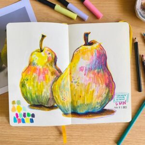
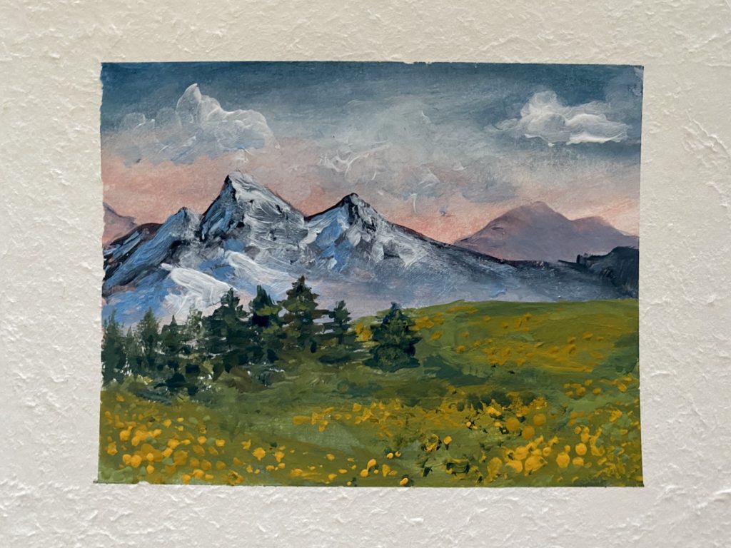
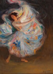
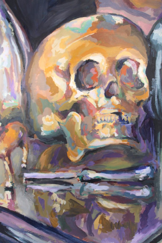
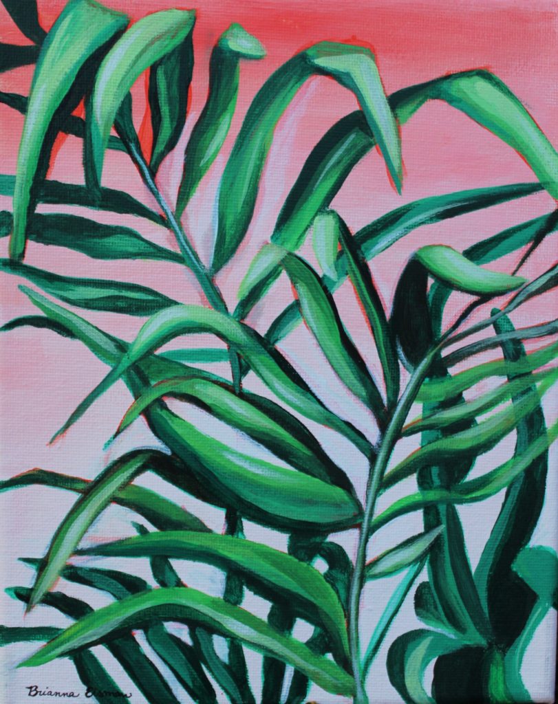
As a fine artist painter myself, I’ve always believed that art is more than just formal techniques and polished masterpieces.
Art is what we create with intention and passion. From Visual Art like painting, drawing, printmaking, sculpture, and photography to Performance Art like theatre and acting or Musical Art like the drums or the piccolo. Coding can be art, a PowerPoint can be art. Art is the product of the study of something we find passion in. And that passion can be expressed in many forms, including the wonderfully imperfect world of junk journaling.
“Art is the product of the study of something we find passion in.”
b. eisman
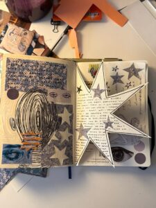
Real art is messy and loud. Junk journaling is the ultimate act of creative freedom: a place where old ticket stubs, torn fabric, vintage stickers, and glitter glue collide in glorious disarray. It’s about capturing the essence o true and intentional art.

A junk journal embodies this perfectly.
It’s a beautifully chaotic collection of memories, thoughts, and creative experiments, crafted from what most would consider “junk.” The joy of junk journaling lies in embracing imperfection and making something meaningful out of everyday materials. Whether you’re an experienced artist or a curious beginner, creating a junk journal is accessible, low-stress, and incredibly freeing: whether that’s a doodle, a splash of color, or a weird sticker you found at along the travels of your life.
Remember, it’s not about looking “good,” because at the end of the day, it’s just trash. But you have to be intentional about making it not trash. You’re creating joy and something nice to look at. Ai says it’s about feeling alive, loud, and unapologetically YOU.
The Creative Power of Combining Materials

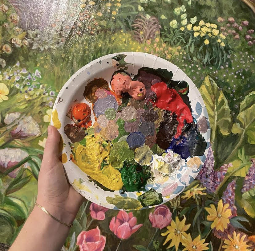
One of the most inspiring aspects of junk journaling is the endless combination of materials you can use.
Think of it as a visual language—ribbons, vintage postcards, stamps, stickers, or even glitter glue—each piece adds personality and story to your journal.
Some of my favorites I’ve collected are letters sent to me, but just my name cut out, fruit stickers because they’re fun and fruit is expensive, and a recipe for a Berry Tipsy Sorbet. When I create, I love to grab my trusted Tombow Dual Tip Pens and go wild with colors, or splash some Posca Pens for bold, rebellious lines. Glitter glue adds a touch of sparkle and of course don’t forget stickers….lots of stickers. Sometimes chaos is the best art.
Here’s a quick craft list:
🎀Patterned Ribbons
📖Dotted Bullet Journals
🎨Stick Glue
🔵Glue Dots
🎞️Double Sided Tape Roller
✒️Tombow Dual Tip Pens
🖍️Posca Pens
🌸Stickers
🌿Ink Pad Wooden Plant Flower Stamps
💌Envelopes
Ai’s extra suggestions for your junk journal: a pack of vintage game pieces, a bag of tiny plastic dinosaur figurines and googly eyes. “Yes, googly eyes. Because sometimes, your journal needs a little evil eye to keep the boredom away.”
Junk Journal Tips
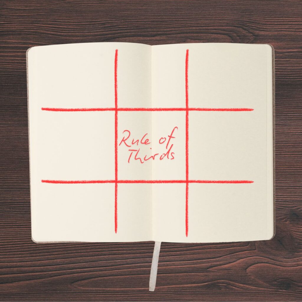
The Rule of Thirds
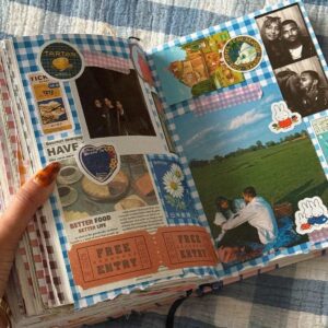
The rule of thirds is a fundamental composition principle in design that helps create balanced and visually appealing layouts. By dividing your page into nine equal parts both horizontally and vertically, you can position key elements—such as photos, embellishments, or focal points—along these lines or at their intersections to draw the viewer’s eye naturally.
According to Wikipedia, “it is common to line the body up to a vertical line and the person’s eyes to a horizontal line. If filming a moving subject, the same pattern is often followed, with the majority of the extra room being in front of the person (the way they are moving).”
Another good composition trick is to know and understand perspective! Check out this article: Perspective in Art: Making Mountains Small and Worms Feel Tall
Focal Point
A focal point is another major composition principle in journaling that helps create a clear center of interest and prevents a page from looking cluttered. By intentionally selecting one dominant element, like a large vintage photograph or a bold stamp, you give the viewer’s eye a natural place to land before it explores the rest of the page’s textures and layers.
According to art theory principles, a successful focal point relies on contrast, isolation, or placement to stand out. When designing a junk journal layout, it is common to make the focal point the largest or most detailed object on the page, surrounding it with subtler background elements like torn book pages, music sheets, or faint stenciling so that the main subject is not overwhelmed by the surrounding chaos.
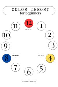
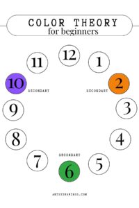
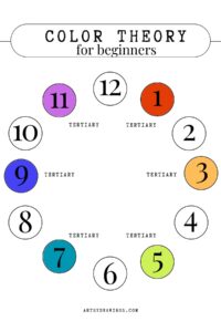
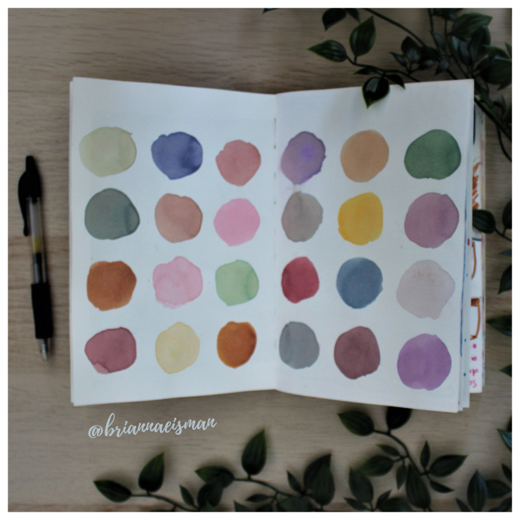
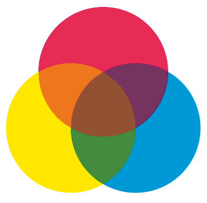
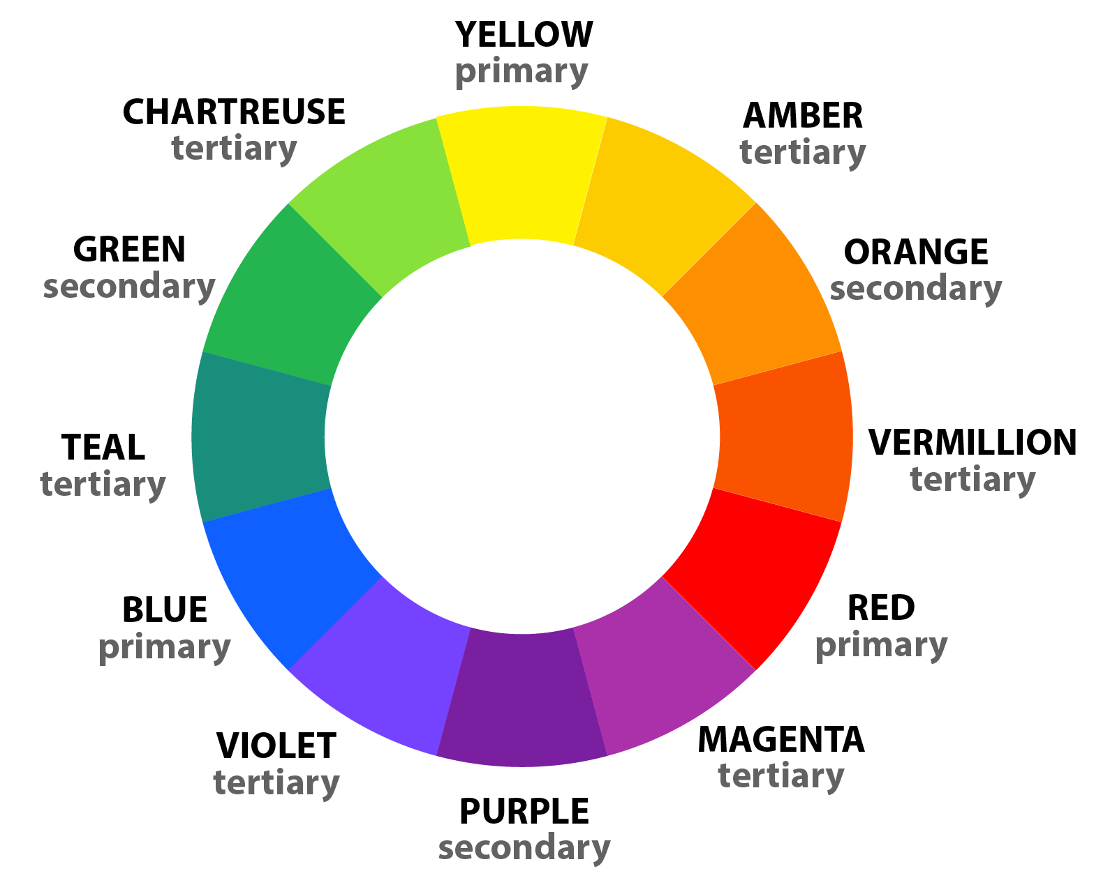
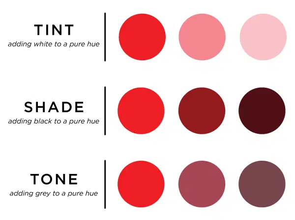
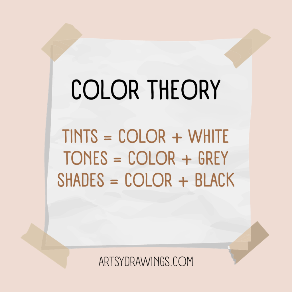
Color Scheme
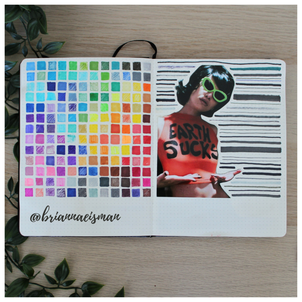
You can also highlight a focal point by color, in which you would need a dedicated color scheme. A color scheme helps create mood, unity, and visual harmony across a single page or even an entire sketchbook junk journal. By intentionally selecting a limited palette, such as a warm monochromatic sepia, a high-contrast complementary duo, or a soothing trio of analogous tones, you bind disparate scraps of paper, fabric, and ink into a cohesive and deliberate story.

According to color psychology, design theory, and Josef Albers, the Bauhaus artist and educator in his 1963 masterwork, Interaction of Color, “colors do not exist in a vacuum; their meaning and impact are entirely dependent on the colors that surround them.”
In junk journaling, establishing a strict or fluid palette allows you to mix wildly different eras and styles of trash while maintaining a sense of deliberate curation rather than random clutter. If you are interested in learning more about color theory and how to craft your own color scheme, I suggest you take a look at these other articles on my website:
- Easy Color Theory for Beginners
- Color Knowledge Tips That Will Make You a Better Artist
- 35 Best BUJO Spreads for a Colorful Summer
Background wash
Another effective technique is to start with a background layer, like a wash of paint or a large piece of patterned paper, before layering additional elements. This will help your color scheme form.
Experiment with composition and colors by placing layers loosely and without glue first, you can assess how the various components like colors, textures, and focal points interact, ensuring the final arrangement has depth and harmony. Playing with these techniques encourages a dynamic, cohesive design that guides the viewer’s eye through your story while maintaining visual interest.
Why Start Your Junk Journal Today?
The best part? Junk journaling is easy and stress-free.
You don’t need to be a professional artist or worry about making everything perfect. The point is to have fun, experiment, and connect with your passions. It’s a process of discovery—an intimate conversation between you and your materials.
Plus, your junk journal becomes a tangible reflection of your journey, with all its imperfections and surprises.

So, I invite you to start your own junk journal today. Dive into your stash of old papers, ticket stubs, and fabric scraps. Grab some pens and glue, and just create. Remember, art is about passion, not perfection. Your junk journal is a beautiful mess waiting to tell your story.
Here’s the truth: junk journaling is low-stress, ridiculously fun, and wildly freeing. It’s about making a mess, laughing at your own chaos, and loving every second of it. Who cares if it looks like a colorful tornado threw up on the pages? That’s the point. Art should be passionate, messy, and totally YOU. So grab that old notebook, tear out some pages, and start sticking.
Let your inner rebel run wild.
 #journaling")
Remember: your junk journal isn’t supposed to be perfect. It’s supposed to be perfectly YOU. So, get glittery, get chaotic, and make some art that’s as wild and wonderful as your imagination. Because the best art is the one that breaks all the rules—and that’s what junk journaling is all about.
The Art of the Junk Journal: Passion Over Perfection Read More »