Best Trending Nail Designs: Is it Actually Art?
Nail Designs vs Fine Art
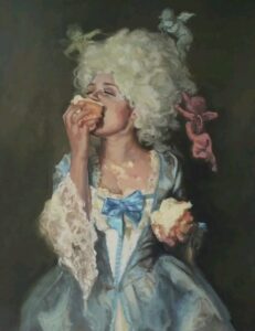
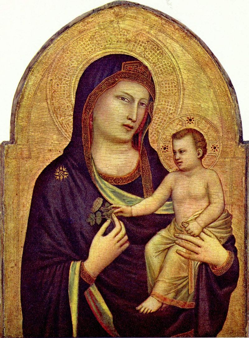
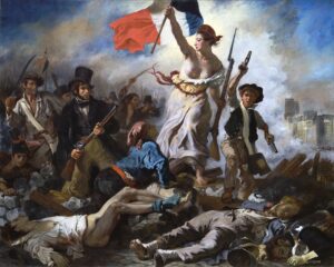
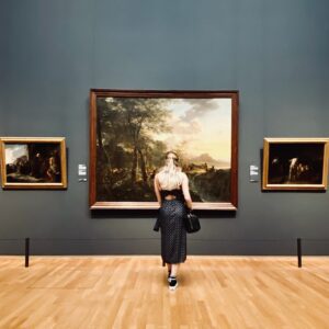
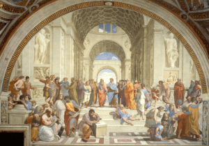
Move over, Michelangelo. 💅
The hottest canvas of Summer 2026 isn’t hanging in the Louvre, it’s currently holding a vanilla iced latte with almond milk.
Let’s be real for a quick minute: nail designs are absolutely a form of art.
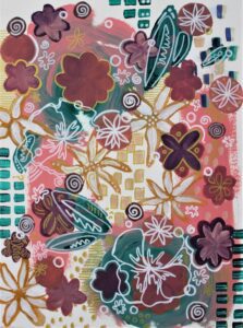
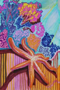
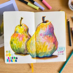
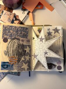
For too long, the traditional art world has looked down from its dusty canvases and marble pedestals, completely missing the pure genius happening at our very fingertips. Anyone who has ever used a liner brush with a blob of polish knows the truth. Those deranged and delicate detailed paintings absolutely qualify nail art as a real art form. For me, my Pinterest board is filled with some really beautiful nail art inspiration. I decided to take a screenshot of it and post it below, go check it out!
Nail art requires precision, color theory, and a great understanding of the material and how to wield it.
In this artsy article, I want to bring together some high-energy, eclectic summer maximalist nail inspiration and simultaneously talk about how nail art is an underappreciated art form.

The Business Behind Nail Designs
According to an article by the Smithsonian, “archeologists have discovered nail art on Egyptian mummies, Indian women, and men in ancient Babylon, dating around 5,000 BCE.” The first “nail polish” is credited by researchers to the Chinese around 3,000 BCE with “a mix of egg white, gelatine, beeswax, and dyes from flower petals.”
In recent days, nail designs have become fashion accessories like a bold lip or sparkly keychain. According to Elle Magazine, actress and singer Cynthia Erivo “has long made nail art her signature beauty look” with the help of Shea Osei, “the London-based manicurist who has been doing Erivo’s nails for the past 15 years.”

Sometimes, long beautiful stiletto nails can even prevent normal functions. Amazon sells soda can openers, raised keyboard caps, and even a tool to help with your bracelet clasp. While these products could be used for other reasons, they are marketed towards women with long nails who would rather purchase a tool than mess up their manicure.
OPI Stay Off the Lawn! Nail Laquer, $12

The Nail Tech to Artist Pipeline
The industry has evolved from simple beauty services into a legitimate art form. The biggest shift happened when nail technicians stopped seeing themselves as service providers and started embracing their role as creators. Some nail designs take hours to complete and require the patience of a saint and the steady hand of a surgeon.
Social media also played a huge part in that transformation. Suddenly artists could showcase intricate designs to millions of people instead of only the clients sitting across the table from them. Techniques spread faster, creativity exploded, and the standard for nail designs went from “cute” to “how on earth did you paint that?!”
Clients don’t just book appointments anymore, they collect artists as one would collect art. They wait months for openings, travel across state lines, and happily pay premium prices for custom work.
Today’s top nail artists combine illustration, color theory, graphic design, and trend forecasting. They aren’t just painting nails. They’re creating wearable art. <3
Elements & Principles & Color Theory of Nail Designs
The best nail designs aren’t random. Behind every set is a little bit of artistic magic and a lot of thoughtful design.
The difference between a set that feels polished and one that feels chaotic usually comes down to understanding a few basic design principles. Compositionally, the principles and elements of design are crucial stepping stones to understand what makes something appear visually aesthetically pleasing. Color theory is the art and science of how colors interact. Color knowledge is a powerful tool for artists, allowing us to express ideas more effectively and create art that resonates with audiences. These are the foundation of why art looks “pretty.”

Elements of Design
- Line, Shape, Form, Color, Value, Texture, and Space
Principles of Design
- Contrast, Balance, Emphasis, Proportion, Hierarchy, Negative Space, Repetition, Pattern, Rhythm, Movement, Variety, Unity
Color Theory
- Primary Colors: Red, yellow, and blue. These foundational colors cannot be created by mixing other colors
- Secondary Colors: Orange, green, and purple. These are created by mixing two primary colors together (Yellow + Blue = Green)
- Tertiary Colors: Colors created by mixing a primary color with a secondary color (Red-Orange)
Color Schemes
- Complementary: Colors located directly across from each other on the wheel (like blue and orange). They provide high contrast and make each other pop!
- Analogous: Colors situated next to each other on the wheel (like red, orange, and yellow). They blend seamlessly and create cohesive, natural-looking designs.
- Monochromatic: A palette using only different shades, tints, and saturations of a single hue.
- Triadic: Three colors evenly spaced around the color wheel.
More Basic Artsy Tips on ArtsyDrawings.com/Art-Advice/
For other basic art tips, I suggest taking a gander at these other artsy articles on ArtsyDrawings.com:
- Color Knowledge Tips That Will Make You a Better Artist
- Words to Describe Art: Discover 8 Tips to Talk About Art
- 5 Easy Drawing Tips For Beginners and Intermediate Artists
- Easy Color Theory for Beginners
Summer Nail Designs to Inspire You
All right, now that I’ve talked your ear off about how cool nail design can be, let’s get into the visual inspiration of this artsy article.
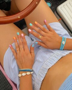
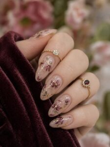
Whether you’re the type of person who books a nail appointment the second a new trend drops or you prefer spending an evening painting your own nails while watching reality TV (comment below your fav Love Island influencer), there’s something here for you. Summer 2026 is bringing a mix of playful, nostalgic, and downright creative nail trends that feel more like tiny works of art than simple manicures.
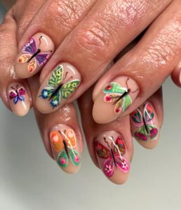
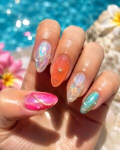
From colorful fruit-inspired designs and dreamy watercolor swirls to chrome finishes, ocean-inspired details, and quirky maximalist patterns, this year’s trends are all about showing off your personality. The best part? You don’t have to be a professional nail artist to pull off many of these looks. Some are surprisingly beginner-friendly, while others are perfect inspiration to bring to your next salon appointment.
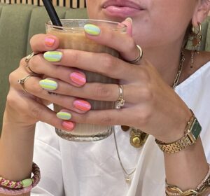
So grab a cold drink, start screenshotting your favorites, and get ready to discover your next manicure obsession. Below you’ll find some of the cutest, trendiest, and most creative nail designs making waves this summer.
Keep in mind, if you’re recreating any of these nail designs at home, don’t underestimate the power of good tools. An ultra-thin detail brush, high-pigment gel polish, and a glossy top coat can make all the difference.
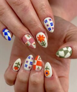
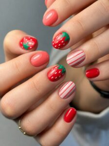
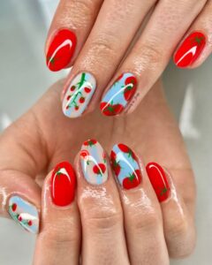
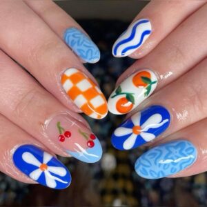
Fruity & Fresh Picnic Style
Inspired by seasonal fruit and farmers markets, these nail designs incorporate your favorite fruits with picnic inspired patterns like red strawberries, white daisy flowers, green leaves, and gingham and stripe patterns like the ones on your picnic blanket. This style is best with a bright red color to really make your nails pop.
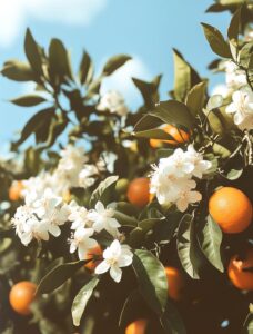
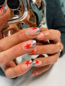
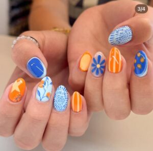
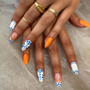
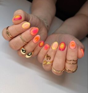
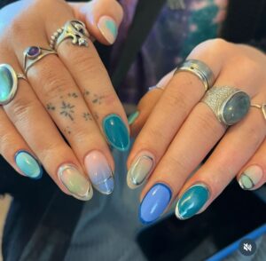
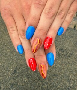
Orange & Blue Complementary Color Scheme
Lean into the summer vibes of complementary colors orange and blue (Go Gators!) Lemons, oranges, limes, and grapefruit make surprisingly adorable nail art. A few accent nails with fruit slices paired with bright solid colors create a playful design that practically screams pool party. Likewise, get inspired by Greek islands and Italian coastlines, with nail designs that use cobalt blue, crisp white, and geometric patterns that look straight out of a seaside café.
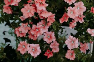
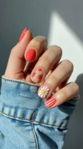
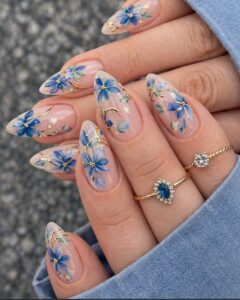
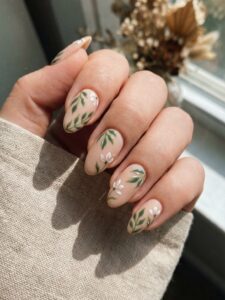
Wildflower Floral Meadow
Tiny hand-painted flowers on a sheer nude base feel romantic without being overly fancy. Mix different flower colors and sizes to create the look of a wildflower field growing across your fingertips. You can also add in gold or silver accents to bring a little more magic to your fingertips.
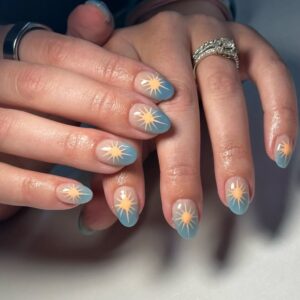
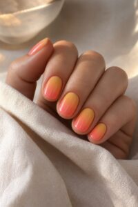
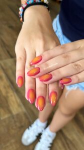
Sunset Ombre Nails
Blend coral, pink, orange, and golden yellow colors together to mimic a summer sunset. They look beautiful on both short and longer nails and this is a really easy way to make your nails look incredible and even a little understated.
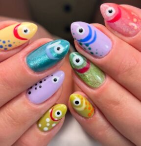
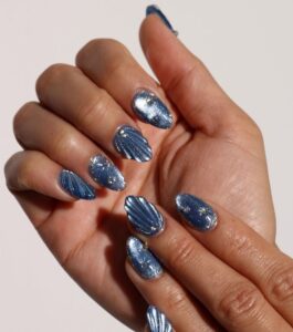
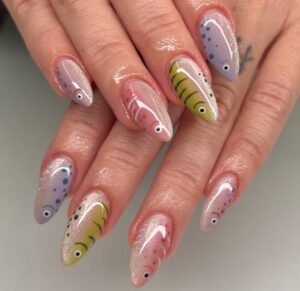
Chrome Mermaid Nails
Mermaid-inspired iridescent chrome finishes are everywhere this year. Pearly pinks, iridescent sparkly blues, and seafoam greens catch the light like fish scales and make even the most boring grocery store trip feel slightly magical. Channel your inner Aquamarine or H2O character with these truly stunning nail designs.
So, Are Nail Designs Actually Art?
Let’s settle this once and for all.
Yes.
Art doesn’t stop being art because it exists on a different canvas.
Artists work on walls, paper, fabric, pottery, digital screens, skateboards, coffee cups, and just about every surface imaginable. Nails simply happen to be one of the smallest and most challenging canvases available. Every set tells a story through color, composition, and technique. The artist makes creative decisions. The client expresses their personality. The result is something unique and personal.
That sounds a lot like art to me.
Sign up for my Newsletter <3
Hey if you enjoyed this article, please leave a comment below with your favorite nail designs or share your dream summer color palette. I’d love to see what trends you’re loving this season. Stay bright, stay colorful, and never let anyone tell you your nails are “just a manicure!” <3
Best Trending Nail Designs: Is it Actually Art? Read More »


 #journaling")