painting tips

100 Surreal Drawing Ideas for every artist

Staring at a blank page, waiting for inspiration to strike, is the worst. You have the skill, the motivation (kind of), and the urge to create, but… what do you even draw? Whether you’re sketching for fun, practicing your craft, or just trying to break out of an art block, having a list of creative drawing ideas at your fingertips can make all the difference. Sometimes, all you need is a single spark—an unusual prompt, a fresh challenge, or a concept that takes your art in an unexpected direction.

Below is a carefully curated list of 100 creative drawing ideas designed to help you experiment, refine your style, and, most importantly, enjoy the process.

Introduction

There’s no wrong way to use this list—pick one randomly, challenge yourself to a daily drawing spree, or combine ideas to create something truly unique. These prompts are broken into different categories to suit your mood and style: fantasy, portraiture, nature, surrealism, and more.

For example, if you’re drawn to character design, you might love the idea of sketching a cyberpunk warrior or a historical figure reimagined as a fantasy character. If you prefer atmospheric scenes, try creating a neon-lit city on a rainy night or an enchanted forest with glowing plants. Feeling conceptual? Play with gravity-defying landscapes or melting clocks dripping into dreamscapes. The goal is to let your creativity take the lead—these ideas are just the launchpad.

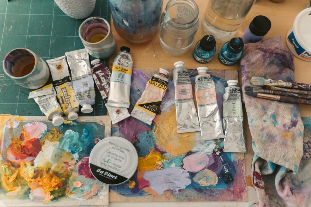
Having the right art supplies is essential for bringing your creative visions to life—whether you’re sketching quick ideas or crafting detailed masterpieces. Quality materials like smooth sketchbooks, vibrant pencils, and blendable markers not only make the process more enjoyable but also help your artwork look its best. Below are some of my favorite and cheap art supplies—click through my Amazon affiliate links to grab them and support my work at the same time!

If you’ve gone through the list, and are still artistically stumped, check out my portfolio or other artsy articles on ArtsyDrawings.com.

Fantasy & Floral Drawing Ideas

  1. A wilted flower coming back to life with magical energy
  2. A giant sunflower with an eye in the center
  3. A fairy sitting inside a blooming rose
  4. A cactus growing out of a teacup
  5. A tree with glowing blossoms that only bloom at night
  6. A tiny village hidden inside a hollow tree
  7. A mushroom house with little windows and a smoking chimney
  8. A snail with a succulent growing from its shell
  9. A flower that changes shape with the seasons
  10. A floating lily pad city in the middle of a peaceful lake

Mystic Nature Scenes Drawing Ideas

pigeon wearing yellow rain boots drawing ideas for artsy drawings
Pigeon in Yellow Rainboots by RM
  1. A twisting tree with roots reaching out like hands
  2. A hidden waterfall behind a wall of vines
  3. A forest path glowing under the light of fireflies
  4. A deer with antlers covered in hanging moss and flowers
  5. A secret garden only visible under the full moon
  6. A butterfly with flower petal wings
  7. A fox with fur that looks like swirling leaves
  8. A bird made entirely of vines and blossoms
  9. A mermaid whose tail turns into flower petals
  10. A rabbit with dandelion fluff instead of fur

Surreal Landscapes Drawing Ideas

  1. A tree growing upside down from the sky
  2. A crystal geode splitting open to reveal a tiny garden inside
  3. A flower field that turns into stars at night
  4. A floating rock covered in grass and wildflowers
  5. A mystical pond that reflects a different world than the one above it
  6. A garden where every flower glows a different color
  7. A river winding through the sky like a ribbon
  8. A giant daisy acting as an umbrella for a tiny creature
  9. A treehouse hidden among cherry blossoms in full bloom
  10. A stormy sky where lightning forms the shape of blooming flowers

Celestial & Atmospheric Drawing Ideas

street view drawing ideas daily sketch by maria
Yellow Street View Drawing Ideas by Daily Sketch by Maria
  1. A moonflower opening under a glowing full moon
  2. A rainbow forming from the mist of a magical waterfall
  3. A sunset where the clouds are shaped like giant blooming roses
  4. A path made of floating lotus flowers leading to an unknown place
  5. A glacier with frozen flowers trapped inside the ice
  6. A bird with crystal feathers that glow in the dark
  7. A forest where every tree has a different colored bark
  8. A giant lily pad floating through the sky like an airship
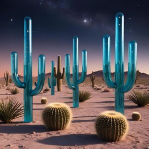
  9. A desert where the cacti are made of glass and reflect the stars
  10. A floating island with a single, massive cherry blossom tree

Whimsical Animals & Insects Drawing Ideas

  1. A hummingbird with wings made of flower petals
  2. A swan whose feathers turn into leaves when it spreads its wings
  3. A moth with wings that resemble dried autumn leaves
  4. A fox with a tail made of ivy and wildflowers
  5. A butterfly with stained-glass wings that reflect flowers in the light
  6. A river that glows in the dark, winding through a field of lavender
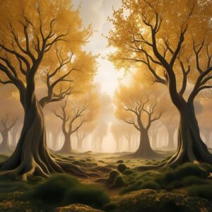
  7. A forest where the trees have golden leaves that never fall
  8. A moss-covered ruin overtaken by vines and blooming flowers
  9. A lake with floating flowers that light up like lanterns at night
  10. A meadow filled with oversized mushrooms and glowing spores

Dreamy Botanical Drawing Ideas

morning glory drawing ideas cami gonzalez calligraphy
Morning Glory Drawing By Cami Gonzalez
  1. A teapot pouring a stream of water that turns into a waterfall
  2. A giant sunflower bending down to whisper to a tiny creature
  3. A floating flower shop with bouquets tied to balloons
  4. A bridge made entirely out of intertwined vines and roses
  5. A giant dandelion puff releasing wishes into the sky
  6. A succulent terrarium with tiny people living inside
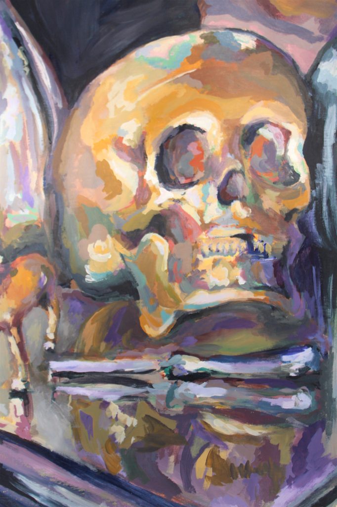
  7. A flower-covered skull as a symbol of life and rebirth
  8. A morning glory vine wrapping around an old, forgotten key
  9. A rose bush growing in the shape of a heart
  10. A water lily with a tiny fairy sleeping on its petals

Geometric & Abstract Conceptual Drawing Ideas

  1. A single line forming the silhouette of a city skyline
  2. Abstract shapes blending into each other to create a mysterious figure
  3. Geometric forms representing the concept of chaos
  4. A spiraling pattern that slowly morphs into a bird
  5. A circular pattern that gets increasingly disorganized the closer you look
  6. A series of interconnected dots forming a complex, surreal network
  7. A series of mismatched patterns swirling together into one image
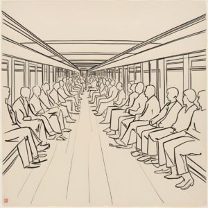
  8. A minimalist sketch of a crowded subway, showing only the outlines of passengers
  9. A futuristic city skyline where every building is a different distorted shape
  10. A chaotic mix of black ink splatters and precise pencil details

Organic & Flowy Drawing Ideas

colorful Non-Local Pear Drawing ideas by Erika Lamar Buentello artsy drawings brianna eisman
Non-Local Pear Drawing by Erika Lamar Buentello
  1. A plant growing through a cracked window, creeping upward
  2. A half-drawn face with its features slowly dissolving into thin air
  3. A hollowed-out human figure with intricate patterns spilling out from inside
  4. A body with transparent parts that reveal a hidden world inside
  5. A melting object dripping into a chaotic pool of shapes
  6. A liquid that’s spilling from a cup, but instead of water, it’s made of words
  7. A deconstructed object—like a chair—rearranged into an abstract form
  8. A person holding a transparent sphere, and inside it, a completely different world
  9. A tangled mess of strings, each representing different emotions or concepts
  10. A floating object that shifts in shape the longer you look at it

Human & Emotional Drawing Ideas

  1. A faceless person standing in a crowd of shadows
  2. Two hands reaching toward each other, but never quite touching
  3. A hollowed-out human figure with intricate patterns spilling out from inside
  4. A body with transparent parts that reveal a hidden world inside
  5. A person holding a transparent sphere, and inside it, a completely different world
  6. A maze drawn inside a person’s silhouette, with no clear beginning or end
  7. A floating object that shifts in shape the longer you look at it
  8. A crumpled paper drawing, with creases creating a 3D effect
  9. A human figure dissolving into an array of fine, intricate lines
  10. An empty frame with only a shadow inside, suggesting what’s missing

Minimalism & Surrealism Drawing Ideas

  1. A blank page slowly getting filled with random scribbles
  2. A melting object dripping into a chaotic pool of shapes
  3. An open hand with light streaming out between the fingers
  4. A single brushstroke that seems to form a silhouette but fades into abstract swirls
  5. A sketch of a tree with roots that are made of tangled thread
  6. A bird with crystal feathers that glow in the dark
  7. A liquid that’s spilling from a cup, but instead of water, it’s made of words
  8. An abstract wave crashing into a geometric structure, like a solid wall
  9. A figure partially submerged in water, with only certain parts of them visible
  10. A cloud of dust swirling around an undefined object

Conclusion

At the end of the day, the best drawing ideas are the ones that excite you. Don’t be afraid to put your own spin on these prompts—merge ideas, push boundaries, and experiment with styles you wouldn’t normally try. The more you create, the more your artistic voice develops, and that’s where the real magic happens.

So grab your sketchbook, pick an idea, and start drawing! Who knows? That one random prompt might just lead to your next masterpiece.

Join my monthly newsletter!

Sign up for my monthly artsy newsletter and stay up to date with all things from ArtsyDrawings.com

*

100 Surreal Drawing Ideas for every artist Read More »

How to Paint a Flower for Beginners: 6 Easy Steps

Have you ever wanted to paint a beautiful flower but didn’t know where to start? Painting can be a lot of fun and a great way to relax. Today, I’m going to show you how to paint a flower step by step. This guide is perfect for beginners or anyone who loves art and wants to create something beautiful. So, let’s get started!

Learn how to paint a flower in a few easy steps!

How to paint a flower step 1: Gather Your Supplies

Before we dive into painting, it’s important to gather all the necessary supplies. You can find these supplies at your local craft stores, or purchase them from Amazon. If you choose to buy from Amazon, please use the links below to support Artsy Drawings!

You will need paints, either acrylic or watercolor, depending on what you prefer. Acrylic paints are thicker and dry quickly, while watercolors are lighter and can be blended with water. For help choosing mediums, check out the article My Favorite Artistic Mediums. Choose colors that you love for your flower and background.

Next, you’ll need a variety of paintbrushes. Having a big brush for the background and smaller brushes for details will help you create different effects. You will also need a canvas or watercolor paper to paint on, and a palette to mix your paints. Regardless of whether you choose acrylic paints or watercolor paints, it’s important to keep a cup of water handy. If you’re using acrylics, a palette knife can be useful for mixing. Don’t forget to have some paper towels or a cloth to clean your brushes, and a pencil and eraser for sketching your flower.

Optional items that can make your painting experience better include an easel to hold your canvas or paper, an apron or old clothing to protect your clothes, and painters’ tape to keep your paper from moving. Once you have all your supplies ready, you’re set to learn how to paint a flower and create your masterpiece.

How to paint a flower step 2: Setting Up Your Workspace

how to paint a flower painting - artist set up
High Angle Shot of a Woman Painting by Leeloo The First

Creating a comfortable and organized workspace is crucial for a smooth painting experience. Find a well-lit area where you feel relaxed and can see your work clearly. Arrange your paints, brushes, and other materials within easy reach so you won’t have to interrupt your creative flow to hunt for supplies. Make sure your canvas or paper is secured on your easel or flat surface, and you’re ready to begin to learn how to paint a flower.

Having a reference photo can be very helpful. Choose a simple flower like a daisy, tulip, or sunflower. You can find pictures online or in books. Pinterest is a great source for reference material. A reference photo will guide you and help you understand the shapes and colors better.

Here are some helpful tips before you start: keep your workspace tidy to avoid distractions, use a color wheel for better color choices, and practice basic shapes before starting on the final sketch. These tips will make your painting experience more enjoyable and successful.

How to paint a flower step 3: Sketching the Flower

Now that your workspace is set up and your supplies are ready, it’s time for the real step 1 in how to paint a flower: sketching the flower. Using a pencil, lightly sketch the outline of your flower on the canvas or paper. Use simple shapes to get the proportions right. For instance, a daisy has a round center with long, thin petals radiating out. Use your reference photo to guide your sketch. Don’t worry about making your sketch perfect; it’s just a guide to help you when you start painting.

How to paint a flower step 4: Painting the Flower

how to paint a flower for beginners: different types of flowers in watercolor paint - Artsy Drawings
Learn how to paint a flower in a few easy steps!

Now comes the fun part—painting the flower! Start by applying a base layer to the petals using a light color. For example, if you’re painting a daisy, you might use white or light yellow. Use a smaller brush for this step and carefully paint each petal.

Once the base layer is dry, it’s time to add details. Remember, if you are using acrylic or gouache paint you can paint dark to light. If you are using watercolors, paint light to dark.

Use different shades and tints to create shadows and highlights. This will give your flower depth and make it look more realistic. For the center of the flower, use a different color like yellow or brown for a daisy, and paint the stem and leaves green. Blending the colors smoothly where they meet will help your flower look soft and natural. Add any final touches to enhance the details and make your flower pop.

Let your painting dry completely before moving on to painting the background. This will prevent the colors from mixing unintentionally.

How to paint a flower step 5: Painting the Background

With your flower fully based out, the next step is to paint the background. Pick a color that will make your flower stand out, such as a light blue or green, because these colors are opposite to red and orange on the color wheel. Using a big brush, apply the paint in long, even strokes to cover the entire background. If you want, you can blend different colors to create a more interesting effect. For example, you can blend blue and white to create a sky-like background. You can also add extra green colors for grass, trees, or whatever garden you may find your flower in.

Understanding Different Types of Flowers

While the daisy, tulip, and sunflower are excellent choices for beginners, it’s worth exploring a variety of flowers to expand your painting repertoire. Each flower has unique shapes, colors, and textures that can be both a challenge and a delight to paint. Let’s take a closer look at a few more flowers you might want to try.

how to paint a flower for beginners: different types of flowers in watercolor paint - Artsy Drawings
There are many different types of flowers you can choose to paint, from sunflowers and violets to hydrangeas and poppies.

Roses

Roses are classic and loved by many. They can be a bit challenging due to their layered petals, but with patience and practice, you can master them. Start by painting the central petals tightly together and gradually expand outwards, layering as you go. Use shades of red, pink, white, or yellow, and remember to add shadows and highlights to give depth.

Orchids

Orchids have an exotic and delicate appearance, making them a fascinating subject. Their petals often have intricate patterns and vibrant colors. When painting orchids, focus on capturing the delicate texture of the petals and the unique shapes of the flower parts. Use reference photos to help guide you.

Lilies

Lilies are elegant and can add a touch of sophistication to your artwork. Their large, curved petals and prominent stamens make them an interesting challenge. Use smooth, sweeping brushstrokes to capture the shape of the petals and pay attention to the subtle color variations in each petal.

Sunflowers

Sunflowers are cheerful and relatively straightforward to paint. Their bright yellow petals and large, dark centers make them instantly recognizable. When painting sunflowers, start with the center and work your way outwards, adding petals in layers to create a full, vibrant flower.

Cherry Blossoms

Cherry blossoms are delicate and often painted in clusters, creating a beautiful and serene scene. Use light pinks and whites, and focus on capturing the softness of the petals. Adding branches and buds can enhance the overall composition.

Hydrangeas

Hydrangeas are composed of many small flowers clustered together, creating a lush and full appearance. They can be painted in various colors, from blues and pinks to purples and whites. Use small, delicate brushstrokes to capture the individual flowers and create a sense of volume.

Practicing Different Flower Structures

As you become more comfortable with learning how to paint a flower, challenge yourself to explore different structures and compositions. Practice painting flowers from various angles and perspectives, such as a side view, top view, or even a close-up of a single petal. This will help you develop a better understanding of the shapes and forms of different flowers.

how to paint a flower for beginners: different types of flowers in watercolor paint - Artsy Drawings

Mastering Color Mixing and Techniques

Color mixing is an important part of painting. Mixing colors allows you to create different shades and tones, making your painting more vibrant and realistic. For example, you can mix blue and yellow to make green, or red and white to make pink. Experiment with mixing colors on your palette to see what new colors you can create. If you want to learn more about color theory and mixing, check out our blog post here.

There are some easy painting techniques that can make your flower look even better. The wet-on-wet painting technique is when you apply wet paint onto wet paper or another layer of wet paint. This creates soft edges and allows colors to blend easily. The dry brush technique involves using a dry brush with very little paint. This technique is great for creating texture. Lastly, the layering technique involves applying multiple layers of paint, letting each layer dry before applying the next. This technique adds depth and richness to your painting.

To learn more color and painting techniques, check out the articles about My Favorite Artistic Mediums, Color Knowledge Tips to Make You a Better Artist, and Color Theory for Beginners.

How to paint a flower step 6: Final Steps

After you’ve finished painting your flower, let it dry completely. This might take a few hours depending on the type of paint you used. Once it’s dry, you can handle your painting without worrying about smudging it. If you want to protect your painting, you can apply a clear varnish, though this step is optional. Sealing your painting can help it last longer and keep the colors vibrant.

At Artsy Drawings, we recommend using a good quality varnish, especially if you plan to sell your work or hang it in a sunny place. We use Liquitex Acrylic Medium Gloss Varnish for acrylic paintings.

Conclusion

You did it! You’ve painted a beautiful flower. In a few simple steps, you created a beautiful work of art, and became better at knowing how to paint a flower. Painting is all about practice and enjoying the process, so don’t worry if your first flower isn’t perfect. Keep practicing, and you’ll get better and better.

Knowing how to paint a flower can be a versatile skill that extends beyond your canvas. For instance, you can apply this talent to decorate pottery, adding a personal and artistic touch to ceramic pieces like vases or plates, making them unique gifts or home decor. Additionally, hand-painted flowers can be used to create personalized holiday ornaments or cards, infusing gifts with a special, handcrafted charm that reflects your creativity and attention to detail. This skill can also enhance your ability to design floral patterns for textiles or even decorate cakes with artistic precision.

We’d love to see your flower paintings! Share your finished artwork on social media and tag us. Feel free to leave comments and let us know how your painting experience went.

how to paint a flower for beginners: paint flowers on pottery
You can use this skill of how to paint flowers on all sorts of things: from canvas to pottery

How to Paint a Flower for Beginners: 6 Easy Steps Read More »

How to Thrift Art Supplies: 10 Easy Tips

Getting the right art supplies is very important for making art. Having good quality materials can really make your art look better. But, buying new art supplies can be costly. That’s why many artists like to thrift art supplies second-hand. This process can benefit the environment, save money, and utilize fewer new materials in this way. We’ll discuss how and where to thrift art supplies, as well as the benefits, in this blog post.

art supplies thrift secondhand
Art supplies can get expensive, but don’t let that stop you from creating art.

Understand What Makes Good Art Supplies

When making art, the quality of your art supplies can really matter. So, what makes good art supplies? How can you differentiate between something that’s merely okay and something that’s really good? Let’s break it down.

First and foremost, good art supplies should be durable. This means that they are built to last and can withstand repeated use. For example, a good paintbrush should have a sturdy handle that is comfortable to hold and bristles that don’t easily fall out. Similarly, a good sketchbook should have thick, high-quality pages that won’t easily tear or get damaged by erasers or different types of mediums.

Good art supplies should have a high level of performance. This means that they do their job well. In the case of paint, it should have vibrant, consistent colors and should apply smoothly on the canvas. Likewise, a good pencil should make clear, precise lines and should be easy to erase without leaving smudges or marks. They can be used for a variety of different art projects and styles. This is especially important if you like to experiment with different techniques or if you’re still exploring your artistic style.

Successful artists experiment frequently to see what works and what doesn’t. Choose art supplies that work for you and your style.

However, it’s important to remember that good art supplies don’t always have to be the most expensive ones. Sometimes, you can find high-quality art supplies at thrift stores or second-hand shops. The key is knowing what to look for. When shopping for thrift art supplies, you should always carefully check the condition of the items. Make sure they are not damaged in any way and that they still function as expected.

The best art supplies are the ones that work well for you. Everyone has different preferences and different needs when it comes to their art materials. What one person prefers might not work for another person. So, don’t be afraid to try out different types of art supplies and brands until you find the ones that suit your unique style and needs.

Thrift art supplies may be well loved, but not in the best condition. Be sure to carefully evaluate the materials before purchasing.

Where to thrift Art Supplies

Thrift stores are excellent places to find thrift art supplies second-hand. They often have a wide variety of items, from paintbrushes and sketchbooks to easels and canvases. Here are a few places you might want to check out:

1. Goodwill

Goodwill stores sell all sorts of donated items, including thrift art supplies. You may find brushes, paints, sketchbooks, and much more, all at affordable prices. Their stock changes often, so frequent visits may lead to finding different supplies each time.

2. Salvation Army

The Salvation Army also offers a variety of thrift art supplies. Their prices are usually very reasonable, which is great for artists on a budget. Similar to Goodwill, their inventory changes frequently, so there’s always a chance of finding something new.

3. Local Charity Shops

Local charity shops can be hidden gems for second-hand art supplies. These smaller shops often have a more select range of items. When you buy from them, you’re supporting local charities, which is a wonderful added bonus.

4. eBay

eBay is an online marketplace where you can find almost any type of art supply. There’s a huge range of items, from barely-used to brand-new. However, make sure to read the descriptions carefully and check the seller’s ratings before buying anything.

5. Etsy

Etsy is not just for handmade and vintage items – it also has a section for craft supplies. You can find unique and high-quality used art supplies here, often from fellow artists. As with eBay, keep an eye on seller ratings and reviews to ensure a successful purchase.

6. Facebook Marketplace

Facebook Marketplace is a great platform to find used thrift art supplies in your local area. People in your community might be selling just the thing you need. Besides finding great deals, it’s also a good way to connect with other local artists.

Remember, whether you’re shopping in-store or online, always check the condition of the art supplies before buying. Happy thrifting!

avoid low quality thrift Art Supplies

When you’re looking for thrift art supplies at second-hand stores, it’s really important to take your time and look over everything carefully before you buy it. Here are some easy-to-follow tips on how to make sure you’re getting good stuff:

  1. Look over all the art supplies for any damage: Before you buy anything, make sure you check it over really well. Look for any damage like cracks, dents, rust, or any missing parts. You want to make sure that the supplies are in good shape so you can use them for your art projects.
  2. Try out the thrift art supplies to make sure they still work: Besides just looking them over, you should also try out the art supplies to make sure they work like they’re supposed to. For example, if you’re thinking about buying a paintbrush, check to see if the bristles are in good shape and can hold paint well. If you’re looking at paints, open the tubes to check the color and how smoothly it comes out. This way, you can avoid any surprises when you start using them for your art.
  3. Talk to the thrift store workers about prices: Don’t be shy about asking for a lower price when you’re buying second-hand art supplies. A lot of thrift stores are happy to negotiate prices, especially if something has been there for a while. Ask nicely if they can lower the price a bit, especially if you’re buying a lot of things. If you’re nice to the thrift store workers, you might even be able to get discounts or special deals on art supplies.

By following these steps, you can feel confident about buying second-hand art supplies at thrift stores. Keep in mind that buying used thrift art supplies at these stores is not only a great way to save money, but it also helps to reuse materials that might have been thrown away. So, it’s a win-win situation! You save money, you help the environment, and you might even discover some really cool art supplies that you wouldn’t find anywhere else.

Conclusion:

Thrifting for art supplies is a fantastic way to save money, reduce waste, and discover unique materials for your creative projects. By exploring local thrift stores, researching brands, and carefully evaluating each item, you can build a collection of quality art supplies without breaking the bank. Not only does thrifting benefit your wallet and the environment, but it also adds an element of excitement and surprise to your artistic practice.

Whether you’re an experienced artist looking to expand your materials or a beginner on a budget, consider giving thrift shopping a try for your next art project.

Enjoy this article? Read more from Emily here.

How to Thrift Art Supplies: 10 Easy Tips Read More »

Color Knowledge Tips That Will Make You a Better Artist

Introduction to color knowledge

Color knowledge is a fundamental aspect of art that has the power to evoke emotions, convey messages, and create captivating compositions. Whether you’re an aspiring artist or a seasoned pro, a deep understanding of color can significantly enhance your creative endeavors, and in turn, make you a better artist.

If you are new to the art world, I suggest you take a look at this article on color theory for beginners.

In this artsy article, we’ll dive headfirst into color knowledge, covering essential principles of color theory like primary, secondary and tertiary colors, how to create an effective color scheme, and basics of color mixing.

Color Theory: The Foundation of Creativity

Color Knowledge tip 1: Primary Colors are Red, Blue, and Yellow

Color Knowledge image of primary colors mixing in triple venn diagram to create secondary colors
Red, yellow and blue are the starting point to create more colors like orange, green, and violet.

Primary colors are the foundational hues in the world of color theory, consisting of red, blue, and yellow. These three colors are considered “primary” because they cannot be created by mixing other colors together.

On a computer, these inks are called magenta, yellow, blue, and black. Though, you’ll notice if you run out of black ink, the computer will offer an alternative to mix magenta, yellow, and blue. This mixture is “optical black” in the painting world. I’ll talk more about optical black in the section about mixing paint colors together.

Different combinations of the primary colors create all other colors on the color wheel. The primary colors are essential color knowledge for artists and designers.

If you mix two primary colors, you get secondary colors. For instance, if you mix even parts red and yellow, you will get orange. Blue and red make violet. Yellow and blue make green.

Color Knowledge tip 2: memorize The Color wheel

The color wheel further expands with tertiary colors, created by mixing primary and secondary colors. There are endless possibilities for color exploration in art and design.

Color Knowledge image of the color wheel showing primary, secondary, and tertiary colors
This color wheel shows primary, secondary, and tertiary colors.

Great, now that you’ve grasped the basic concept of the Roy G. Biv color wheel, let’s move on to relationships between colors. For more beginner friendly tips, check out this article on color theory for beginners!

Color Knowledge tip 3: Understand Color Harmony

Next, let’s learn about color harmony schemes like complementary, analogous, and triadic colors. Choosing the right color scheme can add a lot of visual and metaphorical depth to your art.

Complementary color schemes involve pairing colors that are located directly opposite each other on the color wheel. They are literal compliments, such as red and green or blue and orange. This scheme creates strong visual contrast and can make each color appear more vibrant when placed next to its complement. This color scheme is often seen in comic books, illustrations, logos, and even signage on the side of the road.

Color Knowledge image of complementary colors in everyday media like Christmas card, football team, and soda logo
Complementary colors contrast one another and tend to “pop” off the page.

Analogous color schemes use colors that are adjacent to each other on the color wheel, such as yellow, yellow-green, and green. This scheme creates a sense of harmony and cohesion. The analogous color scheme is ideal for creating a peaceful or monochromatic color palette in art or design.

Both The Kiss by Gustav Klimt and my painting inspired by the same work use analogous color schemes to create a sense of calm and peaceful harmony.

Triadic color schemes involve selecting three colors evenly spaced around the color wheel, forming an equilateral triangle. For example, red, blue, and yellow form a triadic color scheme. This scheme offers a balanced and dynamic contrast of colors. Triadic color schemes create visually striking and vibrant compositions.

Spiderman showing a tertiary color scheme of red, yellow and blue
This image shows the selected colors used in the comic book about Spiderman. Red, blue, and yellow make a triadic color scheme.

Color Knowledge tip 4: Know the difference between tint and shade

Saturation and value are essential aspects of color theory illustrated through the use of tints, shades, and tones.

Tints and shades determine values. Tints are created by adding white to a color and shades are formed by adding black to a color. Saturation is determined by tone, in which grey is added to the pure hue to mute the color.

Tints, shades, and tones showing color knowledge
Tints, shades, and tones change the color depending on how much white, black or grey you add to the hue, respectively.

Tints and shades alter both the brightness (value) and intensity (saturation) of colors. The level of darkness or lightness is crucial for creating depth in your artwork and originality in your color schemes.

Color Knowledge tip 5: Color temps (Warm vs. Cool Colors)

Color temperature is a fundamental color knowledge tip that helps convey emotion and moods.

Warm colors, such as reds, oranges, and yellows, are associated with warmth, energy, and excitement. Typically seen in the foreground of the composition, warm colors evoke feelings of passion and vibrancy.

In contrast, cool colors, like blues, greens, and violets, are calming and associated with serenity, tranquility, and a sense of distance. They tend to recede in a composition and can evoke feelings of calmness and introspection.

During Pablo Picasso’s Blue Period, the artist used a predominantly cool color palette. This color scheme included shades of blue (obviously) and blue-green as dominant hues. This deliberate choice of colors conveyed a sense of melancholy, sadness, and emotional turmoil in his artworks.

Color Knowledge image of Pablo Picasso's blue period about how color schemes can help convey emotions
Pablo Picasso’s Blue Period (1901-1904) is one of the most well known artistic uses of how color can signify emotion.

Color can serve as a powerful tool for expressing complex emotions and capturing the human condition.

One of my favorite moments of artists being angsty and non-conformists is the controversy surrounding “Blue Boy.” Painted by English portrait artist Thomas Gainsborough, the 1770 painting includes the unconventional use of blue as the dominant color for the subject’s attire, rather than as a background hue.

One of my favorite moments of artists being angsty and non conformists is the controversy surrounding "Blue Boy" by English portrait artist Thomas Gainsborough. The 1770 painting includes the unconventional use of blue as the dominant color for the subject's attire rather than as a background hue.
Blue Boy by Tomas Gainsborough challenged norms of its time by using blue in the foreground of the painting.

This departure from traditional portraiture raised eyebrows in its time. I find that something I love about learning art history is how artists challenge conventional norms. Sparking debate about artistic choices leads to innovation and change and progress.

Likewise, try to understand the interplay between warm and cool colors. This part of color knowledge is crucial for creating balanced and emotionally resonant color palettes in art and design.

COLOR MIXING

Color Knowledge tip 6: learn to mix Optical black

Color mixing techniques can greatly enhance the range and depth of your artwork. This section will focus on the important concept of “optical black.”

In this painting, I mixed phthalo (Phthalocyanine) blue with burnt umber to create this super dark optical black background to show color knowledge
I mixed phthalo (Phthalocyanine) blue with burnt umber to create this dark optical black background.

Optical black is a “fake black” which looks like black, but is instead created using color.

In art school, we were not allowed to buy or use black paint in our paintings. Turns out, creating optical black teaches you color theory and color mixing much better than simply using black.

Remember back to when we were discussing value and saturation?

Color theory is easy with a cute visual.

So then if Optical Black = Orange + Blue then Shades = Optical Black + Orange + Blue.

Whoever said art doesn’t include math was just a silly-billy.

Anyways, mixing complementary colors can create the visual appearance of black, despite no actual black pigment used.

To start, mix complementary colors from the color wheel. From there, continue to add colors until you reach the optical black that looks best for your chosen color scheme.

For example, if your painting uses yellow highlights, you may want your optical black to look more violet. How does this work?

Using complementary colors trick the color receptors in your eyes to believe the color is black, and not dark violet. This technique achieves rich, natural and deep shadows in your artwork without resorting to flat-looking black paint.

The same effect is achieved when you wear colored ski-goggles.

“[Ski-goggles] are often orange so at the end of the day the orange receptors are tired and the world looks blue.”

stoopidusername

Disney World also uses this technique to make their colors seem more vibrant. The sidewalks are painted red to trick the color receptors in your eye to make the grass and trees seem greener.

Disney World uses complementary colors in their park. The red sidewalks make the grass and trees look greener.

Color Knowledge tip 7: Use complementary colors for desaturation

Additionally, complementary colors tone down the saturation of a color. When you mix a color with its complementary color, the result is a desaturated, or less vibrant, version of the original color.

In the below painting of a skull still life, I chose a color scheme that included a golden yellow ochre and a muted violet. To achieve many of the greyish mid-tones, I chose to mix the yellow and violet together using varying amounts of each color.

This acrylic painting of a skull illustrates the use of optical black in learning color knowledge for painting.
In addition to making optical black using violet and yellow, I chose those same complementary colors as a base color scheme for this painting.

For example, if you have a highly saturated red and you want to reduce its intensity, mix it with a bit of green, its complementary color. The resulting mixture will be a less vibrant shade of red, leaning more towards a neutral gray or brown, depending on the proportions used.

I tend to love using complementary color schemes in my artwork. For this work, I started with a red wash and red base painting, then added the green layers on top to really push the color.
I tend to love using complementary color schemes in my artwork. For this work, I started with a red wash and red base painting, then added the green layers on top to really push the green color forward.

When using complementary colors to desaturate, it’s essential to be mindful of the proportions of added colors. Adding too much of the complementary color can cause the mixture to become too muddy or dark. This is particularly evident in watercolor painting as it is more difficult to lighten the painting back (for watercolors you paint light to dark).

Experimentation and practice will help you develop an intuitive sense of how to mix colors. Color knowledge like optical black and using complementary colors to adjust saturation and intensity can help you become a better artist.

Color Knowledge tip 8: Physically mix colors

Mixing colors is an essential skill for any artist expanding their color knowledge. For this section, we will focus on mixing paint.

Begin with a clean palette and brushes. I also like to have a paper towel handy to dry my brushes. Then, squeeze small amounts of your chosen paint colors onto the palette. I like to use a paper plate as a paint palette, and I place the paint in a circle around the outer edge of the plate.

For example, the photo below features one of the paper plate palettes I used. Notice how I tried to keep the main paint colors clean and mixed my paint towards the center of the plate. You will also notice, I did not use black paint — I mixed an optical black using a dark blue and burnt umber.

I used this paper paint palette for a 4’x4′ garden painting with a lot of colorful flowers.

Next, use a palette knife or brush to blend the colors together gradually, starting with the lightest color and adding small increments of the darker color until you achieve the desired shade. Remember to test your mix on a scrap surface or a corner of the canvas itself to ensure it matches your vision before applying it to your artwork. Practice and experimentation will help you become proficient in creating custom colors for your art.

Follow my social media and newsletters for more tips on how to create a wider array of hues and tones, adding depth and complexity to your work through color knowledge.

Concluding color knowledge for now…

Color knowledge is a powerful tool for artists, allowing us to express ideas more effectively and create art that resonates with audiences. By mastering color theory, you can elevate your art to new heights. So, embrace the world of color, experiment fearlessly, and let your creativity flourish on the canvas of your imagination.

Understanding color theory and mixing colors is like having an artist’s secret toolkit. Whether you’re gently blending opposite, or complementary, colors to tone down the saturation or using clever mixtures to create “optical black,” these techniques are simply invaluable. I do want to remind you art lovers that there is so much more to know about color. If this is something that really interests you, please comment, message me, or join my newsletter to read more! I love color!!!

By grasping these fundamentals, you not only make your artwork visually engaging but also open doors to express intricate emotions and stories through color. So, dive into the world of color knowledge, and watch your art flourish with richer, more meaningful color scheme choices.

This is a super easy exercise for testing your markers to show what colors work and which markers have dried out. It also uses color knowledge to arrange the colors in a rainbow style order.

I realized this article was getting long, so I had to chop it up to allow for more in depth discussion of color knowledge. Trust me, there will be more color themed articles!

Color Knowledge Tips That Will Make You a Better Artist Read More »

Scroll to Top
Cart
0
Add Coupon Code
Subtotal