How to Thrift Art Supplies: 10 Easy Tips
Getting the right art supplies is very important for making art. Having good quality materials can really make your art look better. But, buying new art supplies can be costly. That’s why many artists like to thrift art supplies second-hand. This process can benefit the environment, save money, and utilize fewer new materials in this way. We’ll discuss how and where to thrift art supplies, as well as the benefits, in this blog post.
Understand What Makes Good Art Supplies
When making art, the quality of your art supplies can really matter. So, what makes good art supplies? How can you differentiate between something that’s merely okay and something that’s really good? Let’s break it down.
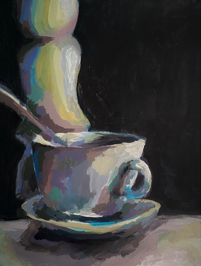
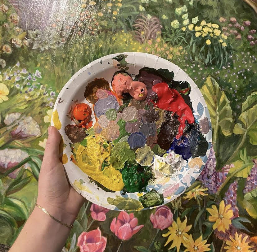
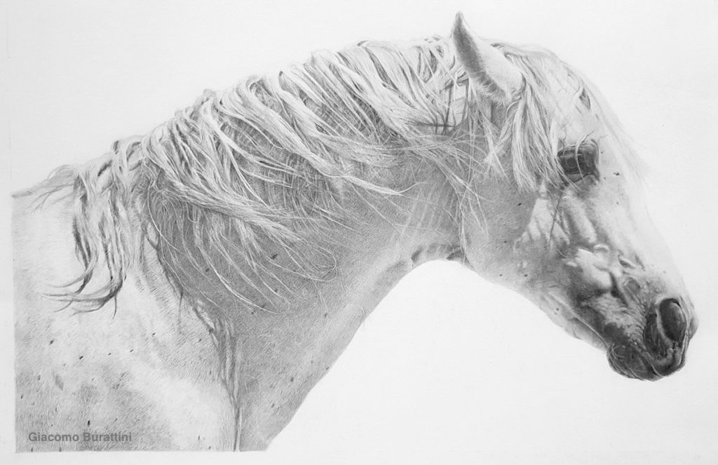
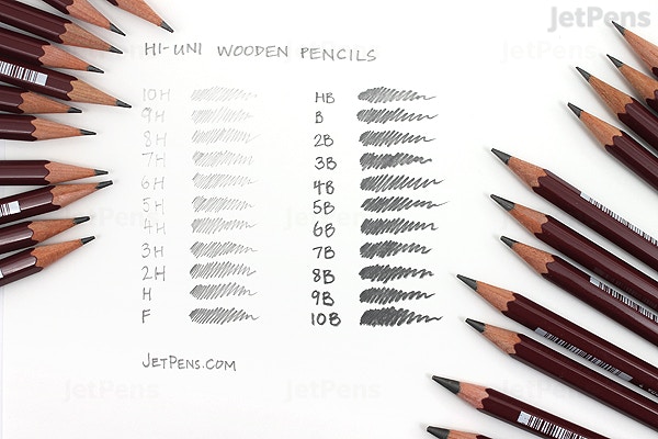
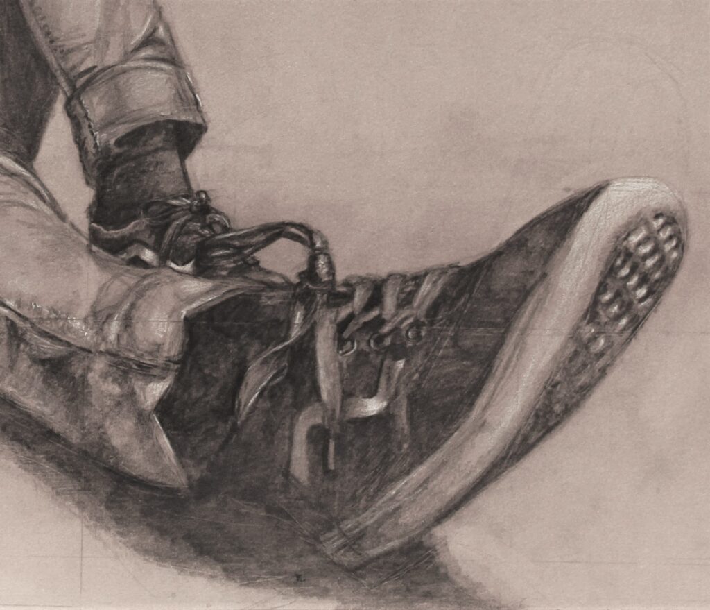
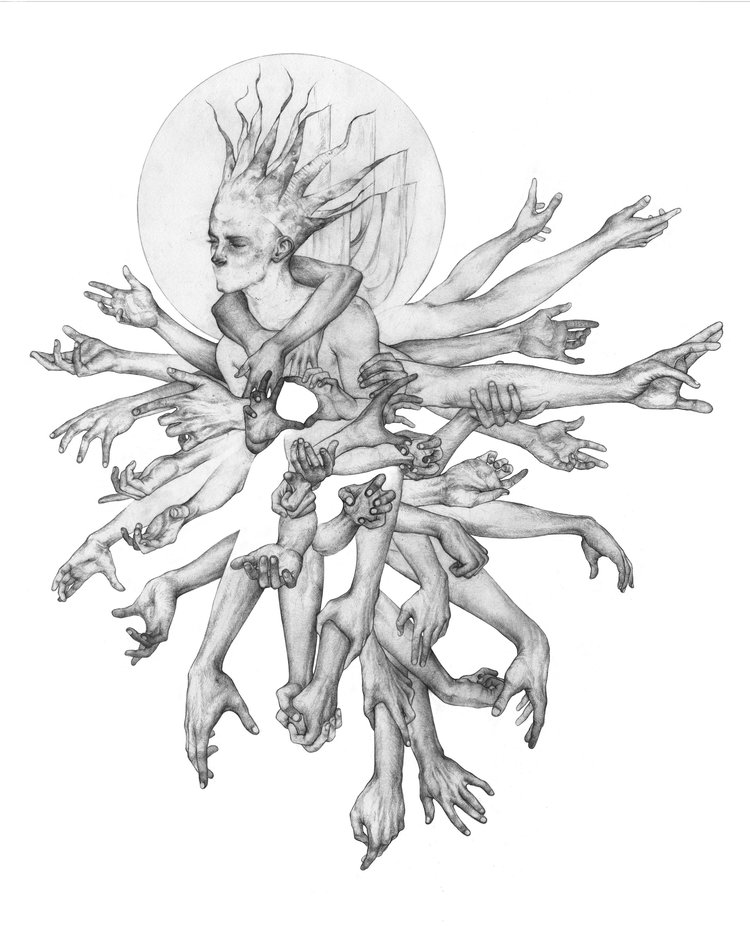
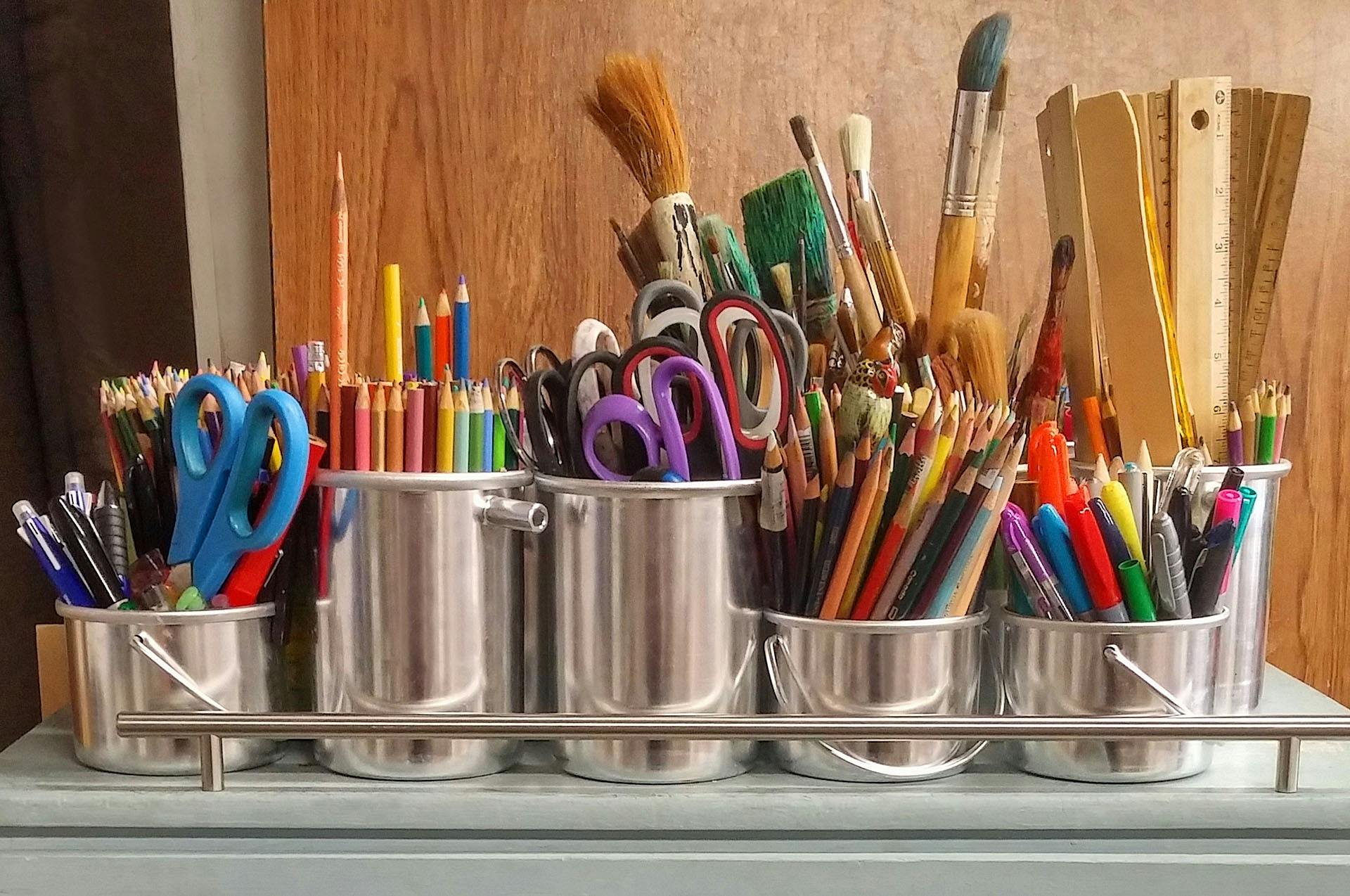
First and foremost, good art supplies should be durable. This means that they are built to last and can withstand repeated use. For example, a good paintbrush should have a sturdy handle that is comfortable to hold and bristles that don’t easily fall out. Similarly, a good sketchbook should have thick, high-quality pages that won’t easily tear or get damaged by erasers or different types of mediums.
Good art supplies should have a high level of performance. This means that they do their job well. In the case of paint, it should have vibrant, consistent colors and should apply smoothly on the canvas. Likewise, a good pencil should make clear, precise lines and should be easy to erase without leaving smudges or marks. They can be used for a variety of different art projects and styles. This is especially important if you like to experiment with different techniques or if you’re still exploring your artistic style.
However, it’s important to remember that good art supplies don’t always have to be the most expensive ones. Sometimes, you can find high-quality art supplies at thrift stores or second-hand shops. The key is knowing what to look for. When shopping for thrift art supplies, you should always carefully check the condition of the items. Make sure they are not damaged in any way and that they still function as expected.
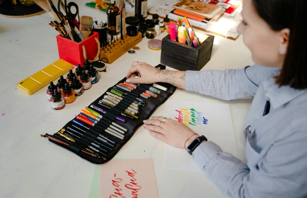
The best art supplies are the ones that work well for you. Everyone has different preferences and different needs when it comes to their art materials. What one person prefers might not work for another person. So, don’t be afraid to try out different types of art supplies and brands until you find the ones that suit your unique style and needs.
Where to thrift Art Supplies
Thrift stores are excellent places to find thrift art supplies second-hand. They often have a wide variety of items, from paintbrushes and sketchbooks to easels and canvases. Here are a few places you might want to check out:
1. Goodwill
Goodwill stores sell all sorts of donated items, including thrift art supplies. You may find brushes, paints, sketchbooks, and much more, all at affordable prices. Their stock changes often, so frequent visits may lead to finding different supplies each time.
2. Salvation Army
The Salvation Army also offers a variety of thrift art supplies. Their prices are usually very reasonable, which is great for artists on a budget. Similar to Goodwill, their inventory changes frequently, so there’s always a chance of finding something new.
3. Local Charity Shops
Local charity shops can be hidden gems for second-hand art supplies. These smaller shops often have a more select range of items. When you buy from them, you’re supporting local charities, which is a wonderful added bonus.
4. eBay
eBay is an online marketplace where you can find almost any type of art supply. There’s a huge range of items, from barely-used to brand-new. However, make sure to read the descriptions carefully and check the seller’s ratings before buying anything.
5. Etsy
Etsy is not just for handmade and vintage items – it also has a section for craft supplies. You can find unique and high-quality used art supplies here, often from fellow artists. As with eBay, keep an eye on seller ratings and reviews to ensure a successful purchase.
6. Facebook Marketplace
Facebook Marketplace is a great platform to find used thrift art supplies in your local area. People in your community might be selling just the thing you need. Besides finding great deals, it’s also a good way to connect with other local artists.
Remember, whether you’re shopping in-store or online, always check the condition of the art supplies before buying. Happy thrifting!
avoid low quality thrift Art Supplies
When you’re looking for thrift art supplies at second-hand stores, it’s really important to take your time and look over everything carefully before you buy it. Here are some easy-to-follow tips on how to make sure you’re getting good stuff:
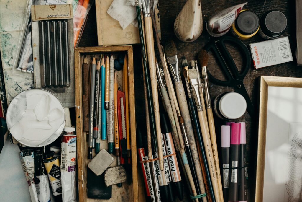
- Look over all the art supplies for any damage: Before you buy anything, make sure you check it over really well. Look for any damage like cracks, dents, rust, or any missing parts. You want to make sure that the supplies are in good shape so you can use them for your art projects.
- Try out the thrift art supplies to make sure they still work: Besides just looking them over, you should also try out the art supplies to make sure they work like they’re supposed to. For example, if you’re thinking about buying a paintbrush, check to see if the bristles are in good shape and can hold paint well. If you’re looking at paints, open the tubes to check the color and how smoothly it comes out. This way, you can avoid any surprises when you start using them for your art.
- Talk to the thrift store workers about prices: Don’t be shy about asking for a lower price when you’re buying second-hand art supplies. A lot of thrift stores are happy to negotiate prices, especially if something has been there for a while. Ask nicely if they can lower the price a bit, especially if you’re buying a lot of things. If you’re nice to the thrift store workers, you might even be able to get discounts or special deals on art supplies.
By following these steps, you can feel confident about buying second-hand art supplies at thrift stores. Keep in mind that buying used thrift art supplies at these stores is not only a great way to save money, but it also helps to reuse materials that might have been thrown away. So, it’s a win-win situation! You save money, you help the environment, and you might even discover some really cool art supplies that you wouldn’t find anywhere else.
Conclusion:
Thrifting for art supplies is a fantastic way to save money, reduce waste, and discover unique materials for your creative projects. By exploring local thrift stores, researching brands, and carefully evaluating each item, you can build a collection of quality art supplies without breaking the bank. Not only does thrifting benefit your wallet and the environment, but it also adds an element of excitement and surprise to your artistic practice.
Whether you’re an experienced artist looking to expand your materials or a beginner on a budget, consider giving thrift shopping a try for your next art project.
Enjoy this article? Read more from Emily here.
How to Thrift Art Supplies: 10 Easy Tips Read More »