color wheel

Yellowing of AI: The Golden Hour Before Sunset

When I visit home, I love flipping through old photo albums. From ski trips to vacations to Disney and every birthday in between, my mom has collected dozens of filled photo books. Recently, she realized the photos are taking on a yellow varnish, simply from being 20+ years old. To preserve these memories, she started a detailed and extensive project to digitally scan the collection.

Of course, paper yellows, photographs fade, varnish cracks. Time fades memories as much as we try to hold onto them.

But, I noticed a funny similarity between the photos Mom scanned and the AI images created online. And, if you’re here, I think you noticed it too: AI is yellowing.

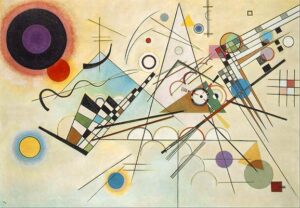
Artificial intelligence seems to be skipping ahead in the aging process. The yellowing of AI was first noticed over the past few months where images generated by models like DALL-E, Midjourney, and ChatGPT appear glowing with a yellow haze. It’s always golden hour, and my theory is that AI is close to sunsetting.

Yellowing of AI: Yellowing in History

The irony is that visual art and photography have wrestled with yellowing for centuries. Early photographs often took on a sepia look as chemicals oxidized. Paintings varnished in the Renaissance turned amber with age, muting stunning blue skies into a mustard yellow.

Many museums spend years restoring blues swallowed by time. Over time, many paintings start to yellow, which hides bright colors like blue. Museums use careful restoration to clean away the discoloration and bring those original colors back. Restoring the blue isn’t just about looks—it helps people today see the artwork as the artist meant it to be seen.

Conservation efforts, whether through careful restoration, climate regulation, or digital archiving, allow art to keep speaking, generation after generation. Without preservation, we risk losing not just the work itself, but the voice, struggle, and spirit behind it.

If you are interested in the restoration and preservation of art, you may like this other article I wrote on The Destruction of Art.

The “why” behind all this is even more mysterious.

One theory for this yellowing is the use of linseed oil in oil painting. According to George O’Hanlon and Painting Best Practices, “this phenomenon occurs due to the oxidation and polymerization of the oil.” But, it seems this yellowing is reversible by sun-bleaching your oil painting, as seen in the experiment visualized below.

Unfortunately, the mystery of why paints yellow has yet to be solved. Numerous environmental factors play into testing materials, contributing to complicated chemistry behind the mustard-ization of artwork over time. Sarah Sands with JustPaint.org lists these environmental factors including the following:

  • “Humidity,
  • temperature,
  • the amount and type of light,
  • periods of darkness,
  • exposure to chemicals,
  • the pigments used,
  • the type of oil and the method of processing it,
  • presence of impurities,
  • the thickness of the paint,
  • use or lack of driers,
  • added mediums,
  • differences in formulations,
  • and a host of other variables…”

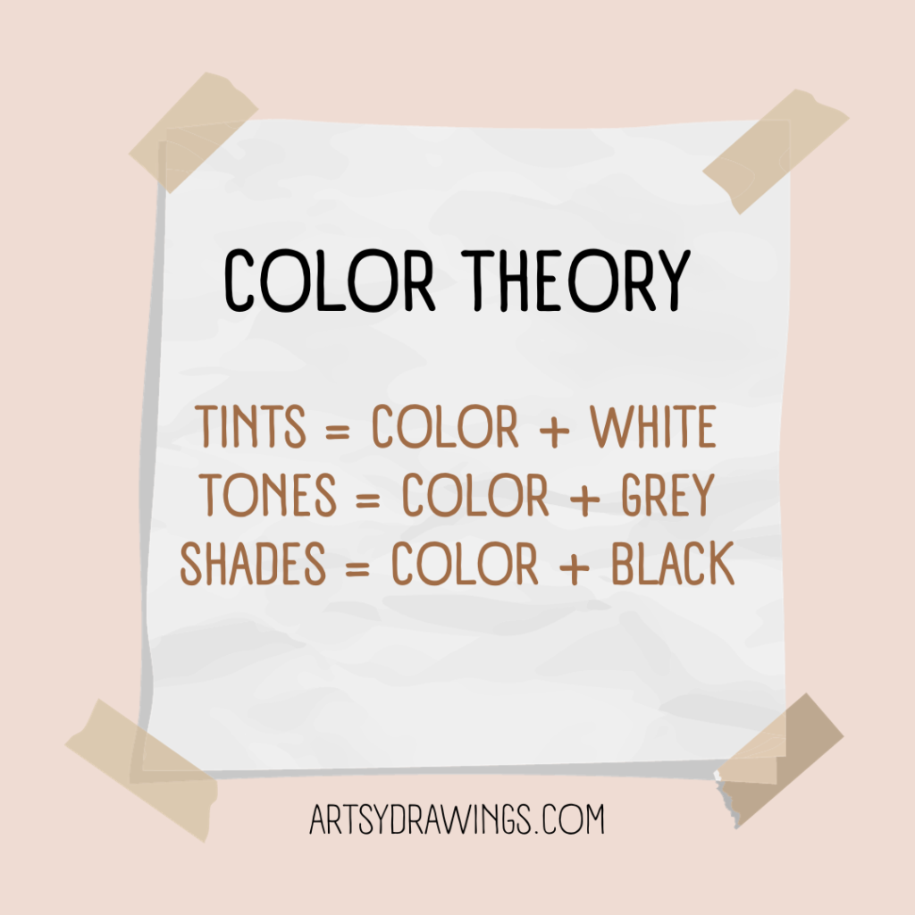
Yellowing of AI: The Color Theory Problem

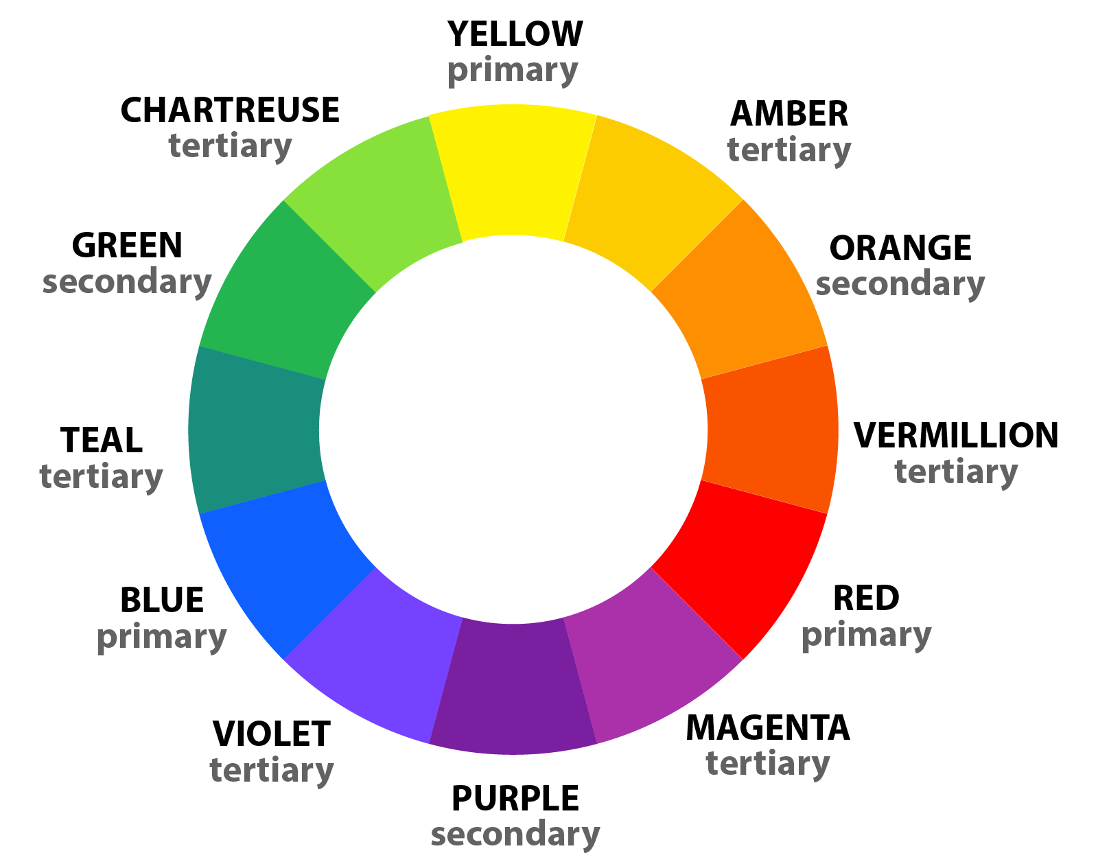
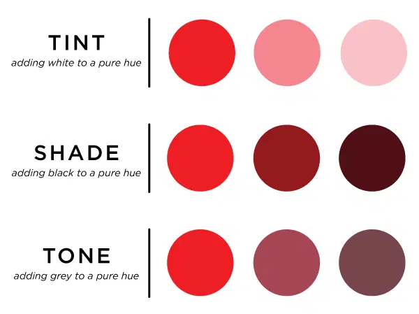
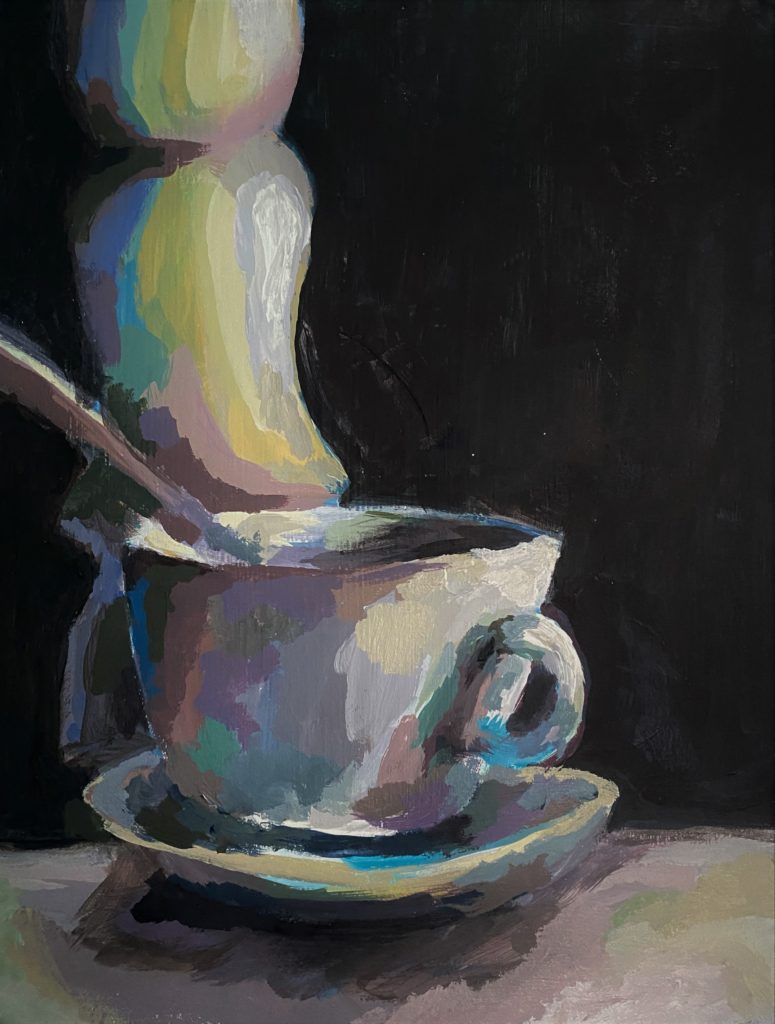
If you ask a color theorist, yellow can be tricky. As the lightest primary color, yellow can sometimes dominate a piece when it’s unbalanced, just like bananas in smoothies.

An artist knows the general basics of the color wheel and easy color theory: you mix blue and yellow to get green. A more developed artist like a watercolor painter knows to mix 90% yellow with 10% blue to create a green smoothie that doesn’t taste solely like bananas.

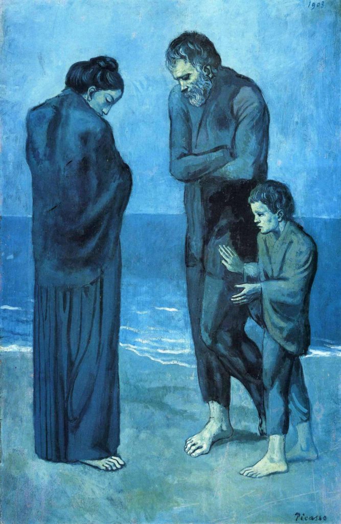
They also know that warmer colors are pushed forward while cooler colors are pushed back. It’s why Gainsborough was such a baddie.

blue boy by Gainesborough The painting is notable for its use of the color blue, which was unusual for the time
The Blue Boy by Thomas Gainsborough
A great mastery of color theory and artistic ego and spunk

All this to say, an artist understands the principles, elements, theories, and nuances of art. A human understands the need for art and how it makes humanity better. AI does not.

In AI’s case, it isn’t a painter reaching for cadmium—it’s a statistical hiccup. Are we really surprised that the robot favors warmth?

Yellowing of AI: Ouroboros

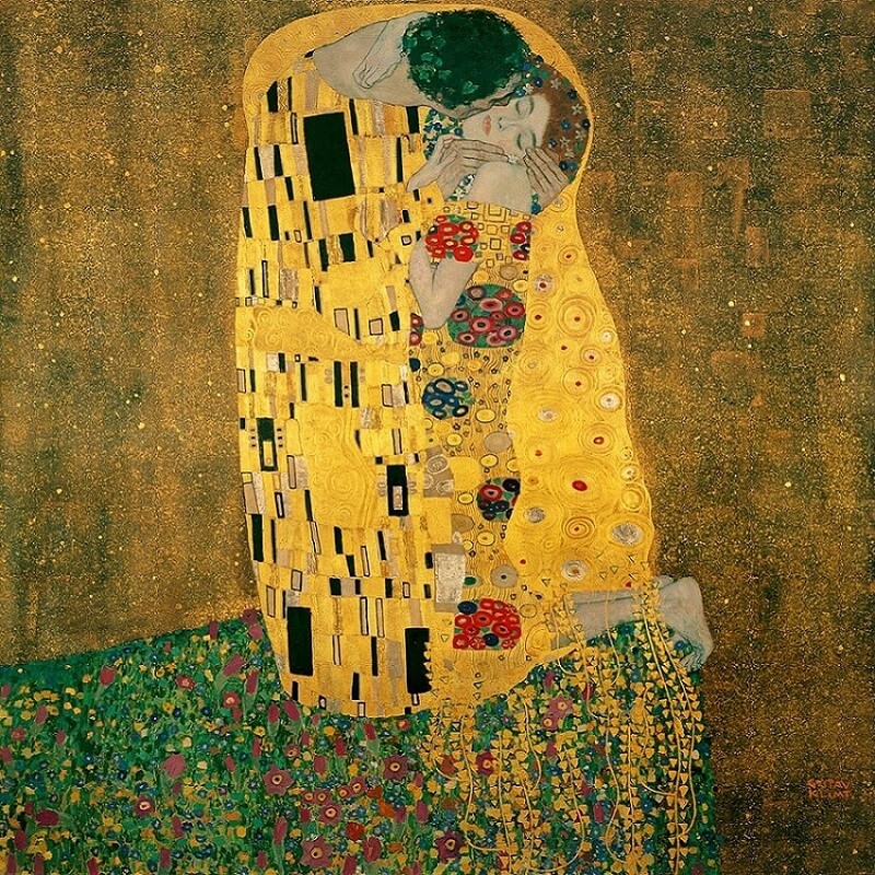
In late March and early April 2025, the AI art world noticed this new quirk and called it “the yellowing of AI.” Images created from DALL-E, Midjourney, and especially ChatGPT kept showing up with a yellow tint, as if every canvas had been washed in yellow ochre. Subreddits like /r/ChatGPT and /r/ChatGPTPro first noticed the trend, and it’s grown more popular since.

While the possibilities for this golden hiccup are unknown, I have my theories.

Matt Verges dragon eating its own tail to show the yellowing of AI
Ouroboros by Matt Verges

The first theory is that AI models are trained on yellow images. If you put in old, sepia photos and filtered Instagram posts, you may see them circulate back to you. The models are fed information from all over, most notably the free and public internet. If the AI can’t differentiate an old image from a heavily filtered image, then it may believe that both photos come from the same time period and are actively relevant.

Another theory is that AI is chewing on its own leftovers. As more generated images feed back into training sets, the flaws are exponentially exaggerated. If half those images lean yellow, the model doubles down, convinced it has discovered the truth of beauty. The ouroboros metaphor is almost too perfect: the AI swallows its tail, burps out more golden sludge, and calls it progress.

In project management terms, AI’s golden hour isn’t shining. It’s sunsetting.

Yellowing of AI: Do Artists Still Matter? P.S. They Do!

A painter knows when to glaze a yellow to add warmth and that sunset glow to a landscape painting. A photographer knows to run outside to capture the golden hour at the perfect moment. An AI model doesn’t know the nuances of creating art, it just predicts what it thinks the audience wants.

When every image comes out mustard, it reminds us why actual artists are irreplaceable. We don’t just reproduce—we choose, edit, and improvise. The yellowing glitch is proof that craft and judgment can’t be automated away.

The Yellowing of AI Art by Brianna Eisman

The real question we need to be asking is whether AI models will learn and evolve to comprehend and create true art. Personally, I think this process will take time, but it may be inevitable. And its not because the AI will get smarter, though that is true. AI will learn to comprehend and create art because we as a species and as a society are failing human artists.

A beautiful painting is created, but if no one sees it, is it art?

I can write article after article about this, but if no one reads them, do they matter?

We live in a time where creativity is everywhere, but meaning feels harder to find. I think about this a lot when I watch a video of an artist paint the Mona Lisa in 30-seconds, but it’s buried under trends, or dismissed as “just content.” Somewhere along the way, we stopped giving art the space it deserves.

During the Renaissance, fine art was meant to challenge people. It questioned power, religion, and beauty in ways that made people feel uncomfortable. It meant something. But now, fine art feels like it’s everywhere and nowhere at the same time. It’s not that people don’t care about art, it’s just that so much of it is made to be content, not to be felt.

Yellowing of AI: Why Actually Nothing Matters

When art starts to lose its value, it tends to start to disappear. We scroll past talent, overlook technique, and straight up ignore beauty. And what happens if people can’t recognize the value of a painting or sculpture in peace, what happens to that art in times of conflict? The less we appreciate it, the less we fight to protect it.

When artists are threatened and AI can develop a complex emotion visually better than you can create it on paper, do you choose the path of least resistence? Or do you fight for the art you love? Do you give in to technology and progress because AI said it was “progressive?”

Obviously I can’t answer these questions without sounding like a hypocrite, so I will leave it here for your own judgement. The truth is that AI is yellowing. Images created by AI models are turning mustard and you can choose to see it as a pretty sunset or a sick and twisted death.

Are we watching a golden revolution in art—or just the longest sunset in history?

Yellowing of AI: The Golden Hour Before Sunset Read More »

Easy Color Theory for Beginners

Color theory is all about how colors work together and the rules that tell us how to use them in art, design, and in our daily lives. It’s really important for those who are just starting out in art and design because it helps you make things that look nice and balanced.

One important person in the story of color theory is Sir Isaac Newton. He found out that white light is actually made up of all different colors – red, orange, yellow, green, blue, indigo, and violet. This discovery helped us create the color wheel, which is a tool that shows us how colors relate to each other and how we can mix them to get different effects. In this blog post, you’ll learn how color makes a big difference in art, design, and even in your daily life.

For a more in-depth evaluation of color theory, check out this article on color knowledge tips for artists.

What is Color Theory?

Understanding color theory is really important when you’re creating art or designs. If you’re just starting out, it might seem a bit hard, but don’t worry! Once you get the hang of some basic ideas, you’ll be able to use color theory in your own work with no problem.

Let’s start with primary, secondary, and tertiary colors. These are the main parts of color theory.

Primary colors are red, blue, and yellow. They’re the starting point for all other colors. Secondary colors are made when you mix two primary colors together. That’s how you get green, orange, and purple. Tertiary colors come from mixing a primary color with a secondary color. That gives you colors like red-orange, yellow-green, and blue-purple.

So, how can we see all these colors and how they relate to each other? That’s where the color wheel comes in. It’s a tool that arranges the primary, secondary, and tertiary colors in a circle. By looking at the color wheel, you can learn about how colors work together.

color theory for beginners shows primary secondary and tertiary colors like numbers on a clock
If the Color Wheel was a clock, primary, secondary, and tertiary colors would sit at numbers from 1-12.

For example, complementary colors are colors that are right across from each other on the color wheel. When you use them together, they make each other stand out and your artwork look really vibrant. Color harmonies are combinations of colors that just look good together. They can be analogous colors, which are next to each other on the color wheel, or triadic colors, which are evenly spaced around the color wheel.

Guidelines in Color Theory:

Understanding these guidelines in color theory can help you make informed decisions when creating art and design. By using the color wheel as a guide, you can create cohesive color schemes that enhance the overall look and feel of your work. Whether you are painting a piece of art, designing a website, or choosing an outfit, incorporating color theory can take your creations to the next level.

The color wheel is like a rainbow in a circle. It has primary colors (red, yellow, and blue), secondary colors (orange, green, and purple), and tertiary colors (mixtures of primary and secondary colors). Understanding these colors can help beginners create nice color combinations for their artwork.

Complementary colors are colors that are directly across from each other on the color wheel, like red and green or blue and orange. When you use them together, they create a strong contrast and make the artwork pop. On the other hand, color harmonies are groups of colors that look good together, like analogous colors (colors that are neighbors on the color wheel) or triadic colors (three colors that are spaced evenly around the color wheel).

Using Colors in Everyday Life:

Colors are really important in our daily lives because they can affect how we feel. For example, red can make us feel excited and passionate, while blue can make us feel calm and peaceful. Understanding how colors can affect our feelings can help us when we’re creating art or designs.

Artists like to use colors to make people feel different things. Two famous artists who did this are Piet Mondrian and Wassily Kandinsky. Mondrian liked to use big blocks of colors like red, blue, and yellow in his paintings. Kandinsky liked to use bright and bold colors to make people feel different emotions.

Piet Mondrian and Wassily Kandinsky were both really good at using color. They understood how colors can make people feel certain ways. Mondrian liked to use big, bright colors like red, blue, and yellow in his artwork. He made simple shapes and filled them in with these bold colors. One of his most famous works is called “Composition with Red Blue and Yellow”. In this painting, you can really see how he used these primary colors to make a strong statement.

On the other hand, Kandinsky liked to use lots of different colors in his art. His painting “Composition VIII” is full of many different colors. He used these colors to explore how they can make people feel. Both Mondrian and Kandinsky show us how color can be really powerful in art. They teach us that we can use color in smart ways to make people feel strong emotions.

Colors are also really important when we’re designing a website or a graphic. Warm colors like red and orange can make people feel excited and energetic. Cool colors like blue and green can make people feel calm and peaceful. By understanding how colors work, designers can use them to make people feel a certain way.

Businesses also use colors to make people feel a certain way. They do this to help people remember their brand. A good example is McDonald’s. They use the colors red and yellow to make people feel warm, energetic, and happy. These are feelings that we usually associate with eating fast food.

Understanding colors can also help you when you’re picking out clothes or creating a brand. By picking colors that match your personality and values, you can create a brand that people will recognize. When you’re picking out clothes, understanding colors can help you pick outfits that look good and express your personal style.

In Conclusion

Color theory is not just a tool for artists, but a fundamental aspect of everyday life. Understanding the basics of color theory can enhance your creativity, communication, and emotional expression through art, design, and branding. By exploring the impact of color on mood and emotions, as well as its practical applications in various industries, you can develop a deeper appreciation for the power of color in our lives.

So, whether you are a beginner in art or a seasoned professional, continue to explore and learn about color theory as a guide to creating impactful and meaningful work. Embrace the beauty and versatility of color, and let it inspire you to create art that truly speaks to the soul.

Enjoy this article? Read more from Emily here, and check out more color theory tips in this article.

Easy Color Theory for Beginners Read More »

Color Knowledge Tips That Will Make You a Better Artist

Introduction to color knowledge

Color knowledge is a fundamental aspect of art that has the power to evoke emotions, convey messages, and create captivating compositions. Whether you’re an aspiring artist or a seasoned pro, a deep understanding of color can significantly enhance your creative endeavors, and in turn, make you a better artist.

If you are new to the art world, I suggest you take a look at this article on color theory for beginners.

In this artsy article, we’ll dive headfirst into color knowledge, covering essential principles of color theory like primary, secondary and tertiary colors, how to create an effective color scheme, and basics of color mixing.

Color Theory: The Foundation of Creativity

Color Knowledge tip 1: Primary Colors are Red, Blue, and Yellow

Color Knowledge image of primary colors mixing in triple venn diagram to create secondary colors
Red, yellow and blue are the starting point to create more colors like orange, green, and violet.

Primary colors are the foundational hues in the world of color theory, consisting of red, blue, and yellow. These three colors are considered “primary” because they cannot be created by mixing other colors together.

On a computer, these inks are called magenta, yellow, blue, and black. Though, you’ll notice if you run out of black ink, the computer will offer an alternative to mix magenta, yellow, and blue. This mixture is “optical black” in the painting world. I’ll talk more about optical black in the section about mixing paint colors together.

Different combinations of the primary colors create all other colors on the color wheel. The primary colors are essential color knowledge for artists and designers.

If you mix two primary colors, you get secondary colors. For instance, if you mix even parts red and yellow, you will get orange. Blue and red make violet. Yellow and blue make green.

Color Knowledge tip 2: memorize The Color wheel

The color wheel further expands with tertiary colors, created by mixing primary and secondary colors. There are endless possibilities for color exploration in art and design.

Color Knowledge image of the color wheel showing primary, secondary, and tertiary colors
This color wheel shows primary, secondary, and tertiary colors.

Great, now that you’ve grasped the basic concept of the Roy G. Biv color wheel, let’s move on to relationships between colors. For more beginner friendly tips, check out this article on color theory for beginners!

Color Knowledge tip 3: Understand Color Harmony

Next, let’s learn about color harmony schemes like complementary, analogous, and triadic colors. Choosing the right color scheme can add a lot of visual and metaphorical depth to your art.

Complementary color schemes involve pairing colors that are located directly opposite each other on the color wheel. They are literal compliments, such as red and green or blue and orange. This scheme creates strong visual contrast and can make each color appear more vibrant when placed next to its complement. This color scheme is often seen in comic books, illustrations, logos, and even signage on the side of the road.

Color Knowledge image of complementary colors in everyday media like Christmas card, football team, and soda logo
Complementary colors contrast one another and tend to “pop” off the page.

Analogous color schemes use colors that are adjacent to each other on the color wheel, such as yellow, yellow-green, and green. This scheme creates a sense of harmony and cohesion. The analogous color scheme is ideal for creating a peaceful or monochromatic color palette in art or design.

Both The Kiss by Gustav Klimt and my painting inspired by the same work use analogous color schemes to create a sense of calm and peaceful harmony.

Triadic color schemes involve selecting three colors evenly spaced around the color wheel, forming an equilateral triangle. For example, red, blue, and yellow form a triadic color scheme. This scheme offers a balanced and dynamic contrast of colors. Triadic color schemes create visually striking and vibrant compositions.

Spiderman showing a tertiary color scheme of red, yellow and blue
This image shows the selected colors used in the comic book about Spiderman. Red, blue, and yellow make a triadic color scheme.

Color Knowledge tip 4: Know the difference between tint and shade

Saturation and value are essential aspects of color theory illustrated through the use of tints, shades, and tones.

Tints and shades determine values. Tints are created by adding white to a color and shades are formed by adding black to a color. Saturation is determined by tone, in which grey is added to the pure hue to mute the color.

Tints, shades, and tones showing color knowledge
Tints, shades, and tones change the color depending on how much white, black or grey you add to the hue, respectively.

Tints and shades alter both the brightness (value) and intensity (saturation) of colors. The level of darkness or lightness is crucial for creating depth in your artwork and originality in your color schemes.

Color Knowledge tip 5: Color temps (Warm vs. Cool Colors)

Color temperature is a fundamental color knowledge tip that helps convey emotion and moods.

Warm colors, such as reds, oranges, and yellows, are associated with warmth, energy, and excitement. Typically seen in the foreground of the composition, warm colors evoke feelings of passion and vibrancy.

In contrast, cool colors, like blues, greens, and violets, are calming and associated with serenity, tranquility, and a sense of distance. They tend to recede in a composition and can evoke feelings of calmness and introspection.

During Pablo Picasso’s Blue Period, the artist used a predominantly cool color palette. This color scheme included shades of blue (obviously) and blue-green as dominant hues. This deliberate choice of colors conveyed a sense of melancholy, sadness, and emotional turmoil in his artworks.

Color Knowledge image of Pablo Picasso's blue period about how color schemes can help convey emotions
Pablo Picasso’s Blue Period (1901-1904) is one of the most well known artistic uses of how color can signify emotion.

Color can serve as a powerful tool for expressing complex emotions and capturing the human condition.

One of my favorite moments of artists being angsty and non-conformists is the controversy surrounding “Blue Boy.” Painted by English portrait artist Thomas Gainsborough, the 1770 painting includes the unconventional use of blue as the dominant color for the subject’s attire, rather than as a background hue.

One of my favorite moments of artists being angsty and non conformists is the controversy surrounding "Blue Boy" by English portrait artist Thomas Gainsborough. The 1770 painting includes the unconventional use of blue as the dominant color for the subject's attire rather than as a background hue.
Blue Boy by Tomas Gainsborough challenged norms of its time by using blue in the foreground of the painting.

This departure from traditional portraiture raised eyebrows in its time. I find that something I love about learning art history is how artists challenge conventional norms. Sparking debate about artistic choices leads to innovation and change and progress.

Likewise, try to understand the interplay between warm and cool colors. This part of color knowledge is crucial for creating balanced and emotionally resonant color palettes in art and design.

COLOR MIXING

Color Knowledge tip 6: learn to mix Optical black

Color mixing techniques can greatly enhance the range and depth of your artwork. This section will focus on the important concept of “optical black.”

In this painting, I mixed phthalo (Phthalocyanine) blue with burnt umber to create this super dark optical black background to show color knowledge
I mixed phthalo (Phthalocyanine) blue with burnt umber to create this dark optical black background.

Optical black is a “fake black” which looks like black, but is instead created using color.

In art school, we were not allowed to buy or use black paint in our paintings. Turns out, creating optical black teaches you color theory and color mixing much better than simply using black.

Remember back to when we were discussing value and saturation?

Color theory is easy with a cute visual.

So then if Optical Black = Orange + Blue then Shades = Optical Black + Orange + Blue.

Whoever said art doesn’t include math was just a silly-billy.

Anyways, mixing complementary colors can create the visual appearance of black, despite no actual black pigment used.

To start, mix complementary colors from the color wheel. From there, continue to add colors until you reach the optical black that looks best for your chosen color scheme.

For example, if your painting uses yellow highlights, you may want your optical black to look more violet. How does this work?

Using complementary colors trick the color receptors in your eyes to believe the color is black, and not dark violet. This technique achieves rich, natural and deep shadows in your artwork without resorting to flat-looking black paint.

The same effect is achieved when you wear colored ski-goggles.

“[Ski-goggles] are often orange so at the end of the day the orange receptors are tired and the world looks blue.”

stoopidusername

Disney World also uses this technique to make their colors seem more vibrant. The sidewalks are painted red to trick the color receptors in your eye to make the grass and trees seem greener.

Disney World uses complementary colors in their park. The red sidewalks make the grass and trees look greener.

Color Knowledge tip 7: Use complementary colors for desaturation

Additionally, complementary colors tone down the saturation of a color. When you mix a color with its complementary color, the result is a desaturated, or less vibrant, version of the original color.

In the below painting of a skull still life, I chose a color scheme that included a golden yellow ochre and a muted violet. To achieve many of the greyish mid-tones, I chose to mix the yellow and violet together using varying amounts of each color.

This acrylic painting of a skull illustrates the use of optical black in learning color knowledge for painting.
In addition to making optical black using violet and yellow, I chose those same complementary colors as a base color scheme for this painting.

For example, if you have a highly saturated red and you want to reduce its intensity, mix it with a bit of green, its complementary color. The resulting mixture will be a less vibrant shade of red, leaning more towards a neutral gray or brown, depending on the proportions used.

I tend to love using complementary color schemes in my artwork. For this work, I started with a red wash and red base painting, then added the green layers on top to really push the color.
I tend to love using complementary color schemes in my artwork. For this work, I started with a red wash and red base painting, then added the green layers on top to really push the green color forward.

When using complementary colors to desaturate, it’s essential to be mindful of the proportions of added colors. Adding too much of the complementary color can cause the mixture to become too muddy or dark. This is particularly evident in watercolor painting as it is more difficult to lighten the painting back (for watercolors you paint light to dark).

Experimentation and practice will help you develop an intuitive sense of how to mix colors. Color knowledge like optical black and using complementary colors to adjust saturation and intensity can help you become a better artist.

Color Knowledge tip 8: Physically mix colors

Mixing colors is an essential skill for any artist expanding their color knowledge. For this section, we will focus on mixing paint.

Begin with a clean palette and brushes. I also like to have a paper towel handy to dry my brushes. Then, squeeze small amounts of your chosen paint colors onto the palette. I like to use a paper plate as a paint palette, and I place the paint in a circle around the outer edge of the plate.

For example, the photo below features one of the paper plate palettes I used. Notice how I tried to keep the main paint colors clean and mixed my paint towards the center of the plate. You will also notice, I did not use black paint — I mixed an optical black using a dark blue and burnt umber.

I used this paper paint palette for a 4’x4′ garden painting with a lot of colorful flowers.

Next, use a palette knife or brush to blend the colors together gradually, starting with the lightest color and adding small increments of the darker color until you achieve the desired shade. Remember to test your mix on a scrap surface or a corner of the canvas itself to ensure it matches your vision before applying it to your artwork. Practice and experimentation will help you become proficient in creating custom colors for your art.

Follow my social media and newsletters for more tips on how to create a wider array of hues and tones, adding depth and complexity to your work through color knowledge.

Concluding color knowledge for now…

Color knowledge is a powerful tool for artists, allowing us to express ideas more effectively and create art that resonates with audiences. By mastering color theory, you can elevate your art to new heights. So, embrace the world of color, experiment fearlessly, and let your creativity flourish on the canvas of your imagination.

Understanding color theory and mixing colors is like having an artist’s secret toolkit. Whether you’re gently blending opposite, or complementary, colors to tone down the saturation or using clever mixtures to create “optical black,” these techniques are simply invaluable. I do want to remind you art lovers that there is so much more to know about color. If this is something that really interests you, please comment, message me, or join my newsletter to read more! I love color!!!

By grasping these fundamentals, you not only make your artwork visually engaging but also open doors to express intricate emotions and stories through color. So, dive into the world of color knowledge, and watch your art flourish with richer, more meaningful color scheme choices.

This is a super easy exercise for testing your markers to show what colors work and which markers have dried out. It also uses color knowledge to arrange the colors in a rainbow style order.

I realized this article was getting long, so I had to chop it up to allow for more in depth discussion of color knowledge. Trust me, there will be more color themed articles!

Color Knowledge Tips That Will Make You a Better Artist Read More »

Scroll to Top
Cart
0
Add Coupon Code
Subtotal