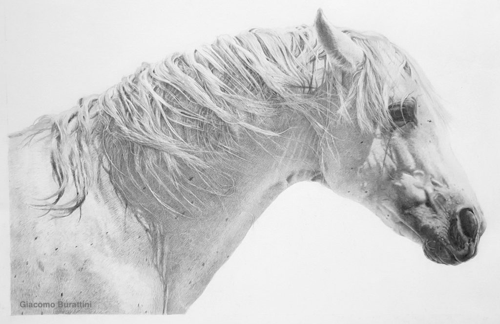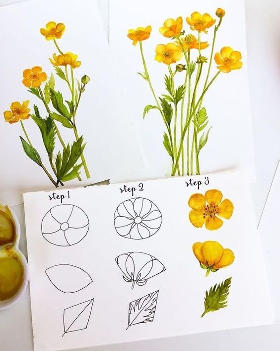
I accidentally fell down a rabbit hole of beginner drawing advice…..and honestly everyone keeps saying the same 5 things.
Draw more than you consume
Make bad art
Use references
Value and lighting matter way more than finding the “perfect” color
Draw stuff you actually care about
These are great pieces of art basics advice, and I know they absolutely helped me in my own art journey. If you’re new here, hi I’m Brianna! I found my passion in art when I was pretty young and now I like to inspire others to get artsy and crafty and to enjoy art again. ArtsyDrawings.com is my craft blog and digital portfolio. Click here to learn more about me and my artsy articles <3
However, advice doesn’t replace actually learning fundamental art basics by making art. You can look up advice for anything, but until you sit down and actually draw, it’s hard to understand how making bad art with poor color schemes can teach you color theory.
In this article, I want to review 11 art basics that I think are the most important things to know about the fundamentals of art. I also included advice from artists on Reddit, so you don’t have to take only my word for these art basics. If you’re wanting more advice, check out what Reddit Artists would recommend to beginner artists.
If you’re here, you probably are interested in becoming a better artist, and I want to help you on that journey. I’ve been an artist for over 20 years and have experimented with many different mediums and styles, from film photography and plaster sculpting to linoleum printmaking and origami paper folding. I like to think I know a thing or two about art basics, and I want to share that knowledge with you.
There are thousands of articles that say “practice every day” or “don’t compare yourself to others.” Those are true, but they don’t explain what you should actually be practicing. These are the fundamentals you’ll spend your entire artistic career learning.
Table of Contents
1. Elements of Design
The elements of design are the alphabet of art basics.
You wouldn’t expect someone to write beautiful poetry before they learned their ABCs, and the same thing goes for drawing and painting. Every masterpiece is built from a handful of visual ingredients: line, shape, form, color, value, texture, and space. Once you start recognizing them, you’ll notice they’re hiding in literally everything.
You can check out a complete list of the Elements of Design here!
You don’t have to memorize a bunch of fancy definitions to understand them either. The best way to learn is by making art, messing up, and asking yourself why something feels off. Maybe your lines are stiff, maybe everything blends together because the values are too similar, or maybe your composition needs more negative space to let the drawing breathe. Those little discoveries are how the fundamentals start to click.
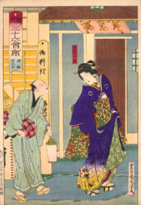
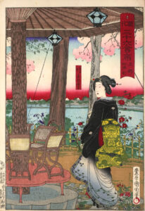
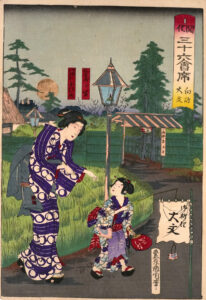
One of my favorite examples is traditional Japanese ukiyo-e woodblock prints. They use bold outlines, flat shapes, and carefully chosen colors to create images that still feel incredibly dynamic hundreds of years later. In fact, when these prints made their way to Europe in the 1800s, artists like the Impressionists were completely fascinated by them. It’s a good reminder that even revolutionary art is still built from the same simple visual building blocks, they were just arranged in a fresh, unexpected way.
🐇 Art History Rabbit Hole 🐇
Japanese prints were so popular in Europe that artists like Claude Monet, Edgar Degas, and Mary Cassatt collected them and hung them in their homes. It’s kind of funny to think that one art movement accidentally inspired another halfway across the world, all because artists couldn’t stop geeking out over bold lines and beautiful compositions.
2. Principles of Design
If the Elements of Design are the art basics alphabet, the Principles of Design are grammar.
The elements are your nouns and verbs, but the principles teach you how to arrange them into something people actually want to look at. Things like balance, contrast, emphasis, rhythm, movement, and unity help guide the viewer’s eye around your artwork. They’re the reason one drawing feels exciting while another feels a little… awkward, even if you can’t quite explain why.
You can find a complete list of the Principles of Design here!
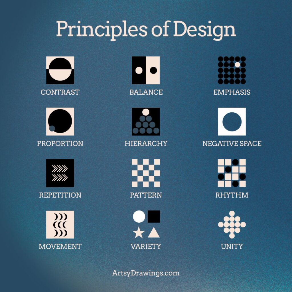
One of my favorite things to think about is where my eyes land first. Do they immediately find the subject, or do they get distracted by a bright color in the corner? Does my eye naturally wander through the piece, or does it get stuck in one spot like a shopping cart with a wonky wheel? That’s the Principles of Design at work. These art basics quietly direct traffic without the viewer even realizing.
You can see this in traditional Japanese scroll paintings, where your eyes slowly travel across the artwork as the story unfolds instead of taking everything in at once. William Morris used repeating patterns and rhythm to make wallpaper that somehow feels both busy and peaceful at the same time. Art Nouveau artists wrapped flowing lines around buildings, posters, and furniture, creating movement that almost feels alive. Different styles, different centuries, same visual language.
🐇 Art History Rabbit Hole 🐇
Pablo Picasso could paint incredibly realistic portraits when he was just a teenager. He didn’t create Cubism because he couldn’t paint realistically, he chose to break the rules after he had already learned them.
3. Line Quality, Technique & Style
This might be my favorite of the art basics because it’s where your personality starts to sneak in. A lot of artists think style is something you wake up with one day. It isn’t. It slowly leaks out while you’re learning, experimenting, and making lots of weird little drawings along the way.

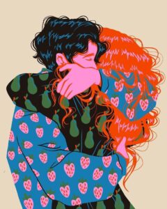
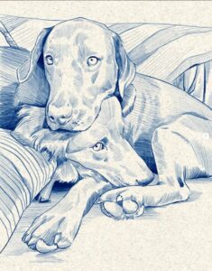
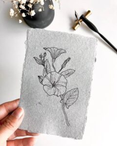
Technique is just how you make your marks, but those marks communicate a lot. A scratchy line can feel nervous. A smooth line feels calm. A thick, bold line feels confident. Try drawing the same flower with a ballpoint pen, a paintbrush, and a stick dipped in ink. Same subject, completely different mood.
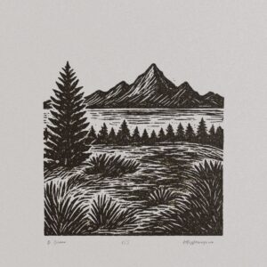
Every technique teaches you something new. Crosshatching builds value one line at a time. Sumi-e ink painting teaches confidence because every brushstroke counts. Woodcuts and linocuts make you think about positive and negative space before you even start carving. Then there’s Pointillism, where thousands of tiny dots magically blend together in your brain. It’s technique, color theory, and a little bit of science all working together.
🐇 Art History Rabbit Hole 🐇
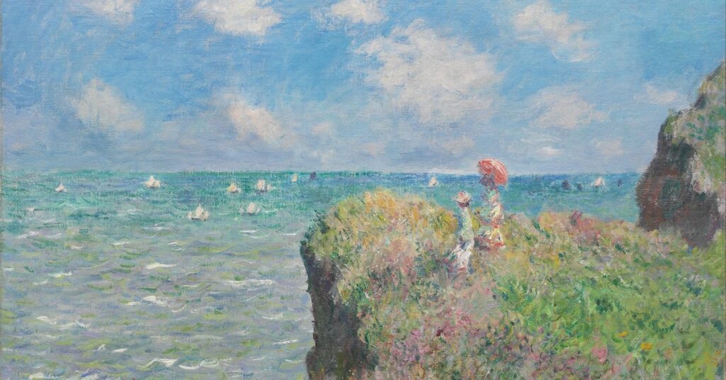
The Impressionists were originally mocked by critics. After Claude Monet exhibited Impression, Sunrise, one reviewer joked that the paintings looked unfinished and sarcastically called the artists “Impressionists.” Instead of getting offended, they kept the name. Honestly, that’s kind of iconic.
4. Color Theory
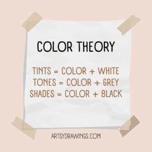
Color theory is one of those art basics that sounds scary until you realize you’ve been using it your whole life.
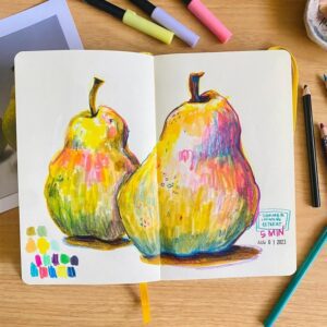
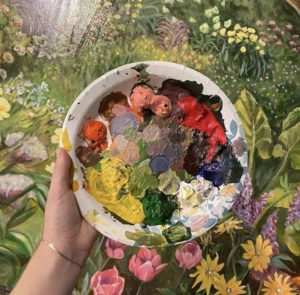
Ever notice how a blue blanket somehow looks warmer sitting next to icy white snow? Or how a bright orange flower practically glows against a dark green background? That’s color theory doing its thing. Warm vs. cool colors, color harmony, saturation, and something called simultaneous contrast all affect how we experience a piece of art.
Check out other art basics color theory articles: Easy Color Theory for Beginners, Color Knowledge Tips That Will Make You a Better Artist, and How to Make the Color Purple
🐇 Art History Rabbit Hole 🐇
Blue was once more expensive than gold. Ultramarine blue pigment came from crushing lapis lazuli imported from Afghanistan. The pigment was so expensive that artists often saved it for the robes of the Virgin Mary to show importance and wealth. Imagine spending today’s equivalent of thousands of dollars just to paint someone’s shirt.
Color isn’t just about the paint on your palette, it’s also about how your brain interprets it. A bright color can make the one next to it seem duller. A dull color can make another one look even more vibrant. Once you start paying attention to these little relationships, choosing colors becomes way less about guessing and way more about experimenting.
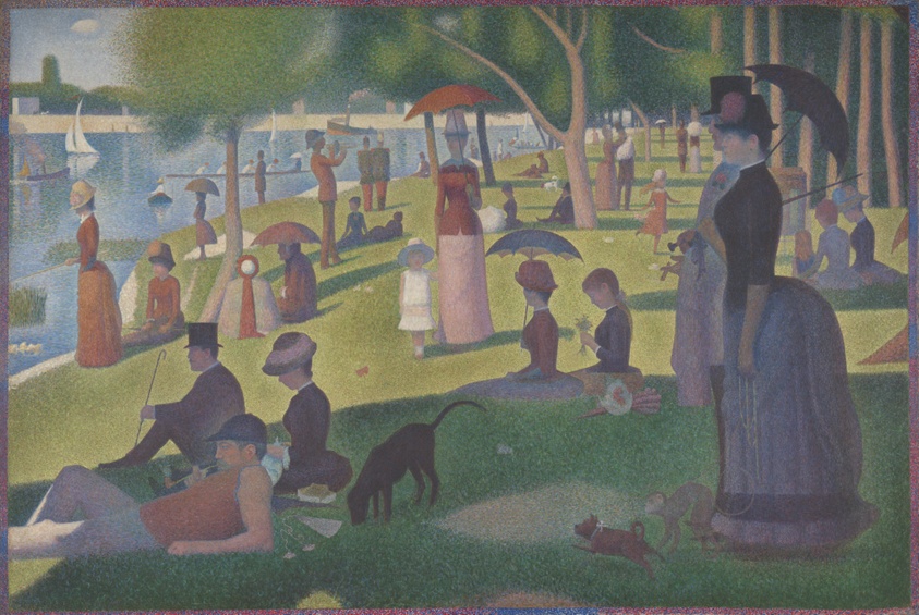
French artist Georges Seurat understood color theory art basics better than almost anyone. He wasn’t just decorating a canvas with thousands of tiny dots. He was testing how our eyes mix color before our brains even realize what’s happening. Stand close and you’ll see individual dots of blue, yellow, and red. Step back, and those dots suddenly blend into colors that don’t actually exist on the canvas. That’s called optical mixing, and it’s honestly a little bit magical.
💬 Advice from Reddit Artist: Early-Title5581 💬
Color Theory (at least the basics) is not as complicated as it sounds. To sum it up as simply as possible, we judge color based on the colors next to it. A blue surrounded by red will look more blue than a blue surrounded by green. Take the most dominant color in the piece, and shift all the other colors towards it slightly in hue, whatever direction is closest.
5. Light & Value
Value is almost MORE important than color.
If I could convince every new artist to study just one of the art basics, it would be value. Honestly, I truly think it’s sometimes more important than color. Value is simply how light or dark something is, and it’s what gives your artwork depth, drama, and makes it actually look three-dimensional. You can have the prettiest color palette ever, but if the values are all the same, your drawing will feel flat.
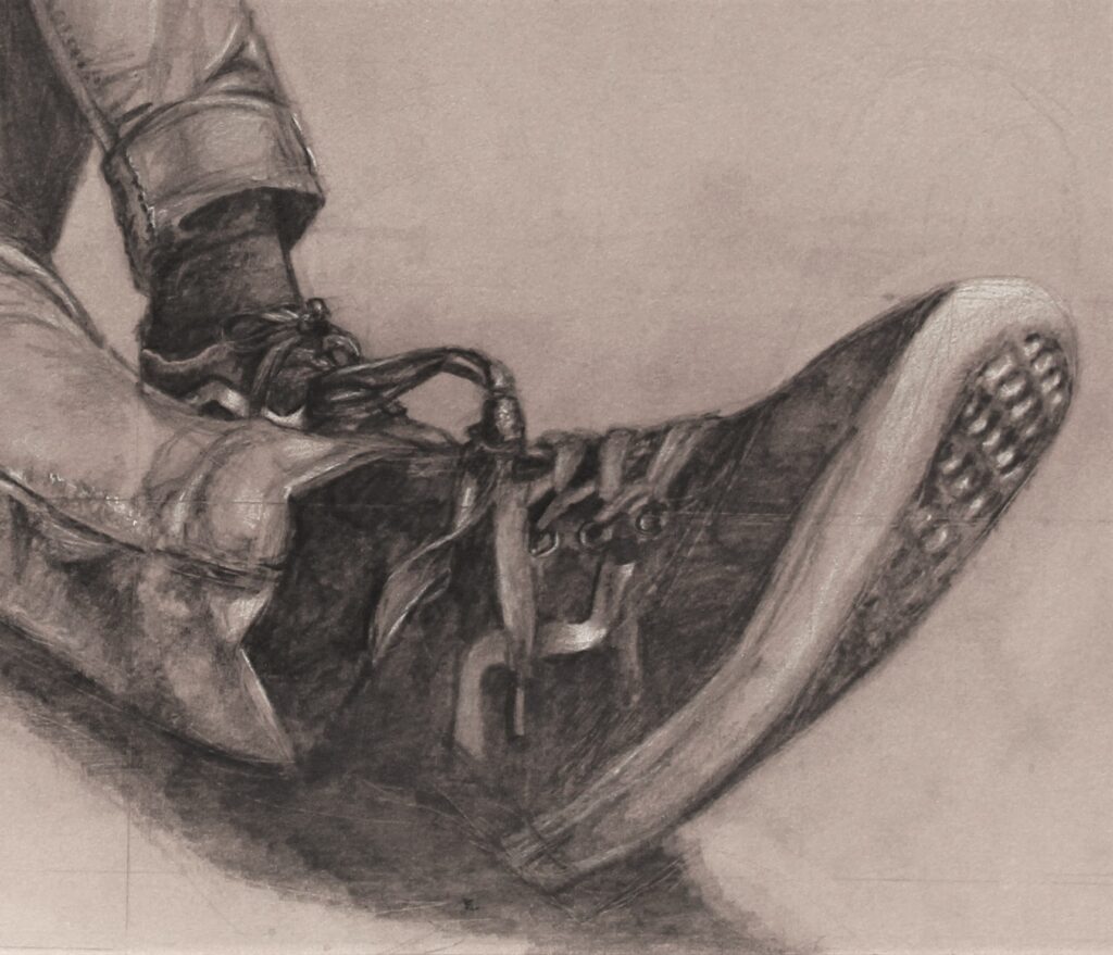
A fun way to test this is by turning your artwork into grayscale. Does your subject still stand out? Can you still tell where the light is coming from? If the answer is yes, you’re on the right track. That’s why charcoal drawing is such a fantastic teacher. It strips away color completely and forces you to think about light first.
Some of the most beautiful works of art don’t rely on color at all. Think about dramatic black-and-white photography, the bold lighting in Mad Max: Fury Road, or the paintings of Rembrandt and Caravaggio, where light almost becomes another character in the scene. They all prove the same thing, color catches your attention, but value is what makes an image unforgettable.
6. Composition
Composition is all about deciding what deserves your attention first. Most people learn the Rule of Thirds, and it’s a great place to start, but it’s really just one tool in a much bigger toolbox. Art basics like visual hierarchy, leading lines, framing, negative space, and cropping all help guide the viewer through your work. You’re basically telling their eyes where to go and what to look at.
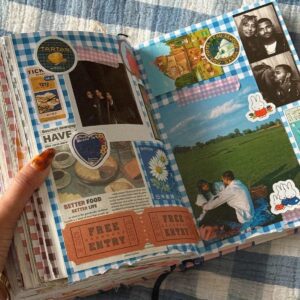
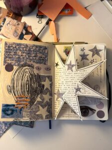
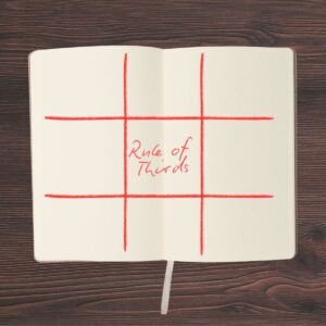
One of my favorite art basics tricks is to ask, “Where did my eye land first?”
If your focal point isn’t the subject, something probably needs to change. Sometimes the fix is as simple as moving an object a few inches or leaving a little more empty space. Negative space isn’t wasted space, it’s what gives your artwork room to breathe.
💬 Advice from Reddit Artist: Axequez24 💬
My art improved drastically when I started considering composition. Looking at professional photography and how subjects are centered is a good way to learn. Does it take longer? Yes. But it always feels more worth the effort in the end. Take advantage of environments, I’m saying this as someone who only started caring about backgrounds after a decade of drawing.

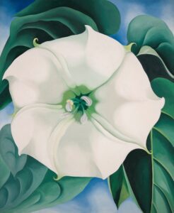
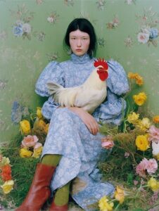
You start to see composition art basics everywhere once you start looking for it.
Japanese photography often embraces simple compositions with lots of quiet, open space. Filmmakers do the same thing. Hayao Miyazaki is famous for giving viewers little “breathing moments,” scenes where almost nothing happens except the wind moving through the trees or a train gliding across the water. Those quiet moments make the exciting ones feel even more powerful, and your artwork can do the exact same thing.
7. Perspective
When most people hear “perspective,” they immediately picture drawing boxes with one or two vanishing points. That’s definitely part of it, but perspective is actually about gaslighting your viewer with art basics and creating the illusion of space. Perspective helps your viewer understand where they are and how your world works.
To learn more about perspective, specifically drawing depth in landscapes, I suggest you check out my article: Perspective in Art: Making Mountains Small and Worms Feel Tall
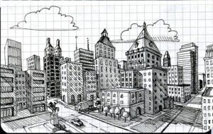
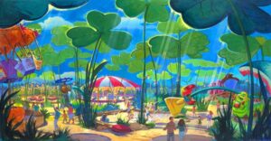
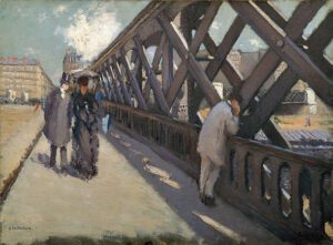
Perspective is one of the art basics that decides whether your mountains look grand, serene, intimidating, or flat as pancakes. By experimenting with one-point, two-point, three-point, bird’s-eye, worm’s-eye, atmospheric, and overlapping planes, you start to see depth not as a mystery but as a set of tools you can play with.
8. Anatomy & Gesture
Anatomy is about way more than memorizing muscles with intimidating Latin names. It’s one of the art basics that helps you understand how a body moves, carries weight, and stays balanced. A quick 30-second gesture sketch can often capture more life and energy than a perfectly rendered figure that feels stiff. People aren’t statues, they’re constantly shifting, stretching, and moving.
Seriously, to learn anatomy art basics, draw people from life. People are not perfect and they’re definitely not all structured the same. To visualize life, you need to draw from life.
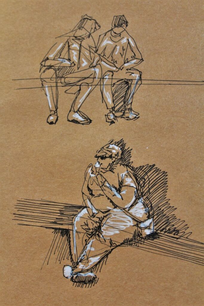
Gesture drawing teaches you to look for movement first and details second. Edgar Degas famously studied dancers over and over again because he wanted to capture motion, not just perfect anatomy. Sometimes a slightly messy drawing with great movement feels more alive than one that’s technically flawless.
🐇 Art History Rabbit Hole 🐇
Those bright white Roman marble statues you see in museums? They weren’t originally white. Ancient Roman sculptors painted them with bold reds, blues, yellows, and other vibrant colors, but the pigments slowly disappeared over thousands of years. The ancient world was probably way more colorful than most of us imagine.
9. Explore Different Mediums
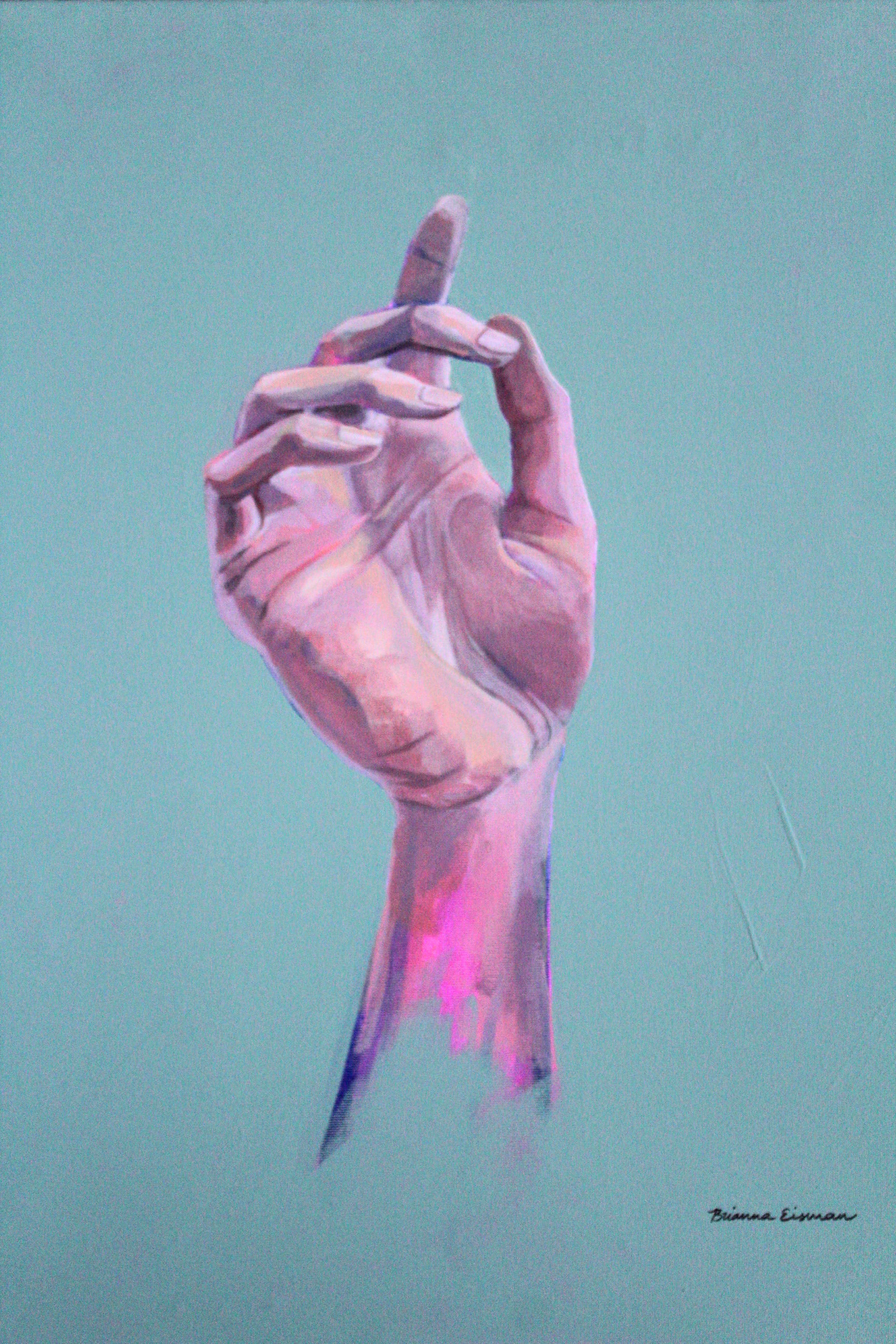
Over the years I’ve experimented with photography, sculpture, printmaking, painting, origami, digital art, and whatever random craft happened to catch my attention. Every single one taught me something I still use today and helped me to feel like an actual artist.
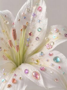
Different mediums force you to think in different ways. Watercolor teaches patience because you can’t always control where the paint goes. Ink teaches confidence because you can’t erase it. Clay helps you understand form from every angle, while film photography makes every shot feel intentional because you only get so many. Even folding a simple piece of paper can teach you how shapes fit together in space.

💬 Advice from Reddit Artist: Smooth_Development48 💬
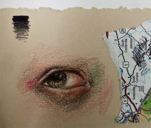
Practice drawing in pen instead of pencil. It helps you to stop the constant erasing, commit to your lines and see what you need to work on. I spent most of Covid lockdown drawing only in pen and I really leveled up. I got pretty good at drawing portraits because of it.
Don’t worry about finding “your medium” too early. Play around and get your hands messy! Try something that has absolutely nothing to do with your usual style. You might not fall in love with every material, but every medium will leave you a better artist than it found you.
10. Sharing Your Art
Making art is usually a solo activity, but growing as an artist doesn’t have to be. Some of the biggest improvements I’ve made came after posting my work online, asking for feedback, or seeing how someone else solved the exact problem I was struggling with. A good critique isn’t someone telling you your art is bad, it’s someone helping you see what you couldn’t see on your own.
Sharing your work is also how you start finding your artistic voice. You’ll notice what subjects you keep coming back to, what people connect with, and what kinds of projects make you lose track of time. Don’t post just to chase likes. Post because you’re joining a conversation with artists who are learning right alongside you.
Speaking of sharing art online, be sure to check out my social channels and give me a follow: https://linktr.ee/briannaeisman
💬 Advice from Reddit Artist: Early-Title5581 💬
Finally, learn how to take critique well. Don’t attach your self worth to the quality of your art, and be open to hearing both compliments and criticism. Additionally, learn to recognize criticism from just plain insults, because unfortunately much of the internet does not understand how proper critique works.


🐇 Art History Rabbit Holes 🐇
You’ve probably heard that Vincent van Gogh only sold one painting during his lifetime. It’s a great story, but it’s also a bit of an oversimplification. Van Gogh sold very little, but he also traded artwork, gave pieces away, and was financially supported by his brother Theo. Art history is full of myths like this, which is why it’s always worth digging a little deeper than the headline.
11. Patience
The hardest art fundamental to learn might be patience. You must accept that your artistic taste may develop faster than your skills. You can see amazing artwork and know exactly what you like, but your hands might not know how to create it yet. That gap can feel frustrating, but it’s actually a sign that you’re growing.
Ira Glass calls this the “taste gap.” You have good taste, but your work hasn’t caught up with your vision yet. And every artist goes through it.
The only way across that gap is to keep making things, learning art basics, experimenting, and occasionally creating something that makes you say, “Well… that was not what I pictured.” Those pieces aren’t failures, they’re stepping stones.
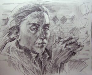
💬 Advice from Reddit Artist: Internet_Cryptid_ 💬
Don’t get attached to initial ideas, if a sketch isn’t working then scrap it and start over (even if it took hours), early iteration and failing faster is more informative than polishing a turd in a way. I’m not knocking anyone for wanting finished pieces as it’s confidence/character building and can be enlightening to goals for improvement, but nipping issues in the bud will stop most spiraling issues that should’ve been resolved in the sketch and early colour phase. This could be what people mean by draw more.
Even the artists we think of as effortless masters spent years chasing improvement. Claude Monet painted hundreds of water lilies, studying the same subject again and again under different lighting and seasons. Hokusai, the artist behind The Great Wave, once wrote, “At seventy-three I have learned something of the structure of nature…” and still believed his best work was ahead of him.
Art isn’t a finish line you cross. It’s a lifelong conversation between curiosity, practice, and a little bit of stubbornness. So keep making the weird drawings. Keep trying new mediums. Keep learning the fundamentals. Your future favorite piece of art might be hiding inside a mistake you haven’t made yet.
Final Thoughts: Keep Learning, Keep Playing
Art basics can feel like a lot when you see them all listed out. But the truth is, these ideas are all connected.
The Elements of Design are your alphabet. The Principles of Design teach you how to arrange that alphabet into a visual language. Technique is how you physically make your marks, and those marks influence everything that comes next. Color, value, composition, perspective, and anatomy all work together every time you create.
A single painting might use color theory to create emotion, composition to guide the viewer’s eye, perspective to build a world, and technique to give it personality. That’s the fun part, art is basically a bunch of tiny decisions stacked on top of each other.
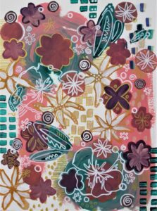
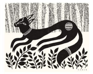
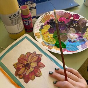
The biggest thing I hope you take away is that learning art basics isn’t about becoming a robot who follows the rules perfectly. It’s about understanding the art basics so you can play and challenge them. Explore different mediums. Make weird things. Try techniques that feel impossible. Share your work with other artists. Stay curious.
The art basics aren’t here to limit your creativity, they’re here to give it somewhere to go. Every artist, from a beginner doodling in the margins of a notebook to someone hanging work in a museum, is still learning. So grab your pencil, paintbrush, camera, clay, or whatever weird art supply is calling your name and go make something!