How can drawing make you a more successful artist?
Introduction: How do you become a successful artist?
Why is drawing important? What does it teach you in the long run? Why does it seem like drawing is the beginning step in becoming a successful artist? What does learning about art have to do with becoming a better person? Why is drawing important to being a successful artist?
It is my goal to attempt to answer these questions by the end of the article. Whether you are just starting out, or a seasoned professional artist, it is important to know the base skills that drawing provides. Overall, drawing is important for several reasons, from cognitive and emotional reasons like self expression and to help release stress, to practical domains like improving hand-eye coordination and motor skills.
For a list of tools and mediums I recommend, check out my Favorite Art Supplies list and this article about my favorite paints and drawing materials.
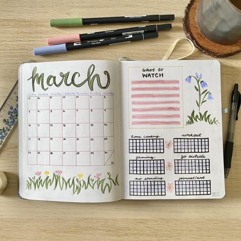
If you are interested in learning more about basic drawing and painting skills, please check out my Art Advice page. If you are a beginner artist, I recommend 5 Easy Drawing Tips and How to Create an Artist Statement. These are great resources to becoming a successful artist.
Table of Contents
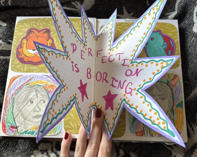
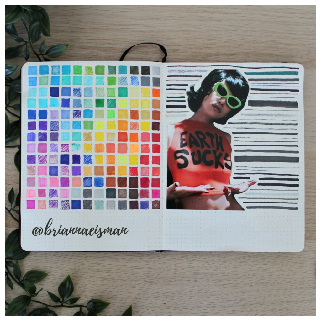
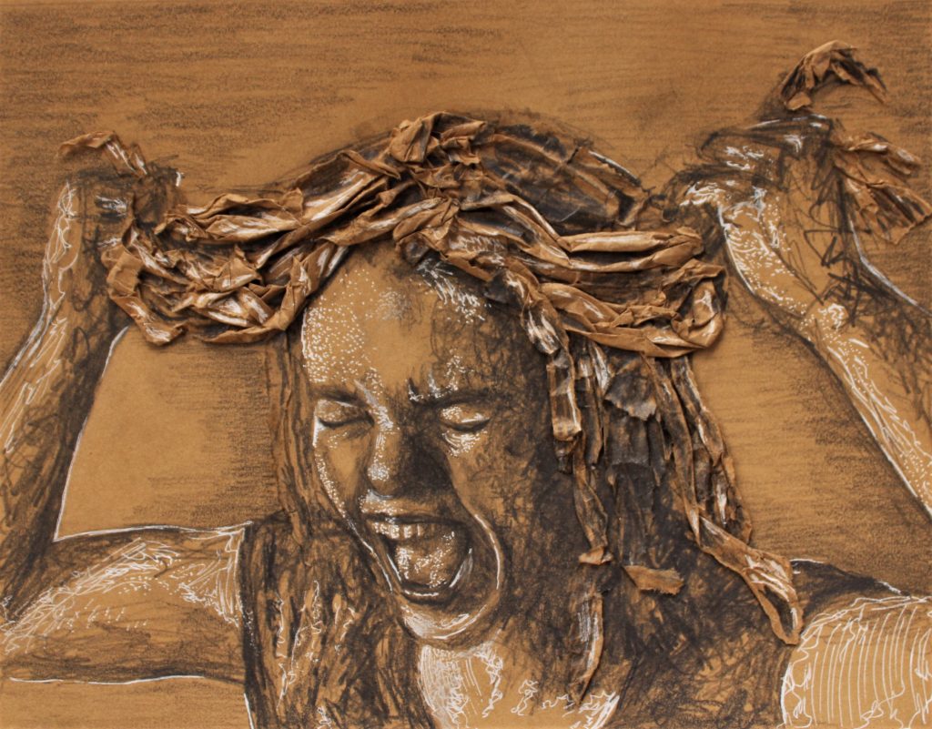
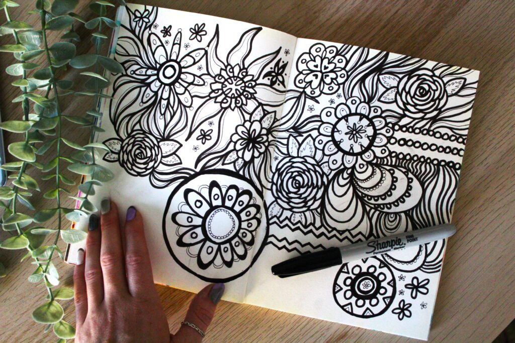
Drawing is a form of Self expression
Drawing allows individuals to express themselves visually, providing an outlet for emotions, ideas, and experiences that may be difficult to convey through words alone. It’s a form of non-verbal communication that can be powerful and evocative. The article from Arts Academy in the Woods puts it perfectly:
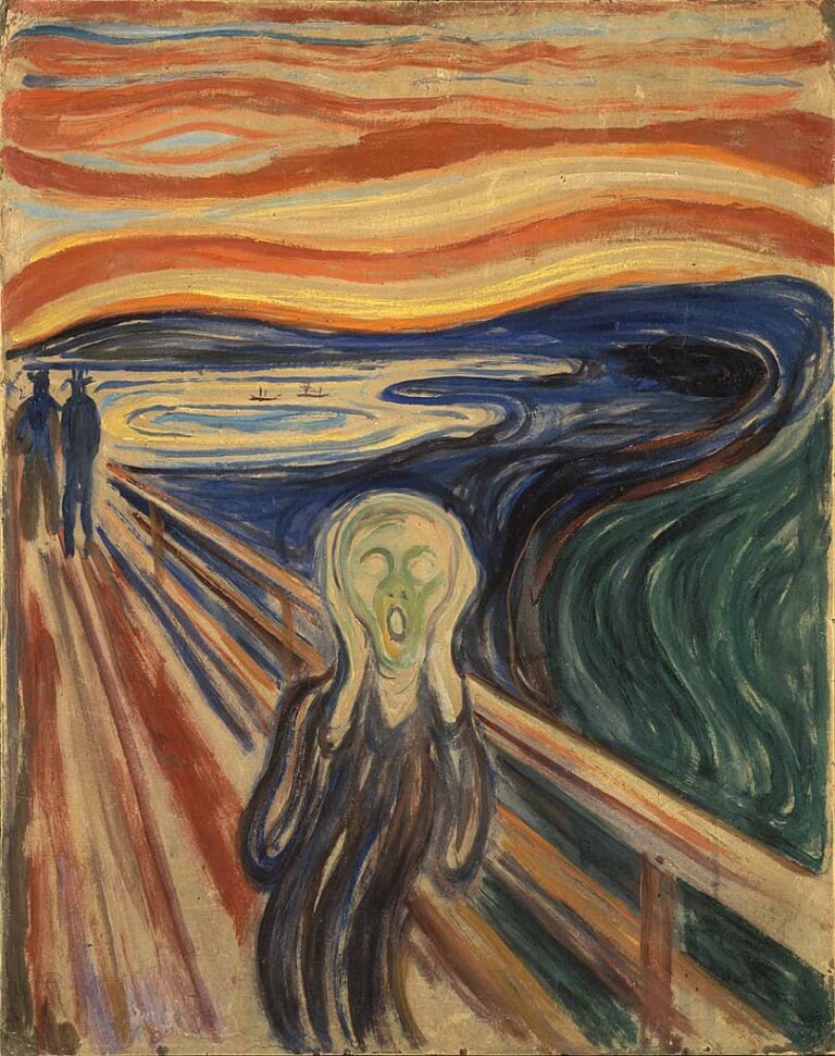
“Art gives us a way to take a painful thought out of our heads and put it onto a page or into a drawing, painting, or performance. It thereby releases the emotions around that thought and gives it less power.”
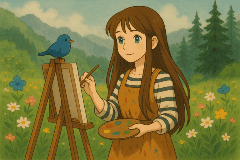
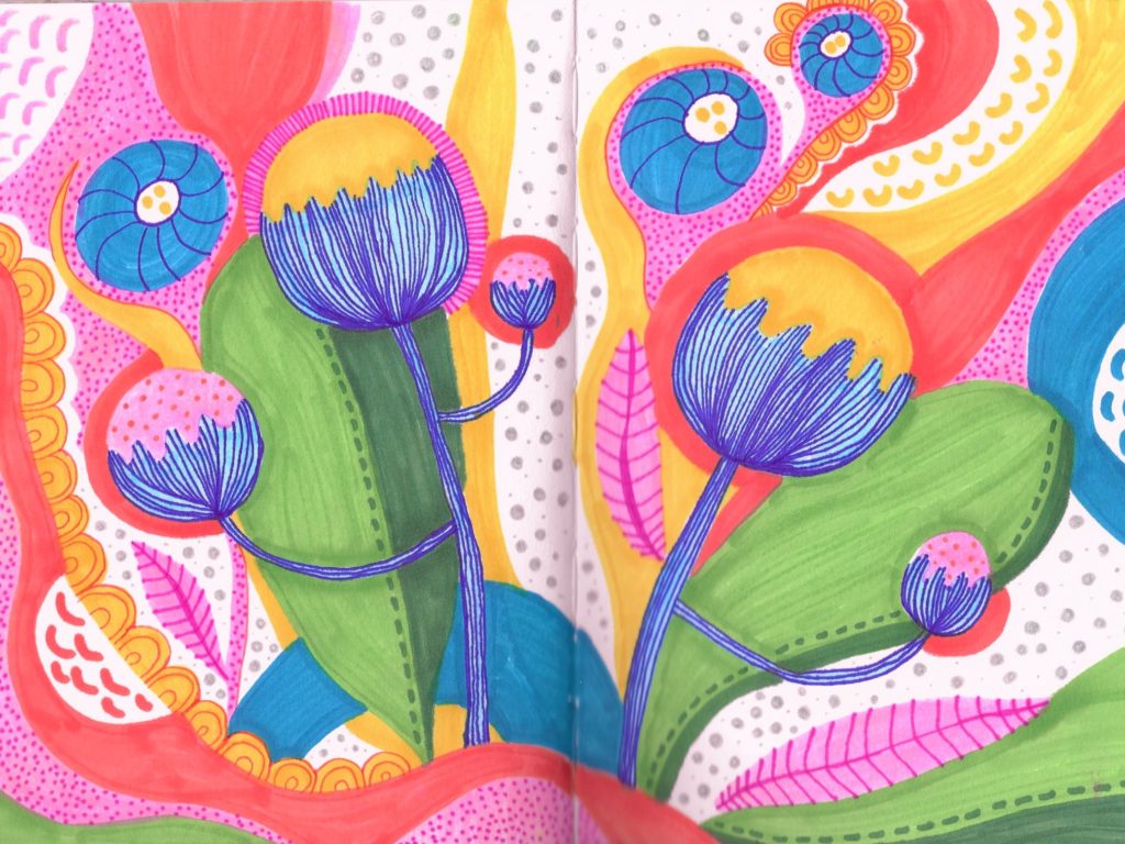
Drawing inspires creativity
Engaging in drawing stimulates creativity and imagination. It encourages you to think outside the box, explore new ideas, and experiment with different techniques and mediums. I first found a passion for art in school. Whenever I finished a test early, I would flip the page to the back, and doodle, sketch, and draw anything and everything I could imagine. Creativity is a skill, just like riding a bike or learning to code, you must practice being creative and using your imagination.
I believe that you truly become a successful artist when you make a mistake and have to think of a creative solution to fix it. This creative process teaches problem-solving skills, and I have found these skills help in many other areas of my life too.
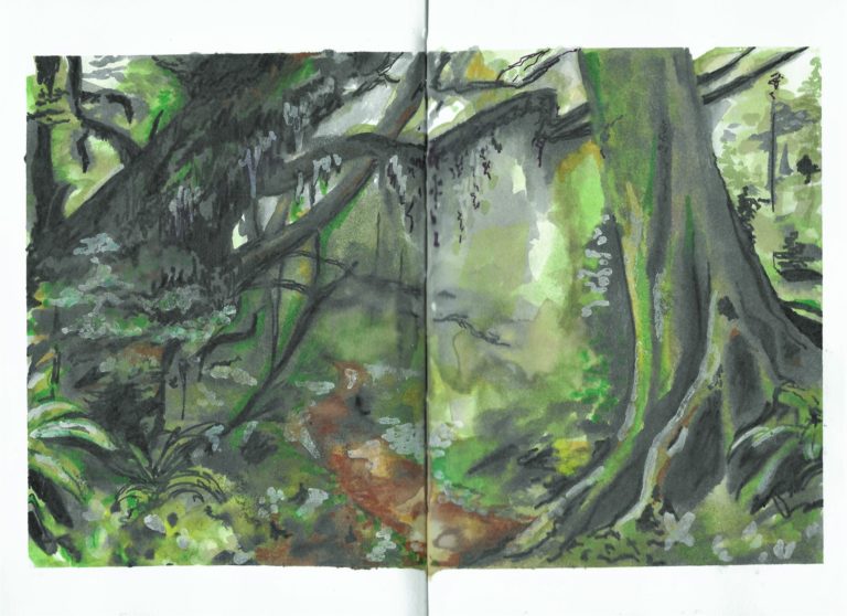
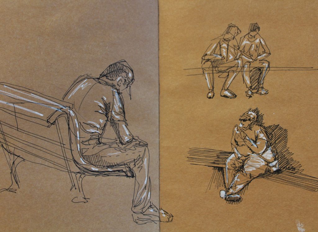
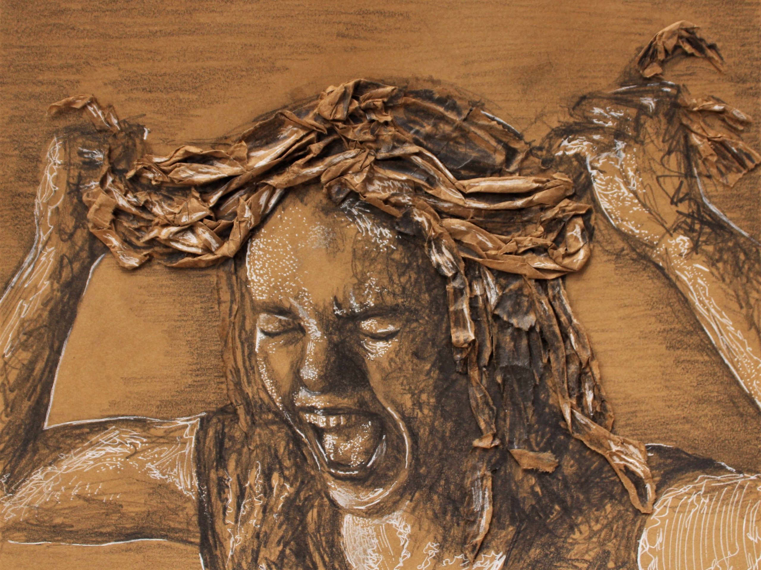
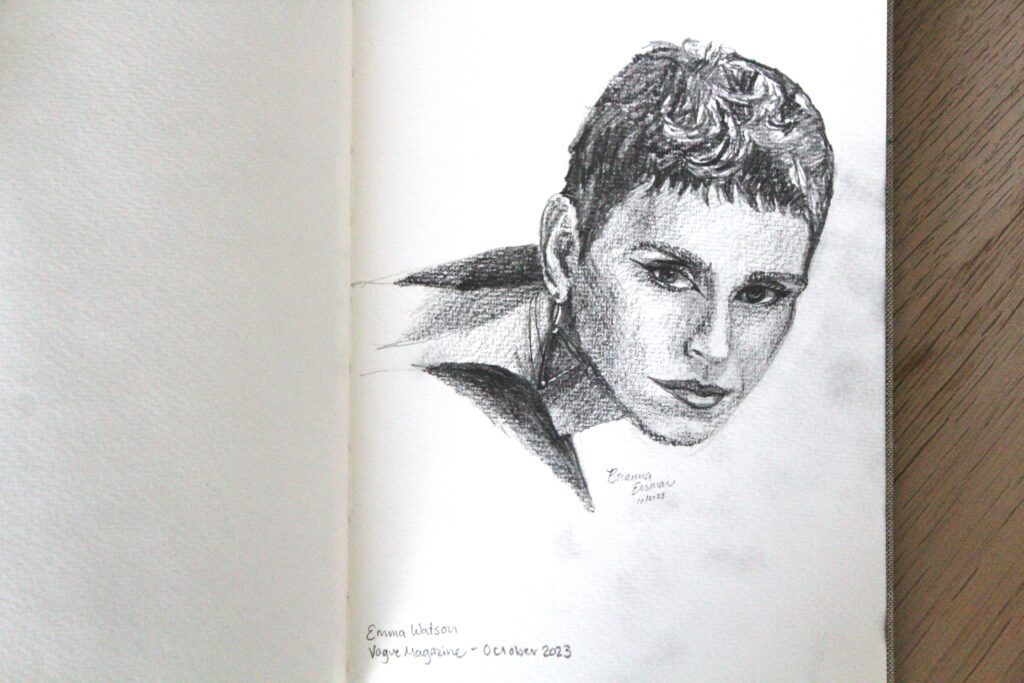
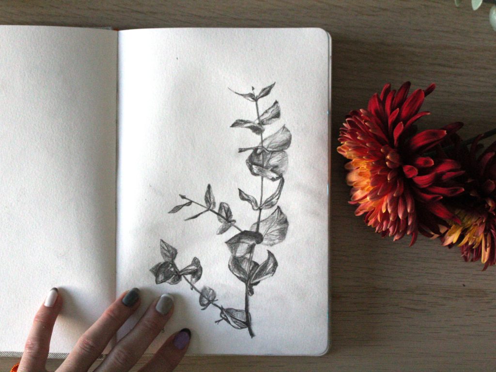
Drawing improves observation
Drawing enhances observational skills as it requires a keen attention to detail, proportions, shapes, and spatial relationships. Performing blind drawing studies especially expedites this skill, and is key to becoming an experienced and successful artist.
Through practice, successful artists learn to perceive the world more deeply and accurately, honing their ability to notice subtleties and nuances in their surroundings, and in other people.
Drawing is a type of therapy
Drawing has therapeutic benefits and can promote relaxation, stress relief, and emotional healing. Many people, including myself, use art as a form of self-expression and introspection, finding solace and catharsis through the act of creating art. It’s also a sort of meditative process, especially one away from a digital screen.
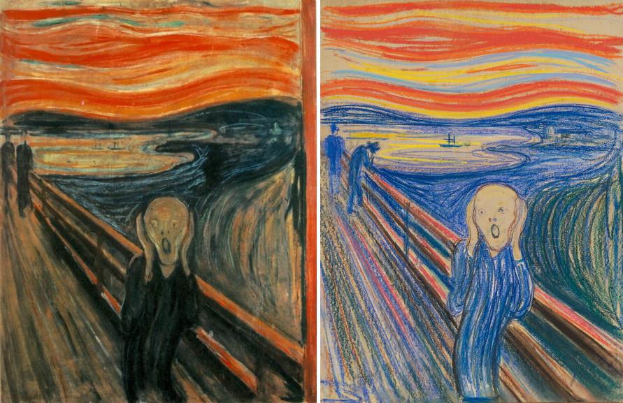
Drawing is a Universal Language
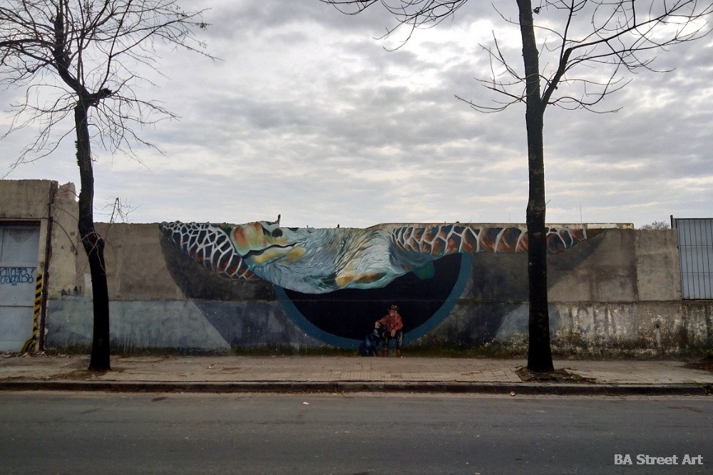
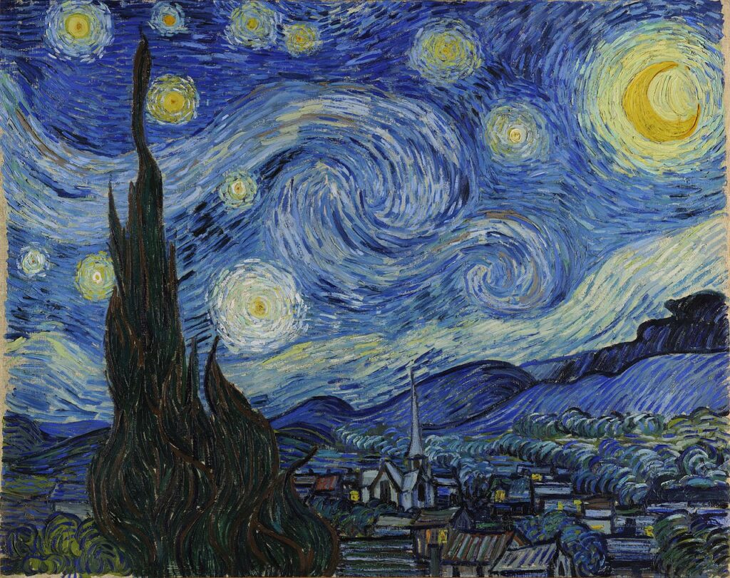
Visual representations can transcend language barriers. Drawing was first used as a form of communication to pass down verbal stories through generations. The caves in Lascaux, France contain around 2000 Paleolithic cave paintings estimated to be 20,000 years old.


From art and design to science and engineering, drawing serves as a universal language that facilitates communication and understanding across cultures and disciplines.
Drawing helps develop motor skills
Drawing requires precise hand-eye coordination and fine motor skills, which are crucial for overall development, particularly in children. Practicing art helps improve dexterity and control over hand movements, which can have positive effects on writing, typing, and other manual tasks.
This skill is key to accurately translating your intended subject. That’s why drawing is taught first in art school, before other techniques like painting or sculpture. Art builds on itself and the more you draw, the better you’ll paint or sculpt or print.
An easy way to practice these motor skills, especially with children, is to create your own birthday and holiday cards. I share my process and inspiration in the article How to Wish Someone Happy Birthday, from an Artist.
Drawing uses visual thinking
Creating art stimulates visual thinking, allowing individuals to organize and conceptualize ideas in a spatial manner. It encourages the brain to think in pictures, aiding in problem-solving, planning, and critical thinking across various domains. For example, my experience with writing in school started with writing artist statements. I used critical thinking to analyze what I was seeing in the painting, and what message the artist was trying to convey or communicate.
To be a successful artist, means you know how to communicate with your viewers. Whether you communicate through paint or sketches or an artist statement on the wall of the museum, bridging visual skills with written text is necessary.
Studies do show arts education improves academic performance. A study by Brian Kisida and Daniel H. Bowen analyzed “42 elementary and middle schools with over 10,000 third- through eighth-grade students.”
The study found “increases in arts educational experiences significantly reduce the proportion of students receiving disciplinary infractions,” “improve writing achievement” and “increase students’ compassion for others by… appreciation of art.”
Drawing encourages art appreciation
Engaging in the arts yourself, fosters an appreciation for artwork and the creative process, and helps you become a more successful artist. By creating your own artwork, you develop insight into the techniques, styles, and meanings behind other works of art, leading to a deeper understanding and enjoyment of visual culture. For example, once you learn color theory, you start to notice it everywhere; from football teams to soda brands.
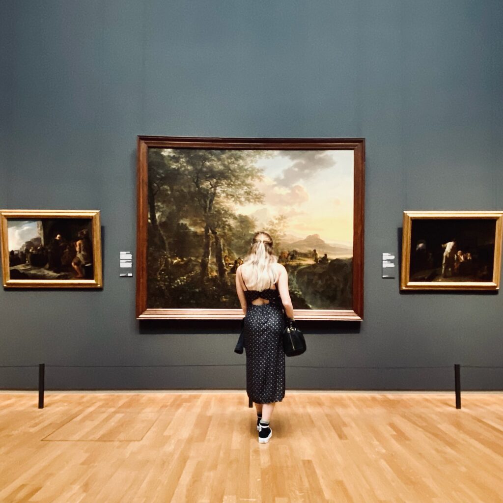
To be a successful artist, you need to appreciate the arts. You can do this by learning about and analyzing artwork, attending museums, supporting local artists, and visiting arts markets and galleries. If you are interested in learning more about art history and art styles, I suggest you take this quick quiz I made!
Reading about art helps too. Searching for this article and learning about the creative process promotes appreciation of the arts. You are becoming a more successful artist simply by supporting my art journey, and inspiring me to continue to share my knowledge and passion for art.
Conclusion
Think of drawing as ‘step 1’ to becoming a more successful artist. Overall, drawing is a versatile and valuable skill that offers numerous cognitive, emotional, and practical benefits. It enriches the lives of artists and contributes to their personal growth and development.
How can drawing make you a more successful artist? Read More »