White. The color of nothing, everything, and apparently, 2026.
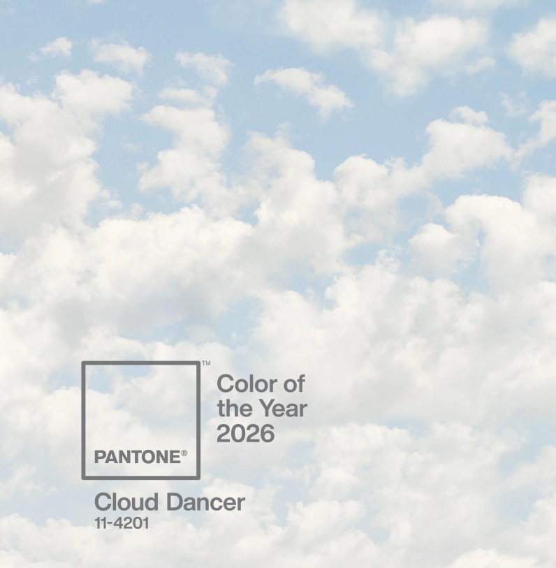
Pantone’s Color of the Year for 2026 is Cloud Dancer (PANTONE 11-4201), a soft, airy white that feels clean, pure, heavenly, and almost deliberately absent of color. It’s a curious choice in a world that rarely seems to have a quiet moment.
While white might seem like a boring choice for Pantone’s Color of the Year, its influence is anything but boring. From fashion and pop culture to political imagery, branding, and contemporary art, white has become a surprisingly relevant visual language.
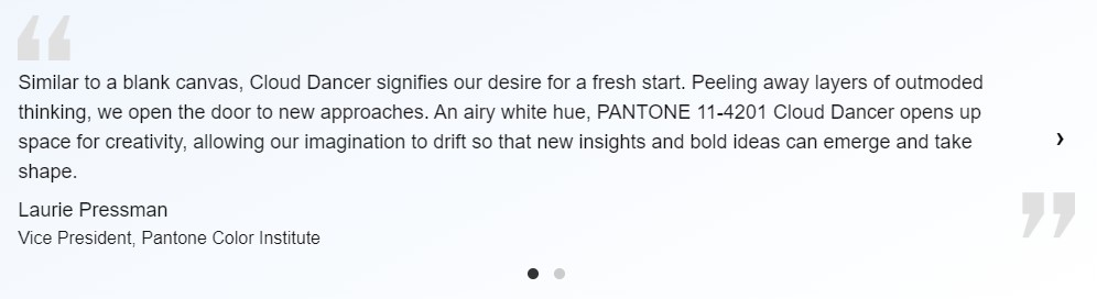
A Blank Canvas in Pop Culture
One of the most interesting things about white is how differently it can be interpreted.
In fashion, we’ve seen it everywhere from minimalist, quiet-luxury wardrobes to dramatic all-white runway collections. The clean-girl aesthetic, white sneakers, bridal-inspired looks, and understated interiors all fit into this larger visual trend.
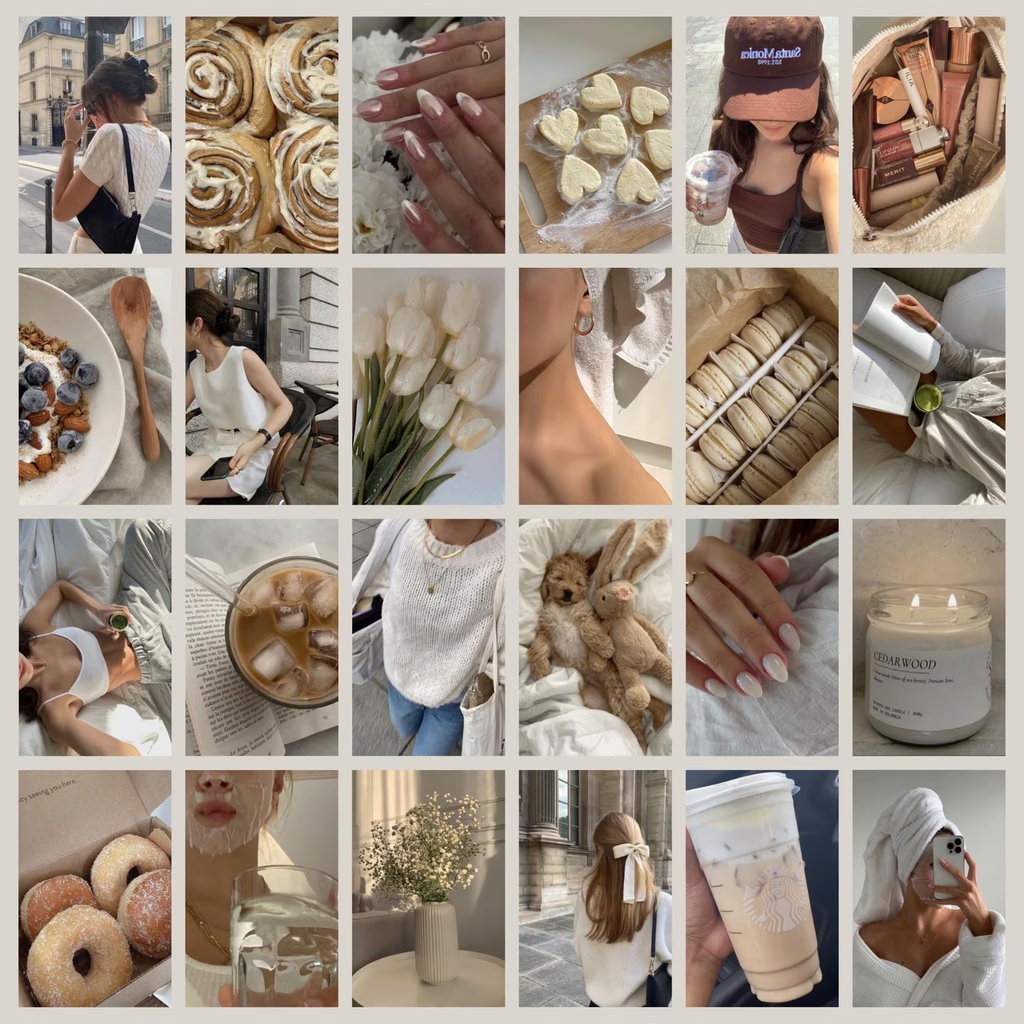
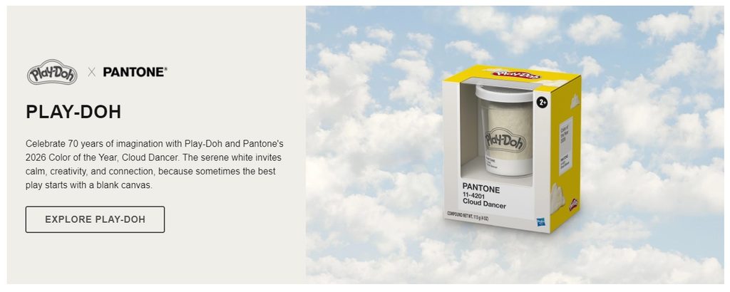
It’s also made its way into everyday consumer culture. Pantone partnered with brands including Motorola, Play-Doh, and Joybird to bring Cloud Dancer into products and design. Even something as ordinary as a white phone or a white piece of furniture suddenly becomes part of a bigger trend.
My favorite ironic product is Pantone’s Color of the Year Play-Doh, as seen below in all its white-ness.
Politics adds another layer. White has long been used to communicate purity, innocence, peace, authority, and national identity. In today’s political climate, choosing white as a symbol of a fresh start and unity is not necessarily a neutral decision. People bring their own cultural and political associations to color, making Pantone’s choice particularly interesting and, for some, controversial.
White in Art and Design
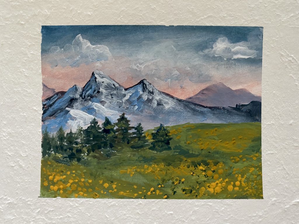
For artists, white is anything but empty. It can create space, emphasize light, establish contrast, and completely change how surrounding colors appear. As an acrylic painter myself, I use titanium white paint the most.
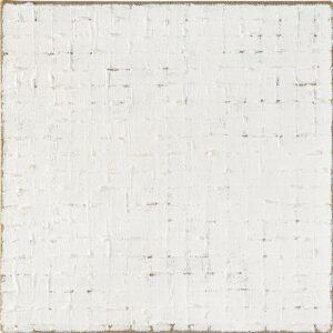
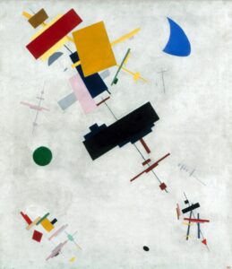
Think of the stark white backgrounds of Kazimir Malevich or the minimalist paintings of Robert Ryman. Their work demonstrates that removing color doesn’t necessarily remove meaning. Sometimes the absence of obvious visual information is exactly what makes us look closer at the little information we are given.
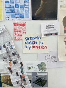
There’s also something particularly striking about white paired with black. High-contrast black lettering against a bright white background is practically everywhere, from editorial design and advertising to political posters and website layouts. It’s simple, readable, bold, and difficult to ignore. White gives black room to speak.
Who Chooses the Color of the Year?
Pantone has been selecting a Color of the Year since 1999. But how does a company decide which color gets the spotlight?
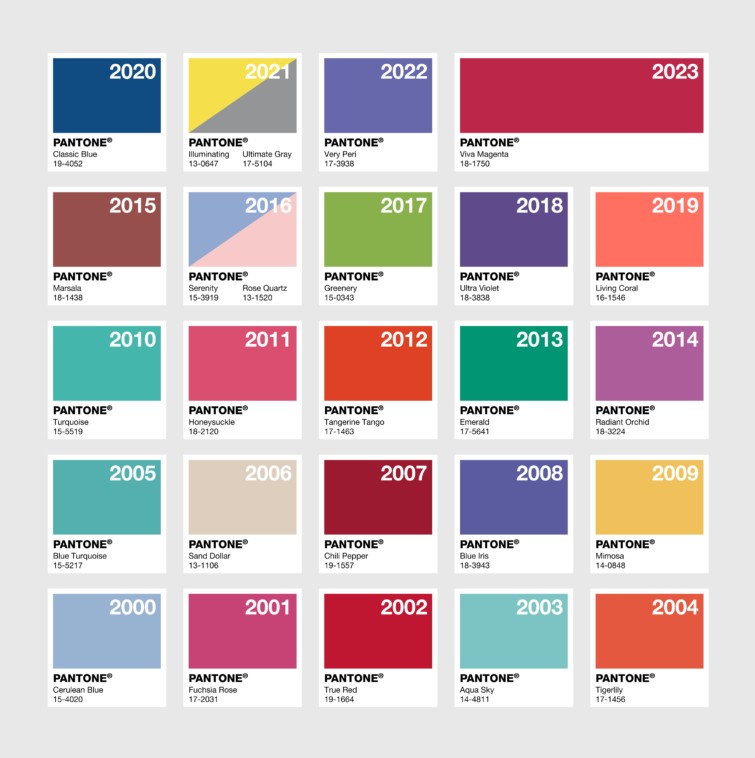
The Pantone Color Institute studies global influences throughout the year, including fashion, art, technology, entertainment, travel, social movements, and changing consumer preferences. Its team of color experts looks for patterns in what people are creating, buying, wearing, and responding to.
The chosen shade then becomes a reference point for designers, artists, marketers, and manufacturers. It influences everything from clothing collections and home interiors to product packaging and advertising. It’s part cultural observation, part trend forecasting, and part inspiration. And I’m lowkey obsessed.
If you notice, Pantone’s Color of the Year is typically orange or purple in election years and a yellow hue after years of economic decline. With the 2027 year coming up, I want to throw my hat in the ring. I guess Pantone’s Color of the Year for 2027 will be a forest green like #OB6623.
For more articles, I recommend you take a look at these on my website: Color Knowledge Tips That Will Make You a Better Artist, Why Art Is Essential to Humanity, and Yellowing of AI: The Golden Hour Before Sunset.
Why Color Matters
Color is one of the most immediate ways we communicate without words. It influences how we interpret advertisements, recognize brands, experience artwork, and even associate certain objects with particular feelings.

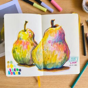
White can represent a fresh start, but it can also feel sterile, cold, luxurious, peaceful, or completely intimidating depending on how it’s used. That’s the fun part of working with color. There isn’t always one correct interpretation.
Pantone’s Color of the Year, Cloud Dancer, might be a soft, quiet white, but its selection has sparked plenty of conversation. And I think that’s the point.
It’s like the minimalist art we talked about earlier: when the background is white, you’re able to focus more on the actual technique, brush strokes, and meaning behind the work.
So, maybe when the product is white, you’re better able to focus on the quality and intentional design behind it.
But what do I know?? I’m just an artist.