Color Advice

Easy Color Theory for Beginners

Color theory is all about how colors work together and the rules that tell us how to use them in art, design, and in our daily lives. It’s really important for those who are just starting out in art and design because it helps you make things that look nice and balanced.

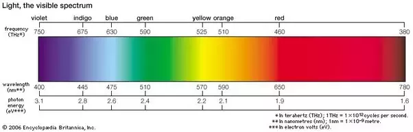
One important person in the story of color theory is Sir Isaac Newton. He found out that white light is actually made up of all different colors – red, orange, yellow, green, blue, indigo, and violet. This discovery helped us create the color wheel, which is a tool that shows us how colors relate to each other and how we can mix them to get different effects. In this blog post, you’ll learn how color makes a big difference in art, design, and even in your daily life.

What is Color Theory?

Understanding color theory is really important when you’re creating art or designs. If you’re just starting out, it might seem a bit hard, but don’t worry! Once you get the hang of some basic ideas, you’ll be able to use color theory in your own work with no problem.

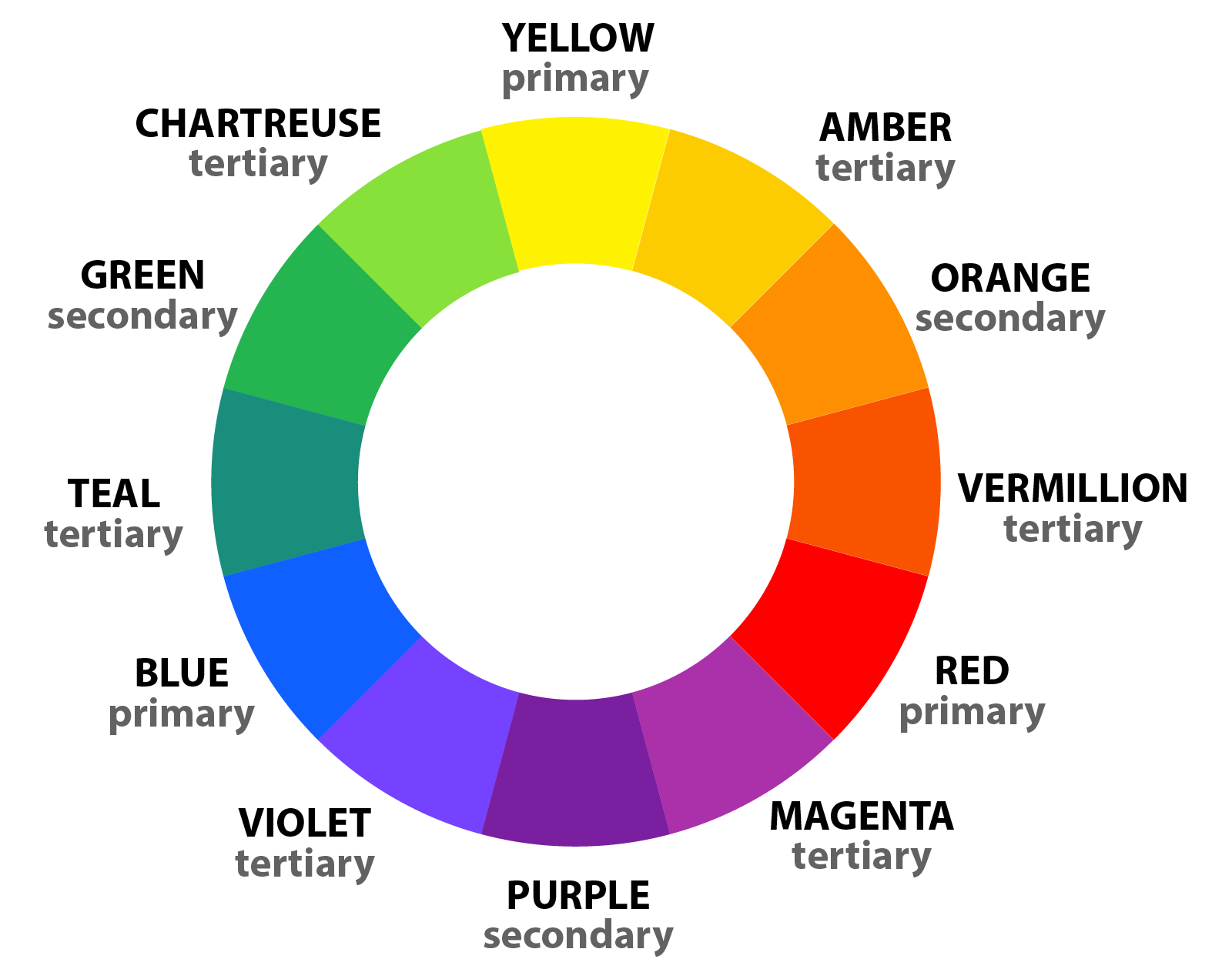
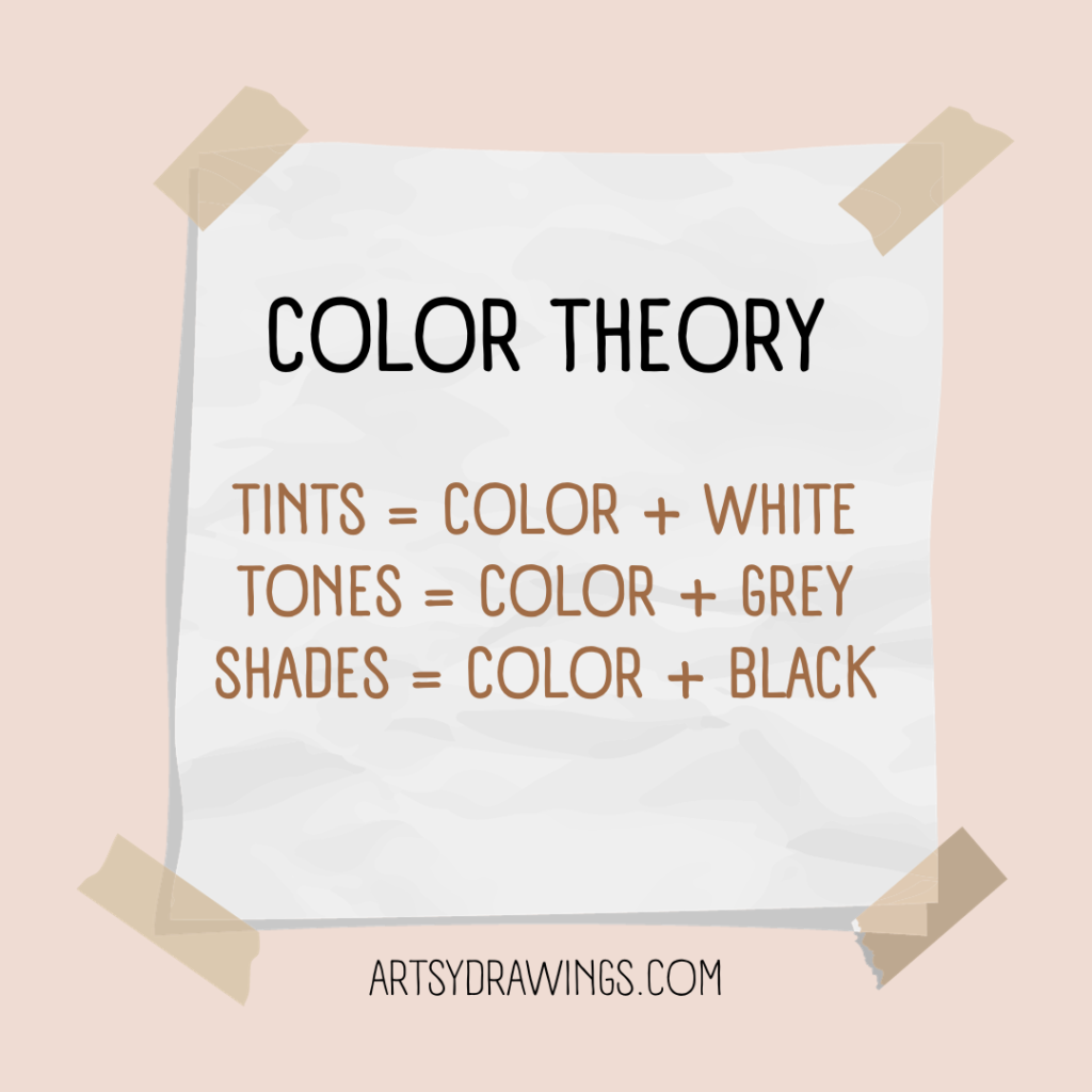
Let’s start with primary, secondary, and tertiary colors. These are the main parts of color theory.

Primary colors are red, blue, and yellow. They’re the starting point for all other colors. Secondary colors are made when you mix two primary colors together. That’s how you get green, orange, and purple. Tertiary colors come from mixing a primary color with a secondary color. That gives you colors like red-orange, yellow-green, and blue-purple.

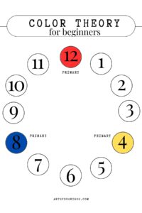
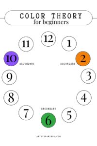
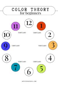
So, how can we see all these colors and how they relate to each other? That’s where the color wheel comes in. It’s a tool that arranges the primary, secondary, and tertiary colors in a circle. By looking at the color wheel, you can learn about how colors work together.

color theory for beginners shows primary secondary and tertiary colors like numbers on a clock
If the Color Wheel was a clock, primary, secondary, and tertiary colors would sit at numbers from 1-12.

For example, complementary colors are colors that are right across from each other on the color wheel. When you use them together, they make each other stand out and your artwork look really vibrant. Color harmonies are combinations of colors that just look good together. They can be analogous colors, which are next to each other on the color wheel, or triadic colors, which are evenly spaced around the color wheel.

Guidelines in Color Theory:

Understanding these guidelines in color theory can help you make informed decisions when creating art and design. By using the color wheel as a guide, you can create cohesive color schemes that enhance the overall look and feel of your work. Whether you are painting a piece of art, designing a website, or choosing an outfit, incorporating color theory can take your creations to the next level.

The color wheel is like a rainbow in a circle. It has primary colors (red, yellow, and blue), secondary colors (orange, green, and purple), and tertiary colors (mixtures of primary and secondary colors). Understanding these colors can help beginners create nice color combinations for their artwork.

Complementary colors are colors that are directly across from each other on the color wheel, like red and green or blue and orange. When you use them together, they create a strong contrast and make the artwork pop. On the other hand, color harmonies are groups of colors that look good together, like analogous colors (colors that are neighbors on the color wheel) or triadic colors (three colors that are spaced evenly around the color wheel).

Using Colors in Everyday Life:

Colors are really important in our daily lives because they can affect how we feel. For example, red can make us feel excited and passionate, while blue can make us feel calm and peaceful. Understanding how colors can affect our feelings can help us when we’re creating art or designs.

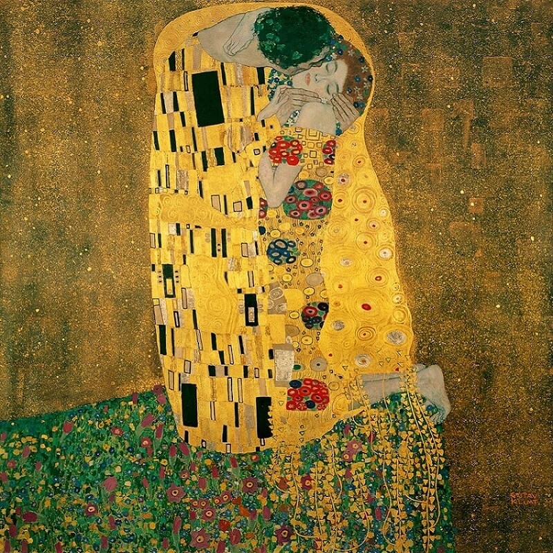
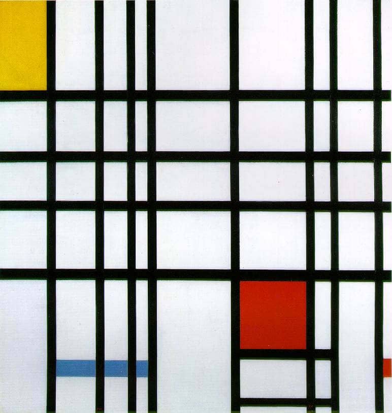
Artists like to use colors to make people feel different things. Two famous artists who did this are Piet Mondrian and Wassily Kandinsky. Mondrian liked to use big blocks of colors like red, blue, and yellow in his paintings. Kandinsky liked to use bright and bold colors to make people feel different emotions.

Piet Mondrian and Wassily Kandinsky were both really good at using color. They understood how colors can make people feel certain ways. Mondrian liked to use big, bright colors like red, blue, and yellow in his artwork. He made simple shapes and filled them in with these bold colors. One of his most famous works is called “Composition with Red Blue and Yellow”. In this painting, you can really see how he used these primary colors to make a strong statement.

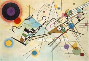
On the other hand, Kandinsky liked to use lots of different colors in his art. His painting “Composition VIII” is full of many different colors. He used these colors to explore how they can make people feel. Both Mondrian and Kandinsky show us how color can be really powerful in art. They teach us that we can use color in smart ways to make people feel strong emotions.

Colors are also really important when we’re designing a website or a graphic. Warm colors like red and orange can make people feel excited and energetic. Cool colors like blue and green can make people feel calm and peaceful. By understanding how colors work, designers can use them to make people feel a certain way.

Businesses also use colors to make people feel a certain way. They do this to help people remember their brand. A good example is McDonald’s. They use the colors red and yellow to make people feel warm, energetic, and happy. These are feelings that we usually associate with eating fast food.

Understanding colors can also help you when you’re picking out clothes or creating a brand. By picking colors that match your personality and values, you can create a brand that people will recognize. When you’re picking out clothes, understanding colors can help you pick outfits that look good and express your personal style.

In Conclusion

Color theory is not just a tool for artists, but a fundamental aspect of everyday life. Understanding the basics of color theory can enhance your creativity, communication, and emotional expression through art, design, and branding. By exploring the impact of color on mood and emotions, as well as its practical applications in various industries, you can develop a deeper appreciation for the power of color in our lives.

So, whether you are a beginner in art or a seasoned professional, continue to explore and learn about color theory as a guide to creating impactful and meaningful work. Embrace the beauty and versatility of color, and let it inspire you to create art that truly speaks to the soul.

Enjoy this article? Read more from Emily here, and check out more color theory tips in this article.

Easy Color Theory for Beginners Read More »

How to Make the Color Purple

The Hypnotic And Rich Historical Backstory Of How Simple Purple Became Periwinkle, Indigo, Maroon, And Lavender Color.

The color purple is a mesmerizing hue and has captured the imagination of artists, designers, and enthusiasts for centuries. It is a color of intrigue, luxury, creativity, and spirit. And it comes in many shades, tints, and tones, from mauve to grape to a stunning pastel lavender color.

According to color theory, purple is a secondary color and a mixture of red and blue. But I think it’s much more than that.

the color purple lily flower drawing by Kathleen Fiorito with vibrant lavender color
Drawing by Kathleen Fiorito

In this article, we’ll explore the world of the color purple, including its rich history, the art of mixing and creating it, and its significance in various industries.

We’ll also explore a spectrum of 30 distinct shades of purples, violets and lavender color, from periwinkle to plum, and where you can find them in different aspects of our world.

A Journey Through Art History: Purple’s Royal Past

The regal reputation of purple goes back centuries. In ancient times, the production of purple dye was a laborious and costly process, making it a symbol of wealth and status.

Phoenician traders extracted violet dye from the glands of mollusks in the Mediterranean Sea. The product was called “Tyrian purple.”

This exhibit in the Museum of Natural History in Vienna features fabrics dyed from different species of sea snail, similar to how ancient people extracted the purple color.

In fact, according to an article by Kristine Ballard, over 9,000 snail mollusks produced a single gram of the precious Tyrian purple dye. This rarity made the color purple especially valuable.

The term “purple” comes from the Greek πορφύρα (porphura) and Latin purpura.

The Romans reserved the color purple for emperors and high-ranking officials. Similarly, the Byzantine Empire used purple as a privilege exclusively for the imperial family.

During the Renaissance, artists like Leonardo da Vinci, Titian, and Veronese utilized various shades of lavender color in their works to symbolize nobility and spirituality. In the 18th and 19th centuries, purple represented mysticism and the spiritual, often appearing in paintings with religious or symbolic themes.

During the Renaissance Violet featured throughout many religious paintings. Angels and the Virgin Mary were often portrayed wearing violet robes. Many painters of the 19th century experimented with the uses of the colour violet to capture the subtle effects of light.
Madonna and Child by Giotto. Tempera on panel, 1320-30.

The Perfect Purple, Maroon, or Lavender Color

To create the perfect shade of purple, one must combine red and blue. As discussed in a preliminary article regarding color theory and the color wheel, you must mix two primary colors to produce a secondary color, like purple.

The proportion of each color will determine the tone, from a delicate lavender to a deep violet. Experiment with different ratios to achieve your desired hue. Introducing white will lighten the shade, while black or optical black will darken it. You can also adjust the tone, saturation and vibrancy using other colors on the wheel. Keep in mind that the specific red and blue you use will influence the final result.

The color purple can vary immensely based on how you choose to mix blue and red.

The Many Shades of the color Purple and Their Applications

Depending on how you choose to mix the purple color, the outcome can be very different. Even though you mix red and blue, your purple can vary significantly. Next, I’ll determine the differences between 30 different colors of purple and their origins.

Overall, it’s important to keep in mind that colors are extremely variable. The hue derived from the origin, like a flower or fruit, may not match the HEX or color code exactly. Likewise, you may interpret the color differently in your head than how I interpret the color in this article.

There are so many lavender color flowers!

Firstly, the best way to organize these colors is by their origin. I found 9/30 come from flowers, so let’s start with that.

Lavender: #A684C2

This light purple is often associated with tranquility and can be seen in interior design for bedrooms and spa settings. Like its namesake flower, the lavender color provides a calm feeling with its pastel quality and slightly bluer hue.

Lilac: #B889BB

A soft, pale purple used in springtime floral arrangements. Similar to the lavender color, the name lilac originates from the flower’s color. I think lilac is slightly more red and pink than the lavender color, though.

Periwinkle: #CCCCFF

A soft and charming, periwinkle is the color purple shade used in children’s products and fashion.

Heather: #A484AC

A muted purple with a gray undertone, often found in interior design.

Iris: #5D3FD3

A medium purple, perfect for adding a pop of color to clothing or accessories.

Orchid: #DA70D6

This vivid and exotic shade is sourced from the vibrant flower and used in cosmetics and fashion. Additionally, clothing designer Halston was known for populating his studio with live orchid flowers as inspiration. He had a $150,000 yearly orchid budget! Aside from their brilliant pinky-purple hue and meanings of love, luxury, beauty and strength, orchids are innately provocative, much like Halston’s lines.

Thistle: #D8BFD8

A pale purple with a touch of gray, ideal for sophisticated design projects.

Pansy: #78184a

A vibrant and bold purple often found in gardening and horticulture.

Wisteria: #c9a0dc

A pale and delicate purple often used in weddings and floral design.

What are Spectral Colors?

Next, violet and indigo deserve their own sub-section as these are some of the most pure colors in the human visible light spectrum.

Both violet and indigo colors are found on the visible light spectrum.
Both violet and indigo are on the visible light spectrum.
Violet: #8F00FF

Violet is a type of flower and what is known as a spectral color. The hue has its own wavelength at the end of the spectrum of light identified by Isaac Newton.

In the art community, the color violet is often interchangeable with “purple.” This confusion comes from the formal color wheel, Roy G. Biv, where the last two letters stand for indigo and violet. This original color wheel was created by Isaac Newton himself in 1666.

Visually, a purple marker and violet marker are the same color. Scientifically, violet is a spectral color with a wavelength of 400nm and purple is a combination of two spectral colors, red and blue, and has no wavelength.

Indigo: #4B0082

Indigo is another spectral color with its own wavelength. It is a deep, dark purple-blue, perfect for textiles and dyeing. According to Muzli Colors, indigo dye is derived from the Indigofera tinctoria plant and its first recorded use was in 1289.

Purple berries, fruits, and sweet treats!

Many purple colors come from berries and fruit in nature. These hues tend to be darker in color, but are definitely still classified as purple.

Eggplant: #614051

A rich and dark purple often used in cooking and home décor.

Aubergine: #472C4C

A rich and elegant shade found in gourmet cuisine and interior design. Actually, color wise, aubergine is the same color purple as eggplant. The difference is merely regional. ‘Eggplant’ is the term in American English, while ‘aubergine’ is used in British English.

Plum: #673147

A deep and luxurious purple often used in clothing and accessories. As expected, this color gets its name from the sweet fruit.

Mulberry: #c54b8c

A dark, reddish-purple shade often found in autumn-themed artwork.

Purple colors from food items like mulberry fruit on vines.
Mulberry purple comes from the mulberry fruit.
Boysenberry: #873260

A dark and fruity purple often found in food products and branding.

Grape: #6f2da8

This is really close to what I envision when I immediately think of the color purple. Even though the name of this color matches the fruit, this is not the color of grapes. Instead, the color purple ‘grape’ represents branding for candy in this flavor. It’s nostalgic for me in a sense. This color purple is a vibrant and playful purple used in branding for sweets and children’s products.

Fashion Forward Lavender Color

These colors typically more artificial and fabricated specifically for fashion and products. They can be perceived as more vibrant and rich than floral or berry purples.

Mauve: #C77398

This color purple is a dusty purple often used in fashion for a vintage, romantic feel. Mauve is actually the color of the first synthetic dye, created in 1856 by 18-year-old William Perkin. Within five years of the chemical creation, 28 dye factories opened, revolutionizing the fashion world and forever changing color production. Today, according to The American Scholar, there are over 10,000 synthetic dyes, from clothing to car paint to children’s’ toys and even shampoo.

Mauve is a dusty purple often used in fashion for a vintage, romantic feel. Mauve is actually the color of the first synthetic dye, created in 1856 by 18-year-old William Perkin. Within five years of the chemical creation, 28 dye factories opened, revolutionizing the fashion world and forever changing color production. Today, according to The American Scholar, there are over 10,000 synthetic dyes, from clothing to car paint to children's' toys and even shampoo.
Perkin’s original mauve dye from 1856.
Amethyst: #9966cc

Probably the most natural purple on this list, amethyst is a deep and vibrant purple taken from the crystal with the same name. Often used in jewelry design, this color has a more regal and wealthy appearance.

Probably the most natural purple on this list, amethyst is a deep and vibrant purple taken from the crystal with the same name. Often used in jewelry design, this color has a more regal and wealthy appearance.
While the gemstone comes in a variety of colors, typically, the color amethyst most closely resembles the popular African Amethyst (first image).
Magenta: #FF00FF

A bold and intense purple often found in advertising and packaging. While magenta is typically categorized as a pink, it is created by mixing blue and red, and can fall into the category of purple colors.

Jazzberry Jam: #a50b5e

I love the name of this color. Jazzberry jam is a playful, intense purple-pink commonly found in children’s products. Crayola has a crayon in this vibrant color.

A playful, intense purple commonly found in children's products. Crayola has a crayon in this vibrant color.
Jazzberry Jam is a fun pinky-magenta purple color with the Hex code #A50B5E.
Heliotrope: #df73ff

A soft and romantic purple used in cosmetics and fashion.

Grape Soda: #b498aa

Unlike the grape color, Grape Soda is manufactured by Kelly Moore paints and is typically used as house or wall paint. Kelly Moore describes the color as a “medium light shade of magenta-pink.”

Liseran Purple: #DE6FA1

Probably closer to a pink, this color is a bright, synthetic purple-pink used in textiles and plastics.

Regalia: #522d80

A rich, royal purple often found in academic regalia and ceremonial attire.

Taylor Swift in regalia purple attire speaking at NYU graduation
Taylor Swift wore a regalia purple attire when speaking at Spring 2022 NYU graduation ceremony.
Royal Purple: #7851a9

Historically, royal purple is associated with royalty. Similar to ancient Tyrian purple, the color is used in ceremonial and regal settings.

Byzantium: #702963

A dark, imperial purple used in art and historical reenactments.

Palatinate Purple: #682860

Not to be confused with Emperor Palpatine, palatinate purple is a bright, eye-catching purple. It’s used in sports branding and uniforms, as well as university ceremonial robes.

Remember that Emperor Palpatine is not palatinate purple!
Electric Purple: #bf00ff

A striking and intense shade, this brilliant hue generally appears in technology and digital design.

Blue-Purple (Cool Purple): #8a2be2

A cool-toned purple often used in contemporary design and art.

The Significance of the color Purple in the Modern World

The color purple still holds a unique place in our lives. It signifies creativity, individuality, and extravagance. Plus, it’s pretty!

For this gesture drawing, I chose a purple themed color scheme. I chose indigo, magenta, and peach colored soft pastels to create the illusion of a rich regalia violet color. This was created by Brianna Eisman for Artsy Drawings.
Purple Gesture Drawing by Brianna Eisman

For this gesture drawing, I chose a purple themed color scheme. I chose indigo, magenta, and peach colored soft pastels to create the illusion of a rich regalia violet color.

In branding, purple and lavender color invokes a sense of luxury, elegance, spirituality, creativity and uniqueness. So, you’ll find brands like Cadbury and NYU in deep rich regal purples. In the same way, you’ll see brands like Discord and Teams in more indigo and electric blue-purples.

In art and design, the color purple conveys a wide range of emotions and moods, from serenity to drama.

Purple lavender color is used in a variety of branding logos.
Purple is used in a variety of branding logos.

By all means, the color purple is more than just a color; it’s a symbol of history, luxury, and creative expression. Understanding the various shades of lavender and magenta and their intrinsic value to design and history can allow artists and creators to better utilize the color purple in their work.

As you explore the world of the color purple, remember the rich history, the art of creating the hue, and the ever-present mystique of this enchanting lavender color in our lives.

How to Make the Color Purple Read More »

Color Knowledge Tips That Will Make You a Better Artist

Introduction to color knowledge

Color knowledge is a fundamental aspect of art that has the power to evoke emotions, convey messages, and create captivating compositions. Whether you’re an aspiring artist or a seasoned pro, a deep understanding of color can significantly enhance your creative endeavors, and in turn, make you a better artist.

In this artsy article, we’ll delve into the fascinating realm of color knowledge, covering essential principles of color theory like primary, secondary and tertiary colors, how to create an effective color scheme, and basics of color mixing.

Color Theory: The Foundation of Creativity

Color Knowledge tip 1: Primary Colors are Red, Blue, and Yellow

Color Knowledge image of primary colors mixing in triple venn diagram to create secondary colors
Red, yellow and blue are the starting point to create more colors like orange, green, and violet.

Primary colors are the foundational hues in the world of color theory, consisting of red, blue, and yellow. These three colors are considered “primary” because they cannot be created by mixing other colors together.

On a computer, these inks are called magenta, yellow, blue, and black. Though, you’ll notice if you run out of black ink, the computer will offer an alternative to mix magenta, yellow, and blue. This mixture is “optical black” in the painting world. I’ll talk more about optical black in the section about mixing paint colors together.

Different combinations of the primary colors create all other colors on the color wheel. The primary colors are essential color knowledge for artists and designers.

If you mix two primary colors, you get secondary colors. For instance, if you mix even parts red and yellow, you will get orange. Blue and red make violet. Yellow and blue make green.

Color Knowledge tip 2: memorize The Color wheel

The color wheel further expands with tertiary colors, created by mixing primary and secondary colors. There are endless possibilities for color exploration in art and design.

Color Knowledge image of the color wheel showing primary, secondary, and tertiary colors
This color wheel shows primary, secondary, and tertiary colors.

Great, now that you’ve grasped the basic concept of the Roy G. Biv color wheel, let’s move on to relationships between colors.

Color Knowledge tip 3: Understand Color Harmony

Next, let’s learn about color harmony schemes like complementary, analogous, and triadic colors. Choosing the right color scheme can add a lot of visual and metaphorical depth to your art.

Complementary color schemes involve pairing colors that are located directly opposite each other on the color wheel. They are literal compliments, such as red and green or blue and orange. This scheme creates strong visual contrast and can make each color appear more vibrant when placed next to its complement. This color scheme is often seen in comic books, illustrations, logos, and even signage on the side of the road.

Color Knowledge image of complementary colors in everyday media like Christmas card, football team, and soda logo
Complementary colors contrast one another and tend to “pop” off the page.

Analogous color schemes use colors that are adjacent to each other on the color wheel, such as yellow, yellow-green, and green. This scheme creates a sense of harmony and cohesion. The analogous color scheme is ideal for creating a peaceful or monochromatic color palette in art or design.

Both The Kiss by Gustav Klimt and my painting inspired by the same work use analogous color schemes to create a sense of calm and peaceful harmony.

Triadic color schemes involve selecting three colors evenly spaced around the color wheel, forming an equilateral triangle. For example, red, blue, and yellow form a triadic color scheme. This scheme offers a balanced and dynamic contrast of colors. Triadic color schemes create visually striking and vibrant compositions.

Spiderman showing a tertiary color scheme of red, yellow and blue
This image shows the selected colors used in the comic book about Spiderman. Red, blue, and yellow make a triadic color scheme.

Color Knowledge tip 4: Know the difference between tint and shade

Saturation and value are essential aspects of color theory illustrated through the use of tints, shades, and tones.

Tints and shades determine values. Tints are created by adding white to a color and shades are formed by adding black to a color. Saturation is determined by tone, in which grey is added to the pure hue to mute the color.

Tints, shades, and tones showing color knowledge
Tints, shades, and tones change the color depending on how much white, black or grey you add to the hue, respectively.

Tints and shades alter both the brightness (value) and intensity (saturation) of colors. The level of darkness or lightness is crucial for creating depth in your artwork and originality in your color schemes.

Color Knowledge tip 5: Color temps (Warm vs. Cool Colors)

Color temperature is a fundamental color knowledge tip that helps convey emotion and moods.

Warm colors, such as reds, oranges, and yellows, are associated with warmth, energy, and excitement. Typically seen in the foreground of the composition, warm colors evoke feelings of passion and vibrancy.

In contrast, cool colors, like blues, greens, and violets, are calming and associated with serenity, tranquility, and a sense of distance. They tend to recede in a composition and can evoke feelings of calmness and introspection.

During Pablo Picasso’s Blue Period, the artist used a predominantly cool color palette. This color scheme included shades of blue (obviously) and blue-green as dominant hues. This deliberate choice of colors conveyed a sense of melancholy, sadness, and emotional turmoil in his artworks.

Color Knowledge image of Pablo Picasso's blue period about how color schemes can help convey emotions
Pablo Picasso’s Blue Period (1901-1904) is one of the most well known artistic uses of how color can signify emotion.

Color can serve as a powerful tool for expressing complex emotions and capturing the human condition.

One of my favorite moments of artists being angsty and non-conformists is the controversy surrounding “Blue Boy.” Painted by English portrait artist Thomas Gainsborough, the 1770 painting includes the unconventional use of blue as the dominant color for the subject’s attire, rather than as a background hue.

One of my favorite moments of artists being angsty and non conformists is the controversy surrounding "Blue Boy" by English portrait artist Thomas Gainsborough. The 1770 painting includes the unconventional use of blue as the dominant color for the subject's attire rather than as a background hue.
Blue Boy by Tomas Gainsborough challenged norms of its time by using blue in the foreground of the painting.

This departure from traditional portraiture raised eyebrows in its time. I find that something I love about learning art history is how artists challenge conventional norms. Sparking debate about artistic choices leads to innovation and change and progress.

Likewise, try to understand the interplay between warm and cool colors. This part of color knowledge is crucial for creating balanced and emotionally resonant color palettes in art and design.

COLOR MIXING

Color Knowledge tip 6: learn to mix Optical black

Color mixing techniques can greatly enhance the range and depth of your artwork. This section will focus on the important concept of “optical black.”

In this painting, I mixed phthalo (Phthalocyanine) blue with burnt umber to create this super dark optical black background to show color knowledge
I mixed phthalo (Phthalocyanine) blue with burnt umber to create this dark optical black background.

Optical black is a “fake black” which looks like black, but is instead created using color.

In art school, we were not allowed to buy or use black paint in our paintings. Turns out, creating optical black teaches you color theory and color mixing much better than simply using black.

Remember back to when we were discussing value and saturation?

Color theory is easy with a cute visual.

So then if Optical Black = Orange + Blue then Shades = Optical Black + Orange + Blue.

Whoever said art doesn’t include math was just a silly-billy.

Anyways, mixing complementary colors can create the visual appearance of black, despite no actual black pigment used.

To start, mix complementary colors from the color wheel. From there, continue to add colors until you reach the optical black that looks best for your chosen color scheme.

For example, if your painting uses yellow highlights, you may want your optical black to look more violet. How does this work?

Using complementary colors trick the color receptors in your eyes to believe the color is black, and not dark violet. This technique achieves rich, natural and deep shadows in your artwork without resorting to flat-looking black paint.

The same effect is achieved when you wear colored ski-goggles.

“[Ski-goggles] are often orange so at the end of the day the orange receptors are tired and the world looks blue.”

stoopidusername

Disney World also uses this technique to make their colors seem more vibrant. The sidewalks are painted red to trick the color receptors in your eye to make the grass and trees seem greener.

Disney World uses complementary colors in their park. The red sidewalks make the grass and trees look greener.

Color Knowledge tip 7: Use complementary colors for desaturation

Additionally, complementary colors tone down the saturation of a color. When you mix a color with its complementary color, the result is a desaturated, or less vibrant, version of the original color.

In the below painting of a skull still life, I chose a color scheme that included a golden yellow ochre and a muted violet. To achieve many of the greyish mid-tones, I chose to mix the yellow and violet together using varying amounts of each color.

This acrylic painting of a skull illustrates the use of optical black in learning color knowledge for painting.
In addition to making optical black using violet and yellow, I chose those same complementary colors as a base color scheme for this painting.

For example, if you have a highly saturated red and you want to reduce its intensity, mix it with a bit of green, its complementary color. The resulting mixture will be a less vibrant shade of red, leaning more towards a neutral gray or brown, depending on the proportions used.

I tend to love using complementary color schemes in my artwork. For this work, I started with a red wash and red base painting, then added the green layers on top to really push the color.
I tend to love using complementary color schemes in my artwork. For this work, I started with a red wash and red base painting, then added the green layers on top to really push the green color forward.

When using complementary colors to desaturate, it’s essential to be mindful of the proportions of added colors. Adding too much of the complementary color can cause the mixture to become too muddy or dark. This is particularly evident in watercolor painting as it is more difficult to lighten the painting back (for watercolors you paint light to dark).

Experimentation and practice will help you develop an intuitive sense of how to mix colors. Color knowledge like optical black and using complementary colors to adjust saturation and intensity can help you become a better artist.

Color Knowledge tip 8: Physically mix colors

Mixing colors is an essential skill for any artist expanding their color knowledge. For this section, we will focus on mixing paint.

Begin with a clean palette and brushes. I also like to have a paper towel handy to dry my brushes. Then, squeeze small amounts of your chosen paint colors onto the palette. I like to use a paper plate as a paint palette, and I place the paint in a circle around the outer edge of the plate.

For example, the photo below features one of the paper plate palettes I used. Notice how I tried to keep the main paint colors clean and mixed my paint towards the center of the plate. You will also notice, I did not use black paint — I mixed an optical black using a dark blue and burnt umber.

I used this paper paint palette for a 4’x4′ garden painting with a lot of colorful flowers.

Next, use a palette knife or brush to blend the colors together gradually, starting with the lightest color and adding small increments of the darker color until you achieve the desired shade. Remember to test your mix on a scrap surface or a corner of the canvas itself to ensure it matches your vision before applying it to your artwork. Practice and experimentation will help you become proficient in creating custom colors for your art.

Follow my social media and newsletters for more tips on how to create a wider array of hues and tones, adding depth and complexity to your work through color knowledge.

Concluding color knowledge for now…

Color knowledge is a powerful tool for artists, allowing us to express ideas more effectively and create art that resonates with audiences. By mastering color theory, you can elevate your art to new heights. So, embrace the world of color, experiment fearlessly, and let your creativity flourish on the canvas of your imagination.

In conclusion to this article, understanding color theory and mixing colors is like having an artist’s secret toolkit. Whether you’re gently blending opposite, or complementary, colors to tone down the saturation or using clever mixtures to create “optical black,” these techniques are simply invaluable. I do want to remind you art lovers that there is so much more to know about color. If this is something that really interests you, please comment, message me, or join my newsletter to read more! I love color!!!

By grasping these fundamentals, you not only make your artwork visually engaging but also open doors to express intricate emotions and stories through color. So, dive into the world of color knowledge, and watch your art flourish with richer, more meaningful color scheme choices.

This is a super easy exercise for testing your markers to show what colors work and which markers have dried out. It also uses color knowledge to arrange the colors in a rainbow style order.

I realized this article was getting long, so I had to chop it up to allow for more in depth discussion of color knowledge. Trust me, there will be more color themed articles!

Color Knowledge Tips That Will Make You a Better Artist Read More »