My 5 Favorite Artistic Mediums: How to Paint and Draw like a Pro

Art is a powerful means of self-expression that allows individuals to convey emotions, ideas, and experiences. Within the vast realm of art, various artistic mediums offer unique possibilities for artists to translate their visions onto the canvas.

In this Artsy Drawings blog post, we delve into five fascinating artistic mediums that have captured the hearts of many: acrylic, mixed media, watercolor, pencil, and gouache. I chose the order by which are my personal favorite artistic mediums. So, let’s explore the distinct qualities and creative potential of each of the five artistic mediums and discover why they are beloved by artists worldwide.

I also created a list of my Favorite Art Supplies, from brush pens to gouache paint.

Acrylic – my all time favorite of the artistic mediums

  1. Acrylic: Versatility and Vibrancy

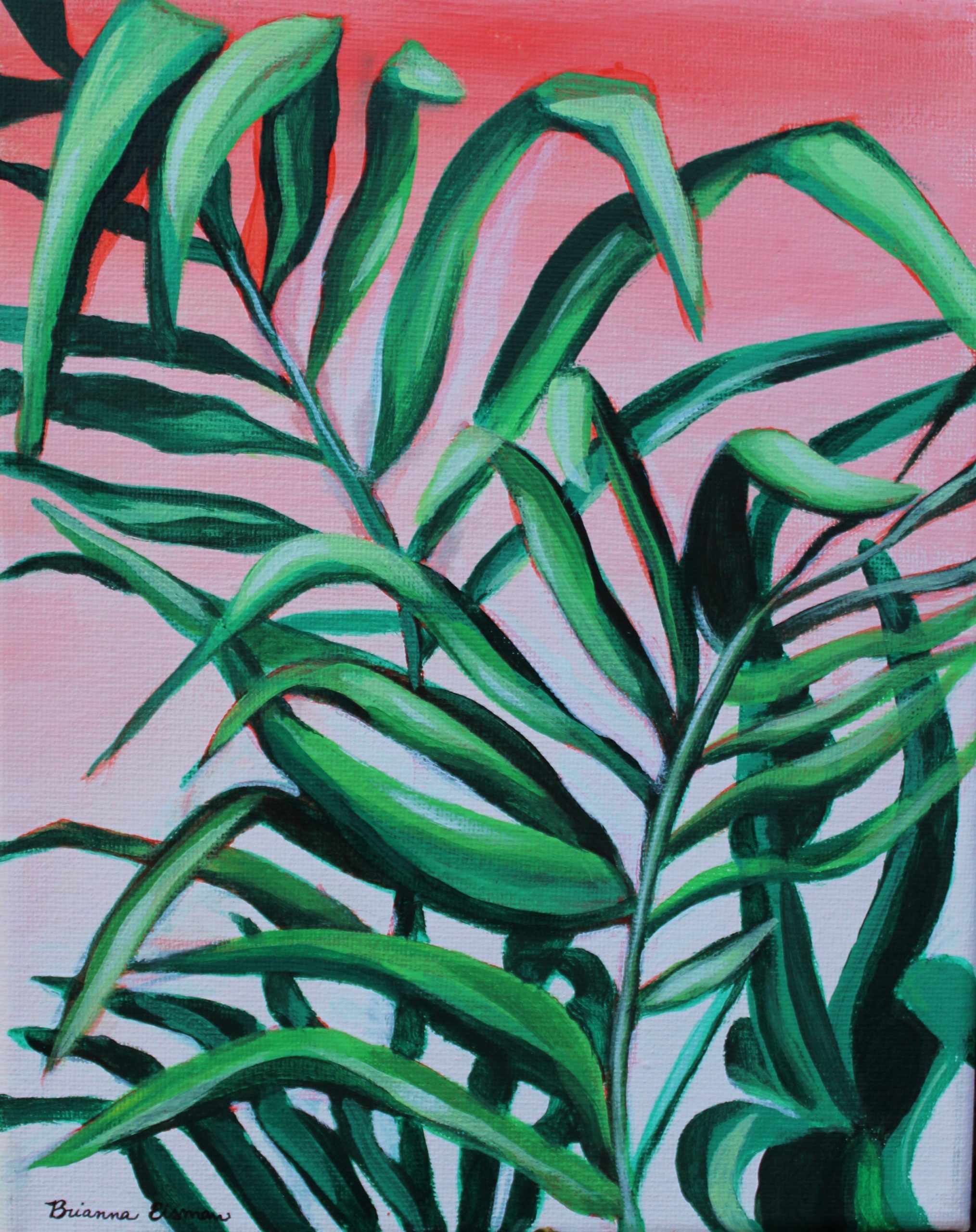
I want to start with my favorite artistic medium: acrylic paint. This medium is becoming increasingly popular due to its versatility and vibrant color range. Many artists, like myself, appreciate the quick drying time of acrylics, which allows for layering and blending techniques. Rather than waiting around all day, (approximately 24 hours) for oil paint to dry, I can work much faster with acrylic paint, which can dry within 20-30 minutes. For example, the painting below, Pretty Plants #2, was completed in four total hours, mostly because I didn’t want to waste paint.

pretty green fern style plant painting in acrylic on canvas with red to white gradient background
Pretty Plants #2 by Brianna Eisman is part of an acrylic on canvas series featuring different plants on gradient backgrounds.

Also, I love the versatility of acrylic paint. You can change the consistency by adding water or acrylic mediums. These additions allow you to create transparent glazes or thick impasto textures. The fast-drying nature of acrylics makes it easier to correct mistakes or make alterations during the painting process.

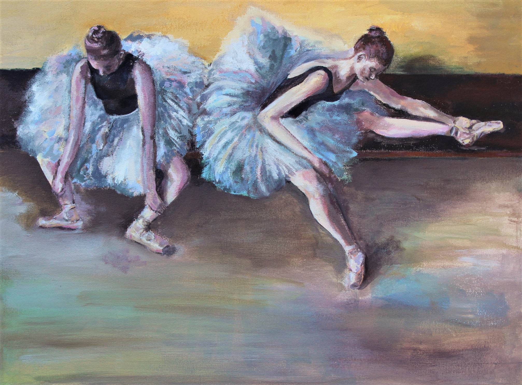
This technique is great for impressionist styles. I had to use it often for paintings during my art classes, as I had limited time to work. When the class ended, I had to clean up quickly so my paints wouldn’t dry out. As a result, my early paintings had a lot of small strokes layered on top of each other, giving them an impressionist look. For example, the painting below, inspired by Edgar Degas’s dancers, has multiple layers of colors and strokes, especially in the tutu skirts, creating depth with a light yellow base and blues and pinks added on top.

Not sure what your art style resembles? Check out this quiz I made to help you find which art style matches your artwork!

this is a acrylic painting on canvas of two dancers wearing black leotards and fluffy white blue tutus. The dancers are stretching while seated on a wooden bench. The style is similar to Edgar Degas. The painting describes the use of favorite artistic mediums in which acrylic is one of my favorites for its impressionistic abilities.
Dancers Stretching by Brianna Eisman was inspired by impressionist painter Edgar Degas. I used acrylic paint on stretched canvas for this painting.

One of the key advantages of acrylics is its ability to mimic other artistic mediums. It can resemble watercolor when diluted or take on the characteristics of oil paint when applied with a heavy body. Acrylic paint can be used on a variety of surfaces, including canvas, wood, paper, and even glass or metal. These broad possibilities add acrylic paint to the list of favorited artistic mediums for many artists.

For me, I have built my acrylic paint arsenal over many years of experience. I prefer Liquitex Basics for my white paint (I use Titanium White more than any other color). I also like Lukas CRYL Studio Paints, although they’re a little more expensive.

Lastly, I like DecoArt Acrylic Paints for projects under 24″x 36″. DecoArt paint typically comes in smaller containers, but I find they are easier to store than larger tube style paints. The brand also just released an environmentally friendly acrylic paint set!

Mixed Media – Making me a trash monster, one sticker at a time

  1. Mixed Media: Limitless Creativity

Mixed media art involves the combination of different materials and techniques to create unique visual experiences. This next medium truly puts “artistic” in the artistic mediums list. Mixed media encourages artists to think beyond the boundaries of traditional artistic approaches. Mixed media, literally mixes artistic mediums. It allows for the incorporation of diverse elements such as paper, fabric, found objects, photographs, and even digital media. You can also classify the use of both paint and pens in the same piece as mixed media, as you are ‘mixing’ the artistic mediums.

Many of my sketchbooks use mixed media. Sometimes, I feel like a trash monster. I collect fortune cookie quotes and receipts and ticket stubs and stickers. I arrange them all in specific sketchbooks as a document of my life, my mental health, and my travels.

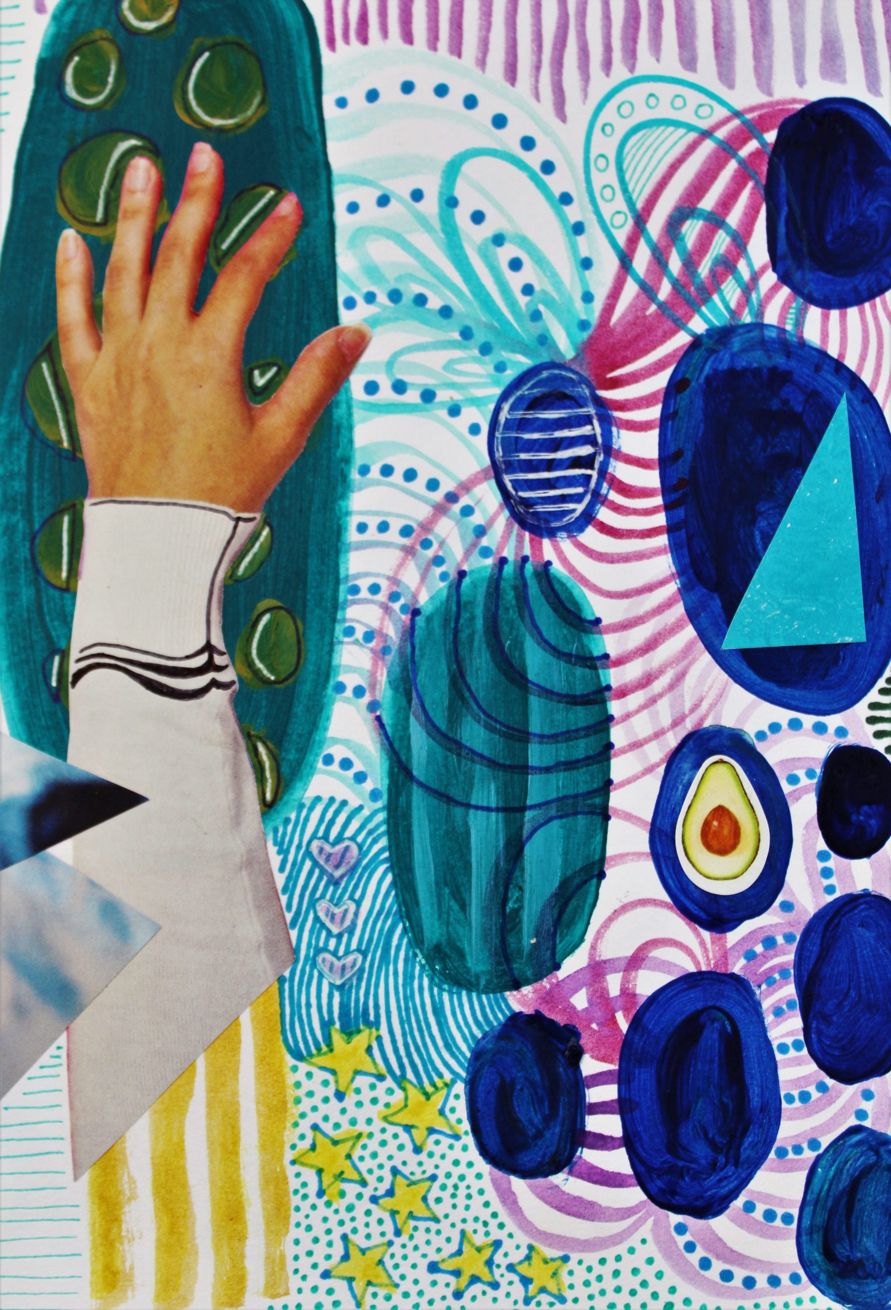
Hand of God by Brianna Eisman is a mixed media work featuring watercolor paint, ink, magazine cutouts, and stickers. This piece was created for Artsydrawings.com at Artsy Drawings. The reference material is for the blog about mixed media and favorite art mediums.
Hand of God by Brianna Eisman is a mixed media work featuring watercolor paint, ink, magazine cutouts, and stickers.

The beauty of mixed media art lies in its limitless possibilities and the freedom it provides for artistic expression. Artists can explore texture, depth, and layers, creating rich and multidimensional artworks with an unlimited number of artistic mediums.

I also think mixed media is one of the most environmentally friendly types of art. As I mentioned above, I sometimes feel like a trash monster, but you really can save money on art supplies by using mixed media. My colleague Emily wrote a great article about how to thrift art supplies, and I think second-hand art supplies could make for the best type of textured found-object artwork.

These limitless mixtures of artistic mediums invite experimentation and encourages artists to step outside their comfort zones, leading to innovative and thought-provoking creations.

Watercolor

  1. Watercolor: Elegance and Serenity

Watercolor paint has an ethereal and delicate quality, often capturing the essence of light, translucency, and fluidity. Artists love the subtle nuances and atmospheric effects achieved with this medium. So, the transparent nature of watercolor allows for luminous washes and seamless gradients.

I also find watercolor to be one of the more accessible art mediums. I absolutely love my cheap Crayola watercolor paints! All you need for watercolor is the paint kit, water in a cup, a brush, and maybe a paper towel or two.

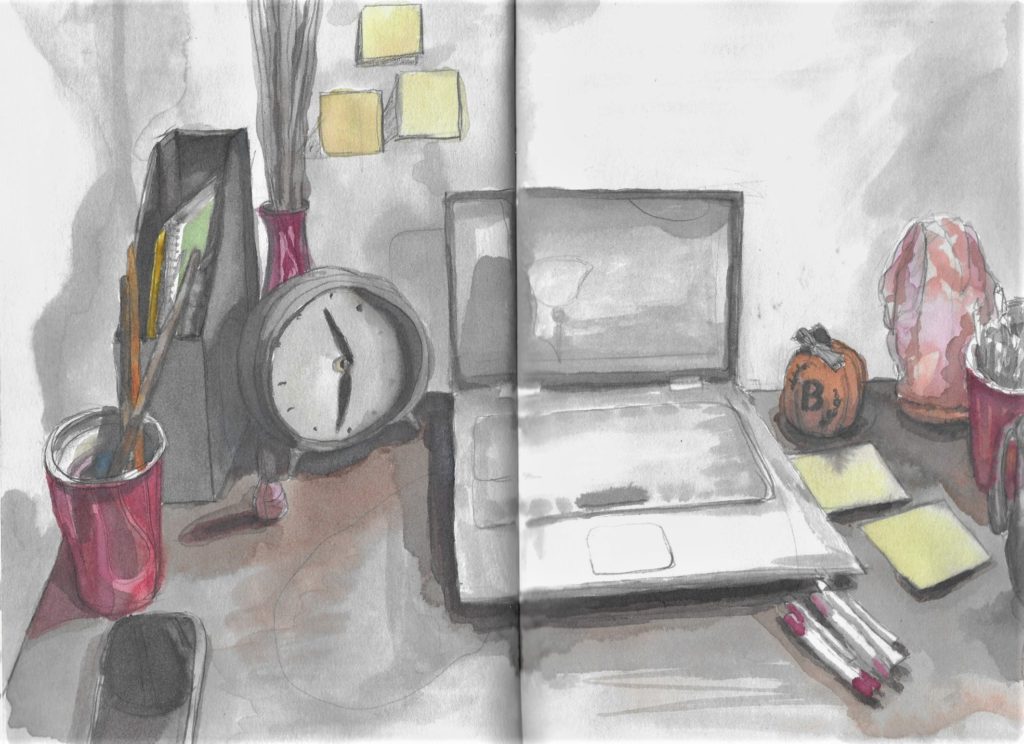
This painting was done in my sketchbook in watercolor paint by Brianna Eisman for Artsy Drawings for Artsydrawings.com. The painting features my desk with my laptop open, clock, pens, sticky notes, water cup, phone, and salt lamp. The study was a quick exercise while watching a movie and I like it a lot.
Desk in Watercolor by Brianna Eisman was painted on a lonely night when all I wanted to do was paint and watch a rom-com on my computer. So I did just that.

Watercolor’s unpredictability adds an element of spontaneity and excitement to the painting process. The artist must adapt and work with the flow of water and pigment, resulting in charming imperfections and unique characteristics. This medium is perfect for capturing landscapes, still lifes, and expressive portraits, evoking a sense of tranquility and serenity.

Pencil Drawings

  1. Pencil: Timeless Precision

Pencil is one of the most fundamental artistic mediums, cherished for its simplicity and versatility. With just a simple pencil and paper, artists can create intricate drawings, detailed sketches, and realistic portraits. Likewise, the graphite shades offer a wide tonal range, enabling artists to achieve a remarkable level of precision and detail.

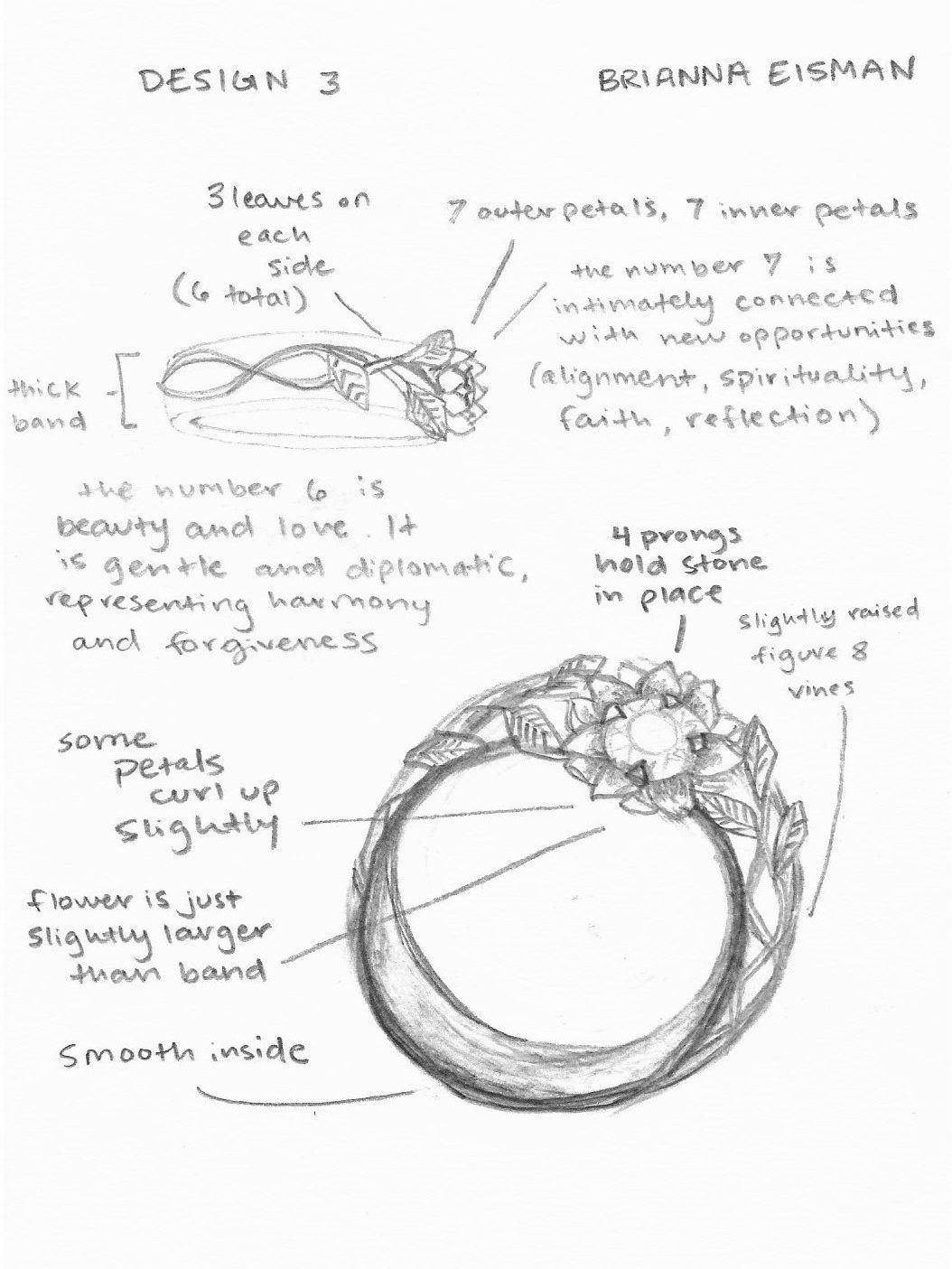
The following image features Design 3, the third design commissioned for a custom floral engagement ring. The patron chose a graphite medium to show fine details and edit the design as needed throughout the workflow of the project.

The following image features Design 3, the third design commissioned for a custom floral engagement ring. The patron chose a graphite medium to show fine details and edit the design as needed throughout the workflow of the project.
Design 3 by Brianna Eisman is a graphite sketch for a custom engagement ring design.

Pencil drawings possess a timeless quality, and the monochromatic nature of graphite pencil adds a sense of elegance and understated beauty. Overall, this medium is perfect for capturing textures, shading, and creating stunning grayscale compositions. Pencil art allows artists to focus on the essentials, emphasizing form, and exploring the interplay of light and shadow. It is also a good starting point for many artists, making it one of the most popular artistic mediums.

Gouache

  1. Gouache: Boldness and Opacity

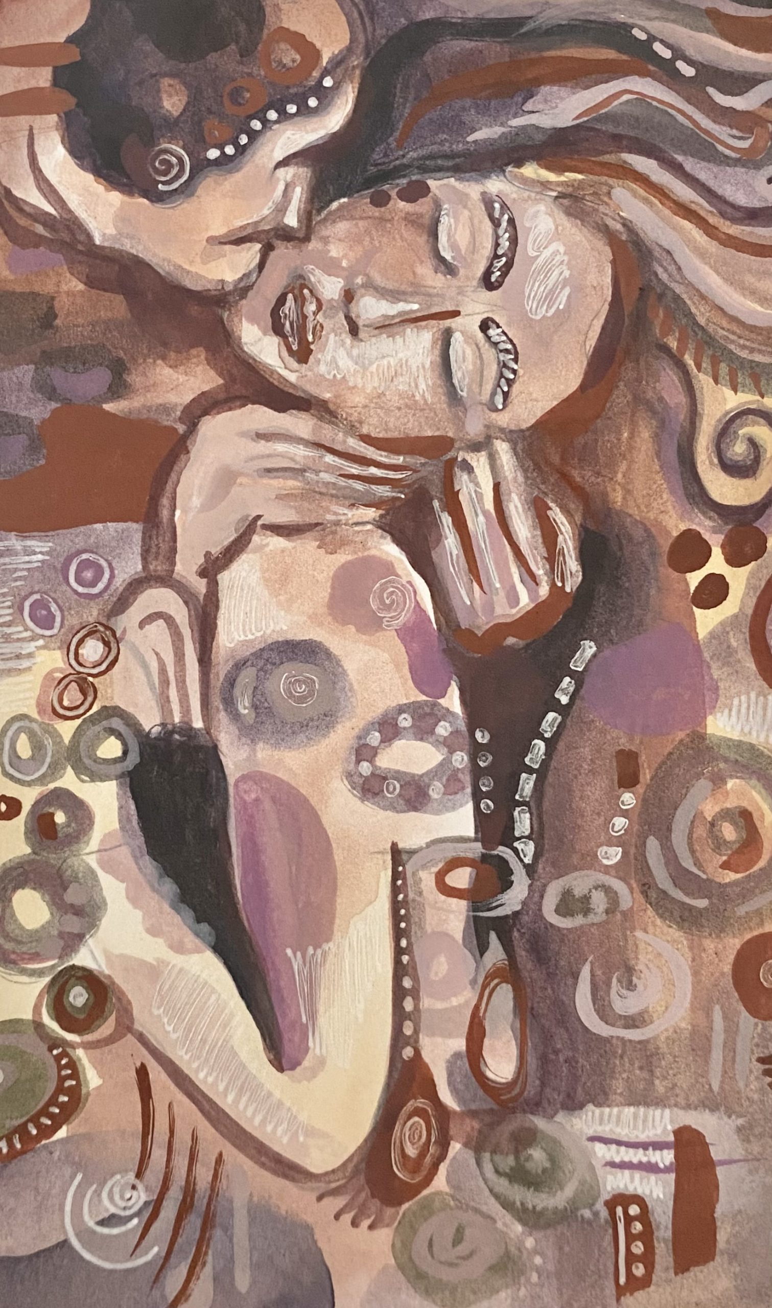
Last but not least, is gouache paint! Gouache is still new to me, but one of the more powerful artistic mediums. I see this medium growing in popularity and I want to experiment with it more. Gouache paint combines aspects of both watercolor and acrylic and allows for many opaque layers added on throughout the process, especially at the end with a fine tip brush.

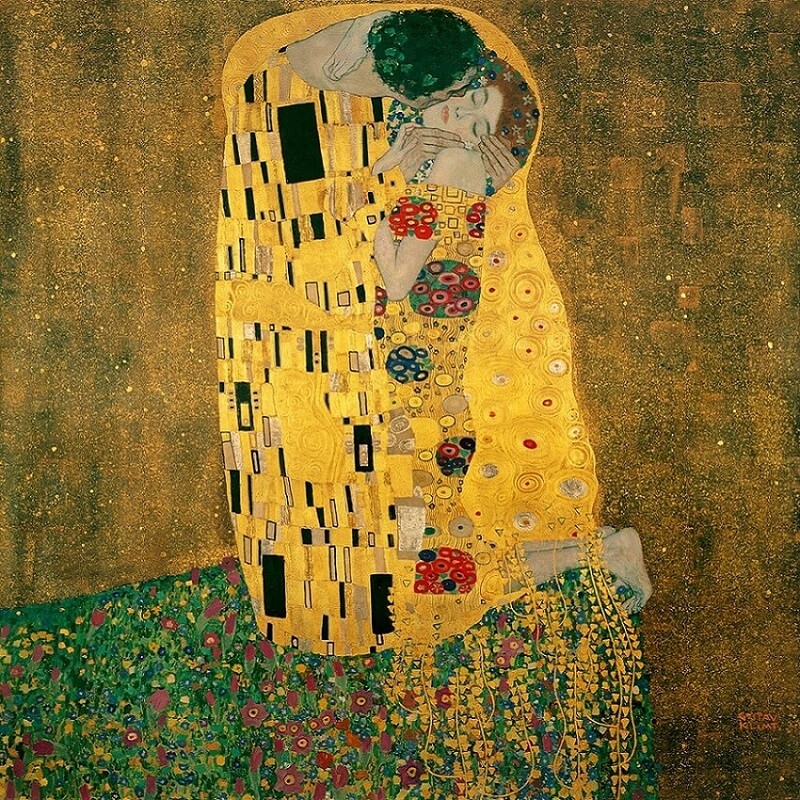
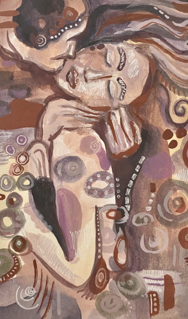
The following painting by me, inspired by the infamous Klimt masterpiece, uses gouache paint and features a couple embracing in a beautiful and intimate kiss. I bought this exact gouache paint set and I really loved it for a starter set. I will admit that I used the white quickly, but I always use white paint more than any other color. For the price and ease, this is a great paint set for any artist wanting to get into gouache.

Inspired by the Kiss by Gustav Klimt, this painting was created in gouache paint and features a couple embracing in a beautiful and intimate kiss. the style has many dots and lines, a stylistic technique I enjoy. This painting is done by Brianna Eisman as part of Artsy Drawings.
The Kiss by Brianna Eisman was inspired by the Kiss by Gustav Klimt.

Gouache’s unique opacity and matte finish give it a distinct aesthetic appeal. Gouache has this masterful ability to provide solid, vibrant colors. Artists can easily apply the paint to various surfaces, including paper, canvas, and illustration boards. The opaque nature of gouache allows artists to correct mistakes or make revisions by simply layering additional paint over the existing layers. Gouache allows for layering and reworking, making it ideal for illustrative works.

One of the key advantages of gouache is its versatility in creating both fine details and bold, graphic elements. Artists can achieve crisp edges, intricate patterns, and precise lines, making it a popular choice among illustrators and designers.

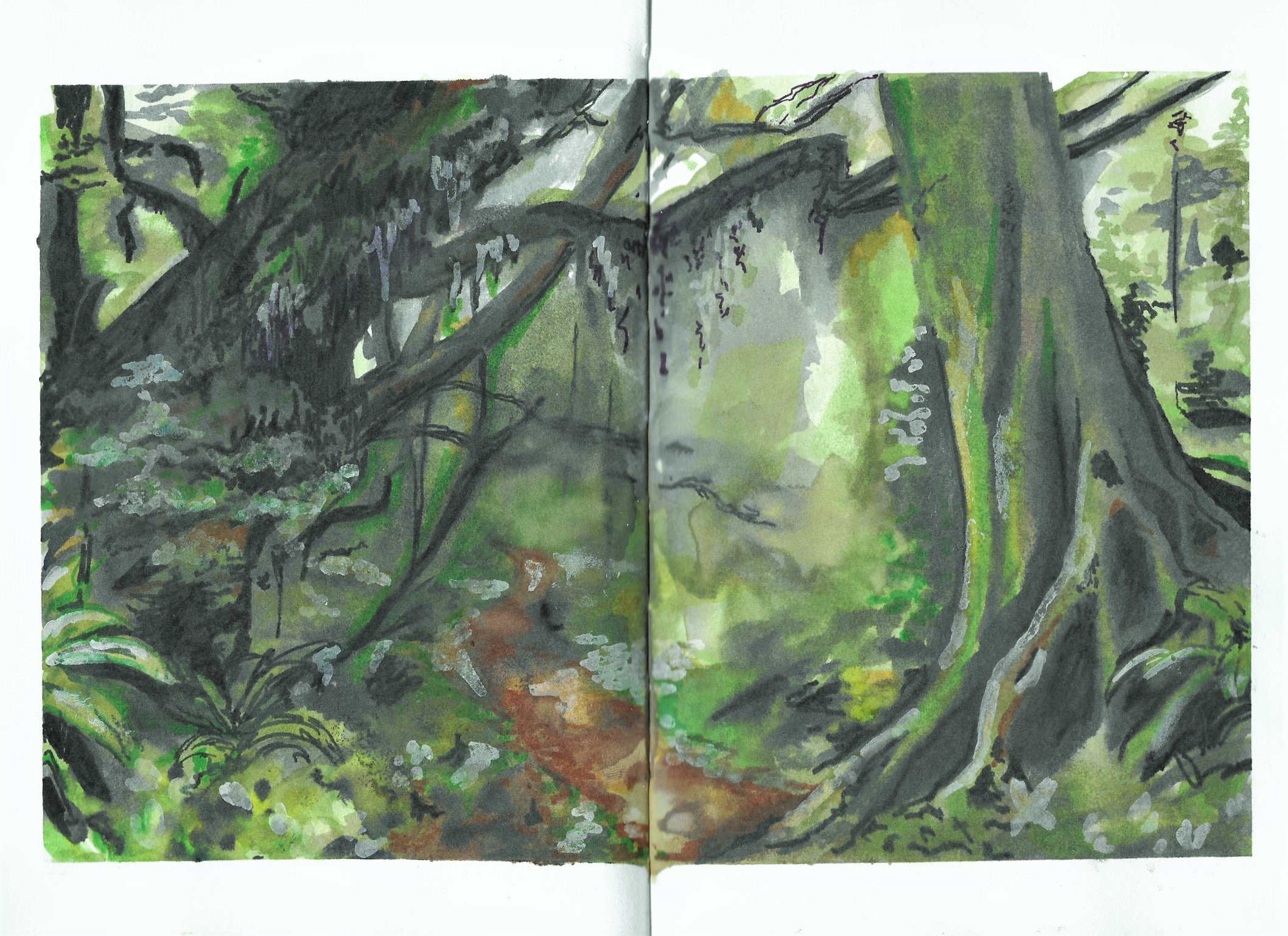
Beautiful Forest by Brianna Eisman was painted using gouache in a sketchbook. The painting was done through Artsy Drawings on artsydrawings.com. The painting shows a green dense forest with large mossy trees and lots of foliage. There is a single brown trail leading through the forest.
Beautiful Forest by Brianna Eisman uses gouache in a sketchbook.

Another noteworthy aspect of gouache is its rewetting properties. As a sustainable artist, this is one of my favorite parts! Unlike acrylics or oil paint, gouache can be reactivated with water, even after it has dried. This makes it possible to rework areas of the painting or blend colors seamlessly, providing artists with greater control and flexibility.

Furthermore, gouache’s quick-drying nature makes it convenient for artists who prefer to work in layers or require shorter drying times for their projects. This quality allows for efficient workflow, enabling artists to build up layers of color and detail without extended waiting periods.

I bought this exact gouache paint set and I really love it!

Conclusion – Favorite Artistic Mediums

Each of these artistic mediums possesses its own unique qualities and appeal, attracting artists with different preferences and artistic goals. Acrylics offer versatility and vibrancy, mixed media enables limitless creativity, watercolor exudes elegance and serenity, pencils provide timeless precision, and gouache showcases boldness and opacity.

These favorite artistic mediums — acrylic, mixed media, watercolor, pencil, and gouache — have captured the hearts of countless artists worldwide, including my own heart. Their distinct characteristics, creative potential, and ability to evoke emotions and narratives make them powerful tools for artistic expression. Please check out my Favorite Art Supplies list and comment below your favorite supplies!

Whether you are drawn to the vibrant colors of acrylics, the multidimensional possibilities of mixed media, the ethereal beauty of watercolor, the precise detailing of pencils, or the boldness of gouache, each medium offers a unique journey of artistic exploration. So, pick up your preferred medium, let your creativity flow, and embark on a captivating artistic adventure.

Not sure which artistic medium matches your art style? Take this quick quiz to better understand your art style!

My 5 Favorite Artistic Mediums: How to Paint and Draw like a Pro Read More »
Is AI art to be a valuable future or a scary end of originality?

Artificial Intelligence (AI) has been a hot topic in recent years, with its applications ranging from self-driving cars to natural language processing. However, AI is not just limited to practical applications – it is also being used in the field of art, leading to the emergence of AI art. AI art is created using algorithms and machine learning techniques, and is becoming increasingly popular among artists and art enthusiasts. But what does AI art mean for traditional artists, and how will it impact the art world?

How do you make AI art?

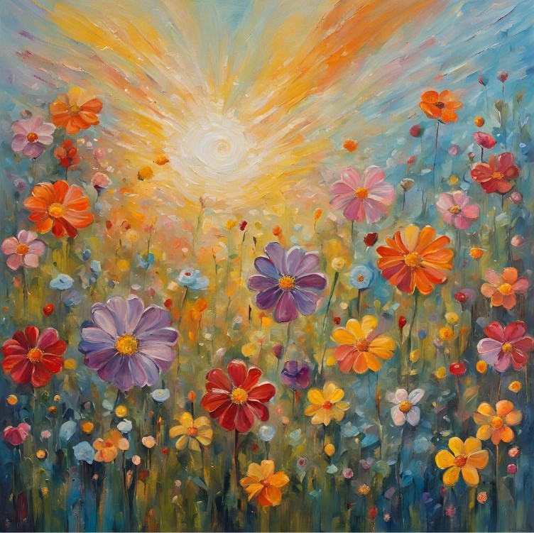
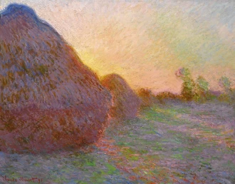
First, it’s important to understand how artificial intelligence art is created. AI art comes from feeding an algorithm with a dataset of images or other visual information. Then, machine learning algorithms generate new images based on that dataset. These images can be completely abstract or can be based on specific styles or genres. For example, an algorithm can be trained to generate new images in the style of Impressionism or Cubism. My own personal style is very similar to Impressionism, though I prefer traditional methods to AI. Check out my gallery here.

Meules by Claude Monet is a great example of the Impressionism style with small, visible brushstrokes that provide the “bare impression of form.”

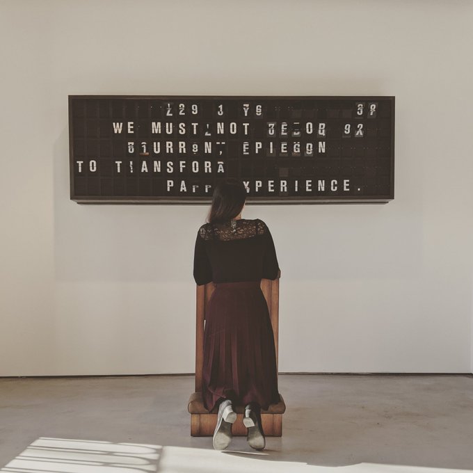
AI art is not limited to still images – it can also be used to create animations, videos, and even music. One example of AI art is the deep dream algorithm developed by Google. This algorithm creates surreal and dreamlike images by analyzing and enhancing patterns in existing images. Another example is the artwork created by Mario Klingemann, who uses neural networks to generate abstract and surreal images.

Appropriate Response by Mario Klingemann poses the question of “how much meaning can you put into 125 letters?”

How will AI art affect traditional artists?

So, what does AI art mean for traditional artists? On the one hand, AI art presents new opportunities for artists to experiment with new techniques and styles. Artists can use AI to generate new and inspiring ideas, or to create artworks that would be difficult or impossible to produce manually. For example, an artist could use AI to research images pieced together as a reference image as the basis for a new painting or sculpture.

On the other hand, art made with artificial intelligence also presents new challenges for traditional artists. With the rise of AI art, there is a risk that traditional art forms may become less relevant or even obsolete. If AI can generate images and other artworks with a high degree of accuracy and creativity, why would people need to commission traditional artists? This is a question that many artists and art enthusiasts are grappling with.

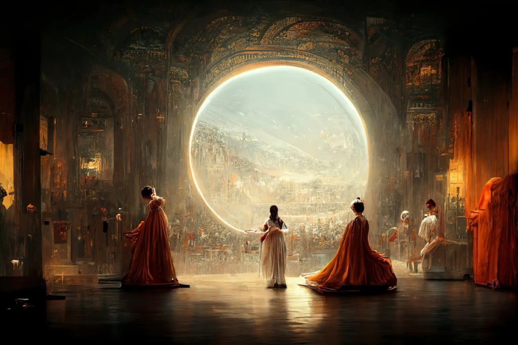
In fact, in September 2022 the New York Times posted an article titled An A.I.-Generated Picture Won an Art Prize. Artists Aren’t Happy. The artist used Midjourney, an artificial intelligence program which transforms lines of text into hyper-realistic graphics. He won first prize — a blue ribbon — in the Colorado State Fair, under the division for “digital art/digitally manipulated photography.”

Théâtre D’opéra Spatial by Jason Allen is created using AI art technology and took first place at the Colorado State Fair.

Have we reached the end of originality?

Another challenge for traditional artists is the potential loss of creativity and originality. If an artist relies too heavily on AI to generate ideas and inspiration, their work may become formulaic and predictable. There is also a risk that AI-generated artworks may become too similar to each other, leading to a lack of diversity and innovation in the art world.

Despite these challenges, many traditional artists are embracing artificial intelligence art as a new tool in their creative arsenal. Some artists use AI to generate new ideas and inspirations, while others are using AI to enhance their existing artworks. For example, an artist could use AI to analyze the colors and patterns in their paintings and then use that data to create a new series of paintings with a similar aesthetic.

AI Art is Here to Stay

In conclusion, artificial intelligence art is a new and exciting field that is rapidly growing and evolving. While it presents new opportunities and challenges for traditional artists, it is clear that AI art is here to stay. Whether traditional artists choose to embrace AI as a tool for creativity or view it as a menace and threat to their livelihoods, there is no doubt that AI will have a significant impact on the art world in the years to come.

Is AI art to be a valuable future or a scary end of originality? Read More »
Words to Describe Art: How to Create an Artist Statement

Tips for Writing an Artist Statement and Effectively Using Words to Describe Art

desk painted in watercolor
Desk Check by Brianna Eisman
As someone who moves rather frequently I document my travels with what I like to call a “Desk Check.” I will draw, paint, photograph, and ultimately document everything on my desk at a certain point in time. This type of artwork displays an intimate snapshot into my life.

Table of Contents

What is an artist statement?
What are the best ways to write a strong artist statement?
How do famous artists describe their art?
What are some of the best words to describe art?
Conclusion

I love the process of creating art. I love the brainstorming session with terrible stick figure drawings, I love the ‘practice stage’ of drawing the same thing over and over again, and I love the final design. Despite the tedious planning stages, I love how those small wobbly drawings in your sketchbook can come to life in a real masterpiece of art.

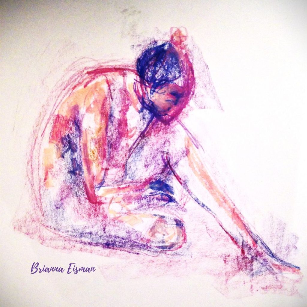
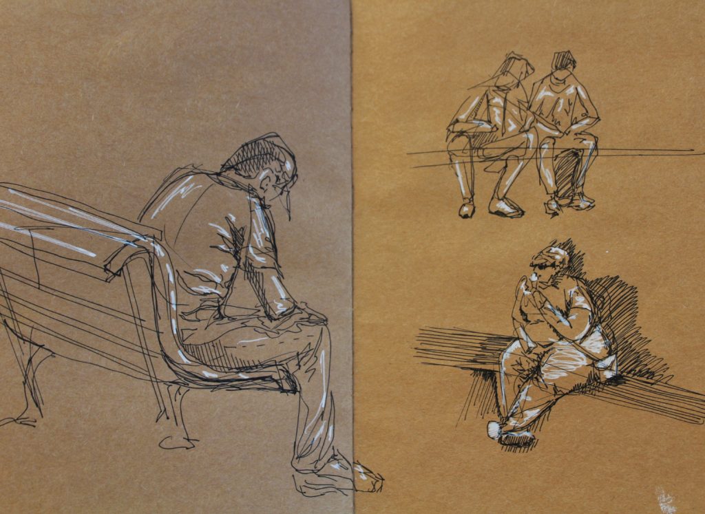
Gesture Drawings of figures sitting and doing normal human things.
Gesture Figure Drawings by Brianna Eisman
Gesture drawings are quick studies of the human form and one of the easiest ways to practice your line work and accurately sketching figures.
~
After visiting the Rijksmuseum in Amsterdam, I sketched a few people sitting around the fountain. I used my brown paper sketchbook to create a mid-tone base, a black pen for shadows, and a white pen for highlights. Not only did these gesture drawings improve my understanding of the human form, but I was able to capture light in a quick and cool manner.

You know what the art means to you, but how do you describe it to others? Also, where do you find the words to describe art, something so subjective and intangible? 

You can Google ‘Words to Describe Art.’ This Google search returns an overabundance of thesauruses and general terms.

google search page screen grab of words to describe art like writing an artist statement
This Google Search shows the results for the search “words to describe art” which include terms like aesthetic, abstract, mural, and contemporary.

While these words are indeed artistically inclined, you want words specific to your artwork, medium, and style. What you need are solid, real tips for writing an artist statement; you want to use the best words to describe art.

What is an artist statement?

“[An artist statement is a] piece of writing by you that helps the audience access or understand your artistic work.” 

School of the Art Institute of Chicago (SAIC)

Basically, an artist statement is a formal way of using words to describe art. Essentially, it is a way for you, the artist, to express the message you are trying to convey visually. 

Many of these words to describe art are generally used for social media and website promotion, galleries, exhibitions, grant applications, teaching position applications, and fellowships.

Generally, I write and rewrite my artist statements on a consistent basis with my social media posting schedule. Please check out my social media to see how I describe my own art.

What are the best ways to write a strong artist statement?

Writing an artist statement is a more complex process than simply using random words to describe art. First, write in first person POV, remember to keep your audience in mind while writing, and follow the acronym K.I.S.S. (Keep It Simple, Stupid). Lastly, I included some good questions to think about when brainstorming your artist statement.

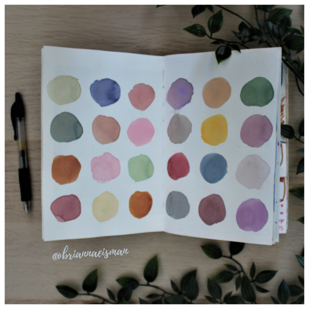
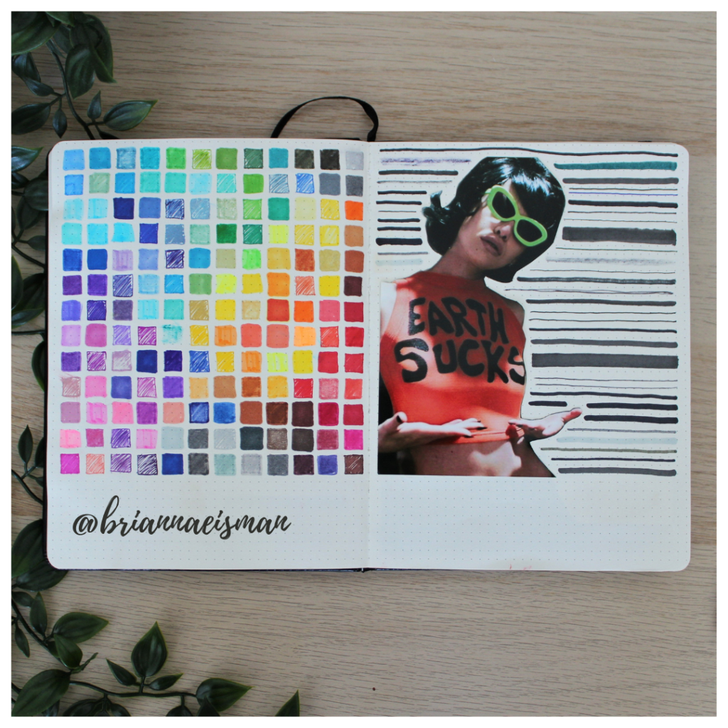
color knowledge example using a marker test with rainbow colors arranged in a color scheme pattern
Marker Test (Earth Sucks) by Brianna Eisman
About once a year I set aside a page in my sketchbook, or bullet journal, to do a marker test. First, I go through every pen I own including Sharpies, highlighters, Bic Permanent Markers, Crayola markers, Stabilo pens, Expo dry erase markers and everything in between. I document the quality and determine whether to keep or toss the utensil. It’s easy to collect art materials, especially when you’re like me and switch mediums regularly. It is important to know that when I reach for a certain pen or marker, it’s going to work the way I want it to. I do keep a page at the back of my sketchbook open for testing mediums, but it’s an important part of the process of creating art to go with the flow and just draw.

Write in First Person Point-of-View

Structurally, the SAIC recommends to write the artist statement in first person. This advice contrasts artist biographies which are typically written in third person. 

For instance, you can say “I created this work to represent…” and “my mother influenced this…”. These examples work well because they help define an intimate connection between the art and the viewer.

Typically, you don’t personally know the viewer, so establishing personalized meaning can add substance to your art. Supporting the connections between the viewer and the artwork is vital in helping people really understand your work.

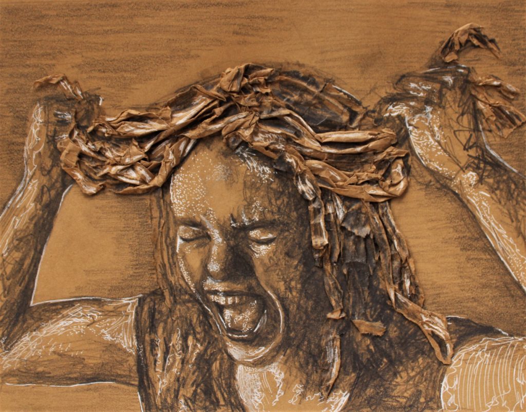
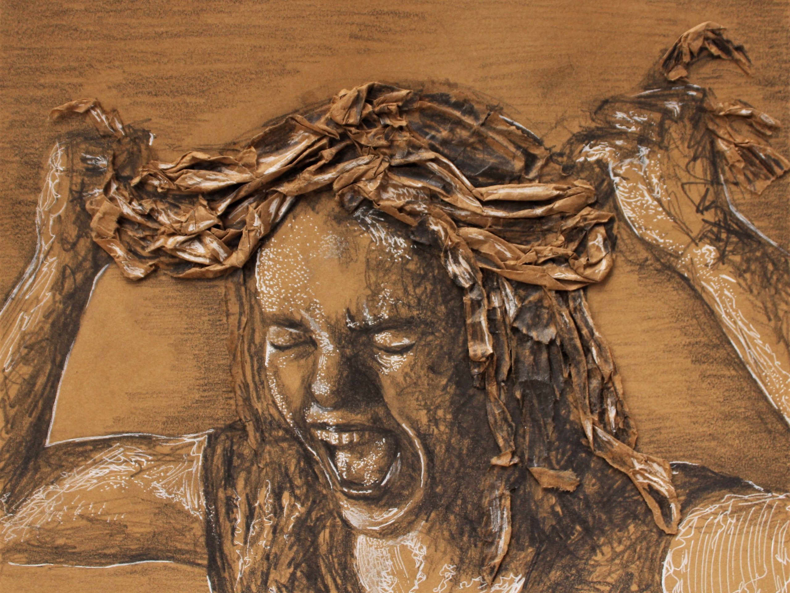
Tension by Brianna Eisman
As art students, we were tasked with creating a work of art, recycling brown paper bags, and expressing ‘tension.’ In the midst of high school drama and stressful testing seasons, I created this mixed media drawing of a woman silently screaming and pulling at her hair, which is made of delicate paper.

Learn to Keep your Audience in Mind

Remember your audience. Who did you create this artwork for? What type of people would you imagine in the gallery looking at this artwork? Who would buy this painting?

The artist statement is sometimes published on social media platforms or printed next to the painting in a gallery. You may be writing to someone who has never held a paintbrush in their life, so keep these thoughts in mind when writing an artist statement. Carefully choose words to describe art that make sense to your audience.

Some words to describe art are different for artists versus non artists. For example, saying a work is impressionistic could mean in reference to the impressionism painting style of the 19th century. In contrast, impressionistic could represent the work’s capability in leaving an impression, or a lasting memory, on the viewer. 

Learning art history is a great method to improve your art lingo. For instance, maybe learn how the difference between modern and contemporary, and how in the art world, they are not synonymous. If you are curious about which art style best matches your artwork, check out this quiz!

The terms ‘modern art’ and ‘contemporary art’ are easily confused, but each refers to its own distinct period in art history,” according to  Rosie Lesso of The Collector

The specialized art jargon, referred to as “art speak,” is great for the critique, though try to avoid it for the artist statement.

The KISS Method: Keep it Simple, Stupid

Basically, try to be concise, straightforward, and as clear as you can. A good rule of thumb is to avoid using too many complex words to describe art, and stick to the basics like colors, shapes, and simple patterns.

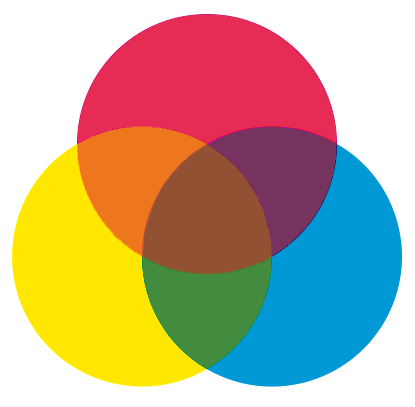
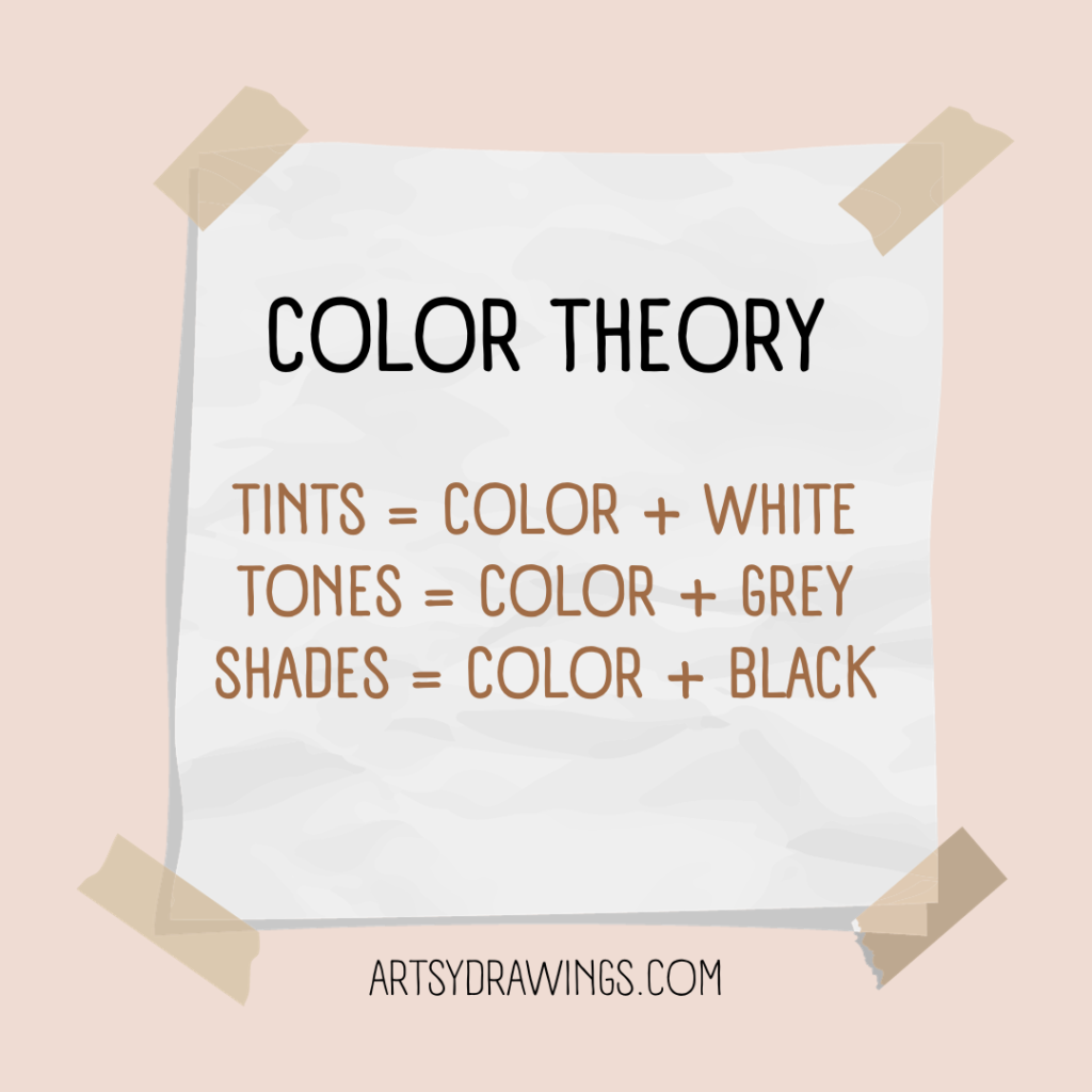
If you are optimizing your artwork for digital marketing purposes, sometimes simply describing the art is better than describing the meaning or the feeling. Using artistic keywords like ROY G. BIV colors and shapes. For more simple color theory tips, check out this blog post written by me: Color Knowledge Tips That Will Make You a Better Artist

Also following SEO guidelines may provide good results.

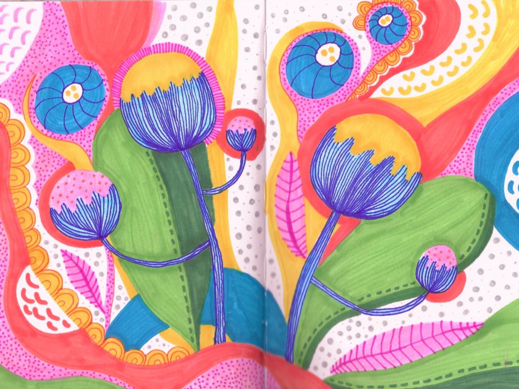
Stylized Poppies by Brianna Eisman
This sketchbook spread features a stylized pattern of colorful poppy flowers. The garden of flowers includes leaves of green, yellow and peach. The flowers are yellow with blue stems. The drawing as a whole has a whimsical and playful feel with a bright color scheme, polka dots and organic squiggle shapes, and blobs of seemingly random colors.

Brainstorming Ideas

Next, find important questions to ask throughout the brainstorming process. Your answers to these questions should include words to describe art and how you created the art.

  • What are the key ideas, issues, struggles, and goals within your work?
  • Does your work have a thematic focus (goals, purposes, intentions, and explorations)?
  • What is the content of work, including themes, ideas, and subject matter? 
  • How were you influenced culturally, historically, theoretically, artistically, personally, and biographically?  
  • Who is your audience? Who will be looking at your work? What do you imagine they feel when viewing it? 
  • How would your audience use words to describe art?
  • How did you create the work? What materials, processes, traditions, and styles did you use in your work?
  • Can you use your senses to describe the art? What does the work look, sound or feel (impasto) like?
  • How can you make your art work easier to understand?

Finally, have a friend or teacher review your artist statement when you finish writing it. You may think the statement makes sense, but it may not be clear to someone who hasn’t spent hours working on the artwork. 

How do famous artists describe their art?

The Masters

Edvard Munch

Many famous artists write artist statements describing their masterful artwork. Some are available in museums, some are available online.

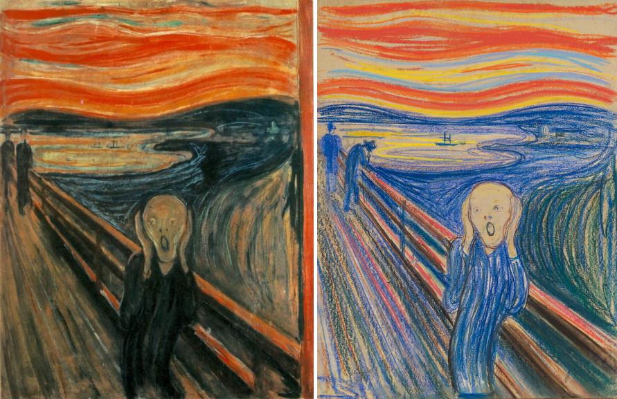
For instance, Edvard Munch’s The Scream has a vivid artist statement full of life and emotion, similar to the visuals seen in the work itself. The artist chose relatively simple words to describe art, but written with dashes, like parsed thoughts coursing through the artist’s head.

The Scream by Edvard Munch
I was walking along a path with two friends – the sun was setting – suddenly the sky turned blood red – I paused, feeling exhausted, and leaned on the fence – there were blood and tongues of fire above the blue-black fjord and the city – my friends walked on, and I stood there trembling with anxiety – and I sensed an infinite scream passing through nature.
Jackson pollock

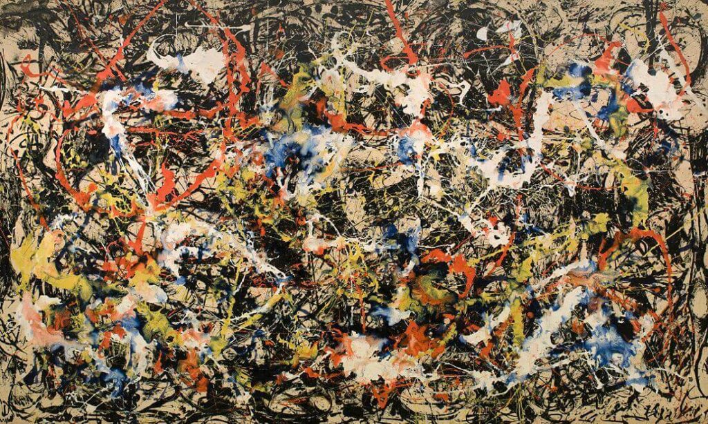
Jackson Pollock remains a fantastic and famous artist, despite criticism for his work’s abstracted and childish features.

Convergence by Jackson Pollock
I want to express my feelings rather than illustrate them. It doesn’t matter how the paint is put on, as long as something is said. On the floor, I am more at ease. I feel nearer, more part of the painting, since this way I can walk around it, work from the four sides and literally be in the painting. When I’m painting, I’m not aware of what I’m doing. It’s only after a get-acquainted period that I see what I’ve been about. I’ve no fears about making changes for the painting has a life of its own.
Louise bourgeois

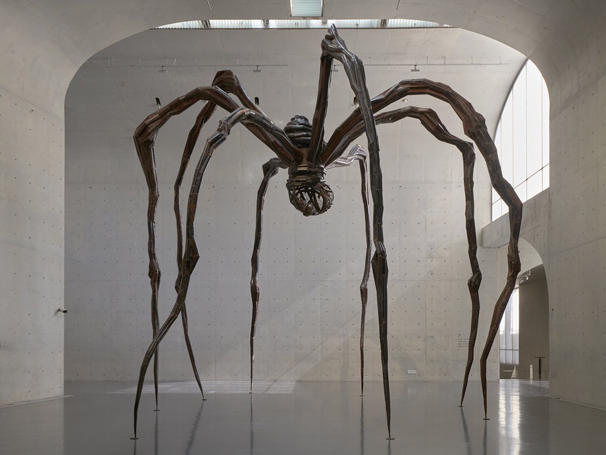
Next, Louise Bourgeois’s massive spider sculptures are really freaking cool and worth sharing. She started creating these steel structures in the 1990s, contrasting her previous styles. The words she chose to describe art explain the metaphorical allegory behind the sculpture.

Spider by Louise Bourgeois
I’ve drawn my whole life. My parents were in the tapestry restoration business, and as a young girl, I would draw in the missing parts of the tapestry that needed to be re-woven. My ability to draw made me indispensable to my parents. I came from a family of repairers. The spider is a repairer. If you bash into the web of a spider, she doesn’t get mad. She weaves and repairs it. ‘The Spider’ is an ode to my mother. She was my best friend. Like a spider, my mother was a weaver. . . Like spiders, my mother was very clever. Spiders are friendly presences that eat mosquitoes. So, spiders are helpful and protective, just like my mother.

Many of these masters use words to describe art with passion, flame, and emotion. Notice how they use first person POV, relatively simple diction, and still manage to communicate what the art is about and what it means to them.

Underrated Artists

I want to include some artist statements of underrated artists as well. I’ve met many talented and creative individuals, and I would like to share their art and artist statements in this section.

AUGUST LAMM

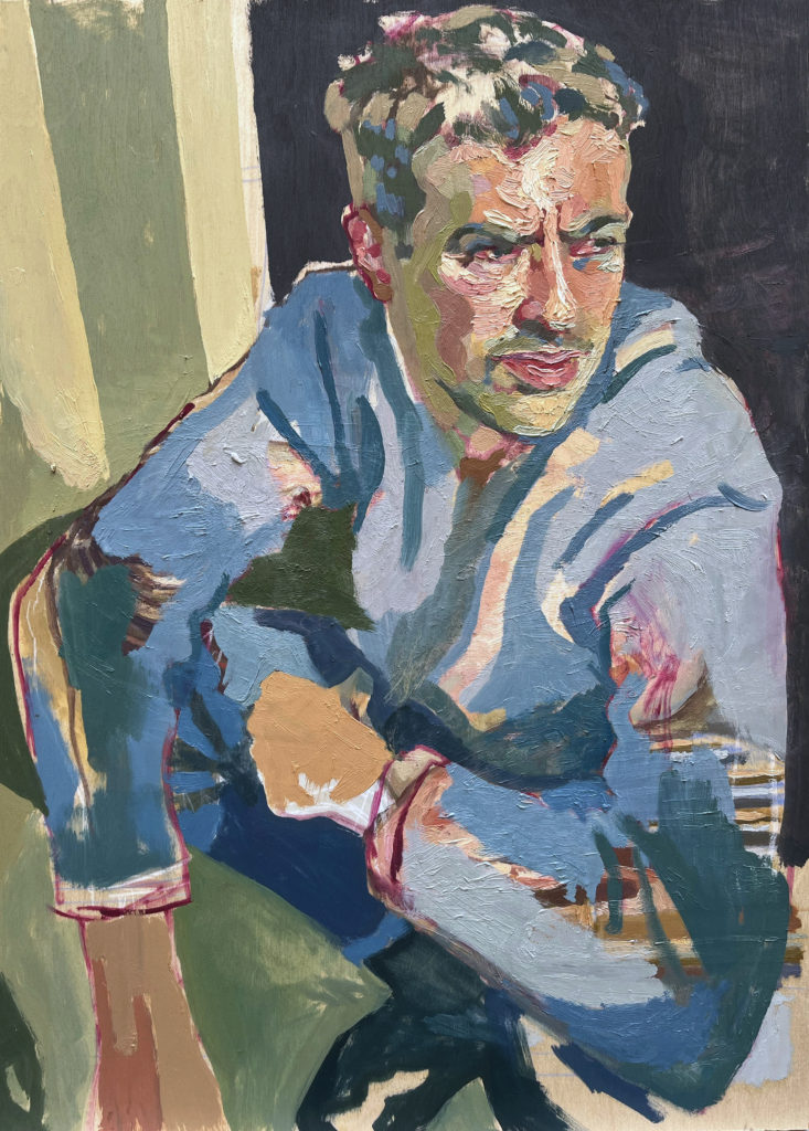
August Lamm is an incredible portrait artist, and I’m very excited to share her artwork. She typically uses ink and oil paints. In this piece, I especially love the use of complementary colors in the man’s face, the contrast of detail versus an almost unfinished impressionistic appearance, and of course, the simplicity of the artist statement. It’s very painterly and I love it. Be sure to check out more of August’s works on her Instagram!

The artist statement included in this painting is short and simple compared to others in this article. Regardless of length, it is powerful and emotional and allows the viewer to connect with the artist, and maybe even the subject, on a more intimate level.

Murray by August Lamm
Sometimes you paint over an old painting and wonder why you waited so long to let go
ERIKA WILSON

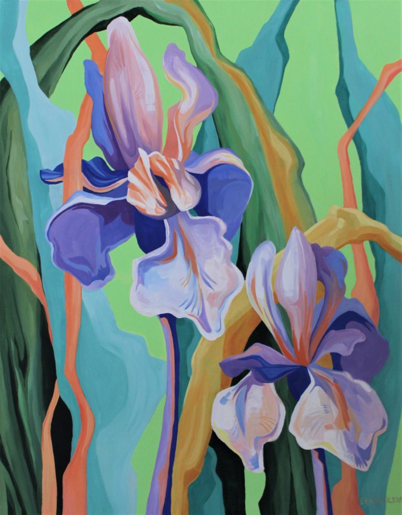
I first discovered Erika Wilson at a local arts market. Her work was captivating and I wanted to learn more about this incredible artist. Erika provided two artist statements, proving her knowledge of writing to a certain audience.

In the first artist statement, notice the purpose is primarily for social media, and make sure to follow her Instagram! Erika uses first person POV and includes the dimensions and mediums used in the work. She also includes emojis and middle dots between paragraphs, a common spacing technique for Instagram, showing that she knows her audience.

There Is Still Time by Erika Wilson
So often I am eager for the future, reminiscent of the past, and losing track of the time in between. Feeling afraid or anxious that I don’t have time for everything. The weighty pressure of needing to make each day count.
.
This painting reminds me that a day is LONG when we are present for it, and immeasurably valuable regardless of what I do during it. Some days are filled with intentional time and mindfulness, some days I am meaninglessly busy and pointlessly stressed out, and some days I indulge in doing nothing at all. All are good days, and there is still time ✨️
.
.
.
“There is Still Time”
22″ x 28″ acrylic on canvas
Available

The next artist statement is noticeably more professional. In particular, notice how Erika adapted the bullet points into dashes and uses clear spacing, giving a cleaner appearance, similar to a resume. Erika’s use of words to describe art discuss her inspiration, techniques, and purpose in under 100 words. It’s simple, effective, and one of the best artist statements I’ve seen.

——————-

Hello! I’m Erika Wilson, a visual artist based in Salt Lake City, UT.

My work is deeply inspired by natural wilderness and the lush, strange, beauty of the botanical world. Equally, my artwork draws from cultivated nature found in urban spaces: gardens, houseplants, and roadside scrub alike.

I use vibrant color and dramatic line to create imagery that provokes wonderment, engages curiosity, and invites viewers to experience their senses unreservedly.

At its foundation, my artwork is a celebration of our intimate connection to nature, in the many forms we may find it, no matter how ordinary or unusual.

———————-

My website: https://erikawilsonart.square.site/

My Instagram: @erika.wilson.art

KYLE DRURY

Kyle and I actually went to the same arts high school. We both studied Visual Arts and I’m really proud to see how he has grown as an artist. Please go follow his Instagram account here!

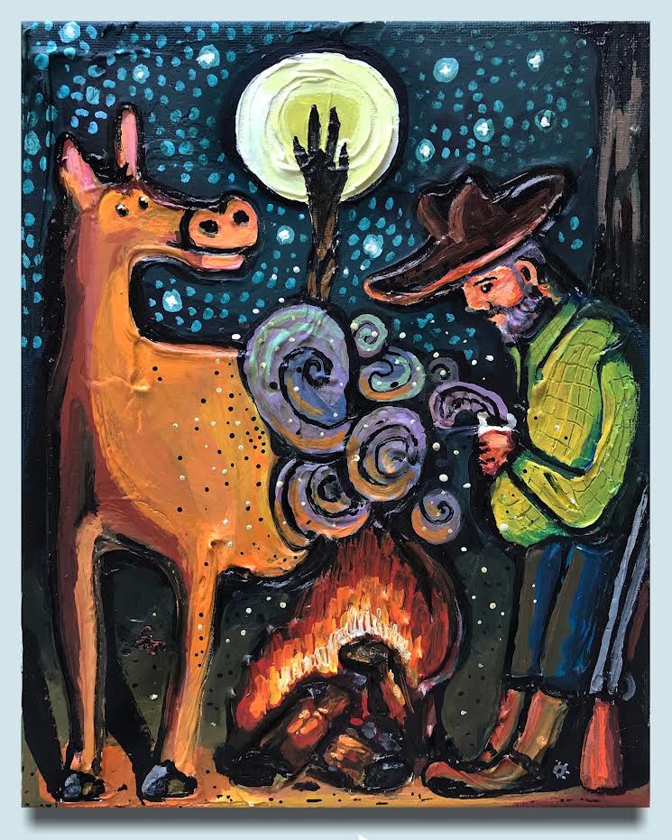
Kyle has a stunning impasto painting technique that really gives life to contrasting flat cartoon-like characters. His works are animated and fun to look at, as well as visually interesting.

Kyle’s artist statement uses first person POV to describe his thoughts and organizes the paragraphs increasing in size. He also continues to deliver contrasting elements. The whimsical and colorful style conveys comfort, in this “cozy painting,” unlike the realities in the life of a western cowboy, portrayed in the serious face and stature of the man.

Campfire Cowboy by Kyle Drury
The Campfire Cowboy is part of a series of paintings I call Worsterns.

I’m thinking about the bad things that could and maybe should have happened to old time cowboys. They’re dramatic paintings of cowboys falling victim to the dangers of the wild west. 


The danger is less obvious in Campfire Cowboy. It’s a cozy painting of a well-fed fella and his horse relaxing and drinking coffee by the fire. Its more about having a feeling that something bad is about to happen instead of witnessing it firsthand.
JULIA HILL

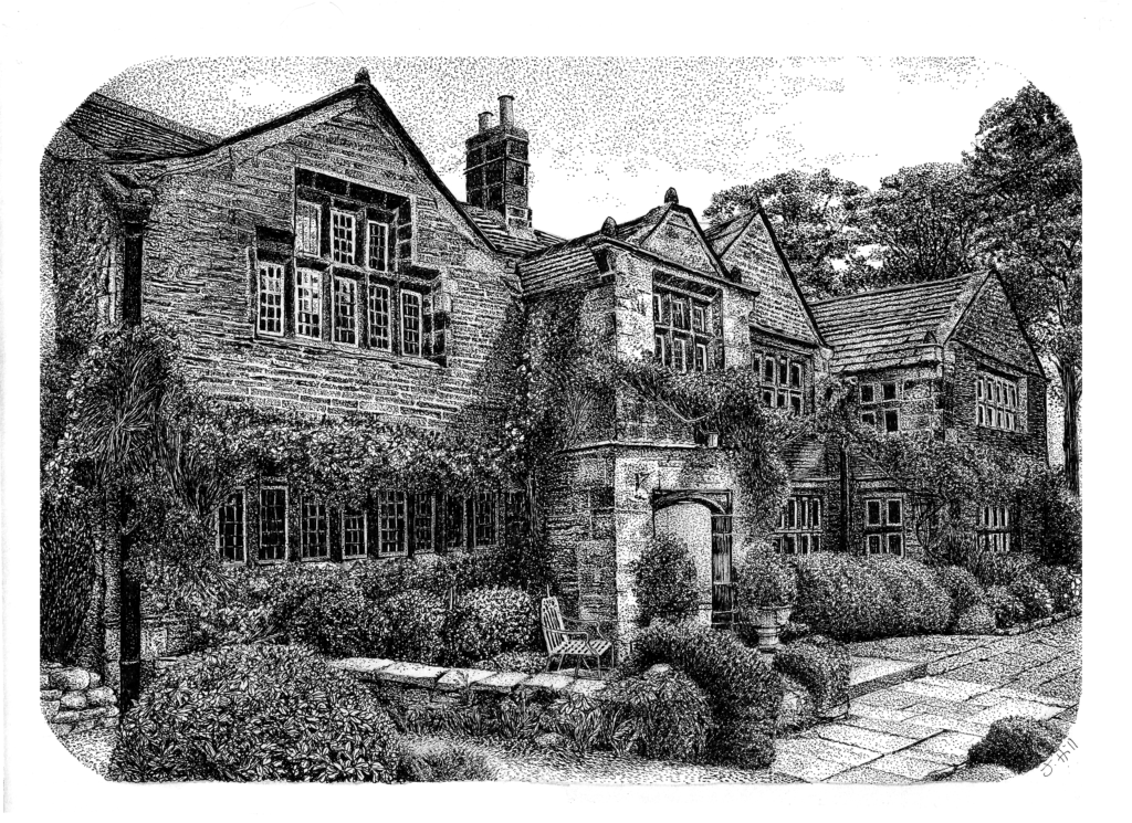
I found Julia’s artwork on Instagram and I was awestruck. Definitely make sure to give her a follow here! She uses fine pens to create stunning realistic landscape drawings.

Her artist statement is also written in first person POV and describes her medium of choice, thoughts behind her style and technique, and how her personal background impacts her artwork. The words to describe art express her talent and experience with the medium, her knowledge of principals and elements of design, and the contextual origin of the content.

Truly, Julia’s words describe the artwork better than I could ever analyze it. This is a perfect example of the importance of an artist statement and how it can compliment the visual artistry of the work.

Holdsworth House - A Place in Time by Julia Hill
Holdsworth House – A Place in Time by Julia Hill
As an Illustrator, I predominantly use fine liners to create my images. I use 0.03, 0.05 and 0.1 black uni pens. I find drawing using a single black line extremely therapeutic and somewhat fascinating. I am driven by the constant complexities of creating depth, texture, light and shadow within my work using only a single black line.  Holdsworth House presented itself to me as a challenge, to combine the solidity of a beautiful structure and the softness of the environment it sits within. 

Nature, the environment, wildlife and botanicals form the basis of all of my personal work. The natural environment has held a particular fascination for me since I was a child. The intricacy of my drawing allows me to connect to each subject on a much deeper level. ‘Seeing’ the intricacy within a form and recreating it with a mix of lines, dots and patterns to create an overall visual effect. My work is not just a simple depiction of the subject I have chosen, but rather a visual expression of my emotional and spiritual connection to what I am drawing.

For more examples of my personal artist statements, please check out my social media platforms.

What are some of the best words to describe art?

In this article we defined an artist statement, discovered tips to effectively use words to describe art, and reviewed examples of artist statements in the wild.

In this final section, we will recall the elements and principles of art and design. These are the building blocks of aesthetically pleasing work, and basic references to use when describing your own art.

To learn more about building blocks of art, and starting out as an artist, please check out the following articles:

The list of elements and principles of art are generally a good place to start when looking for words to describe art. Basically, there are six elements of art and eight principles of art. 

The Basic Elements of Art and Design

  • Color
    • Generally associated with hue, value, and intensity, color is one of my personal favorite elements of art. 
    • Check out examples of color in my art here.
    • I have also elaborated on color theory in the article here.
  • Shape
    • Generally associated with height and width, shape can be organic and/or geometric.
  • Form
    • I associate this element with volume, height, width, depth.
    • It can be two dimensional or three dimensional because it gives an illusion of value (drawing) or real value (sculpture).
  • Line
    • This element is generally associated with being implied, abstracted, parallel, or crossed.
  • Space
    • This element is generally associated with positive (subject matter) and negative (background) areas.
    • Space creates the illusion of depth through value.
  • Texture
    • This element is generally associated with how the art feels or looks like it feels (soft, bumpy, hard, slick, squishy, sharp, smooth).

The Elite Principles of Art and Design

  • Rhythm
    • This principle of art and design is generally associated with patterns, movement, repetition, tempo, and beat.
  • Harmony
    • This principle is generally associated with unification, familiarity, and connection.
  • Balance
    • This principle of art is generally characterized by symmetrical, asymmetrical, and radial.
  • Contrast
    • This principle is generally used to highlight the focal point, or the subject, of a work of art.
    • Pop art is a great example of using contrasting colors, especially complementary colors (colors opposite each other on the color wheel i.e. orange and blue).
  • Movement
    • This principle is generally associated with dynamism and action and helps to guide the viewer’s eye to the focal point.
  • Pattern
    • Similar to rhythm, this principle of design is generally associated with duplication.
  • Proportion
    • Relativity is a huge part of this principle of art and design. It is also related to relationships and size.  
  • Variety
    • Generally associated with diversity and interest, variety captures attention, similar to contrast.
    • Variety partners with unity to establish balance.

Conclusion

You can choose to describe art in any way you want, because it’s your art. You can call it ugly or nonsensical just as easily as you call it stunning and deep and impressive. Adjectives are subjective in the same way you and your artwork are subjective.

However, if you want people to understand your artwork, you may need to clearly communicate what it means. Using artistic terms helps to encourage the viewer to look past the image and think about the process, materials, backstory, and time dedicated to create the art.

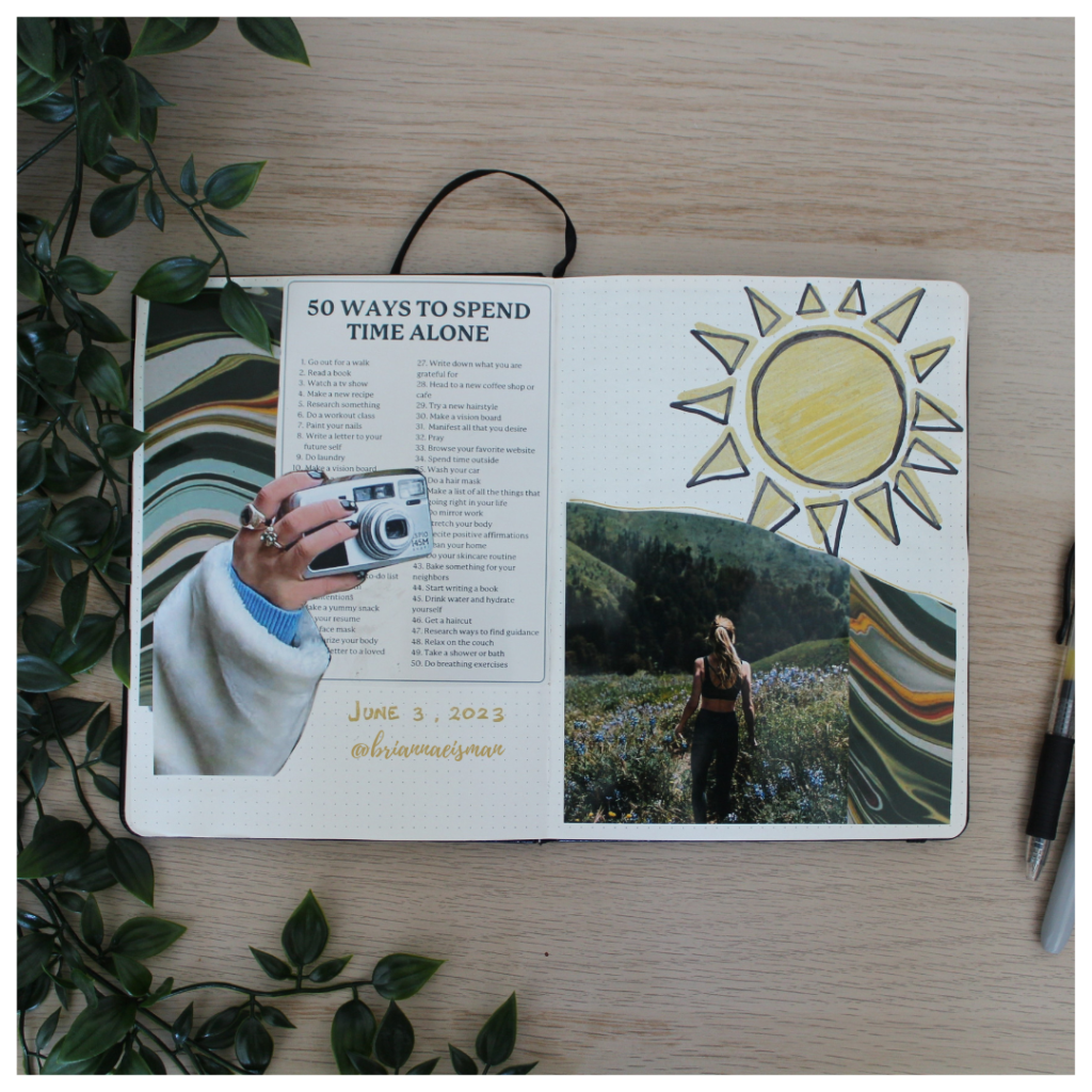
50 Ways to Spend Time Alone by Brianna Eisman
After I graduated college, I felt especially lonely. You go from being surrounded by many curious and exotic people to a much smaller group. And then, you realize working 9-5 means you have even less time to spend with friends. I found this list of 50 Ways to Spend Time Alone on Pinterest. I hope you can use it and learn to love spending time alone as much as I have.

In this sense, writing a clear, optimized, and creative artist statement can add value to your artwork.

Why did the artist choose the colors they did for the different parts of the work? How does the composition move the viewer’s eye around the work? Is there a focal point, a spot where the artist chose for you to look first?

There are many words to describe art, but an artist statement proves unique because it comes directly from the creator.

You, the artist, have the chance to tell the world what your art really means. You are the one to give your art value.

Words to Describe Art: How to Create an Artist Statement Read More »
5 Easy Drawing Tips For Beginners and Intermediate Artists

Are you wondering how to get started as a beginner drawing artist? You may have searched drawing tips for beginners, lineart tips, shading with pencil techniques, or drawing tips and tricks.

Welcome to Artsy Drawings where you will learn those drawing tips for beginners.

Welcome to the world of art, young grasshopper.

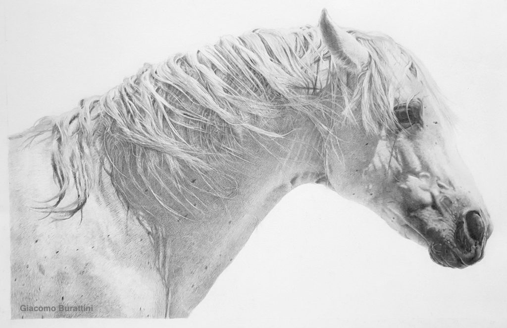
a pencil drawing of a horse helps express drawing tips for beginners
Elegance by Giacomo Burattini

Welcome to the incredible world of art at ArtsyDrawings.com! We are happy to welcome creative spirits, aspiring artists, painters, drawers, photographers, sculptors, printmakers, and lovers of art. It is my hope to teach, inspire, and applaud you for taking steps into the creative realm!

The purpose of this article is to teach drawing tips for beginners and intermediate artists. We will go step by step and cover a myriad of art tips, tricks, and techniques.

We will start with choosing a medium, discuss creating value and using the line weight technique, warn against the dreaded furry kitty, and remind you that drawing and lineart is mark making. Let’s get into these drawing tips for beginners!

Drawing Tips for Beginners 1: Pick a Pencil

Drawing is one of the best ways to get your foot in the door because you can use a wide variety of mediums. You can uses graphite pencils and expensive drawing paper or a ballpoint pen and a napkin. Drawing is the underlying foundation of art, and a great place to start.

Certain mediums and materials can enhance the quality of your artwork simply by using them the right way to get a certain effect. Will we discuss picking a pencil in this drawing tip for beginners.

<img decoding=
Pencil Hardness

Letter and Numbers on your Pencils

This drawing tip for beginners has to do with those letters and numbers on your graphite pencils.

You have seen HB, 4B, 2H, and R2D2, and unless you’re a Star Wars fan, you probably won’t recognize the odd man out. The letters and numbers represent the hardness of the lead in the pencil.

They work on a scale in which HB is in the perfect center and stands for “Hard Black.” This is the typical #2 pencil you probably used in grade school, and a perfectly reasonable tool for extreme calculus problems or drawing artsy drawings.

On opposite ends of the scale are 8H and 8B. I think I’ve come across a 10B somewhere, but honestly, I haven’t found much difference after 8B.

If H stands for “Hard” and B stands for “Black,” an 8H is the hardest lead in the pencil and will create the lightest line.

I have a heavy hand so I typically use a 2H or 4H pencil for my under-drawing and work my way up to the 8B as I add in my shadows and dark tones. I use the drawing technique of working light to dark. The B pencils are softer and can create a darker value because more of the lead is pushed into the paper.

James Portrait – Black and White Detail by Brianna Eisman

Mechanical vs. Wood Pencils

“Mechanical pencils are usually better suited for precision, while traditional pencils are great for laying down large areas of texture.”

Time Von Rueden
a pencil drawing by Tim Von Rueden of a man with many arms stretching out from his abdomen. This drawing shows drawing tips for beginners
Silent King by Tim Von Rueden

Pencil and graphite artist Tim Von Rueden creates stunning detailed drawings that you can see in the example above titled Silent King and on his website. He has a great perspective on mechanical pencils saying they are “usually better suited for precision, while traditional pencils are great for laying down large areas of texture.”

Personally, I do agree with this statement. Most mechanical pencils are classified as an HB #2 pencil. This pencil is a great option for the under drawing before you add a lot of dark tones and shading.

If you do decide to use an HB mechanical pencil throughout the entirety of the piece, it may leave permanent marks in the paper, a shiny finish in the dark shaded areas, and you could accidentally poke a hole in the paper.

All in all, the medium is still up to the artist. You run the show here. It’s your creation and art is about breaking boundaries and trying new things.

Drawing Tips For Beginners 2: Create Value

What is value? I don’t mean the price of the artwork, though I would hope everyone here becomes a famous artist one day.

Value is an element of design that refers to the lightness and darkness of a subject. The illusion of value in a work of art is what makes it look three-dimensional. Value provides the illusion of form.

There are many ways to draw and many more ways to successfully create value.

a pencil drawing by Mariah that features a woman’s face with her hands folded in front of her. This drawing helps express drawing tips for beginners
Fourteenth for JKPP by Mariah

Creating Value with Sketching

My drawing tip for beginners is to focus on finding your own drawing techniques to create value. Some may prefer smoother transitions while others like stippling, hatching, crosshatching and more sketching techniques, where you can clearly see the lines and marks that shade the subject.

a pencil sketch shows drawing tips for beginners featuring 7 square boxes horizontally lined up to show the differences in styles including stippling, hatching, and curved marks
Hatching by Salgood Sam

I recommend playing around with different styles including organic, structured, simple, complex, and making value scales (light to dark gradients) to practice these techniques.

a pencil sketch that features gradients of crosshatching, hatching, stippling (pointillism), and blending to provide drawing tips for beginners that focus on learning value
Value Scale 11 by Julianna Kunstler

Drawing Tip For Beginners 3: Use Line Weight to your Advantage

The next drawing tip for beginners is to use line weight to your advantage to create value.

I started drawing with what’s called “a heavy hand.” My lines were beautiful, clean and uniform, until I realized the portrait head I just drew was disproportionate to the rest of the body so I would have to completely erase it and start over. It is very challenging to erase when you draw hard.

I am not Michelangelo or Picasso, I can’t get away with intentional disproportions in my 2D drawings. Many drawings were lost to the abyss due to inaccurate proportions. Once I had erased and redrawn the piece, you could still see the under-drawing where I had pressed my pencil a little too hard into the paper and created a ghost texture, forever imprinting my mistake into the artwork.

Gesture Drawing

One solution to this issue is drawing a gesture first.

A gesture drawing is a quick, fluid, blog of shapes that resemble your subject. Many times my human subjects will not have details like jewelry or facial expressions. Instead, the focus is on the form of the body, the way the clothes drape, and the subject’s pose.

this drawing shows four gesture drawings of the same figure and pose. Each drawing has progressively more line work, detail, and shading to express drawing tips for beginners that focus on learning value and gesture drawing.

In gesture drawing, the repeated lines create value as you form the shape of the figure.

My next drawing tip is to practice line weight to gain control. This was a practice I really enjoyed in art school. We used line weight to create form in a 2D drawing.

Use graphite or pencil to start.

You start drawing very light and gradually press harder on the pencil creating a value scale line until the mark is as dark as it will go. This is your gradient scale to start your drawing. If you’re drawing a sphere, press harder to create a darker shade for the shadow and lighten your pressure for the lighter side of the sphere.

Below is a photo of four shell drawings I did using line weight. The “head” of the shell where the ridges come together was the most in shadow, so I pushed my pencil harder into the paper to create a darker line for that area.

Weighted line practice with the subject of shells helps express drawing tips for beginners
Weighted Line Shells by Brianna Eisman

When you’re choosing a subject for this practice, focus on something with a lot of form and a range of light to dark value. Shells provide organic and wavy lines showing value, making them the perfect subject to practice this technique.

Drawing Tip FOr Beginners 4: Avoid the Furry Kitty  

One of the first drawing tips for beginners I learned in art school was to avoid drawing a furry kitty.

At first I thought my teacher hated cats. Then, she explained that ‘furry kitty’ is a drawing technique. She wanted me to improve my linework by avoiding a poor drawing technique.

‘Furry Kitty’ is a technique using short strokes to create the shape. The result is a scratchy sketchy-like drawing that often gives an unfinished appearance.

Not only is ‘fur’ a distraction, but it uses a lot of graphite material and can lead to easy smudging. We don’t like accidental smudging and fingerprints on your artwork! It’s messy!

Visual Confidence in Art

Avoiding the furry kitty is also a lesson in becoming more confident in your line work, and by extension, your creations.

Imagine drawing a circle. Whether the circle is for a character’s head, a joint in their arm, or the wheel of a car, circles make up the basis of many forms in our worlds. If your drawing of a circle turns out like an oval or some type of warped sad potato, that’s okay!

Draw your “circle” again over that sad potato. The more you draw the circle over and over again (lightly!), it will eventually look symmetrical enough to actually look like a circle. This method is also the main theory behind gesture drawings.

Gesture Drawings of figures sitting and doing normal human things.

Gesture drawings are quick sketches to improve line quality, hand-eye coordination, and an easy way to get better at art quickly. This method will also help with your drawing and painting skills in the long run.

The artist Love Life Drawing talks about his strategies and suggestions for becoming a better artist in his article here. I really like how he encourages ‘smart’ practice and advises gesture and figure drawings to learn how to draw.

Drawing Tip for Beginners 5: Drawing is about Mark Making

One of my favorite responses when I show people my art is “Wow! I can’t even draw a stick figure!”

Creating a drawing is all about mark making, and that includes drawing stick figures. It is the act of putting the pen to paper, pushing and pulling down on the utensil, and actively guiding the pen to create a work of art. It about being deliberate in creation, as Salgood Sam states in his blog Deliberate Focused Practice.

To accommodate proper practice attitudinally, I make a point that there is a difference between Doing, and Practicing.

Salgood Sam

Do not be afraid to make marks.

Artists are pioneers, explorers, scientists. I’ve spent way too long watching a blank canvas, trying to figure out what to draw. Honestly? If you are ever stuck with artists block, remember that art is about mark making.

a page of marks to express the drawing tips for beginners that drawing can be as easy as putting squiggles on a page. It has heavy, light, straight, curvy, zigzag, and circle marks

Once you start drawing, it’s much harder to stop. So pick up a sketchbook and be inspired:

  • Make a page of intentional marks: curly, straight, squiggles, zigzags, thick, thin, scratchy and smooth.
  • Practice line weight
  • Practice using different pencil leads.
  • Try out different shading techniques using the same subject (like a sphere or egg)
  • Draw a chair, a plant, your hand, your dog
  • Draw yourself in a mirror
  • Look up things to draw
  • Create a drawing upside down
  • Trace an image using a window to work on your line work

Learning art is work. It takes time and practice and perseverance.

But, through it all, it is extremely rewarding. To look back as a work of art that you created is the most incredible feeling of accomplishment and pride.

Someone said a passion is what you enjoy doing that has no purpose except to make you happy. I know you’re passionate about art, that’s why you’re here. Let’s do something about it and start creating.

5 Easy Drawing Tips For Beginners and Intermediate Artists Read More »