Author name: Brianna Eisman

Hi, I'm an artist, web designer, analyst and avid adventurer. I enjoy finding the beauty in the world and sharing it with others.

How to Visualize Data as a Multi-Skilled Artist

This article may be a little different from others on this website. Typically, I try to write about art history, unique styles and creative techniques, and while data visualization feels somewhat foreign to a traditional painting and drawing artist, I believe it’s a necessary skill for the future of promoting and sharing art.

I have my Masters of Science degree in Business Analytics, and took classes in data analytics, visualization, and programming. However, I understand that many artists pursue art degrees. So I’m here to explain, as best I can, why artists should learn data visualization skills and how to merge creativity, color theory, and analytics to visualize data as an artist.

Visualize data part 1: What is data visualization

I assume you know what data is; heck, you probably learned Excel before cursive. Data visualization is essentially the process of transferring records of information into a summary chart or graph.

When you paint with acrylics, you build the painting. You start with the underpainting and add shadows and mid-tones and lights to eventually tell a story. To visualize data, you use a similar process, except with pieces of information, added one by one, to tell a story.

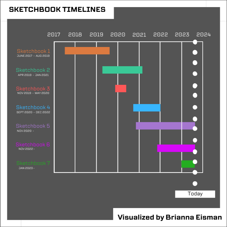
I keep track of when I start and end my sketchbooks, and in Fall 2023, I recorded the data in a Gantt chart, seen below.

Gantt Chart showing Sketchbook Timelines ending Fall 2023

This visualization shows that since 2017, I take around 2 years to complete a sketchbook, and work on 2-3 sketchbooks at a time. During the pandemic, I completed Sketchbook 3 in about 7 months, and started 2 other sketchbooks during 2020. But, why does this matter?

I visualize data to tell a story to improve my skills. This visual allows me to clearly see the speed at which I complete sketchbooks; this is the story. These sketchbooks are around the same size, with the same number of pages, so I can estimate how much artwork I can produce in a given amount of time. In order to expand my art business, this is a necessary metric to know in order to manage my time appropriately.

Visualize data part 2: Why is data visualization important

In truth, you don’t need to know how to visualize data to be a good artist. But, if you want to make money with your art, it may be a good skill to learn.

I adopted a social media marketing strategy and use app-provided analytics. I use many platforms, but in this article I will focus majority on Instagram and Pinterest. Social media platforms typically record insights like accounts reached, accounts engaged, profile activity, and advertising results.

Let’s break this section down into three parts: growth, engagement, and connections.

1. Growth

The first step in building a brand or starting a business is growth. You want people exposed to you and your product. Personally, I chose a digital marketing strategy. I built my website, ArtsyDrawings.com, and directed everything to this one place. I also started many platforms including Instagram, Pinterest, TikTok, RedBubble, Doodle Addicts, Pexels, Reddit, and Buy Me a Coffee.

To learn more about how I built my brand, check out my article 19 Ways to Improve Your Personal Brand.

Growth is measured by impressions, and I’m proud to show 98,000 impressions over the past month on Pinterest.

Pinterest Impressions March 19 – April 18 totaling 97,979.

2. Engagement

Growth is important, but so is engagement. On Pinterest, engagements are “saves, Pin clicks, outbound clicks, carousel card swipes, clicking a link,” etc.

While my Pinterest shows 98,000 impressions, it also shows only 2,500 engagements over the same period. So roughly 2.5% of my impressions are leading to engagements. And wait… that’s interesting…this line graph looks very similar to the impressions line graph above. This data visualization shows a possible correlation between impressions and engagement.

Pinterest Engagements March 19 – April 18 totaling 2,568.

So, then how do I improve my engagement rate? This starts with finding your target audience and marketing your business towards them.

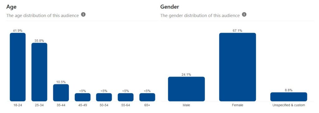
Both Pinterest and Instagram visualize data insights for your target audience’s age and gender. These are called audience demographics.

visualize data as an artist by first discovering audience demographics
Pinterest Insights show age and gender distributions for my audience.

Pinterest shows 77.7% of my audience between the ages of 18-34 and Instagram shows 85.6% of my audience between the ages of 18-34. Both accounts also show my audience is majority women.

3. Connections

Once I was able to target my audience, I tuned my business to accommodate this group of people. Establishing and growing these connections led to more business.

First, I realized that I fall into my target audience in terms of age and gender, and I assumed many of my followers were friends, family, peers, and coworkers I had met in person over the years.

Next, I created a free email subscription for people who want to know me on a more personal level. Every month I send out an Artsy Drawings Newsletter highlighting the art I created recently and updates to my website. For this newsletter, I’ve recorded a 64% open rate and a 12% click rate since August of 2023.

If you are interested in joining my Artsy Drawings Newsletter, please subscribe below!

Subscribe

Sign up for my monthly newsletter and stay up to date

*

By better understanding my target audience and app-provided visualizations, I’m able to share my art with people who support me. This is one of many ways how I benefit from knowing how to visualize data as an artist.

Visualize data part 3: Social Media is not on your side

I want to be honest with you. Social media is a nice serotonin boost for my ego, and it did help me understand my target audience. However, social media metrics are designed to confuse you, and tend to tell the story you want to hear, not the actual story.

I recently learned Instagram does not record insights in your time zone. So, when you look at the app-provided insights, the bar graph showing the most popular times for your audience, may not be recorded accurately. Instead, “Facebook and Instagram’s APIs format all of their data to match the time zone at their headquarters (UTC -8:00 or UTC -7:00 during daylight saving time).” Ironically, this tidbit is not listed in the help section of Instagram.

Likewise, Instagram lacks certain details when they visualize data. The app tends to leave out axis titles and specific units of measure. While I can see that my followers are most active between the hours of 6am-6pm, the visual does not specify the unit of measure. What metric represents activity?

Recording your own data is necessary to beat the algorithm

So, if social media is not providing accurate data, then I must rely on my own data collection. As an artist, I find knowing how to visualize data effectively and accurately is a necessary skill to beat social media algorithms.

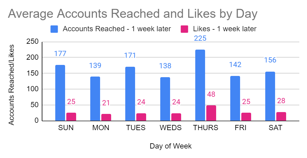
According to Instagram Insights, the best day for me to post is Saturday, with Monday as a close second. According to my personal data collection, and the visual I created below, Thursday is by far the best day for me to post. Instagram is most likely inaccurate because the data can only pull 90 days back, while my records started August 2023, around 260 days ago.

Seasonality, posting frequency, holidays, media type, and changes in the algorithm can all impact this data, so having more data is more accurate. Recording my own information helps maintain my accuracy when I visualize data.

I created this data visualization to find which days are best to post on Instagram. For my account, Thursdays tend to have more engagement than any other day.

You’ll also notice on the above graph that my Accounts Reached averages significantly more than the likes I’m receiving. I’ve done extensive research, and the best theory I have to justify this trend is changes in the Instagram algorithm. You see, I solely use organic search on social media, meaning I don’t buy ads to promote my posts and I don’t buy followers or likes. My theory is that the platform wants me to spend money and is reducing my reach until I do.

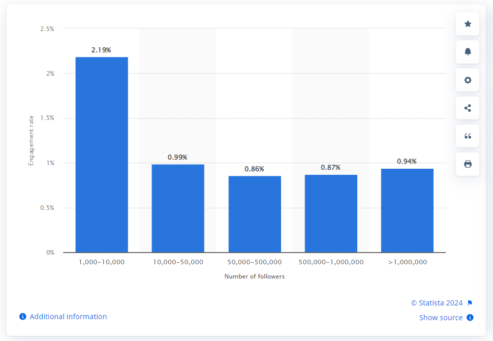
There’s no way to prove why my engagement appears low compared to my impressions, but compared to larger accounts, my rates are actually high. The below visualization shows global Instagram engagement rates in 2023 for accounts with 1000+ followers. Comparably, my average engagement rate is currently 15.4%.

Instagram influencer engagement rates worldwide in 2023, by follower count (Published by Valentina Dencheva, Mar 25, 2024)

Visualize data part 4: How to start recording data

So how do you record data? I think the best advice I can provide is to try different methods and see what works best for you. One of my favorite parts of data visualization, is that you choose the question and the data will tell the story. You can ask about social media metrics or website performance or how many times you eat vegetables in a month. You can record how long it takes you to complete a painting. You can record how many paintbrushes you own and which types you use the most.

Data visualization is a beautiful technology that we have access to. It’s a way of recording behavior and showing trends in contributing factors.

Recording online data

Personally, for website and social media metrics, I like Google Sheets or Excel and create visuals using internal charts and Pivot tables. If you collect big data, programs like Tableau, Power BI and JMP may be better options for visualizing your data.

I create a different worksheet for each platform and columns describing the metrics that platform uses. Keep in mind, it’s not wise to compare different platforms’ metrics to one another. For example, you should not compare Instagram likes to Pinterest saves to Reddit upvotes, there are just too many variables involved.

I tend to choose a date once a week to record my data. This helps me manage my time best, and not overwhelm myself by feeling I have to record everything all the time. I use Google Calendar to schedule posting, data collection, and email newsletters.

As an artist, I strive for beauty in my creations, and this remains true for when I visualize data. I enjoy choosing how to format the data in a visually pleasing and effective way. Here are some tips to visualize data:

  • Use branded colors to your advantage
  • Use colors that work well together (color theory)
  • Remember that pie charts are visually hard to understand if the numbers are close
  • Use San Serif fonts for headers and Serif fonts for paragraphs
  • Add axis titles to clarify units of measure

Recording personal data

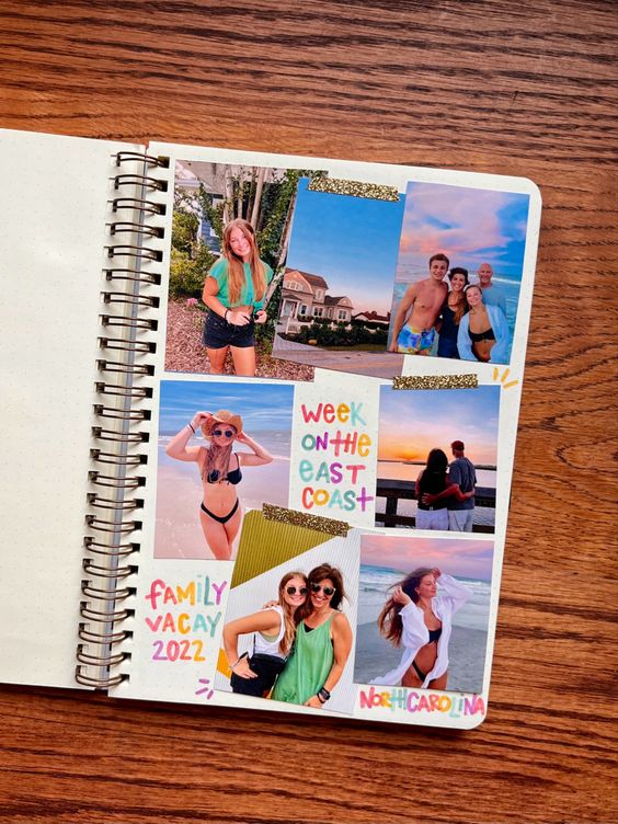
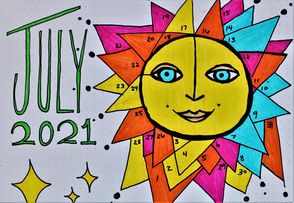
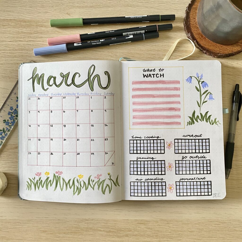
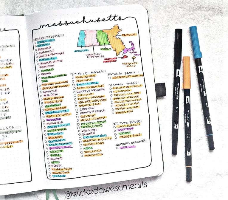
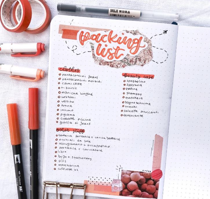
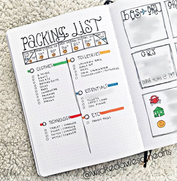
One of my favorite ways to record and visualize data is through a bullet journal (BUJO). As an artist, I like physically drawing the charts and calendars, choosing color schemes, and having a bit more flexibility when it comes to the actual data visualization side of things.

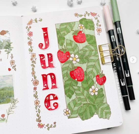
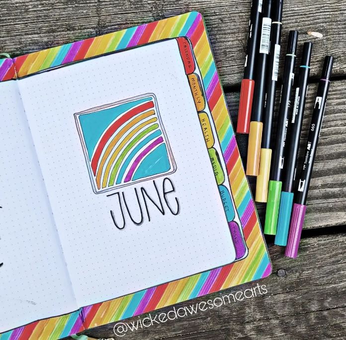
My March 2024 Bullet Journal cover page featured a calendar, a list of movies to watch throughout the month, and six habit trackers.

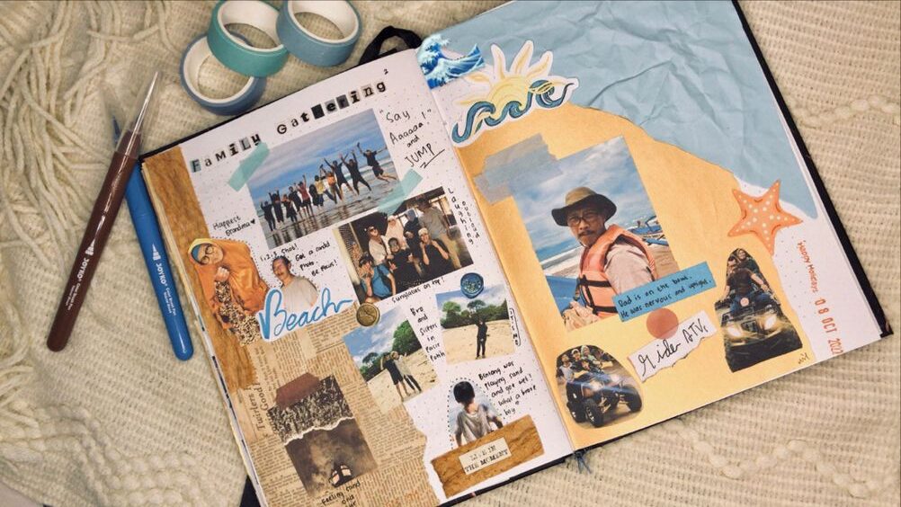
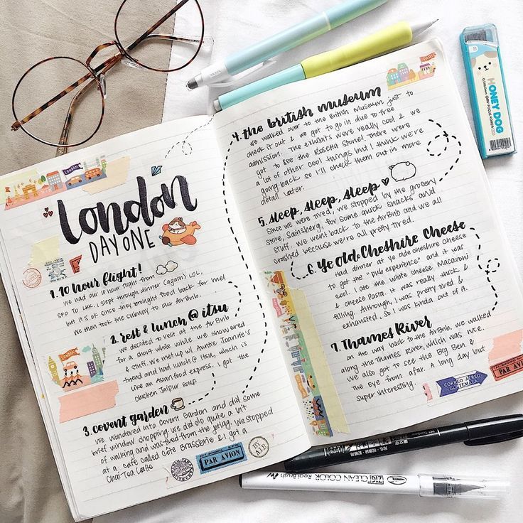
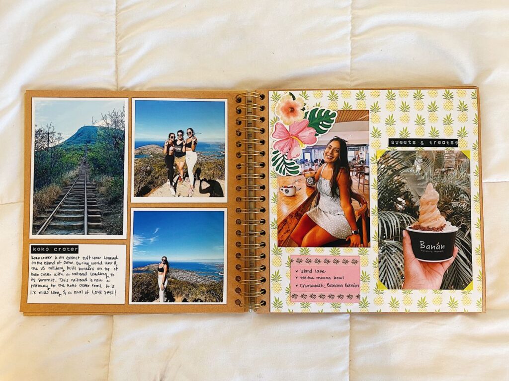
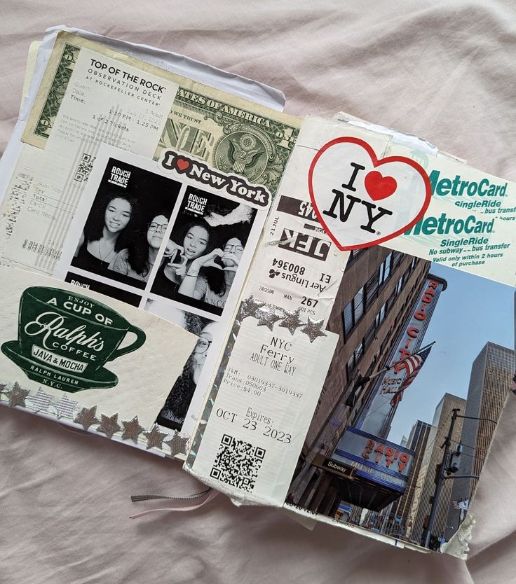
In my bullet journal, I record metrics like Pinterest trends, daily habits, mood trackers, workout schedules and songs I listened to that month. I scrapbook my vacations and trips, my fortunes from fortune cookies, and random scraps of paper from my life. By the end of the bullet journal, I have a beautiful record of my feelings, habits, printed photos of friends and family, and essentially a visual snapshot of my life.

Conclusion

Data visualization is an incredible technology for understanding behavior and factors involved in change. As artists, you have the keen abilities to make visuals aesthetically pleasing, which is often taken for granted in the business and technology world. It is my hope that you will use these skills to visualize data to make yourself and your art more valuable.

How to Visualize Data as a Multi-Skilled Artist Read More »
How can drawing make you a more successful artist?

Introduction: How do you become a successful artist?

Why is drawing important? What does it teach you in the long run? Why does it seem like drawing is the beginning step in becoming a successful artist? What does learning about art have to do with becoming a better person? Why is drawing important to beinga successful artist?

It is my goal to attempt to answer these questions by the end of the article. Whether you are just starting out, or a seasoned professional artist, it is important to know the base skills that drawing provides. Overall, drawing is important for several reasons, from cognitive and emotional reasons like self expression and to help release stress, to practical domains like improving hand-eye coordination and motor skills.

For a list of tools and mediums I recommend, check out my Favorite Art Supplies list and this article about my favorite paints and drawing materials.

If you are interested in learning more about basic drawing and painting skills, please check out my Art Advice page. If you are a beginner artist, I recommend 5 Easy Drawing Tips and How to Create an Artist Statement. These are great resources to becoming a successful artist.

Drawing is a form of Self expression

Drawing allows individuals to express themselves visually, providing an outlet for emotions, ideas, and experiences that may be difficult to convey through words alone. It’s a form of non-verbal communication that can be powerful and evocative. The article from Arts Academy in the Woods puts it perfectly:

“Art gives us a way to take a painful thought out of our heads and put it onto a page or into a drawing, painting, or performance. It thereby releases the emotions around that thought and gives it less power.”

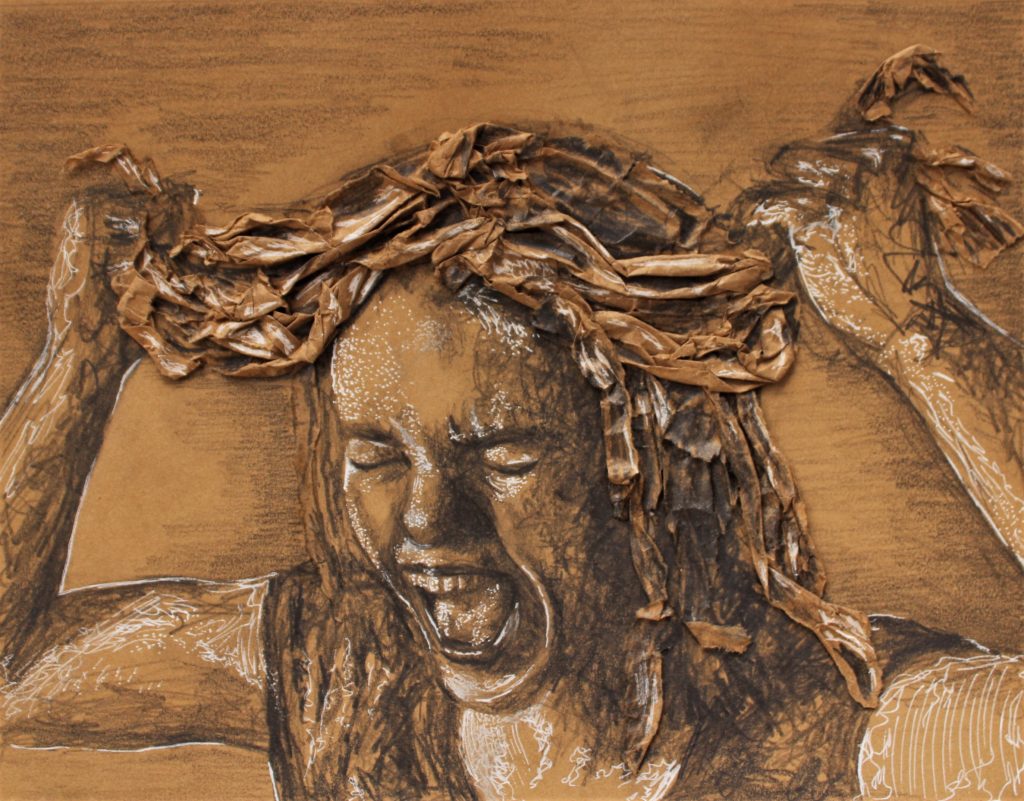
Brown and white artwork of stressed out woman pulling at her hair
Tension, 12″x10″ graphite and white pen on paper by Brianna Eisman

Drawing inspires creativity

Engaging in drawing stimulates creativity and imagination. It encourages you to think outside the box, explore new ideas, and experiment with different techniques and mediums. I first found a passion for art in school. Whenever I finished a test early, I would flip the page to the back, and doodle, sketch, and draw anything and everything I could imagine. Creativity is a skill, just like riding a bike or learning to code, you must practice being creative and using your imagination.

I believe that you truly become a successful artist when you make a mistake and have to think of a creative solution to fix it. This creative process teaches problem-solving skills, and I have found these skills help in many other areas of my life too.

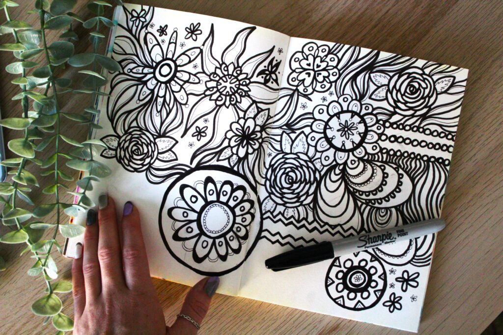
draw more and become a successful artist! black and white pen marker drawing with organic shapes and lines by Brianna Eisman
Draw More, Sharpie and pen on paper by Brianna Eisman

Drawing improves observation

Drawing enhances observational skills as it requires a keen attention to detail, proportions, shapes, and spatial relationships. Performing blind drawing studies especially expedites this skill, and is key to becoming an experienced and successful artist.

Through practice, successful artists learn to perceive the world more deeply and accurately, honing their ability to notice subtleties and nuances in their surroundings, and in other people.

Drawing is a type of therapy

Drawing has therapeutic benefits and can promote relaxation, stress relief, and emotional healing. Many people, including myself, use art as a form of self-expression and introspection, finding solace and catharsis through the act of creating art. It’s also a sort of meditative process, especially one away from a digital screen.

Drawing is a Universal Language

Visual representations can transcend language barriers. Drawing was first used as a form of communication to pass down verbal stories through generations. The caves in Lascaux, France contain around 2000 Paleolithic cave paintings estimated to be 20,000 years old.

From art and design to science and engineering, drawing serves as a universal language that facilitates communication and understanding across cultures and disciplines.

Drawing helps develop motor skills

Drawing requires precise hand-eye coordination and fine motor skills, which are crucial for overall development, particularly in children. Practicing art helps improve dexterity and control over hand movements, which can have positive effects on writing, typing, and other manual tasks.

This skill is key to accurately translating your intended subject. That’s why drawing is taught first in art school, before other techniques like painting or sculpture. Art builds on itself and the more you draw, the better you’ll paint or sculpt or print.

An easy way to practice these motor skills, especially with children, is to create your own birthday and holiday cards. I share my process and inspiration in the article How to Wish Someone Happy Birthday, from an Artist.

woman using pink pen to draw homemade birthday card. This shows drawing is important in every part of life.
Draw your own birthday cards!

Drawing uses visual thinking

Creating art stimulates visual thinking, allowing individuals to organize and conceptualize ideas in a spatial manner. It encourages the brain to think in pictures, aiding in problem-solving, planning, and critical thinking across various domains. For example, my experience with writing in school started with writing artist statements. I used critical thinking to analyze what I was seeing in the painting, and what message the artist was trying to convey or communicate.

To be a successful artist, means you know how to communicate with your viewers. Whether you communicate through paint or sketches or an artist statement on the wall of the museum, bridging visual skills with written text is necessary.

Studies do show arts education improves academic performance. A study by Brian Kisida and Daniel H. Bowen analyzed “42 elementary and middle schools with over 10,000 third- through eighth-grade students.”

The study found “increases in arts educational experiences significantly reduce the proportion of students receiving disciplinary infractions,” “improve writing achievement” and “increase students’ compassion for others by… appreciation of art.”

Drawing encourages art appreciation

Engaging in the arts yourself, fosters an appreciation for artwork and the creative process, and helps you become a more successful artist. By creating your own artwork, you develop insight into the techniques, styles, and meanings behind other works of art, leading to a deeper understanding and enjoyment of visual culture. For example, once you learn color theory, you start to notice it everywhere; from football teams to soda brands.

To be a successful artist, you need to appreciate the arts. You can do this by learning about and analyzing artwork, attending museums, supporting local artists, and visiting arts markets and galleries. If you are interested in learning more about art history and art styles, I suggest you take this quick quiz I made!

gesture drawing pink and purple sketch showing how to be a more successful artist
Figure 2, 18″x24″ soft pastels on canvas by Brianna Eisman

Reading about art helps too. Searching for this article and learning about the creative process promotes appreciation of the arts. You are becoming a more successful artist simply by supporting my art journey, and inspiring me to continue to share my knowledge and passion for art.

Conclusion

Think of drawing as ‘step 1’ to becoming a more successful artist. Overall, drawing is a versatile and valuable skill that offers numerous cognitive, emotional, and practical benefits. It enriches the lives of artists and contributes to their personal growth and development.

How can drawing make you a more successful artist? Read More »
Why do people hate minimalist architecture?

Introduction

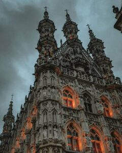
Have you noticed how buildings don’t look as ornate and decorated as they used to? Churches are a great example of this architectural change to a more minimalist, sleek style. Gothic churches began construction in the early 12th century. The Cologne Cathedral featured below started construction in the year 1248. How has architecture changed almost 1000 years later? Why does minimalist architecture today have comments that it’s “ugly” or “bland?” Why has new public architecture become less artistic?

Over the years, there has been a shift from elaborate and ornate structures towards a more minimalist architecture and sleek style. In this article, we’re going to explore why architecture has taken this smooth turn, how it all started, and what it means for the places we live and hang out.

This transformation reflects a broader societal shift towards simplicity, functionality, and efficiency. This article explores factors influencing this change, the rise of minimalist architecture, and its impact on our environment.

From Ornate to Understated: A CHANGE IN Perspective

Architecture is such a cool type of art. Gothic cathedrals of the medieval era and Baroque palaces of the Renaissance exemplify visually stunning feats of engineering. They show off their embellished style with elegance and grandeur. Architects sought to create beautiful structures that reflected the cultural and societal values of their time, environment, and location.

However, as the 20th century unfolded, a significant shift started to occur. Globalization of people and ideas led to a departure from historical styles, and embraced more functional and streamlined approaches. This shift in perspective marked the beginning of a gradual move towards minimalism, and minimalist architecture.

how The Bauhaus movement influenced minimalist architecture

The Bauhaus School for the Arts (1919 -1933, Germany) became the name for the movement toward geometric and functional design. The school’s classes included “metalworking, cabinetmaking, weaving, pottery, typography, and wall painting,” according to an article by the Met Museum.

The Bauhaus Movement inspired the idea that artists and craftsmen were interchangeable titles and held the slogan “Art into Industry.” This concept played a crucial role in shaping the trajectory of minimalist architecture.

A house is a machine for living in.”

Le Corbusier

Global adoption of minimalist architecture

The evolution towards a sleek architectural style can be attributed to various influences, both cultural and technological.

Basically, there was a second globalization following WWII (1939-1945) and this caused a boom of human migration. Around 20 million Europeans were displaced, including 16.5 million Germans. These people shared ideas, designs, and processes as they traveled. This movement popularized “Neo-Russian, Swiss or Alpine and Nordic” architectural styles, especially in places outside their “region of origin.”

As cities grew and technology advanced, the need for practical, space-efficient designs became increasingly evident. Not only was minimalist architecture popular, but there was a significant demand for housing during this time. Because of this need, many designs you see today exhibit features of the Bauhaus Movement and Scandinavian design. Some of these features include simple neutral color schemes and large windows to maximize light. They also use modern inexpensive building materials like concrete, steel, and glass.

seagram building showing minimalist architecture in big cities
The Seagram Building in New York City, designed by Mies van der Rohe and completed in 1958

Fear of the international style

Moreover, the globalization of design trends has played a pivotal role in shaping architectural preferences. Architects and designers shared their minimalist, inexpensive, and efficient creations on a global stage. The world simply adopted their favorite designs.

Architecture vs. Globalization by Beata Majerska-Pałubicka uncovers conflicts of how globalization has caused a standardization of life around the world. Specifically, this conflict is seen in architecture and building design. She argues because of globalization, “architecture became detached from its local, cultural and geographical context” and, “in drastic situations, [caused] the disappearance of cultures of weaker countries and regions.”

Majerska-Palubicka warns of a single, global architectural style, accepted by the entire world.

Presented in 1932, the International Style exemplifies Majerska-Palubicka’s fears. Historian Henry-Russell Hitchcock and architect Philip Johnson defined three key design principles of the International Style:

  1. Architecture as volume – thin planes or surfaces create the building’s form, as opposed to a solid mass
  2. Regularity in the façade, as opposed to building symmetry
  3. No applied ornament
minimalist architecture example international style
The International Style is characterized by flat roofs, asymmetrical, and no applied exterior ornaments or decorations. This style is very close in nature to minimalist architecture.

Globalization has provided designers and architects a nearly unlimited palette when it comes to styles, building materials, and references. Architecture is no longer the product of its context and environment. Essentially, we used to build according to the immediate environment and available resources. Now, we build using everything in the cheapest way possible.

It’s a conflict of creativity versus efficiency.

Form should Follow function

The core principle of the minimalist architecture design philosophy is rooted in the idea that form should follow function. Essentially, emphasizing clean lines, open spaces, and a focus on necessary elements. The idea of form following function is a key lesson in many forms of art, especially sculpture.

Form Follows Function by Rina Jost

Aesthetics for Birds describes the phrase as “a claim about what makes good architecture and design (chairs and cars and clothes and cities). And it’s usually taken to be anti-ornamentation/anti-decoration and pro-minimalist architecture.”

This departure from excess ornamentation marked a paradigm shift in how architects approached their craft. Those who used Form Follows Function, sought to redefine the relationship between space, light, and materials.

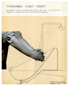
This idea of function-based-design is beautifully shown in the Paimio Sanatorium, designed by Alvar and Aino Aalto in 1929. This building functioned to prevent tuberculosis and included knowledge of the disease and what prevents it into the physical design.

In my opinion, this building is an absolute work of art; it is aesthetically pleasing and functional. It included cross-ventilation and heliotherapy (exposure to sunshine). It housed specific designs for the chairs, sinks, closets and beds: all to prevent tuberculosis and make breathing easier for patients. This is one of the only sanitation stations still standing today.

  • Challenges and Criticisms: Balancing Form and Function
  • While the sleek and minimalist architecture style has gained popularity, it is not without its challenges and criticisms. Some argue the emphasis on simplicity may lead to a lack of diversity in architectural expression, with buildings appearing homogenous and indistinguishable. Another arguments are these “anti-human buildings that do not ‘spark joy’” are wasteful, unsustainable, and environmentally irresponsible to build in the first place.

    Architectural myopia

    Critics assess the disconnect between the architectural elite and the general population.

    Known as Architectural Myopia, scientific and psychological studies show architects perceive buildings differently than the average person. The article explains that “instead of a contextual world of harmonious geometric relationships and connectedness, architects tend to see a world of objects set apart from their contexts, with distinctive, attention-getting qualities.” The source of this cognitive disconnect is correlated, in the article, to academic training including artistic critiques, a overarching expectation to successfully follow ‘form over function,’ and over-inflated egos of the architectural community.

    The result of architectural myopia is architecture which fails to support its inhabitants. Think about apartment buildings that isolate people and don’t provide enough natural light. Think about cities planned for vehicles, rather than incorporating sidewalks and parks and walkable communal areas. These are examples of architecture failing our communities.

    poor architecture leads to years of Broken promises

    In 2007, Brad Pitt founded a charity program to rebuild 90+ homes for New Orleanians whose homes were destroyed by Hurricane Katrina. The homes were designed to look futuristic, they did not appear to have any reference of the historic city, they were expensive to build (around $400,000 each) and expensive to fix. Mold began to grow on the “experimental materials” and much of the wooden decks rotted due to the humid climate in Louisiana. The New Republic called the houses “a waste of money and a distracting sideshow.”

    Brad Pitt Recruited Frank Gehry to Design Sustainable, Two-Family Home For Make It Right in New Orleans

    Unfortunately, this fiasco led to many years of turmoil for both Brad Pitt and his charity program — ironically called Make It Right, and much distress for the New Orleanians who were promised homes. One 91 year old woman, Marion Bryan paid the initial house deposit in 2008. She experienced the demolition of that house, the creation and demo of a second house, and the final construction of a home in 2014. However, as of 2023 in The Hollywood Reporter article, Marion currently lives with her son and not in any house built by the Make It Right organization.

    The class-action lawsuit against Make It Right and Brad Pitt began in 2018, and reached a settlement in 2022, in which the 107 homeowners were “eligible to receive $25,000 as reimbursement for repairs.” A company known as Global Green USA announced they were going to pay the $20.5 million settlement, but it turned out they didn’t have the money. According to public documents and reports, the New Orleans homeowners, many of whom can’t live in their homes, have not received any money from the lawsuit.

    Unsustainable minimalist architecture

    Many new buildings have also become a wasteful use of resources because they are difficult to repair, maintain, and re-use. When I worked in a large business building downtown, I noticed many of the 30+ floors were empty. Likely due to Covid-19 and the housing crisis, my building was not alone in this tragedy. The majority of my coworkers were remote and the office was usually sparse. I would joke with my peers that we could all take an entire floor to ourselves, and it would cost less than our tiny apartments. To this day, those floors are still empty.

    John Barham describes the scenario perfectly in the following quote:

    A building designed with utility first, and form second, will not charm its future occupiers into repurposing it when its original function comes to an end. Because they were designed to look cool and original, their aesthetics will go out of fashion as quickly as they came into fashion.

    Modern Architecture is Killing the Planet.

    In short, it is not just that people find new buildings ugly, but they represent a fundamentally unsustainable way of building human environments.

    Conclusion

    As we navigate the 21st century, the architectural landscape continues to evolve, reflecting the values, technologies, and global interconnectedness of our time. The shift towards more minimalist architecture and sleek style signifies a departure from the ornate, elaborate, and artistic structures of the past. The new styles embrace the achievement of simple, inexpensive, and efficient design.

    However, efficient is not always best and creative is not always functional. It is the balance of form and function that leads to great architecture and great design.

    Enjoy this article? Check out more articles from Artsy Drawings!

    Why do people hate minimalist architecture? Read More »
    How to Make the Color Purple

    The Hypnotic And Rich Historical Backstory Of How Simple Purple Became Periwinkle, Indigo, Maroon, And Lavender Color.

    The color purple is a mesmerizing hue and has captured the imagination of artists, designers, and enthusiasts for centuries. The color purple is a color of intrigue, luxury, creativity, and spirit. And it comes in many shades, tints, and tones, from mauve to grape to a stunning pastel lavender color.

    According to color theory, purple is a secondary color and a mixture of red and blue. But I think it’s much more than that, and I think you do too. Let’s get into the mysteries of the color purple.

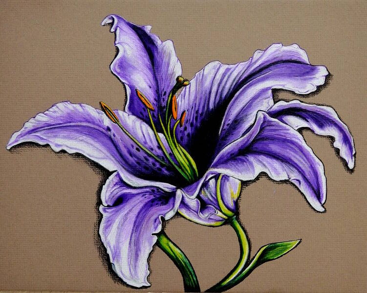
    the color purple lily flower drawing by Kathleen Fiorito with vibrant lavender color
    Drawing by Kathleen Fiorito

    In this article, we’ll explore the world of the color purple: its rich history, the art of mixing and creating it, and its significance in various industries. We’ll also explore a spectrum of 30 distinct shades of purples, violets and lavender color, from periwinkle to plum, and where you can find them in different aspects of our world.

    A Journey Through Art History: the Royal Past of the color purple

    The regal reputation of the color purple goes back centuries. In ancient times, the production of purple dye was a laborious and costly process, making it a symbol of wealth and status.

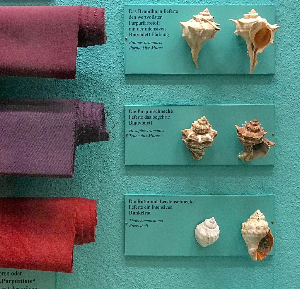
    Phoenician traders extracted violet dye from the glands of mollusks in the Mediterranean Sea. The product was called “Tyrian purple.”

    This exhibit in the Museum of Natural History in Vienna features fabrics dyed from different species of sea snail, similar to how ancient people extracted the purple color.
    This exhibit in the Museum of Natural History in Vienna features fabrics dyed from different species of sea snail, similar to how ancient people extracted the purple color.

    In fact, according to an article by Kristine Ballard, over 9,000 snail mollusks produced a single gram of the precious Tyrian purple dye. This rarity made the color purple especially valuable.

    The term “purple” comes from the Greek πορφύρα (porphura) and Latin purpura.

    The Romans reserved the color purple for emperors and high-ranking officials. Similarly, the Byzantine Empire used purple as a privilege exclusively for the imperial family.

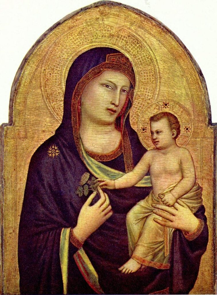
    During the Renaissance, artists like Leonardo da Vinci, Titian, and Veronese utilized various shades of lavender color in their works to symbolize nobility and spirituality. In the 18th and 19th centuries, purple represented mysticism and the spiritual, often appearing in paintings with religious or symbolic themes.

    During the Renaissance Violet featured throughout many religious paintings. Angels and the Virgin Mary were often portrayed wearing violet robes. Many painters of the 19th century experimented with the uses of the colour violet to capture the subtle effects of light.
    Madonna and Child by Giotto. Tempera on panel, 1320-30.

    The Perfect Purple, Maroon, or Lavender Color

    To create the perfect shade of purple, one must combine red and blue. As discussed in a preliminary article regarding color theory and the color wheel, you must mix two primary colors to produce a secondary color, like purple.

    The proportion of each color will determine the tone, from a delicate lavender to a deep violet. Experiment with different ratios to achieve your desired hue. Introducing white will lighten the shade, while black or optical black will darken it. You can also adjust the tone, saturation and vibrancy using other colors on the wheel. Keep in mind that the specific red and blue you use will influence the final result.

    For more color theory tips and tricks, check out these artsy articles on color knowledge tips and color theory for beginners.

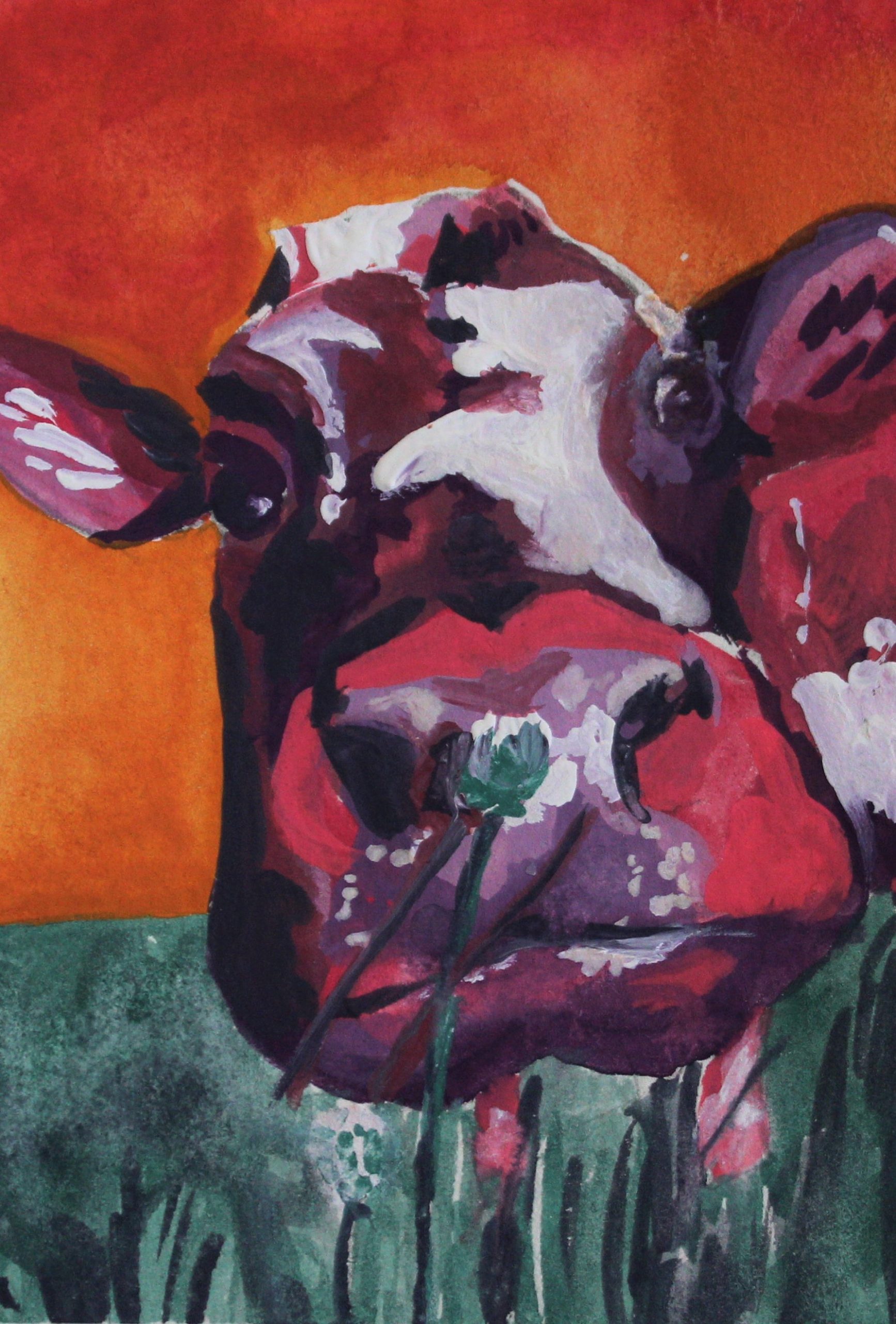
    colorful pink and the color purple cow surreal gouache paint painting with orange sky
    Sweet Cow by Brianna Eisman
    4″x6″ acrylic on paper

    The Many Shades of the color Purple and Their Applications

    Depending on how you choose to mix the color purple, the outcome can be very different. Even though you mix red and blue colors, your purple can vary significantly. Next, I’ll determine the differences between 30 different colors of purple and their origins.

    Overall, it’s important to keep in mind that colors are extremely variable. The hue derived from the origin, like a flower or fruit, may not match the HEX or color code exactly. Likewise, you may interpret the color differently in your head than how I interpret the color in this article.

    There are so many lavender color flowers!

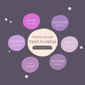
    Firstly, the best way to organize these colors is by their origin. I found nine of out 30 come from flowers, so let’s start with the color purple derived from plants and flowers.

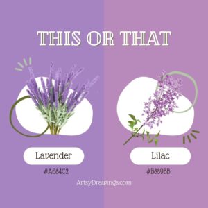
    Lavender: #A684C2

    This light purple is often associated with tranquility and can be seen in interior design for bedrooms and spa settings. Like its namesake flower, the lavender color provides a calm feeling with its pastel quality and slightly bluer hue.

    Lilac: #B889BB

    A soft, pale purple used in springtime floral arrangements. Similar to the lavender color, the name lilac originates from the flower’s color. I think lilac is slightly more red and pink than the lavender color, though.

    Periwinkle: #CCCCFF

    A soft and charming, periwinkle is the color purple shade used in children’s products and fashion.

    Heather: #A484AC

    A muted purple with a gray undertone, often found in interior design.

    Iris: #5D3FD3

    A medium purple, perfect for adding a pop of color to clothing or accessories.

    Orchid: #DA70D6

    This vivid and exotic shade is sourced from the vibrant flower and used in cosmetics and fashion. Additionally, clothing designer Halston was known for populating his studio with live orchid flowers as inspiration. He had a $150,000 yearly orchid budget! Aside from their brilliant pinky-purple hue and meanings of love, luxury, beauty and strength, orchids are innately provocative, much like Halston’s lines.

    Thistle: #D8BFD8

    A pale purple with a touch of gray, ideal for sophisticated design projects.

    Pansy: #78184a

    A vibrant and bold purple often found in gardening and horticulture.

    Wisteria: #c9a0dc

    A pale and delicate purple often used in weddings and floral design.

    What are Spectral Colors?

    Next, violet and indigo deserve their own sub-section as these are some of the most pure colors in the human visible light spectrum.

    Both violet and indigo colors are found on the visible light spectrum.
    Both violet and indigo are on the visible light spectrum.
    Violet: #8F00FF

    Violet is a type of flower and what is known as a spectral color. The hue has its own wavelength at the end of the spectrum of light identified by Isaac Newton.

    In the art community, the color violet is often interchangeable with “purple.” This confusion comes from the formal color wheel, Roy G. Biv, where the last two letters stand for indigo and violet. This original color wheel was created by Isaac Newton himself in 1666.

    Visually, a purple marker and violet marker are the same color. Scientifically, violet is a spectral color with a wavelength of 400nm and purple is a combination of two spectral colors, red and blue, and has no wavelength.

    Indigo: #4B0082

    Indigo is another spectral color with its own wavelength. It is a deep, dark purple-blue, perfect for textiles and dyeing. According to Muzli Colors, indigo dye is derived from the Indigofera tinctoria plant and its first recorded use was in 1289.

    Purple berries, fruits, and sweet treats!

    Many purple colors come from berries and fruit in nature. These hues tend to be darker in color, but are definitely still classified as purple.

    Eggplant: #614051

    A rich and dark purple often used in cooking and home décor.

    Aubergine: #472C4C

    A rich and elegant shade found in gourmet cuisine and interior design. Actually, color wise, aubergine is the same color purple as eggplant. The difference is merely regional. ‘Eggplant’ is the term in American English, while ‘aubergine’ is used in British English.

    Plum: #673147

    A deep and luxurious purple often used in clothing and accessories. As expected, this color gets its name from the sweet fruit.

    Mulberry: #c54b8c

    A dark, reddish-purple shade often found in autumn-themed artwork.

    Purple colors from food items like mulberry fruit on vines.
    Mulberry purple comes from the mulberry fruit.
    Boysenberry: #873260

    A dark and fruity purple often found in food products and branding.

    Grape: #6f2da8

    This is really close to what I envision when I immediately think of the color purple. Even though the name of this color matches the fruit, this is not the color of grapes. Instead, the color purple ‘grape’ represents branding for candy in this flavor. It’s nostalgic for me in a sense. This color purple is a vibrant and playful purple used in branding for sweets and children’s products.

    Fashion Forward Lavender Color

    These colors typically more artificial and fabricated specifically for fashion and products. They can be perceived as more vibrant and rich than floral or berry purples.

    Mauve: #C77398

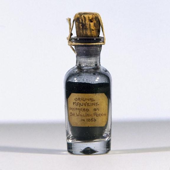
    This color purple is a dusty purple often used in fashion for a vintage, romantic feel. Mauve is actually the color of the first synthetic dye, created in 1856 by 18-year-old William Perkin. Within five years of the chemical creation, 28 dye factories opened, revolutionizing the fashion world and forever changing color production. Today, according to The American Scholar, there are over 10,000 synthetic dyes, from clothing to car paint to children’s’ toys and even shampoo.

    Mauve is a dusty purple often used in fashion for a vintage, romantic feel. Mauve is actually the color of the first synthetic dye, created in 1856 by 18-year-old William Perkin. Within five years of the chemical creation, 28 dye factories opened, revolutionizing the fashion world and forever changing color production. Today, according to The American Scholar, there are over 10,000 synthetic dyes, from clothing to car paint to children's' toys and even shampoo.
    Perkin’s original mauve dye from 1856.
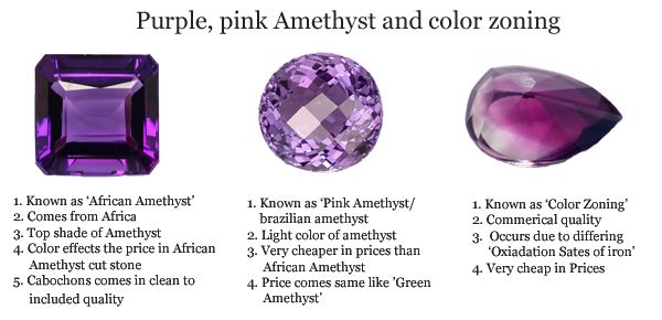
    Amethyst: #9966cc

    Probably the most natural purple on this list, amethyst is a deep and vibrant purple taken from the crystal with the same name. Often used in jewelry design, this color has a more regal and wealthy appearance.

    Probably the most natural purple on this list, amethyst is a deep and vibrant purple taken from the crystal with the same name. Often used in jewelry design, this color has a more regal and wealthy appearance.
    While the gemstone comes in a variety of colors, typically, the color amethyst most closely resembles the popular African Amethyst (first image).
    Magenta: #FF00FF

    A bold and intense purple often found in advertising and packaging. While magenta is typically categorized as a pink, it is created by mixing blue and red, and can fall into the category of purple colors.

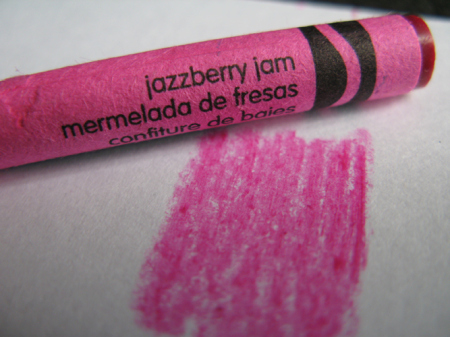
    Jazzberry Jam: #a50b5e

    I love the name of this color! Jazzberry jam is a playful, intense purple-pink commonly found in children’s products. Crayola has a crayon in this vibrant color.

    A playful, intense purple commonly found in children's products. Crayola has a crayon in this vibrant color.
    Jazzberry Jam is a fun pinky-magenta purple color with the Hex code #A50B5E.
    Heliotrope: #df73ff

    A soft and romantic purple used in cosmetics and fashion.

    Grape Soda: #b498aa

    Unlike the grape color, Grape Soda is manufactured by Kelly Moore paints and is typically used as house or wall paint. Kelly Moore describes the color as a “medium light shade of magenta-pink.”

    Liseran Purple: #DE6FA1

    Probably closer to a pink, this color is a bright, synthetic purple-pink used in textiles and plastics.

    Regalia: #522d80

    A rich, royal purple often found in academic regalia and ceremonial attire.

    Taylor Swift in regalia purple attire speaking at NYU graduation
    Taylor Swift wore a regalia purple attire when speaking at Spring 2022 NYU graduation ceremony.
    Royal Purple: #7851a9

    Historically, royal purple is associated with royalty. Similar to ancient Tyrian purple, the color is used in ceremonial and regal settings.

    Byzantium: #702963

    A dark, imperial purple used in art and historical reenactments.

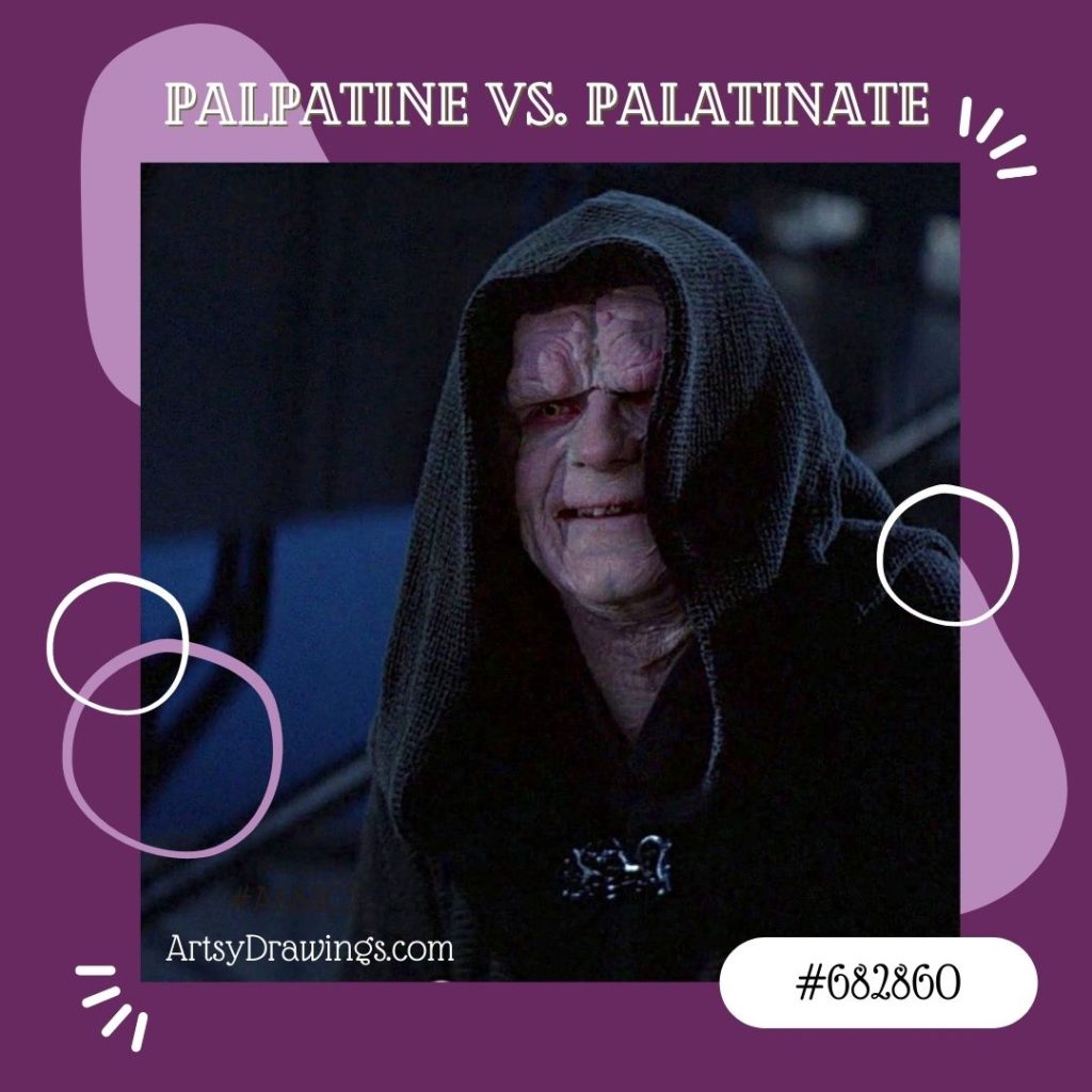
    Palatinate Purple: #682860

    Not to be confused with Emperor Palpatine, palatinate purple is a bright, eye-catching purple. It’s used in sports branding and uniforms, as well as university ceremonial robes.

    Remember that Emperor Palpatine is not palatinate purple!
    Remember that Emperor Palpatine is not palatinate purple!
    Electric Purple: #bf00ff

    A striking and intense shade, this brilliant hue generally appears in technology and digital design.

    Blue-Purple (Cool Purple): #8a2be2

    A cool-toned purple often used in contemporary design and art.

    The Significance of the color Purple in the Modern World

    The color purple still holds a unique place in our lives. It signifies creativity, individuality, and extravagance. Plus, it’s pretty!

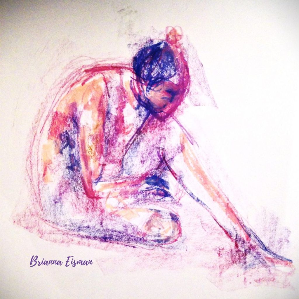
    For this gesture drawing, I chose a purple themed color scheme. I chose indigo, magenta, and peach colored soft pastels to create the illusion of a rich regalia violet color. This was created by Brianna Eisman for Artsy Drawings.
    Purple Gesture Drawing by Brianna Eisman

    For this gesture drawing, I chose a purple themed color scheme. I chose indigo, magenta, and peach colored soft pastels to create the illusion of a rich regalia violet color.

    In branding, purple and lavender color invokes a sense of luxury, elegance, spirituality, creativity and uniqueness. So, you’ll find brands like Cadbury and NYU in deep rich regal purples. In the same way, you’ll see brands like Discord and Teams in more indigo and electric blue-purples.

    In art and design, the color purple conveys a wide range of emotions and moods, from serenity to drama.

    Purple lavender color is used in a variety of branding logos.
    Purple is used in a variety of branding logos.

    By all means, the color purple is more than just a color; it’s a symbol of history, luxury, and creative expression. Understanding the various shades of lavender and magenta and their intrinsic value to design and history can allow artists and creators to better utilize the color purple in their work.

    As you explore the world of the color purple, remember the rich history, the art of creating the hue, and the ever-present mystique of this enchanting lavender color in our lives.

    How to Make the Color Purple Read More »
    Color Knowledge Tips That Will Make You a Better Artist

    Introduction to color knowledge

    Color knowledge is a fundamental aspect of art that has the power to evoke emotions, convey messages, and create captivating compositions. Whether you’re an aspiring artist or a seasoned pro, a deep understanding of color can significantly enhance your creative endeavors, and in turn, make you a better artist.

    If you are new to the art world, I suggest you take a look at this article on color theory for beginners.

    In this artsy article, we’ll dive headfirst into color knowledge, covering essential principles of color theory like primary, secondary and tertiary colors, how to create an effective color scheme, and basics of color mixing.

    Color Theory: The Foundation of Creativity

    Color Knowledge tip 1: Primary Colors are Red, Blue, and Yellow

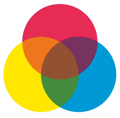
    Color Knowledge image of primary colors mixing in triple venn diagram to create secondary colors
    Red, yellow and blue are the starting point to create more colors like orange, green, and violet.

    Primary colors are the foundational hues in the world of color theory, consisting of red, blue, and yellow. These three colors are considered “primary” because they cannot be created by mixing other colors together.

    On a computer, these inks are called magenta, yellow, blue, and black. Though, you’ll notice if you run out of black ink, the computer will offer an alternative to mix magenta, yellow, and blue. This mixture is “optical black” in the painting world. I’ll talk more about optical black in the section about mixing paint colors together.

    Different combinations of the primary colors create all other colors on the color wheel. The primary colors are essential color knowledge for artists and designers.

    If you mix two primary colors, you get secondary colors. For instance, if you mix even parts red and yellow, you will get orange. Blue and red make violet. Yellow and blue make green.

    Color Knowledge tip 2: memorize The Color wheel

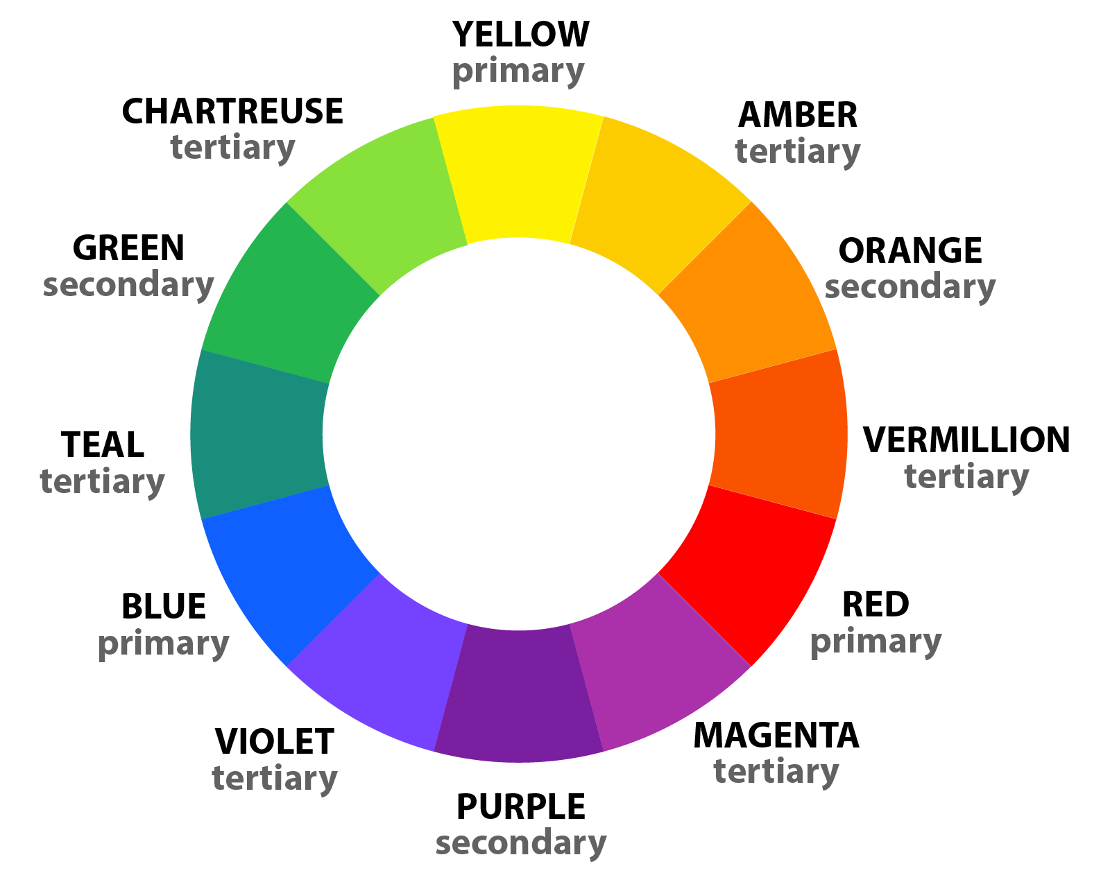
    The color wheel further expands with tertiary colors, created by mixing primary and secondary colors. There are endless possibilities for color exploration in art and design.

    Color Knowledge image of the color wheel showing primary, secondary, and tertiary colors
    This color wheel shows primary, secondary, and tertiary colors.

    Great, now that you’ve grasped the basic concept of the Roy G. Biv color wheel, let’s move on to relationships between colors. For more beginner friendly tips, check out this article on color theory for beginners!

    Color Knowledge tip 3: Understand Color Harmony

    Next, let’s learn about color harmony schemes like complementary, analogous, and triadic colors. Choosing the right color scheme can add a lot of visual and metaphorical depth to your art.

    Complementary color schemes involve pairing colors that are located directly opposite each other on the color wheel. They are literal compliments, such as red and green or blue and orange. This scheme creates strong visual contrast and can make each color appear more vibrant when placed next to its complement. This color scheme is often seen in comic books, illustrations, logos, and even signage on the side of the road.

    Color Knowledge image of complementary colors in everyday media like Christmas card, football team, and soda logo
    Complementary colors contrast one another and tend to “pop” off the page.

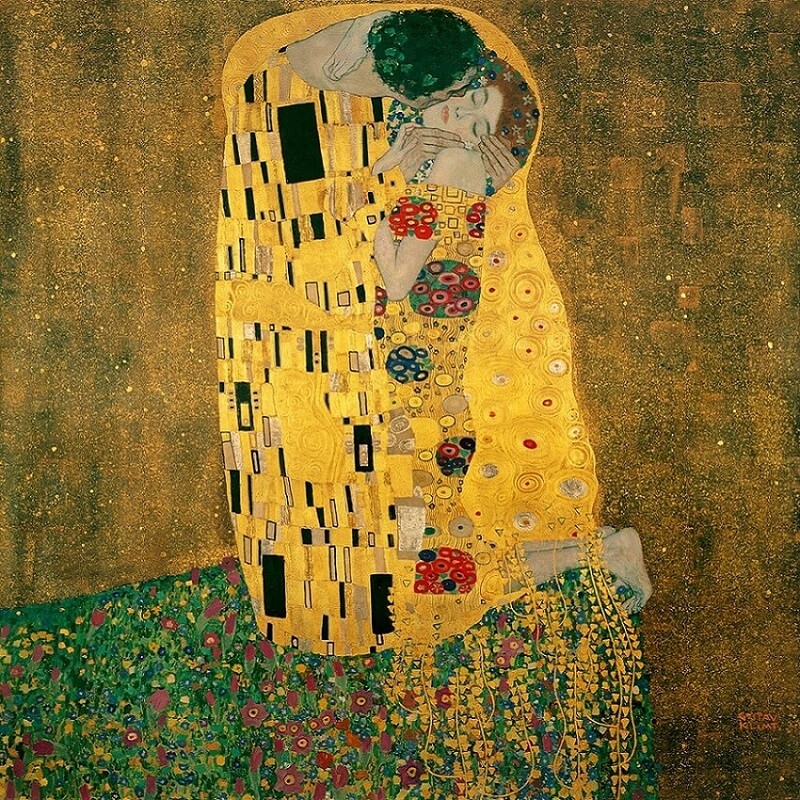
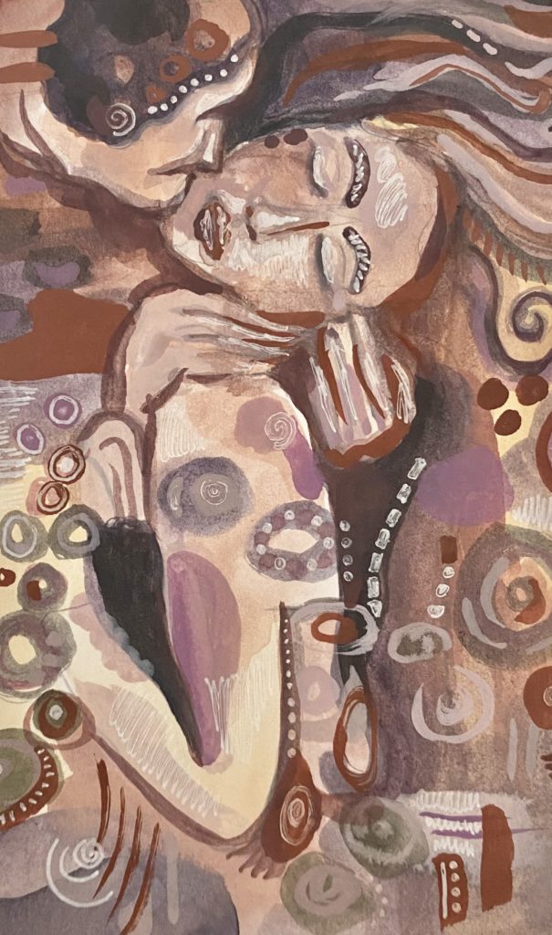
    Analogous color schemes use colors that are adjacent to each other on the color wheel, such as yellow, yellow-green, and green. This scheme creates a sense of harmony and cohesion. The analogous color scheme is ideal for creating a peaceful or monochromatic color palette in art or design.

    Both The Kiss by Gustav Klimt and my painting inspired by the same work use analogous color schemes to create a sense of calm and peaceful harmony.

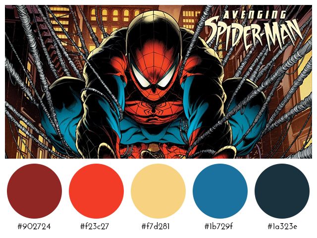
    Triadic color schemes involve selecting three colors evenly spaced around the color wheel, forming an equilateral triangle. For example, red, blue, and yellow form a triadic color scheme. This scheme offers a balanced and dynamic contrast of colors. Triadic color schemes create visually striking and vibrant compositions.

    Spiderman showing a tertiary color scheme of red, yellow and blue
    This image shows the selected colors used in the comic book about Spiderman. Red, blue, and yellow make a triadic color scheme.

    Color Knowledge tip 4: Know the difference between tint and shade

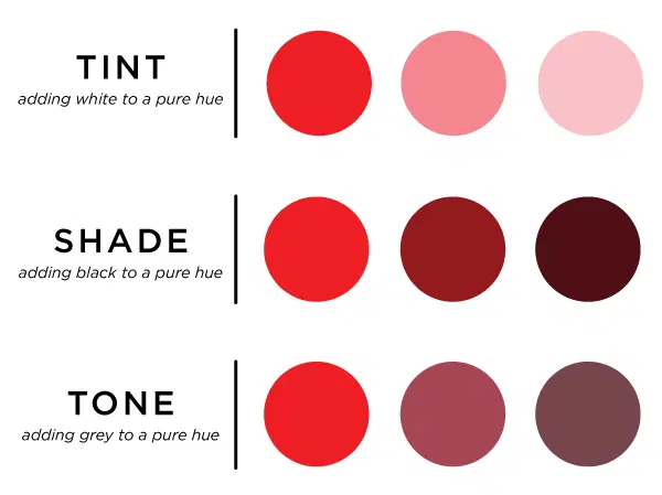
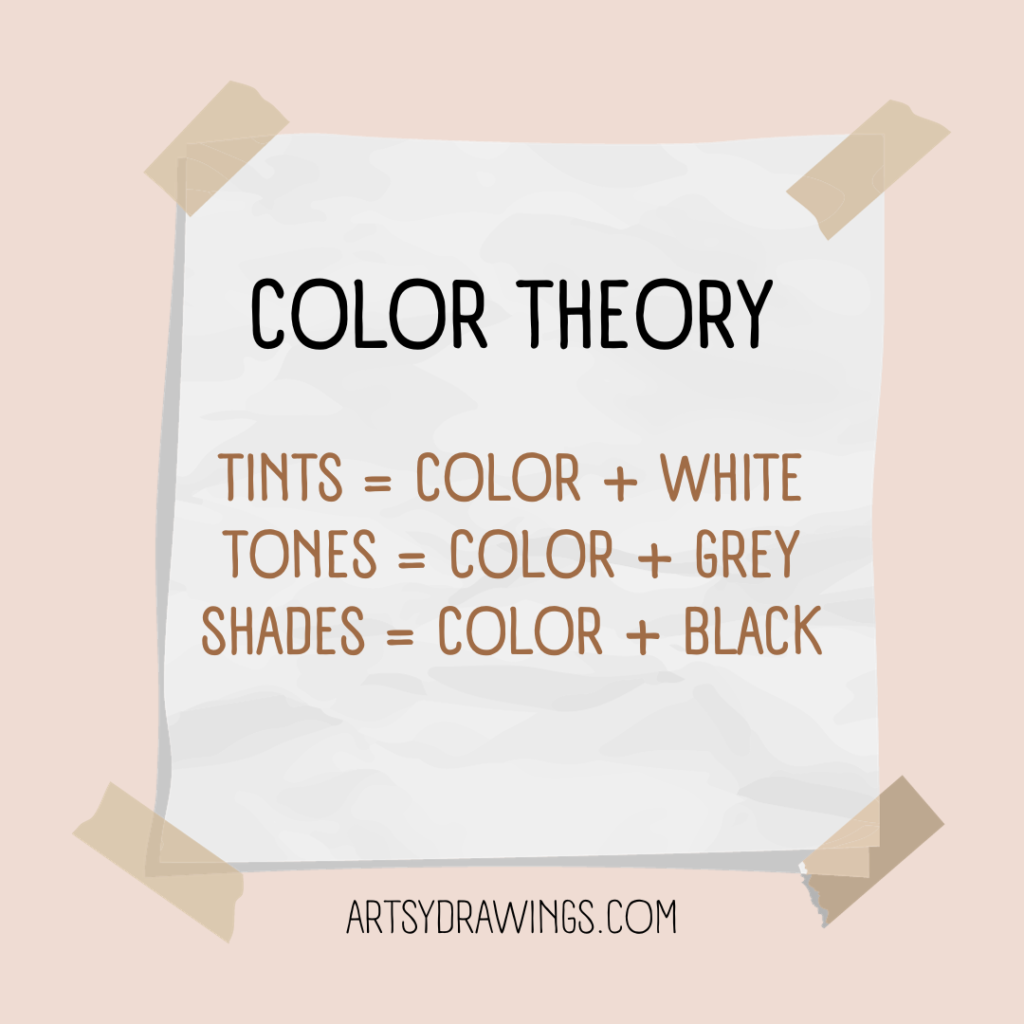
    Saturation and value are essential aspects of color theory illustrated through the use of tints, shades, and tones.

    Tints and shades determine values. Tints are created by adding white to a color and shades are formed by adding black to a color. Saturation is determined by tone, in which grey is added to the pure hue to mute the color.

    Tints, shades, and tones showing color knowledge
    Tints, shades, and tones change the color depending on how much white, black or grey you add to the hue, respectively.

    Tints and shades alter both the brightness (value) and intensity (saturation) of colors. The level of darkness or lightness is crucial for creating depth in your artwork and originality in your color schemes.

    Color Knowledge tip 5: Color temps (Warm vs. Cool Colors)

    Color temperature is a fundamental color knowledge tip that helps convey emotion and moods.

    Warm colors, such as reds, oranges, and yellows, are associated with warmth, energy, and excitement. Typically seen in the foreground of the composition, warm colors evoke feelings of passion and vibrancy.

    In contrast, cool colors, like blues, greens, and violets, are calming and associated with serenity, tranquility, and a sense of distance. They tend to recede in a composition and can evoke feelings of calmness and introspection.

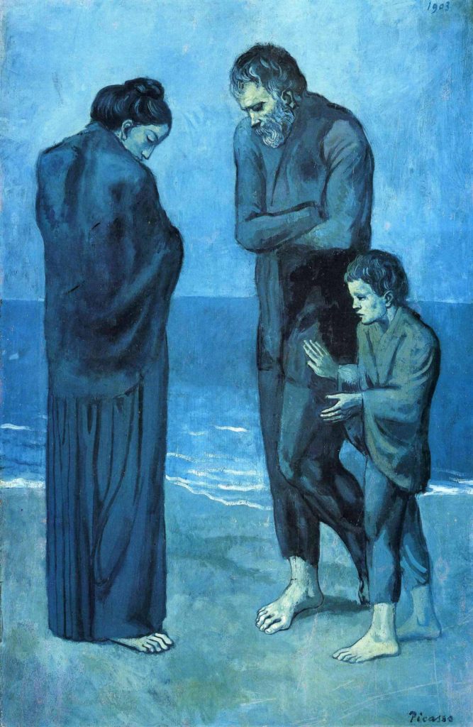
    During Pablo Picasso’s Blue Period, the artist used a predominantly cool color palette. This color scheme included shades of blue (obviously) and blue-green as dominant hues. This deliberate choice of colors conveyed a sense of melancholy, sadness, and emotional turmoil in his artworks.

    Color Knowledge image of Pablo Picasso's blue period about how color schemes can help convey emotions
    Pablo Picasso’s Blue Period (1901-1904) is one of the most well known artistic uses of how color can signify emotion.

    Color can serve as a powerful tool for expressing complex emotions and capturing the human condition.

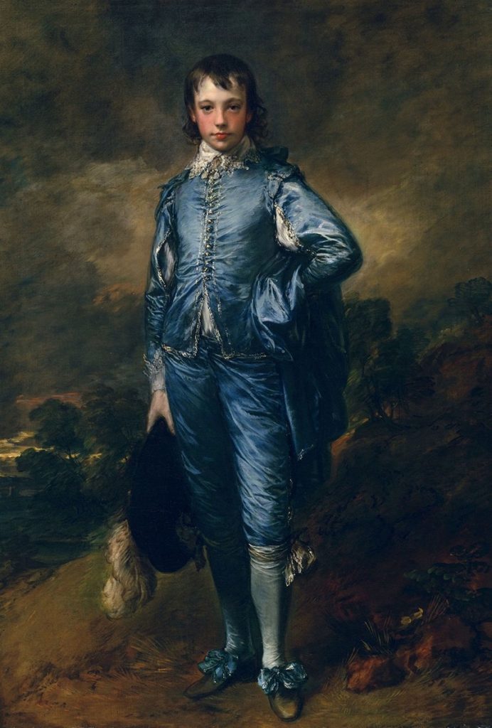
    One of my favorite moments of artists being angsty and non-conformists is the controversy surrounding “Blue Boy.” Painted by English portrait artist Thomas Gainsborough, the 1770 painting includes the unconventional use of blue as the dominant color for the subject’s attire, rather than as a background hue.

    One of my favorite moments of artists being angsty and non conformists is the controversy surrounding "Blue Boy" by English portrait artist Thomas Gainsborough. The 1770 painting includes the unconventional use of blue as the dominant color for the subject's attire rather than as a background hue.
    Blue Boy by Tomas Gainsborough challenged norms of its time by using blue in the foreground of the painting.

    This departure from traditional portraiture raised eyebrows in its time. I find that something I love about learning art history is how artists challenge conventional norms. Sparking debate about artistic choices leads to innovation and change and progress.

    Likewise, try to understand the interplay between warm and cool colors. This part of color knowledge is crucial for creating balanced and emotionally resonant color palettes in art and design.

    COLOR MIXING

    Color Knowledge tip 6: learn to mix Optical black

    Color mixing techniques can greatly enhance the range and depth of your artwork. This section will focus on the important concept of “optical black.”

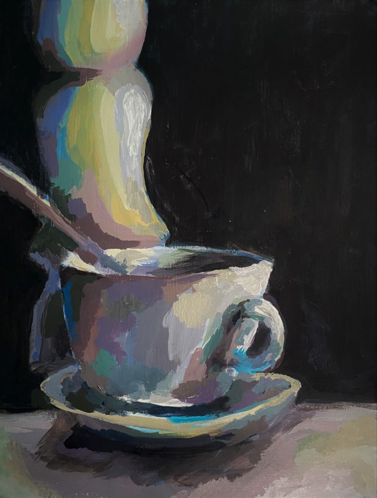
    In this painting, I mixed phthalo (Phthalocyanine) blue with burnt umber to create this super dark optical black background to show color knowledge
    I mixed phthalo (Phthalocyanine) blue with burnt umber to create this dark optical black background.

    Optical black is a “fake black” which looks like black, but is instead created using color.

    In art school, we were not allowed to buy or use black paint in our paintings. Turns out, creating optical black teaches you color theory and color mixing much better than simply using black.

    Remember back to when we were discussing value and saturation?

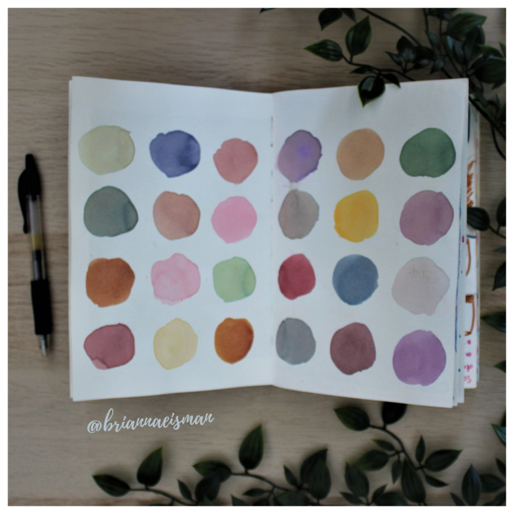
    Color theory is easy with a cute visual.

    So then if Optical Black = Orange + Blue then Shades = Optical Black + Orange + Blue.

    Whoever said art doesn’t include math was just a silly-billy.

    Anyways, mixing complementary colors can create the visual appearance of black, despite no actual black pigment used.

    To start, mix complementary colors from the color wheel. From there, continue to add colors until you reach the optical black that looks best for your chosen color scheme.

    For example, if your painting uses yellow highlights, you may want your optical black to look more violet. How does this work?

    Using complementary colors trick the color receptors in your eyes to believe the color is black, and not dark violet. This technique achieves rich, natural and deep shadows in your artwork without resorting to flat-looking black paint.

    The same effect is achieved when you wear colored ski-goggles.

    “[Ski-goggles] are often orange so at the end of the day the orange receptors are tired and the world looks blue.”

    stoopidusername

    Disney World also uses this technique to make their colors seem more vibrant. The sidewalks are painted red to trick the color receptors in your eye to make the grass and trees seem greener.

    Disney World uses complementary colors in their park. The red sidewalks make the grass and trees look greener.

    Color Knowledge tip 7: Use complementary colors for desaturation

    Additionally, complementary colors tone down the saturation of a color. When you mix a color with its complementary color, the result is a desaturated, or less vibrant, version of the original color.

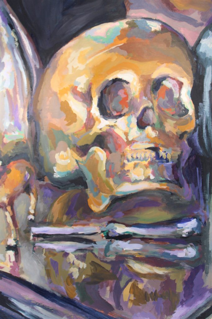
    In the below painting of a skull still life, I chose a color scheme that included a golden yellow ochre and a muted violet. To achieve many of the greyish mid-tones, I chose to mix the yellow and violet together using varying amounts of each color.

    This acrylic painting of a skull illustrates the use of optical black in learning color knowledge for painting.
    In addition to making optical black using violet and yellow, I chose those same complementary colors as a base color scheme for this painting.

    For example, if you have a highly saturated red and you want to reduce its intensity, mix it with a bit of green, its complementary color. The resulting mixture will be a less vibrant shade of red, leaning more towards a neutral gray or brown, depending on the proportions used.

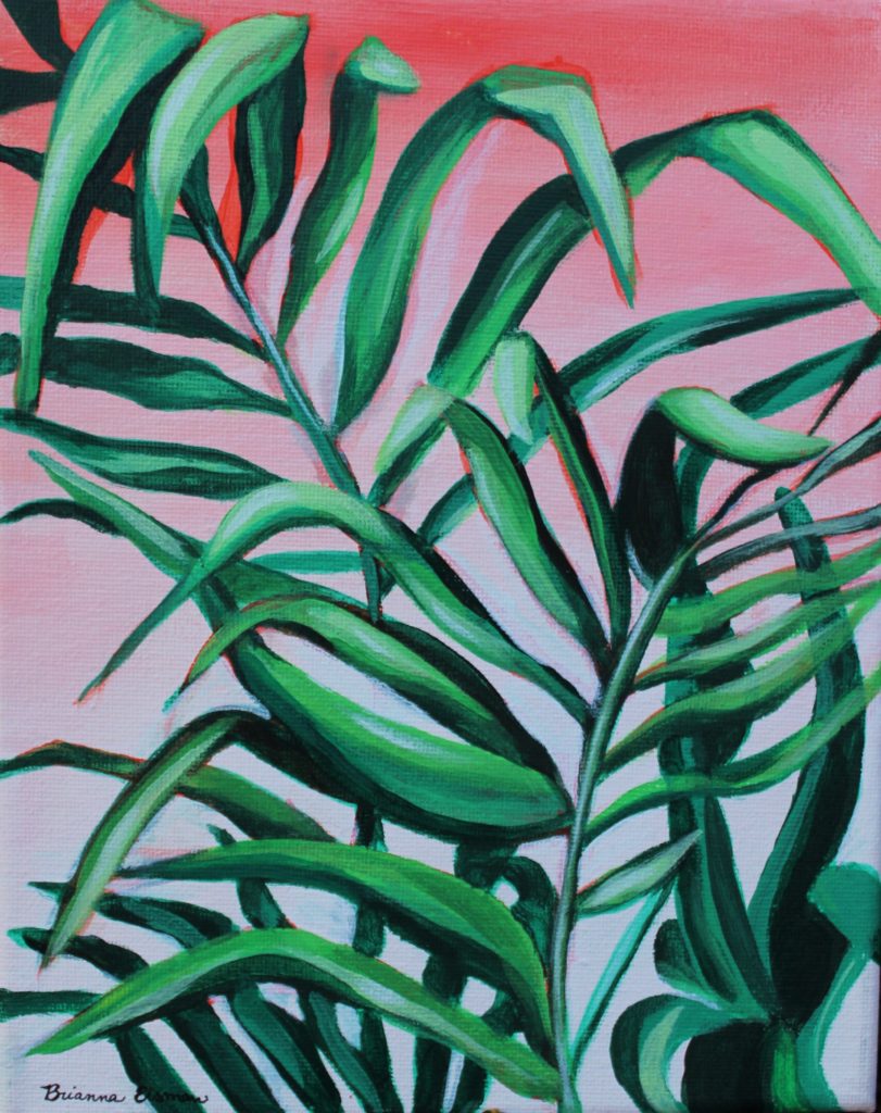
    I tend to love using complementary color schemes in my artwork. For this work, I started with a red wash and red base painting, then added the green layers on top to really push the color.
    I tend to love using complementary color schemes in my artwork. For this work, I started with a red wash and red base painting, then added the green layers on top to really push the green color forward.

    When using complementary colors to desaturate, it’s essential to be mindful of the proportions of added colors. Adding too much of the complementary color can cause the mixture to become too muddy or dark. This is particularly evident in watercolor painting as it is more difficult to lighten the painting back (for watercolors you paint light to dark).

    Experimentation and practice will help you develop an intuitive sense of how to mix colors. Color knowledge like optical black and using complementary colors to adjust saturation and intensity can help you become a better artist.

    Color Knowledge tip 8: Physically mix colors

    Mixing colors is an essential skill for any artist expanding their color knowledge. For this section, we will focus on mixing paint.

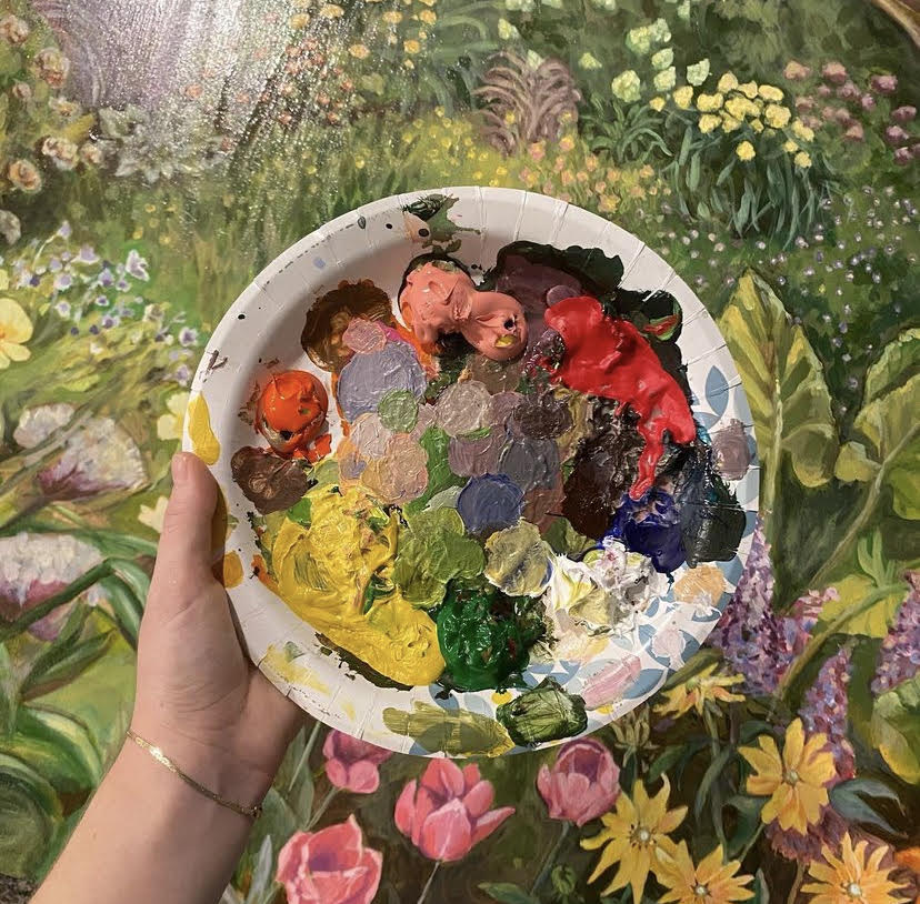
    Begin with a clean palette and brushes. I also like to have a paper towel handy to dry my brushes. Then, squeeze small amounts of your chosen paint colors onto the palette. I like to use a paper plate as a paint palette, and I place the paint in a circle around the outer edge of the plate.

    For example, the photo below features one of the paper plate palettes I used. Notice how I tried to keep the main paint colors clean and mixed my paint towards the center of the plate. You will also notice, I did not use black paint — I mixed an optical black using a dark blue and burnt umber.

    I used this paper paint palette for a 4’x4′ garden painting with a lot of colorful flowers.

    Next, use a palette knife or brush to blend the colors together gradually, starting with the lightest color and adding small increments of the darker color until you achieve the desired shade. Remember to test your mix on a scrap surface or a corner of the canvas itself to ensure it matches your vision before applying it to your artwork. Practice and experimentation will help you become proficient in creating custom colors for your art.

    Follow my social media and newsletters for more tips on how to create a wider array of hues and tones, adding depth and complexity to your work through color knowledge.

    Concluding color knowledge for now…

    Color knowledge is a powerful tool for artists, allowing us to express ideas more effectively and create art that resonates with audiences. By mastering color theory, you can elevate your art to new heights. So, embrace the world of color, experiment fearlessly, and let your creativity flourish on the canvas of your imagination.

    Understanding color theory and mixing colors is like having an artist’s secret toolkit. Whether you’re gently blending opposite, or complementary, colors to tone down the saturation or using clever mixtures to create “optical black,” these techniques are simply invaluable. I do want to remind you art lovers that there is so much more to know about color. If this is something that really interests you, please comment, message me, or join my newsletter to read more! I love color!!!

    By grasping these fundamentals, you not only make your artwork visually engaging but also open doors to express intricate emotions and stories through color. So, dive into the world of color knowledge, and watch your art flourish with richer, more meaningful color scheme choices.

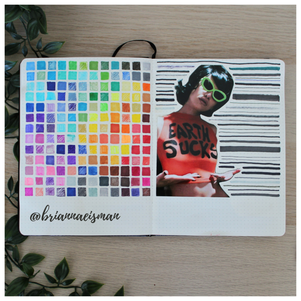
    This is a super easy exercise for testing your markers to show what colors work and which markers have dried out. It also uses color knowledge to arrange the colors in a rainbow style order.

    I realized this article was getting long, so I had to chop it up to allow for more in depth discussion of color knowledge. Trust me, there will be more color themed articles!

    Color Knowledge Tips That Will Make You a Better Artist Read More »
    How to wish someone Happy Birthday, 7 Artsy Tips!

    Why you should make your own artistic ‘happy birthday’ cards

    Maybe you’re a bad friend and haven’t realized, but ‘happy birthday’ cards have gotten really expensive. If you’re in a rush, sure, buy the card, but if you have an ounce of artistic merit and some cardstock paper, I can teach you to create a much more personalized card for a lot less money.

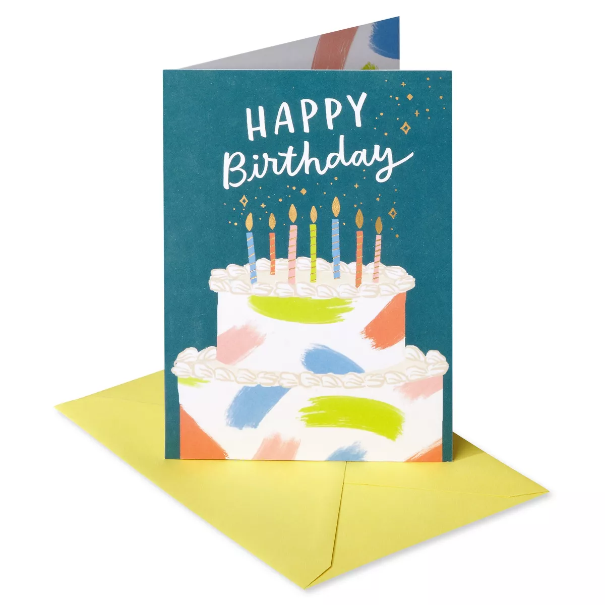
    This happy birthday card from Target is currently $4.99.

    At $5 per ‘happy birthday’ card, plus the cost of a gift, I decided early on to make my own cards for my friends, and they love them. In fact, I’ve been told my friends choose to keep my handmade cards over most others.

    Unfortunately, none of my own cards will be in this article. I choose not to photograph my homemade cards to preserve their integrity as intimate gifts for my friends and family only. I am willing to share my Pinterest board where I source inspiration for my handmade cards.

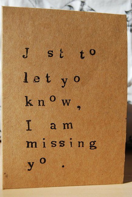
    The cards you make can be just text, feel free to add drawings as you wish.

    Art also has a unique way of expressing emotions, and what better occasion to put your creative skills to work than a friend’s birthday? In this fast-paced world, where digital communication often takes precedence, a handcrafted birthday card can truly stand out as a heartfelt gesture.

    This blog post will not only guide you through the process of making beautiful birthday cards but also explore the idea of planning them in advance based on analytics to ensure you never miss an opportunity to celebrate your friends’ special days.

    Tip 1: The Power of Personalized Happy Birthday Cards

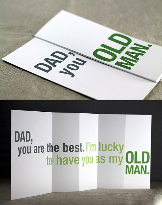
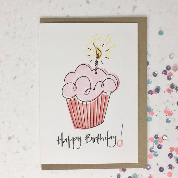
    This is such a cute and easy to make card, sourced from my Pinterest board.

    In a world filled with text messages and emails, a handmade happy birthday card can make a profound impact. It shows that you’ve invested time and thought into celebrating your friend’s special day.

    The act of giving is itself rewarding, and when it’s a personalized birthday card, it can bring immense joy to both the giver and the receiver. A well-crafted card reflects your love and care for your friend.

    Tip 2: Gathering Supplies to decorate the best ‘happy birthday’ card

    Before you begin crafting, gather essential art supplies such as colored paper, scissors, glue, markers, stickers, and embellishments. These will be your tools for creating a unique card to say “happy birthday” or “congratulations” or “i love you.”

    Check out my list of favorite art supplies on Amazon. For personalized cards, I recommend materials including this heavy multi-media paper, these dual tip brush markers, and this Pilot G-2 gel pen.

    Choosing the right materials is crucial. Consider your friend’s personality and preferences when selecting colors, patterns, and themes for the card. Personalization makes the card even more special. For example, I know my mom’s favorite colors are pink and green so I try to include that color scheme in her cards.

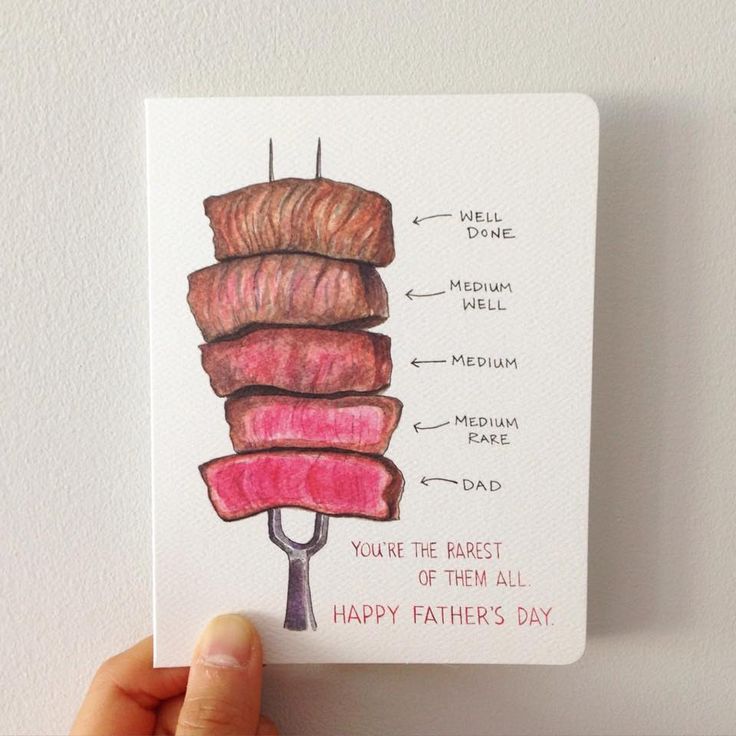
    Your card can be for any occasion, from a happy birthday to a happy father’s day.

    Keep color theory in mind when choosing your colors for these heartfelt cards. Red and green may come across as Christmas themed, purple and orange may feel too much like Halloween, and hot pink may not be the best choice for your hyper-masculine guy friend (but hey, if you know he likes the color, go for it).

    For tips specific to color schemes, check out my color knowledge article!

    Tip 3: Designing Your Happy Birthday Card

    I typically start the design process by gathering inspiration. Check out my Pinterest Board titled ‘Cards‘ to see my inspiration for handmade cards.

    When designing a ‘happy birthday’ card, think about items representing birthdays like candles, cake, balloons, confetti and party hats.

    Start by sketching out your card’s design using pencil on a spare sheet of paper. For more sketching and drawing tips for beginners check out this article. This rough sketch will help you visualize the final product and make necessary adjustments.

    There are countless card layouts to choose from, such as pop-up cards, layered cards, and simple folded cards. Pick one that suits your design and skills.

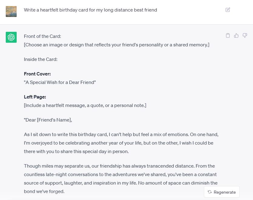
    Though, if inspiration is just not striking, AI may help spark some creativity. Use Chat GPT to find just the right words to say. For more about using AI in art, read this article.

    As a last resort, ask Chat GPT to create text for your card if artists block is blocking the emotions.

    You can also include personal elements like photographs, handwritten messages, or inside jokes that are meaningful to your friendship. These touches will make your card truly unique.

    Tip 4: Planning the ‘happy birthday’ Ahead with Analytics

    In today’s digital age, it’s easier than ever to track birthdays. Consider using calendar apps or social media platforms to remind yourself of your friends birthdays.

    You can also optimize your card making processes by using simple analytics.

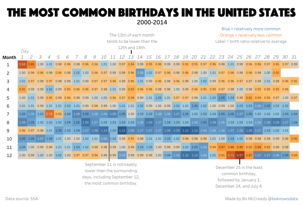
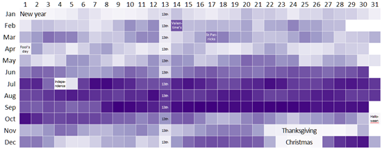
    According to this visualization heat map created by Bo McCready, September is the most popular month to be born.

    In the United States, September is found to be the most popular month to be born. This data was sourced from the public Social Security Administration and the Centers for Disease Control and Prevention’s National Center for Health Statistics.

    This visualization heat map shows the popularity of birthdays in the US between 1973 – 1999.

    An analyst at Gramener Inc evaluated a similar result as Bo McCready’s results showing more births in September than other months of the year.

    Gramener Inc also found the following results:

    • “Most people are born in August & September (and therefore were conceived around November & December, during the holidays, perhaps?)
    • However, very few people are actually born during holidays – New year, Independence day, Halloween, Thanksgiving and Christmas. (People don’t like to spoil their holidays?)
    • Few people are born on the 1st of April. (You don’t want your kid born on Fool’s Day)
    • Few people are born on the 13th of any month. (Unlucky?)
    • Plenty are born on Valentine’s Day and St Patrick’s day”
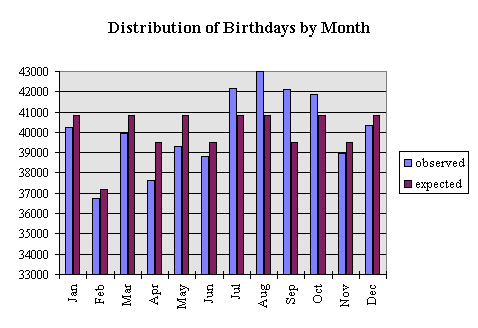
    Analyst Roy Murphy sourced birthdates from “480,040 insurance policy applications” between 1981-1994 from a Life Insurance Company.

    I decided to include one more visualization from another source providing evidence of seasonality in birthdates. The data was sourced from birthdates from “480,040 insurance policy applications” between 1981-1994 from a Life Insurance Company. The graph shows July, August, and September as having the most birthdays of any other month throughout the year.

    Identifying patterns in your friends’ birthdays can help you when creating cards in bulk. September or August may be the perfect time to create several cards at once, when you know September is the most popular month for birthdays in the United States. This efficient approach allows you to be prepared and thoughtful.

    While batch card making can save time, remember to personalize each card according to the recipient’s preferences and personality. Adding small, thoughtful details can go a long way.

    Tip 5: Crafting Tips and Techniques

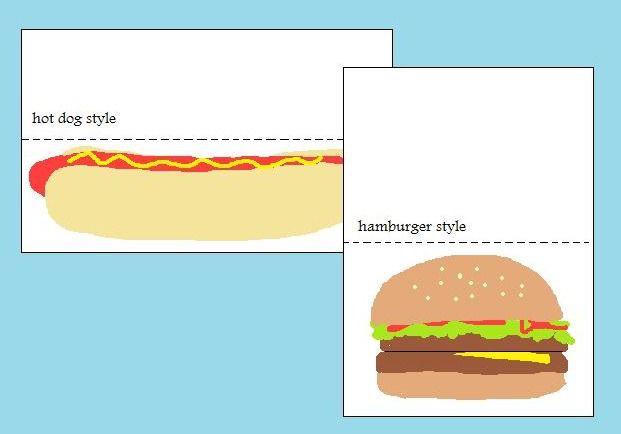
    Visual of hot dog and hamburger style folding. These are the typical folding styles for ‘happy birthday’ cards.

    If you’re looking for tips specifically focused on the design and drawing phase of crafting homemade cards, here are 10 valuable suggestions:

    1. Sketch Your Ideas: Start by sketching your card’s design on a blank sheet of paper. This preliminary step helps you visualize the layout and composition before committing to the final card.
    2. Consider Card Size and Orientation: Decide on the size and orientation (landscape or portrait) (hotdog or hamburger) of your card before diving into the design. This choice will impact the available space and layout possibilities.
    3. Choose a Focal Point: Determine the main element or focal point of your card’s design. It could be a beautifully drawn flower, a charming illustration, or a calligraphy ‘happy birthday.’ Make this element the star of your card.
    4. Explore Themes: Select a theme that aligns with the occasion or recipient’s interests. Whether it’s a whimsical design for a child’s happy birthday or a sophisticated motif for a formal event, a clear theme will guide your drawing.
    5. Color Harmony: Plan your color scheme carefully. Consider complementary and harmonious colors that evoke the desired mood. Test your chosen colors on a separate sheet before applying them to the card.
    6. Practice Your Drawing Skills: If you’re not confident in your drawing abilities, practice specific elements that will appear on the card, such as flowers, animals, or lettering. The more you practice, the more polished your final card will be.
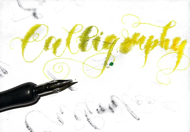
    7. Incorporate Hand Lettering and Fonts: Handwritten messages add a personal touch. If you’re comfortable with hand lettering, consider writing your card’s message using different fonts or calligraphy styles.
    8. Balance and Symmetry: Pay attention to balance and symmetry in your design. Ensure that elements are evenly spaced, and the overall layout feels visually pleasing. Symmetry can create a sense of harmony in your card. John Mulaney jokes about this concept in the video below.
    9. Experiment with Textures: Incorporate textures into your design. Use shading techniques, stippling, or cross-hatching to add depth and dimension to your drawings. Experimenting with textures can make your card visually interesting.
    10. Prototype and Refine: Don’t be afraid to create a few prototypes or drafts before finalizing your card. This allows you to test different design ideas and make refinements based on what works best.
    John Mulaney jokes about the well known situation of writing a happy birthday card without planning out the letters first.

    Remember, the design and drawing phase is where your creativity truly shines. Take your time, enjoy the artistic process, and let your unique style come through in each card you create. Whether you’re crafting cards for a friend’s happy birthday, holidays, or any special occasion, your personal touch will make them truly special and cherished by the recipients.

    Improving your calligraphy or hand lettering skills can make your cards look even more elegant and personal. I like to use a brush tip pen for calligraphy, though I would suggest the Piochoo Calligraphy Pens for beginner artists wanting a variety of different tips. If you find you like a specific pen style best, maybe think about investing in more expensive ones. My absolute go-to pen is the Pilot G-2 in 0.7mm for everyday use and dual tip brush pens for bullet journaling, custom cards, and sketchbook drawings. To learn more about my art supplies and what I prefer to use for drawing and painting, check out this article about my favorite mediums to use as an artist.

    Also, make sure to test out your markers and pens before writing on the final card! While I opt for pens and markers over ink, both can bleed through the paper.

    This artist used the wrong type of paper, and found their writing bled across the page.

    You may also consider integrating technology into your cards, such as adding a QR code that leads to a personalized video message or playlist. How cute would it be if you use a QR code for the ‘happy birthday’ song!! This modern touch can absolutely enhance the card’s charm and charisma.

    Tip 6: Assembling and Presenting Your Card

    Assemble your custom card with precision and patience. Pay attention to details like even folds and neat glue application. Small details like these will be what sets your work apart from a handmade gift to a memorable work of art.

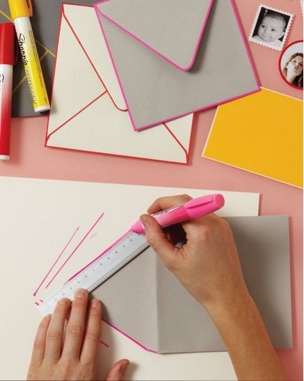
    Adding color to the edges of your envelope can help improve the presentation quality of your card.

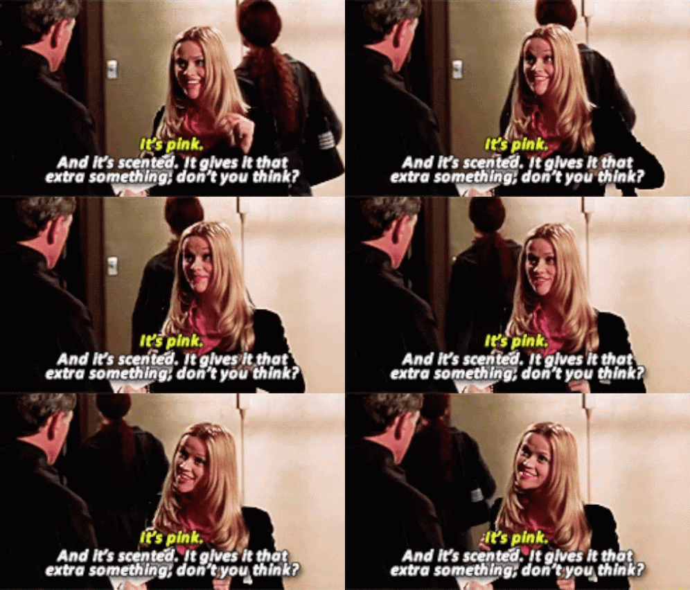
    How you present the card is as important as the card itself. Use a decorative envelope or gift box, and consider adding a small gift or token of appreciation to add that extra celebration. I like to throw in a couple cute stickers, cut out heart confetti, or spray a little of my favorite perfume. It gives it that extra something, don’t you think?

    Pink Scented GIF - Pink Scented Legally - Discover & Share GIFs

    Tip 7: The Joy of Gifting

    Now it’s time to give your custom card away! The joy on your friend’s face when they receive a handmade card is priceless. The surprise element adds to the delight. A well-crafted happy birthday card often becomes a cherished keepsake, a reminder of the beautiful moments you’ve shared with your friend.

    Celebrating Friendship Through Art

    In a world where digital communication often prevails, taking the time to create personalized happy birthday cards is a beautiful way to celebrate and strengthen your relationships and friendships. By planning ahead based on analytics and putting thought into each card’s design, you can make your friends feel truly special.

    Remember, it’s not about the card, but the love and care that go into making it. Your loved ones love YOU, not how well you can write ‘happy birthday’ in cursive. Even if you are no artist, crafting a personalized card lets your loved one know how much they mean to you.

    So, gather your supplies, unleash your creativity, and start crafting those meaningful happy birthday cards today! Your friends will undoubtedly appreciate the effort and thoughtfulness you put into each one, making their birthdays, holidays, and celebrations all the more memorable.

    How to wish someone Happy Birthday, 7 Artsy Tips! Read More »
    How to make your Graffiti Art Drawings more Captivating

    Introduction

    Graffiti art drawings are a testament to the resilience of self-expression in the face of conformity. These vivid visual narratives are far more than mere sketches on barren walls; they are declarations of defiance and creativity. In a world where the urban landscape is the canvas, how can you make sure your graffiti art drawings stand out and communicate your message? This article explores how to create captivating graffiti, offers insights and techniques, and describes the cynical journey art takes from the streets to museums.

    turtle graffiti art drawing painting by Martin Ron of 3D sea turtle swimming street art
    Pedro Luján and his Dog by Martin Ron features a stunning 3D graffiti painting of a sea turtle appearing to swim out of a hole in the wall.

    The Dynamic Spectrum of Graffiti Art Drawings

    Graffiti art drawings encompass a kaleidoscope of styles, messages, and mediums. Housed like the homeless, these drawings challenge conventions, spark conversations, and mirror society’s complexity.

    Crafting captivating graffiti art drawings involves striking a balance between artistry and audacity, and weaving narratives that resonate deeply.

    Basically, what makes something street art is the message in the context of the setting combined with visual aesthetics and painterly techniques.

    Banksy’s Whisper of Dissent

    Banksy is an England-based street artist, political activist, and film director whose real identity remains unknown despite considerable speculation. He is known for his satirical street art and subversive artistry combining dark humor with graffiti executed in a distinctive stenciling technique.

    Firstly, Banksy’s art is probably some of the most well known graffiti art in the world. That being said, the artist’s unknown identity juxtaposes their popularity, which fits the theme of this article.

    Banksy’s graffiti is moving. As shown below, works like “The Flower Thrower” resonates as a powerful statement against oppression and inequality. Banksy’s work comments on topics of capitalism, war, and issues in common society. Like Banksy’s graffiti art drawings, use your art to start conversation, question norms, and challenge views.

    Banksy graffiti art drawings
    Banksy creates some of the most well known graffiti art drawings like The Flower Thrower in which “the protester is a pacifist.”

    Shepard Fairey’s Iconic Amplification

    Next, Shepard Fairey’s works, such as “Obey Giant,” blend pop art with street culture, evoking emotions and creating a lasting impact.

    Incorporating recognizable symbols into his art, Fairey’s graffiti art style is instantly recognizable.

    Shepard Fairey’s first series Andre the Giant, was modeled after an image of professional wrestler André René Roussimoff

    Shepard Fairey’s art style is an exquisite fusion of pop art and activism. His signature use of bright, bold colors, striking visuals, and thought-provoking messages defines his work. In addition to visuals, his graffiti art drawings often carry an urgency to engage with social and political issues.

    Fairey’s meticulous attention to detail and his ability to distill complex ideas into impactful imagery are hallmarks of his artistry. Likewise, his art style exudes a sense of cultural commentary, a visual conversation that challenges norms and prompts contemplation.

    Basquiat’s Emotional Outpouring

    Jean-Michel Basquiat’s art is a raw emotional outpouring on canvas. His graffiti art drawings, like “Untitled,” evoke feelings through chaotic lines and vibrant colors. Similar to Shepard Fairey’s work, Basquiat uses the color red to invoke angry, passion, and intense emotions. Basquiat’s style mirrors Expressionism art styles, where color, texture, and brushstrokes reflect inner emotions. If you are interested in find out more about your personal art style, check out this art style quiz. Your art may also reflect an Expressionist style like Basquiat!

    Basquiat’s graffiti art drawings, like this work titled Untitled, rebel against traditional norms, and voice a bold testament to the power of unfiltered self-expression and an exploration of identity.

    Jean-Michel Basquiat’s art style is an electrifying blend of abstraction, street influences, and expressive rawness. His overall use of vivid colors and frenetic brushwork creates a sense of immediacy and emotional intensity.

    Often, Basquiat’s art incorporates text, symbols, and cryptic codes, inviting viewers to decipher hidden meanings. His fusion of cultural references, from African art to street graffiti, forms a visual tapestry that resonates with diverse audiences. Basquiat’s art style is a rebellion against traditional norms, a bold testament to the power of unfiltered self-expression and an exploration of identity.

    Inviting Interactivity with Ernest Zacharevic

    Ernest Zacharevic’s graffiti art drawings incorporate real-world objects, inviting passersby to interact. Similar to the two previous artists, Zacharevic wants his viewers to interact and really feel his art. His pieces engage viewers both visually and physically, sparking a sense of wonder and social participation. He incorporates physical elements into the graffiti art drawings, making it an immersive experience for the audience.

    The whimsical feeling of Ernest Zacharevic’s art style is a beautiful marriage of street art and interactive installations. His unique approach involves integrating real-world objects alongside his art, ultimately inviting viewers to actively engage with his art. Through this interplay, his pieces appear to come alive, blurring the line between art and reality.

    children on bicycle by Ernest Zacharevic requires the surrounding environment to provide context to the art.

    In short, Zacharevic’s art often exudes a playful and whimsical quality, injecting a dose of lightheartedness into urban landscapes. His ability to seamlessly merge physical elements with artistic expression adds a layer of surprise and delight to his work, turning passersby into participants in the artistic experience.

    Insights and Techniques for Clean Graffiti Art Drawings

    1. Master the Basics: Before diving into complex techniques, ensure you have a solid grasp of fundamental skills like line work, shading, and perspective.
    2. Experiment with Styles and Mediums: Try different graffiti styles like wild style, bubble letters, or stencil art. This exploration will help you find your unique voice. Check out my article on personal branding for context about how to find your voice and personal brand.
    3. Practice Sketching: Regular sketching sharpens your creative abilities and helps you refine your concepts before translating them onto larger surfaces. Drawing is an essential part in learning art and improving your graffiti art drawings. Read this article about drawing tips for artists.
    4. Study Typography: Understanding letterforms and typography is essential in graffiti. Study various fonts and letter styles to add diversity to your work. A fun and easy way to do this is through bullet journalling.
    5. Color Theory: Learn color theory to create eye-catching compositions. Experiment with color schemes and their emotional impact.
    6. Use Layering: Layering colors and elements can add depth and complexity to your work. Start with a base layer and build up from there.
    7. Create Depth with Shadows: Mastering light and shadow adds realism and dimension to your pieces. Experiment with light sources to create depth.
    8. Blend and Fade: Blending colors smoothly into one another adds a professional touch to your graffiti art drawings.
    9. Stencil Techniques: Stencils can help achieve intricate details and precise lines. Experiment with various stencil techniques for dynamic and detailed effects.
    10. Incorporate Texture: Use various tools to create texture in your art. Sponges, fabric, and even unconventional objects can add tactile interest, physically incorporating the audience and environment into the graffiti art drawings.
    11. Embrace 3D Effects: Incorporating three-dimensional elements gives your graffiti an extra dimension. Practice adding depth and highlights for a realistic look.
    12. Study Perspective: Understanding perspective is crucial for creating graffiti art drawings that interact with their environments. Practice drawing objects from different angles.
    13. Keep Evolving: Graffiti is about pushing boundaries. Continuously seek inspiration from other artists, experiment with new techniques, and never stop learning.

    Remember, graffiti art is a form of self-expression, so don’t be afraid to break the rules and develop your unique style. Practice, persevere, and maintain a willingness to learn: these will be your greatest allies on your journey to mastering graffiti art techniques.

    The Museum Paradox

    Does street art belong in museums? Does the surrounding environment matter in art?

    Banksy’s Unauthorized Exhibition

    In the MOCO Museum in Amsterdam, there is a permanent gallery called the ‘Laugh Now’ exhibit. It houses iconic works including Laugh Now, Girl with Balloon, Flower Thrower, Smiling Copper, Crude Oil series and many more.”

    When I visited the Moco Museum in 2021, I was met with a series of different emotions and questions. I felt the awe of seeing some of Banksy’s most famous works personally and confusion about whether the work should even be in a gallery, where I had paid money for entry.

    Man wearing mask stares intently at Banksy’s Home Sweet Home

    Additionally, on the Moco Museum website, the gallery states Banksy has no say in the exhibition of his work:

    “The ‘Laugh Now’ exhibition is not authorised by Banksy nor it is curated by the artist. Moco Museum features a diverse selection of original works throughout Banksy’s noteworthy career.”

    Moco Museum Amsterdam

    Christopher Michaut takes an interesting approach to the conversation of Banksy’s unauthorized exhibition in his article for the Daily Art Magazine.

    Simply put, it seems the very rebellious nature that gave rise to graffiti art is now being paradoxically displayed in museums.

    Artists who were once anonymous are now selling their artwork for high prices. This change is causing discussions about whether this move to museums is genuine or just for profit, and it’s making people wonder if the true spirit of street art can still exist in museums.

    On one hand, it lets more people see and appreciate this type of art. But, on the other hand, it may take away from the raw and daring essence that makes graffiti art unique.

    Understandably, this change is difficult for many artists. Moving from the streets to museums is a delicate balance between staying rebellious and fitting into a more mainstream setting. Likewise, the artist must choose between their origins and making the most of new opportunities.

    Environmental Effects

    On the other other hand, creating art for a museum is more legal and safer than spray painting a building without consent.

    In addition to legitimizing a street artists’ work, museums diligently safeguard precious artworks, ensuring their preservation for generations to come. Climate-controlled environments, delicate lighting, and expert care all come together to shield art from the ravages of time.

    However, the nature of graffiti art, often exposed to the elements and subject to the unpredictability of urban life, contrasts starkly with this protected realm. While museums provide a controlled haven for art, graffiti art exists vulnerably in its raw form, weathering the same elements that give it life.

    Pedro Luján and his Dog by Martin Ron, as mentioned in the introduction of this article, was destroyed when its wall was demolished in 2017 (photo © Buenos Aires Street Art).

    When artwork is moved from gritty city walls to the sterile halls of museums, an essential part of their essence is lost. The street, the texture, the unexpectedness – these are all elements that street artists use to their advantage when choosing the platform for their art. Placing graffiti art drawings in a museum might provide wider exposure, but it also strips away the very environment that gives the art its life and power.

    In museums, the vibrant interplay between art and context is muted, reducing the impact that graffiti pieces could have in their natural habitat. This is a prime example of why some people believe that graffiti art loses its authenticity when confined to museum spaces, as it’s severed from the very context that nurtured its birth and meaning.

    Conclusion

    Graffiti art drawings defy the boundaries of traditional artistry, pushing the limits of expression and protest. Artists like Banksy, Shepard Fairey, and Jean-Michel Basquiat thrive in controversy. Remember, your art can be commentary to injustice, encouragement for change, and a mirror to society’s idiosyncrasies. Find your brand, your voice, and share it.

    As you wield your medium of choice, whether a spray can or paint brush or chisel or Photoshop, remember that your art possesses the power to question, inspire, and provoke.

    In the streets where messages are drowned in noise, your graffiti art drawings can become the unsilenced voice. In every stroke, every splash of color, and every intricate detail, you encapsulate stories that transcend surfaces and resonate with souls. Embrace the irony of the museum paradox, for within it lies a testament to the evolution of rebellion and the temporary nature of creativity in the 21st century. Let your graffiti art drawings challenge, captivate, and leave an indelible mark on the world’s canvas, echoing the voices of the brave.

    How to make your Graffiti Art Drawings more Captivating Read More »
    Discover 19 Reliable Ways to Improve your Personal Brand

    What is personal branding and how do you start? Where do you find inspiration for it? How do you improve your personal brand through market changes? What are some great examples of personal branding?

    Introduction

    In the age of digital connectivity, crafting a compelling personal brand has become more than just an option—it’s a necessity. Your personal brand, a melding of your values, expertise, and online presence, is the compass that guides you towards opportunities and cultivates a meaningful online identity. This article dives headfirst into the art of building an impactful personal brand, offering insights, real-world examples, and a hopeful perspective on its role in your life.

    Wikipedia defines personal branding by providing the purposes of career advancement, increasing circle of influence, and having a larger impact.

    The Essence of a Strong Personal Brand

    Your brand isn’t just a buzzword; it’s the vivid tapestry that reflects who you are, both professionally and personally. It shapes perceptions, fosters connections, and sets you apart in a crowded digital landscape. Try building a powerful personal brand which uses a multifaceted approach across many platforms and with many outlets.

    To begin the process, think about your values, goals, and inspirations. Craft an identity you want to show the world. From there, add a color scheme, maybe a personalized logo, and a platform. For me, I use a website platform ArtsyDrawings.com.

    If you are at a loss for how to build an optimized website, check out my colleague’s web design service: True Ideas.

    Instagram Influencers: Building Communities Through Authenticity

    Instagram influencers like @chrissyteigen and @selenagomez have cultivated personal brands rooted in authenticity. They share unfiltered glimpses of their lives, forging genuine connections with their followers. Emulate their approach by showcasing the real you, sharing your passions, and engaging openly with your audience.

    selena gomez personal brand instagram page
    Selena Gomez takes an authentic approach to her Instagram account by posting a candid photo she references as a “random moment” taken by her friend.

    TikTok Creators: Crafting Compelling Stories in Seconds

    TikTok influencers like @charlidamelio and @zachking have mastered the art of storytelling within seconds. When they use their personal brand to entertain, educate, and inspire, they create content that resonates across demographics. Take inspiration from their succinct storytelling and translate it into your own narrative. Also, many marketers advise short videos as the future of successful marketing.

    Artists with a Digital Identity: Merging Creativity with Branding

    Artists like Banksy and KAWS have utilized their digital presence to amplify their artwork’s impact. Compared to artists who choose to evade social media, these digital connoisseurs have extended their artistic narratives onto social media platforms, effectively merging their creativity with personal branding. Basically, they infuse their personal brands with elements of their craft, merging art with branding.

    KAWS personal brand web search
    In some cases, the artist and his work become synonymous on Google. When you search Brian Donnelly, his work and his professional artist name “KAWS” dominates the first results page.

    Here at Artsy Drawings, I enjoy merging artistry with my personal brand. I use Linktr.ee to create a single, customizable link that houses multiple links to various online platforms. For me, these platforms include my portfolio, social media profiles like Pinterest and Instagram, and my online store. This link simplifies navigation for my audience, allowing them to access all relevant content from one central location.

    Brianna Eisman’s Linktr.ee includes her website, RedBubble, Fiverr, Venmo, LinkedIn, and Pinterest links. Each phrase includes a call to action.

    It is important to also note that changing your personal brand with the market is actually a good thing. Recently, I decided to rebrand my website and social platforms with a new color scheme, dedicated fonts, and a logo that focused more on Artsy Drawings itself. For more details on my rebrand, check out my About page.

    Job Hunting and Personal Branding: A Match Made in Success

    Personal branding isn’t confined to social resources; it plays a pivotal role in job hunting too. When potential employers search your name, what they find can significantly influence their decisions. It is vitally important, especially post graduation, to create a story about who you are and how you want the world to view you. Then, craft your personal brand to reflect your skills, passions, and professional aspirations, essentially turning your online identity into a compelling resume.

    1. Audit Your Social Media: First, go through your social media profiles and remove or adjust any content that might be seen as unprofessional or inappropriate. Delete posts or photos that could be misconstrued or reflect negatively back on you.
    2. Update Your Privacy Settings: Review the privacy settings on your social media accounts to limit what can be viewed by the public. By adjusting your settings, you can control who sees your posts, photos, and personal information. Make use of features that allow you to approve tagged posts before they appear on your profile.
    3. Create a Professional Online Presence: Next, focus on building a positive online image that aligns with your career goals. Share articles, posts, and content related to your industry to demonstrate your knowledge and interests. Consider creating a LinkedIn profile that highlights your professional accomplishments and connects you with others in your field.
    4. Use a Professional Email Address: Create a professional email address that uses your name rather than a nickname or casual (silly goose) handle. This small change can make a positive impression on potential employers when they communicate with you via email.
    5. Monitor Your Online Presence: Regularly search your name on search engines to see what information comes up. This will help you identify any potentially damaging content and take steps to address it. If you find negative information, then you can try to address it directly or focus on pushing positive content higher in search results through active online engagement. Also, try to research personal brand examples to see how influencers tackle positive and negative media.
    I created a separate public Instagram account for my artwork and photography. This public business account also allows me to track post insights and analytics.

    Digital Marketing Yourself: An Essential Skill in Today’s World

    In a world where digital interactions dominate, marketing yourself online is crucial. Similarly to businesses, you can use digital strategies to showcase your personal brand and reach your audience. Hence, dive into SEO optimization, content creation, and consistent engagement to cultivate a strong online presence.

    As you grow digitally, try to track your data through insights and analytics. This recording process can be integral in knowing how well your content is performing and analyzing how to improve. For more details about data visualization, collection, and reporting check out my article titled “How to Visualize Data as a Multi-Skilled Artist.”

    Noteworthy Personal Brand Examples

    1. Marie Forleo (@marieforleo): A businesswoman and motivational speaker, Marie Forleo’s personal brand is built on empowerment and entrepreneurship. Overall, her online platform provides valuable content that resonates with aspiring business leaders.
    2. Neil Gaiman (@neilhimself): Renowned author Neil Gaiman’s personal brand seamlessly weaves his fantastical writing with his witty and engaging online presence. He particularly uses platforms like Twitter to connect with fans, share insights, and showcase his creative process.
    3. Lizzo (@lizzo): Singer and body positivity advocate Lizzo’s personal brand radiates confidence, self-love, and unapologetic authenticity. Her empowering messages and music resonate with a global audience, making her a prime example of a relatable personal brand.
    4. Simon Sinek (@simonsinek): Leadership expert Simon Sinek’s personal brand centers around inspiring leadership and self-discovery. Basically, his TED Talks, books, and majority of his online presence encourage individuals to find their “why” and lead with purpose.
    5. Alex Strohl (@alexstrohl): Adventure photographer Alex Strohl’s personal brand seamlessly intertwines his passion for photography with a love for travel and the outdoors. His captivating visuals and storytelling inspire wanderlust in his followers.
    6. Amanda Gorman (@amandascgorman): Poet Amanda Gorman’s personal brand combines her powerful words with her advocacy for social change. Her eloquence and activism have made her a symbol of hope and progress.
    7. Casey Neistat (@caseyneistat): Filmmaker and content creator Casey Neistat’s personal brand is characterized by his unique storytelling style and his commitment to authenticity. Following his YouTube vlogs and cinematic videos offers insights into his life and creative processes.
    8. Gwyneth Paltrow (@gwynethpaltrow): Last but not least, actress and entrepreneur Gwyneth Paltrow’s personal brand revolves around wellness and lifestyle. Her company, Goop, and her online presence promote holistic living and self-care.

    Conclusion

    Crafting a compelling personal brand isn’t just about garnering followers; it’s about shaping an identity that reflects your values, aspirations, and expertise. As you navigate the digital landscape, drawing inspiration from Instagram influencers, TikTok creators, and notable figures like artists and public speakers, remember that personal branding is a journey of self-discovery and growth.

    Remember, in job hunting, personal branding acts as a beacon that attracts the right opportunities. By digitally marketing yourself, you take control of your narrative and present your most authentic self to the world. Whether you’re an aspiring entrepreneur, a creative artist, or a professional seeking advancement, your personal brand serves as your virtual handshake, leaving a memorable impression that extends beyond pixels and platforms.

    Embrace the evolution of your personal brand with hope and enthusiasm, for it is a canvas that you paint with your passions, experiences, and aspirations. As you infuse your online presence with authenticity, engagement, and a touch of inspiration, you’re bound to forge connections, open doors, and carve a meaningful path towards success.

    Discover 19 Reliable Ways to Improve your Personal Brand Read More »
    New Art Advice from Artsy Drawings

    Explore this collection of artsy articles about new art advice, techniques, art history, and my experiences as an artist in the 21st century.

    Art Advice for non-artists

    I know that not everyone who visits my page is a professional artist, so here’s a few articles if you are just starting out on your own artistic journey!

    For beginner and intermediate artists, I recommend you start with 5 Easy Drawings Tips and Color Knowledge Tips that will make you a Better Artist. Likewise, the article titled Words to Describe Art: How to Create an Artist Statement discusses words you can use to make you sound more like an artist, including the elements and principles of design.

    Dive into different types of art advice, art history, color theory, and even self critiques and artist statements. Enjoy!

    Subscribe

    Sign up for our newsletter and stay up to date

    *

    Art advice for artists

    In this section, I’ve included art advice articles more tuned to artists who have a confident grasp on the basics. This section serves to dive deeper into how to market yourself as an artist online, track and visualize data on social media, and provide insights into my personal experience with art. From using AI to create art to my favorite mediums and techniques, there is something here for any art enthusiast.

    Want to buy some stickers or decorate your home with my prints?

    Purchase my art on my RedBubble account!

    colorful marker drawing of pink orange yellow flowers poppies with blue stems. The sketchbook drawing sketch is surreal and maximalist art and fun

    New Art Advice from Artsy Drawings Read More »
    Cart
    0
    Add Coupon Code
    Subtotal