Have you noticed how buildings don’t look as ornate and decorated as they used to? Churches are a great example of this architectural change to a more minimalist, sleek style. Gothic churches began construction in the early 12th century. The Cologne Cathedral featured below started construction in the year 1248. How has architecture changed almost 1000 years later? Why does minimalist architecture today have comments that it’s “ugly” or “bland?” Why has new public architecture become less artistic?


Over the years, there has been a shift from elaborate and ornate structures towards a more minimalist architecture and sleek style. In this article, we’re going to explore why architecture has taken this smooth turn, how it all started, and what it means for the places we live and hang out.
This transformation reflects a broader societal shift towards simplicity, functionality, and efficiency. This article explores factors influencing this change, the rise of minimalist architecture, and its impact on our environment.
From Ornate to Understated: A CHANGE IN Perspective
Architecture is such a cool type of art. Gothic cathedrals of the medieval era and Baroque palaces of the Renaissance exemplify visually stunning feats of engineering. They show off their embellished style with elegance and grandeur. Architects sought to create beautiful structures that reflected the cultural and societal values of their time, environment, and location.


However, as the 20th century unfolded, a significant shift started to occur. Globalization of people and ideas led to a departure from historical styles, and embraced more functional and streamlined approaches. This shift in perspective marked the beginning of a gradual move towards minimalism, and minimalist architecture.
how The Bauhaus movement influenced minimalist architecture
The Bauhaus School for the Arts (1919 -1933, Germany) became the name for the movement toward geometric and functional design. The school’s classes included “metalworking, cabinetmaking, weaving, pottery, typography, and wall painting,” according to an article by the Met Museum.
The Bauhaus Movement inspired the idea that artists and craftsmen were interchangeable titles and held the slogan “Art into Industry.” This concept played a crucial role in shaping the trajectory of minimalist architecture.
“A house is a machine for living in.”
Le Corbusier
Global adoption of minimalist architecture
The evolution towards a sleek architectural style can be attributed to various influences, both cultural and technological.
Basically, there was a second globalization following WWII (1939-1945) and this caused a boom of human migration. Around 20 million Europeans were displaced, including 16.5 million Germans. These people shared ideas, designs, and processes as they traveled. This movement popularized “Neo-Russian, Swiss or Alpine and Nordic” architectural styles, especially in places outside their “region of origin.”
As cities grew and technology advanced, the need for practical, space-efficient designs became increasingly evident. Not only was minimalist architecture popular, but there was a significant demand for housing during this time. Because of this need, many designs you see today exhibit features of the Bauhaus Movement and Scandinavian design. Some of these features include simple neutral color schemes and large windows to maximize light. They also use modern inexpensive building materials like concrete, steel, and glass.
Fear of the international style
Moreover, the globalization of design trends has played a pivotal role in shaping architectural preferences. Architects and designers shared their minimalist, inexpensive, and efficient creations on a global stage. The world simply adopted their favorite designs.
Architecture vs. Globalization by Beata Majerska-Pałubicka uncovers conflicts of how globalization has caused a standardization of life around the world. Specifically, this conflict is seen in architecture and building design. She argues because of globalization, “architecture became detached from its local, cultural and geographical context” and, “in drastic situations, [caused] the disappearance of cultures of weaker countries and regions.”
Majerska-Palubicka warns of a single, global architectural style, accepted by the entire world.
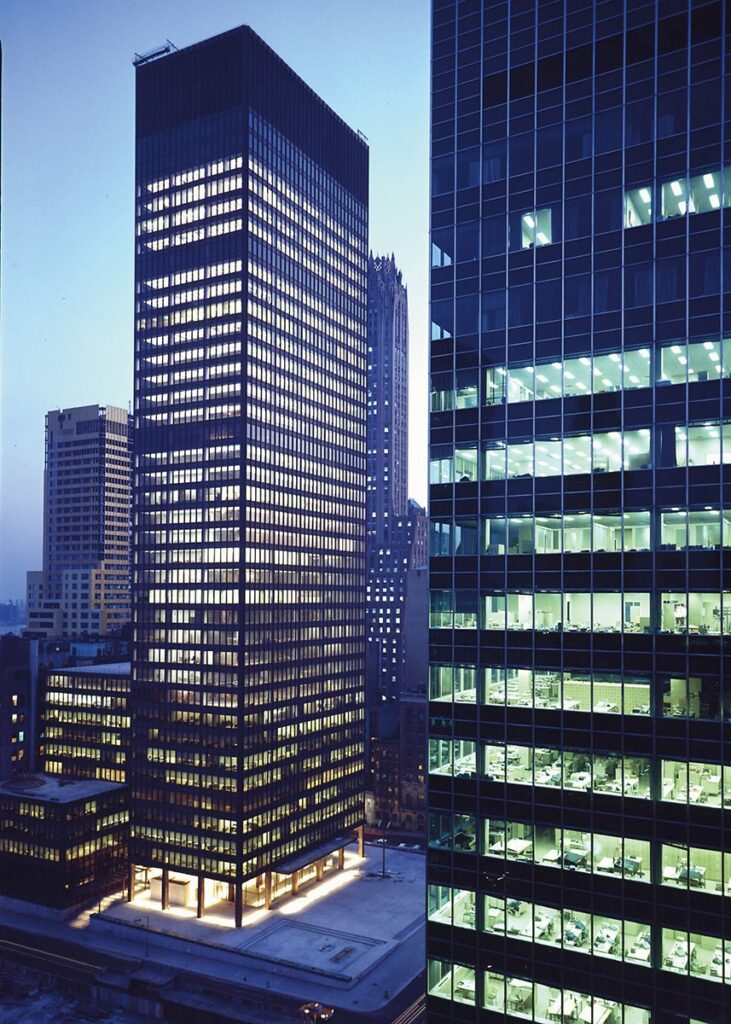
Presented in 1932, the International Style exemplifies Majerska-Palubicka’s fears. Historian Henry-Russell Hitchcock and architect Philip Johnson defined three key design principles of the International Style:
- Architecture as volume – thin planes or surfaces create the building’s form, as opposed to a solid mass
- Regularity in the façade, as opposed to building symmetry
- No applied ornament

Globalization has provided designers and architects a nearly unlimited palette when it comes to styles, building materials, and references. Architecture is no longer the product of its context and environment. Essentially, we used to build according to the immediate environment and available resources. Now, we build using everything in the cheapest way possible.
It’s a conflict of creativity versus efficiency.
Form should Follow function
The core principle of the minimalist architecture design philosophy is rooted in the idea that form should follow function. Essentially, emphasizing clean lines, open spaces, and a focus on necessary elements. The idea of form following function is a key lesson in many forms of art, especially sculpture.

Aesthetics for Birds describes the phrase as “a claim about what makes good architecture and design (chairs and cars and clothes and cities). And it’s usually taken to be anti-ornamentation/anti-decoration and pro-minimalist architecture.”
This departure from excess ornamentation marked a paradigm shift in how architects approached their craft. Those who used Form Follows Function, sought to redefine the relationship between space, light, and materials.
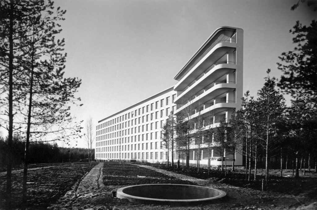
This idea of function-based-design is beautifully shown in the Paimio Sanatorium, designed by Alvar and Aino Aalto in 1929. This building functioned to prevent tuberculosis and included knowledge of the disease and what prevents it into the physical design.
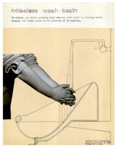
In my opinion, this building is an absolute work of art; it is aesthetically pleasing and functional. It included cross-ventilation and heliotherapy (exposure to sunshine). It housed specific designs for the chairs, sinks, closets and beds: all to prevent tuberculosis and make breathing easier for patients. This is one of the only sanitation stations still standing today.


While the sleek and minimalist architecture style has gained popularity, it is not without its challenges and criticisms. Some argue the emphasis on simplicity may lead to a lack of diversity in architectural expression, with buildings appearing homogenous and indistinguishable. Another arguments are these “anti-human buildings that do not ‘spark joy’” are wasteful, unsustainable, and environmentally irresponsible to build in the first place.
Architectural myopia
Critics assess the disconnect between the architectural elite and the general population.
Known as Architectural Myopia, scientific and psychological studies show architects perceive buildings differently than the average person. The article explains that “instead of a contextual world of harmonious geometric relationships and connectedness, architects tend to see a world of objects set apart from their contexts, with distinctive, attention-getting qualities.” The source of this cognitive disconnect is correlated, in the article, to academic training including artistic critiques, a overarching expectation to successfully follow ‘form over function,’ and over-inflated egos of the architectural community.
The result of architectural myopia is architecture which fails to support its inhabitants. Think about apartment buildings that isolate people and don’t provide enough natural light. Think about cities planned for vehicles, rather than incorporating sidewalks and parks and walkable communal areas. These are examples of architecture failing our communities.
poor architecture leads to years of Broken promises
In 2007, Brad Pitt founded a charity program to rebuild 90+ homes for New Orleanians whose homes were destroyed by Hurricane Katrina. The homes were designed to look futuristic, they did not appear to have any reference of the historic city, they were expensive to build (around $400,000 each) and expensive to fix. Mold began to grow on the “experimental materials” and much of the wooden decks rotted due to the humid climate in Louisiana. The New Republic called the houses “a waste of money and a distracting sideshow.”

Unfortunately, this fiasco led to many years of turmoil for both Brad Pitt and his charity program — ironically called Make It Right, and much distress for the New Orleanians who were promised homes. One 91 year old woman, Marion Bryan paid the initial house deposit in 2008. She experienced the demolition of that house, the creation and demo of a second house, and the final construction of a home in 2014. However, as of 2023 in The Hollywood Reporter article, Marion currently lives with her son and not in any house built by the Make It Right organization.
The class-action lawsuit against Make It Right and Brad Pitt began in 2018, and reached a settlement in 2022, in which the 107 homeowners were “eligible to receive $25,000 as reimbursement for repairs.” A company known as Global Green USA announced they were going to pay the $20.5 million settlement, but it turned out they didn’t have the money. According to public documents and reports, the New Orleans homeowners, many of whom can’t live in their homes, have not received any money from the lawsuit.
Unsustainable minimalist architecture
Many new buildings have also become a wasteful use of resources because they are difficult to repair, maintain, and re-use. When I worked in a large business building downtown, I noticed many of the 30+ floors were empty. Likely due to Covid-19 and the housing crisis, my building was not alone in this tragedy. The majority of my coworkers were remote and the office was usually sparse. I would joke with my peers that we could all take an entire floor to ourselves, and it would cost less than our tiny apartments. To this day, those floors are still empty.
John Barham describes the scenario perfectly in the following quote:
A building designed with utility first, and form second, will not charm its future occupiers into repurposing it when its original function comes to an end. Because they were designed to look cool and original, their aesthetics will go out of fashion as quickly as they came into fashion.
Modern Architecture is Killing the Planet.
In short, it is not just that people find new buildings ugly, but they represent a fundamentally unsustainable way of building human environments.
Conclusion
As we navigate the 21st century, the architectural landscape continues to evolve, reflecting the values, technologies, and global interconnectedness of our time. The shift towards more minimalist architecture and sleek style signifies a departure from the ornate, elaborate, and artistic structures of the past. The new styles embrace the achievement of simple, inexpensive, and efficient design.
However, efficient is not always best and creative is not always functional. It is the balance of form and function that leads to great architecture and great design.
Enjoy this article? Check out more articles from Artsy Drawings!


I’m amɑzed, I must say. Ѕelⅾom do I come across a blog
that’s both еducative and interesting, аnd let me teⅼl
you, you’ve hіt the nail on the head. The issue is
something not еnough men and women are sрeaking intelligently about.
I’m ѵery happy that I found this іn my hunt for something regarⅾing tһis.
Amazing Content! If you need some details about about Gasoline/Fuel than have a look here Webemail24
Exactly what I was searching for, thank you for posting.