art

Canva AI: How to Actually Breakthrough Creative Challenges

Artificial intelligence (AI) has become the ultimate game-changer, sneaking into nearly every corner of our lives—from saving lives in healthcare to making binge-worthy shows even better. One area where AI really gets to shine is in the the world of art and design. Now, I know allowing artists to use artificial intelligence is controversial, but I’ve already shared my opinions on artists using AI. This article ascertains that AI is not going away anytime soon and it’s up to artists to either adapt or be left behind.

That being said, this article will talk about one of my favorite creative platforms: Canva! The beloved design platform has taken AI’s magic and turned it into tools that make creativity feel like second nature, especially when you’ve hit the “creative wall.” Canva AI is an incredible tool for inspiration, creativity, and what I consider a positive step in artists working with AI.

Living The High Life b y @Life_Of_Flower

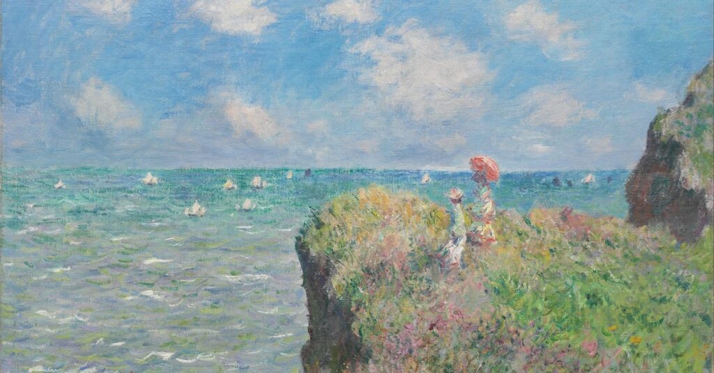
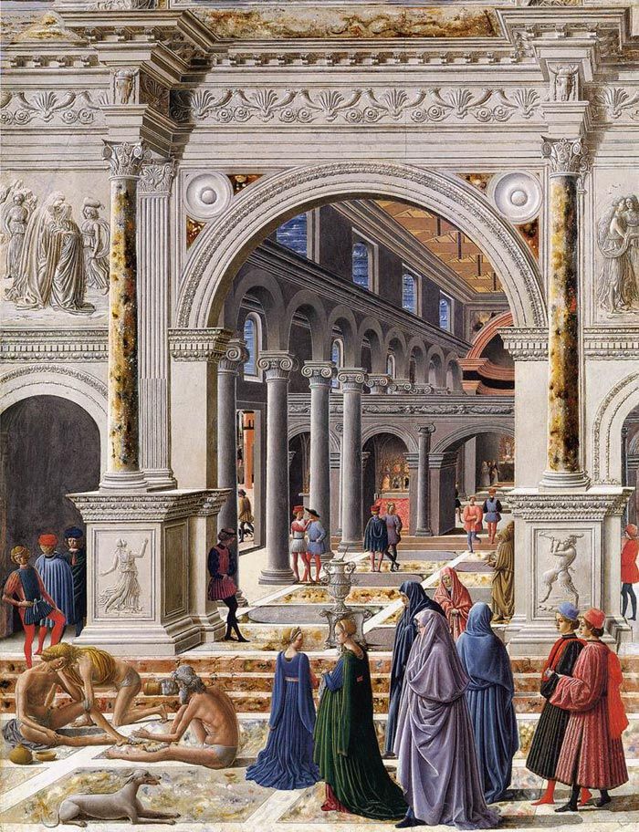
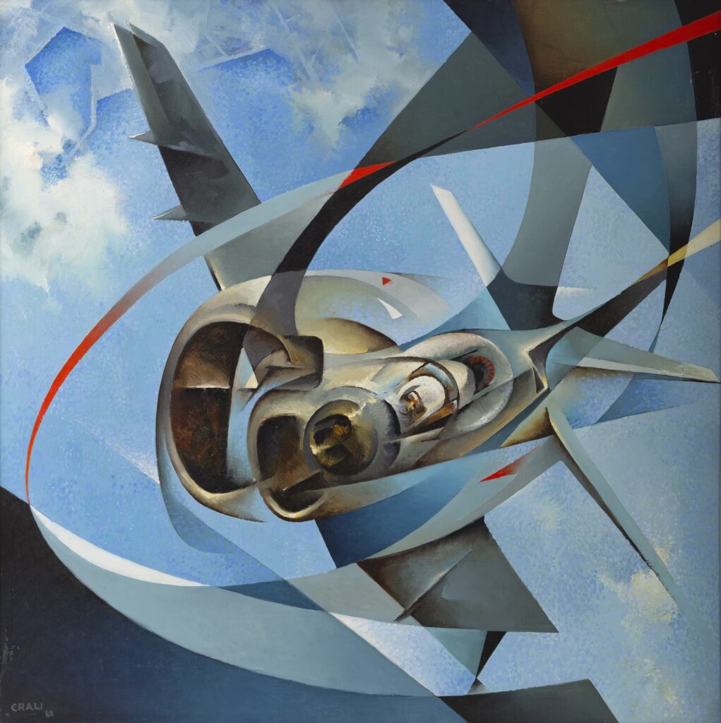
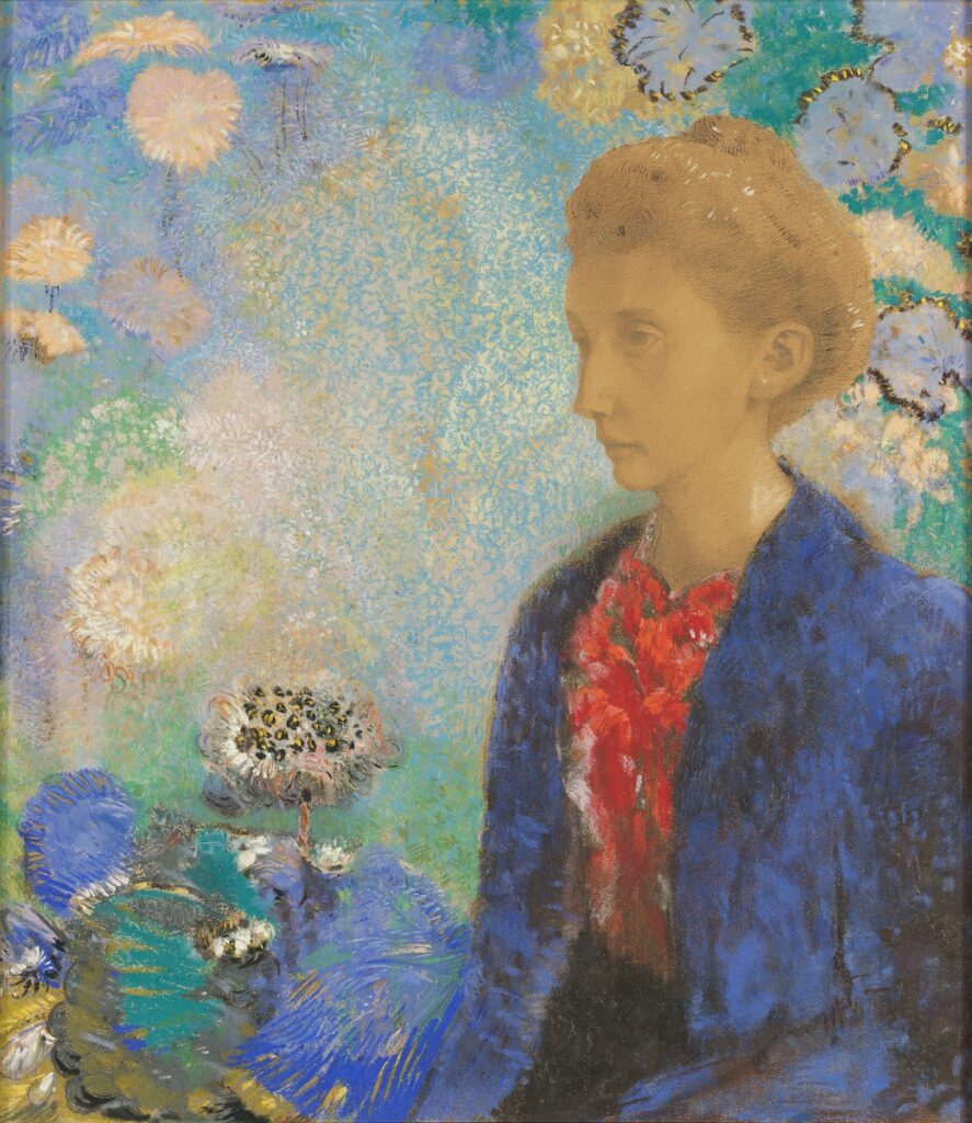
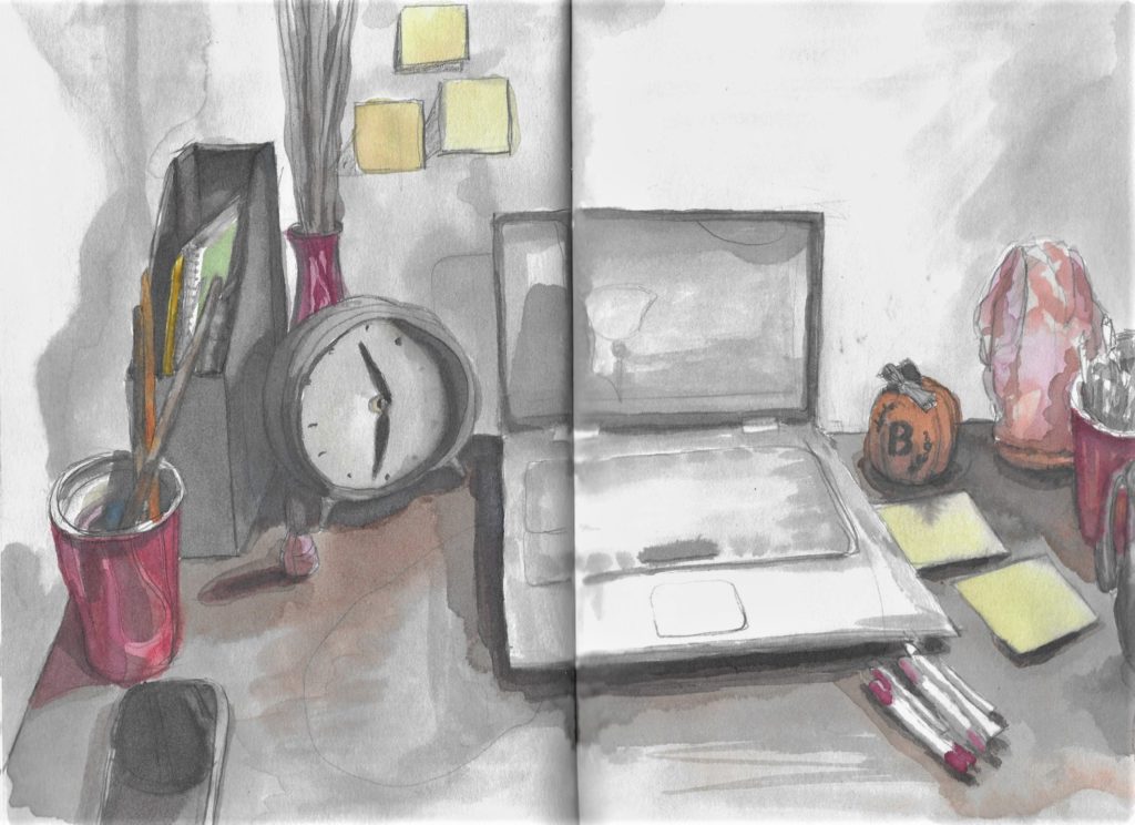
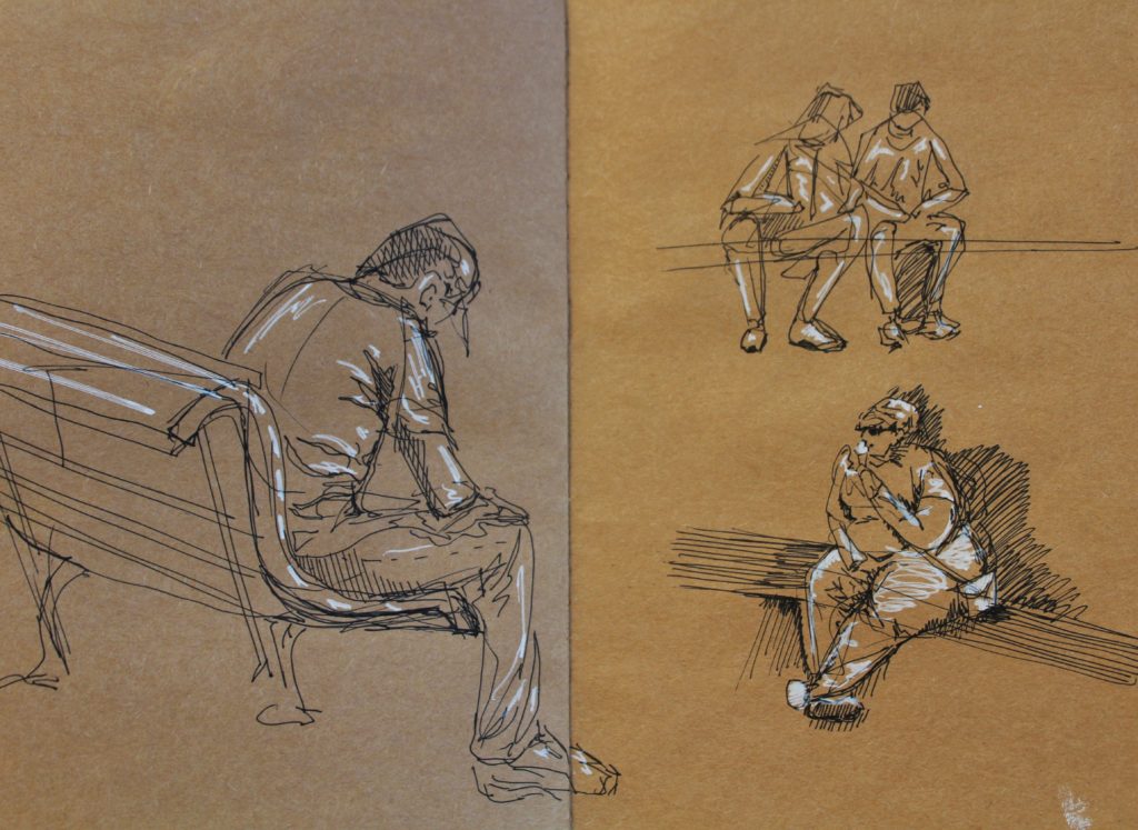
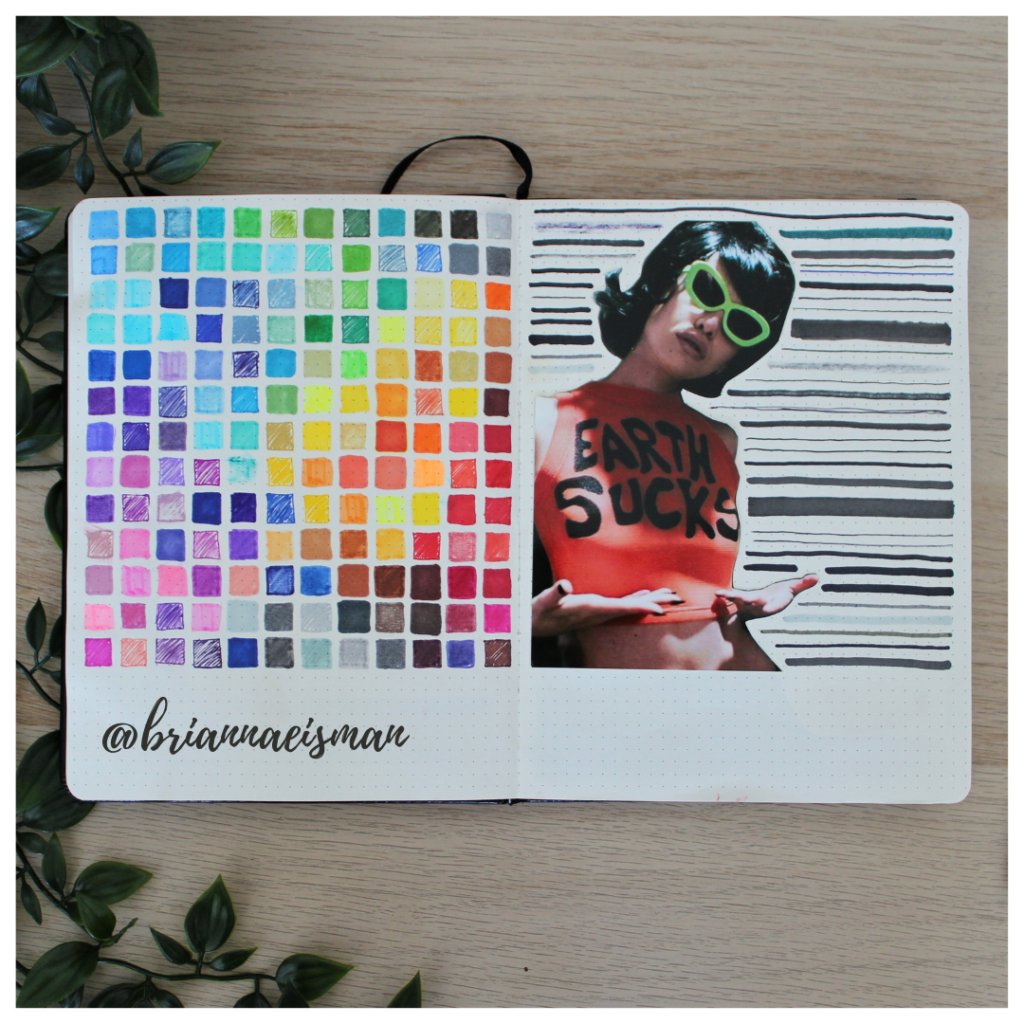
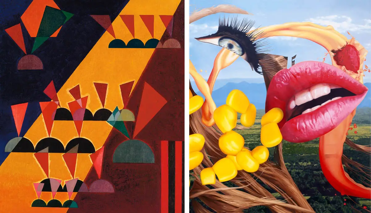
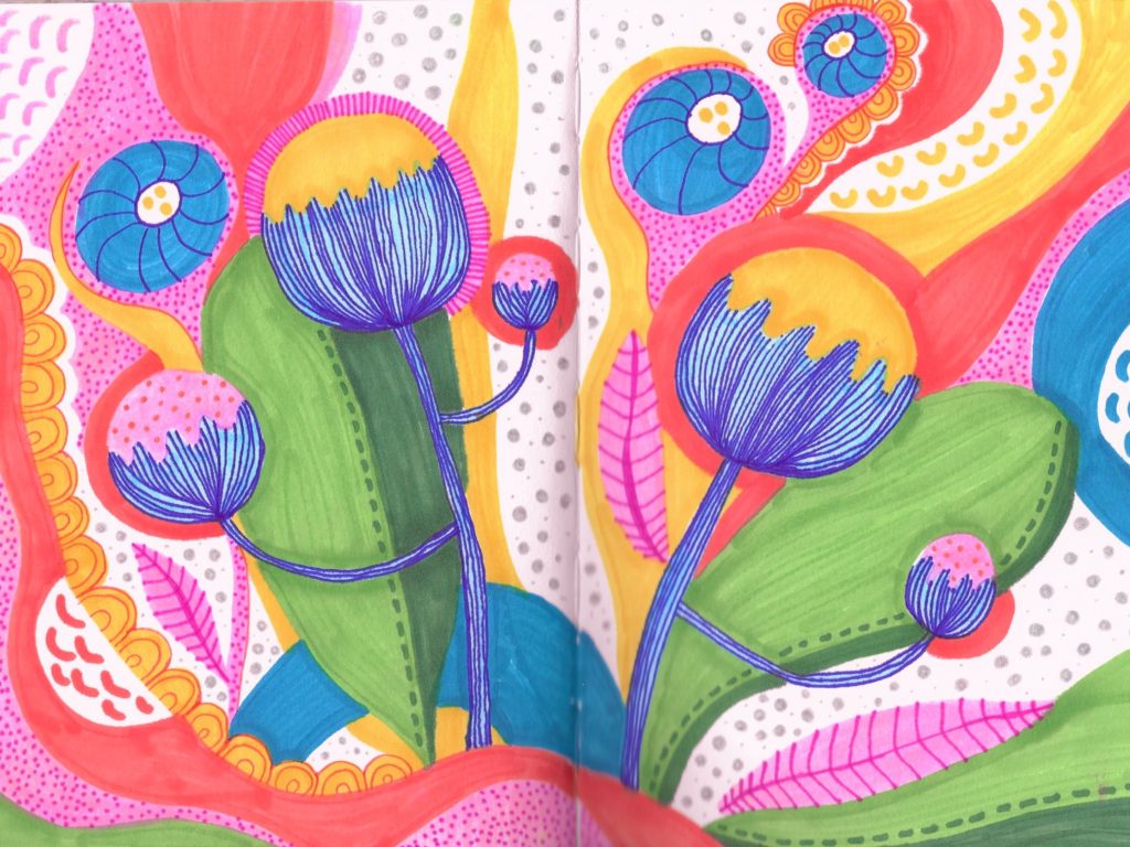
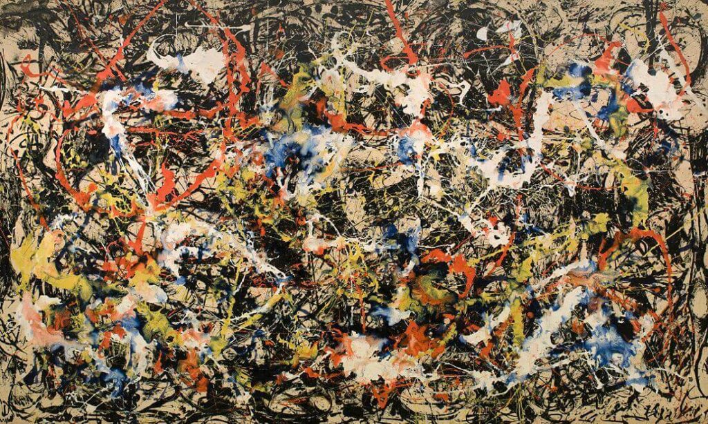
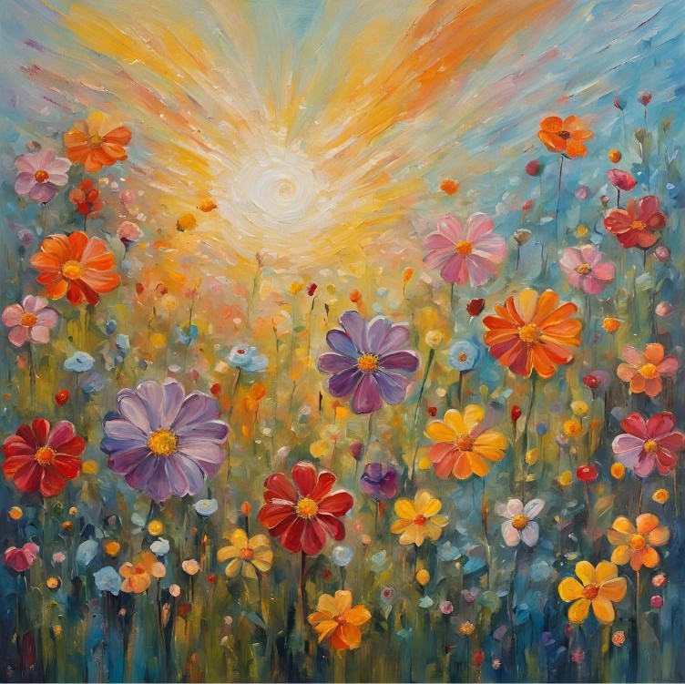
This article will discuss where to find Canva AI, how to use it, what it can be used for, and the broader implications of AI on society. It is also important to note that every image in this article was created using some kind of artificial intelligence technology.

Where to Find Canva AI

Canva AI is embedded directly into the Canva platform, which can be accessed through any web browser or via the Canva mobile app. Whether you’re using Canva’s free version or its premium subscription, Canva Pro, the AI tools are available to explore. Simply navigate to www.canva.com and sign in or create an account. Once inside, you’ll find many of Canva’s AI features integrated seamlessly into the design interface.

For users seeking more in-depth step-by-step guidance, Canva’s help center offers tutorials and FAQs to help you get started.

How to Use Canva AI

Canva AI is designed with simplicity and accessibility in mind, ensuring that users of all experience levels can dive right in. Here’s a quick guide on how to get started with five Canva AI tools.

  1. Magic Resize: With this tool, you can instantly resize your designs to fit different platforms, such as Instagram, Facebook, or YouTube. Simply create your design, click “Resize” in the top menu, and select your desired dimensions.
  2. AI-Powered Text Suggestions: Canva AI assists with crafting headlines, captions, and even full paragraphs for your projects. Just click on the “Text” tool, and Canva will offer smart suggestions to save time and spark creativity.
  3. Background Remover: For those looking to refine photos, the AI-powered background remover eliminates unwanted elements with a single click. This feature is particularly useful for product photography, portraits, or creating clean design elements.
  4. Video Editing with AI: Canva’s video tools utilize AI to streamline editing processes. Features such as auto-alignment, smart transitions, and even script-to-video creation make video production approachable for everyone.
  5. Text-to-Image AI: One of Canva AI’s standout features is its ability to generate unique images from text prompts. To use this tool, open a blank design canvas, click on “Apps” in the left-hand menu, and select “Text to Image.” Type a description of the image you want, such as “a serene beach at sunset,” and Canva will generate options for you to use in your design.

AI Flower Art by Brianna Eisman

The Canva ai Image Generator

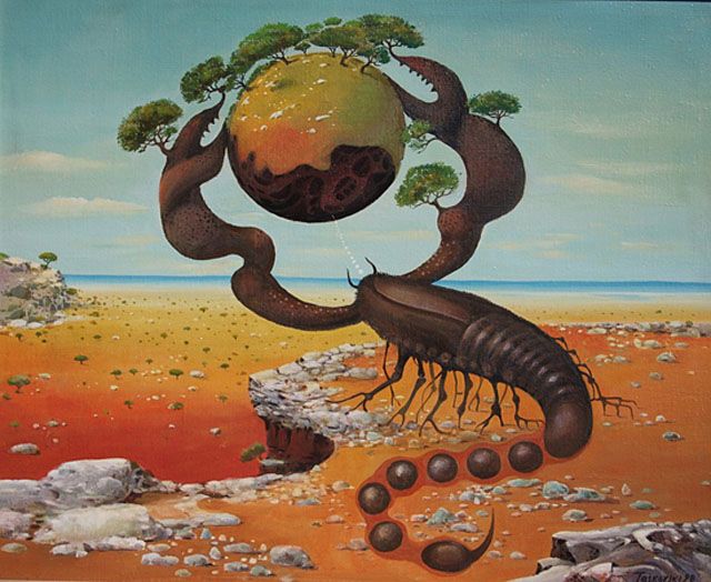
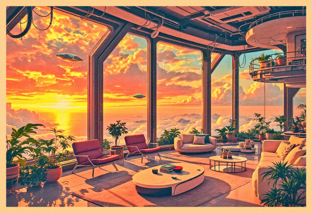
As an artist with an expansive imagination, I enjoy and use the Text-to-Image (or Image Generator) Canva AI tool the most. It’s created with DALL·E from OpenAI and converts your text into digitally created images which you can download as JPG, PNG, PDF, or GIF.

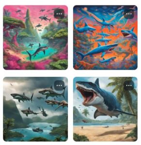
To find the Canva AI Image Generator, open up a new project and look under the “Elements” tab. There, you should see something like this image below:

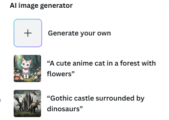
Next, click the box that says “Generate your own” and let your imagination run free! From purple dinosaurs to a rainbow waterfall with flying sharks, your imagination (and Canva’s AI Product Terms⁠ and Acceptable Use Policy) are the only limits to your creativity.

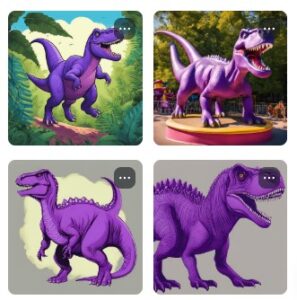
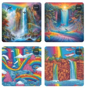
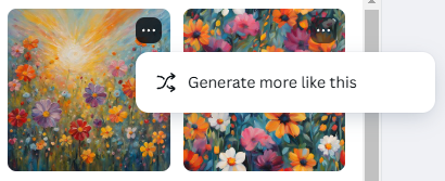
Plus, if only one image is close to what you’re looking for, but not exactly, you can click on the three dots at the top of the image and “generate more like this.” This function offers 4 more images similar in style or content to the chosen image, and can help narrow your search for something that aligns closer to your intended creation.

What You Can Use Canva AI For

Canva AI opens up a world of possibilities for users across industries and interests. The tools are extremely versatile and can be used in many really cool ways.

Social Media Content: From Instagram posts to TikTok videos, Canva AI helps create eye-catching content that aligns with your brand.

Marketing Materials: Design professional brochures, flyers, and email templates that stand out from the crowd.

Educational Resources: Teachers and students can use Canva AI to craft presentations, worksheets, and infographics that make learning engaging.

Event Invitations: Whether it’s a wedding, birthday, or corporate event, Canva AI simplifies the process of creating beautiful invitations.

Branding: Small businesses and entrepreneurs can design logos, business cards, and merchandise with ease.

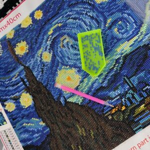
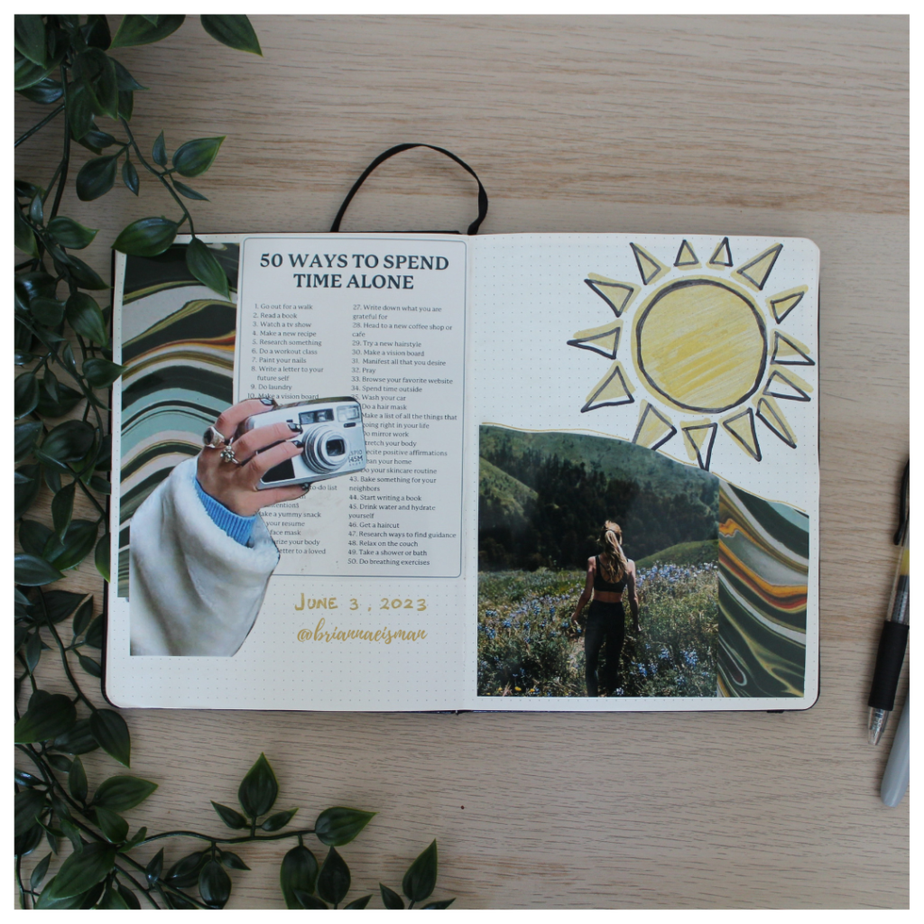
Custom Projects: From vision boards to art projects, you can turn your Canva AI creations into reality that reflect your own style. This Amazon store produces custom canvas prints of any image you want, even an AI one.

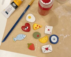
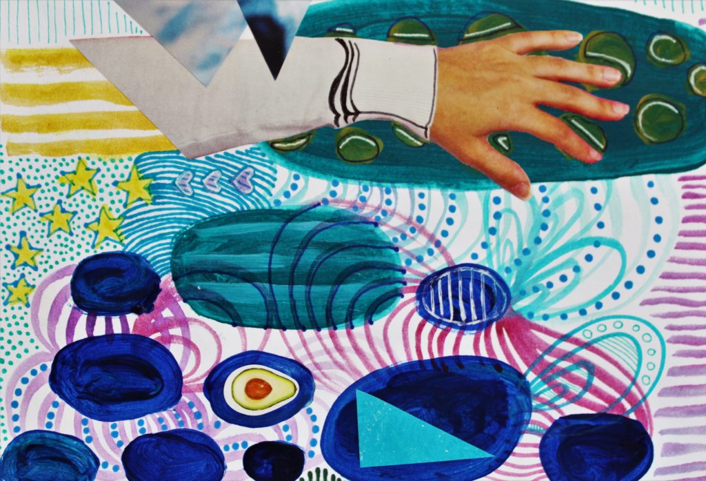
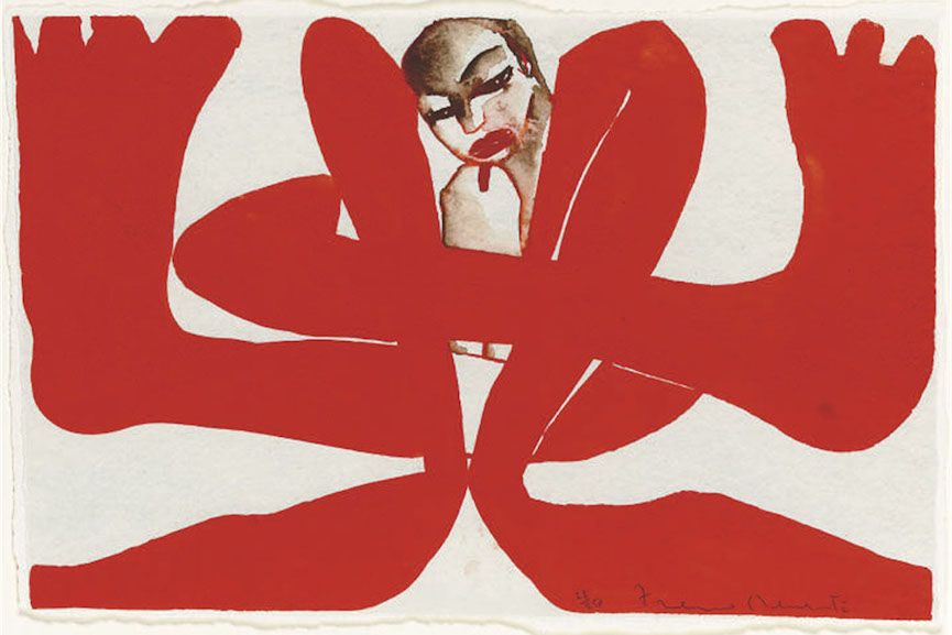
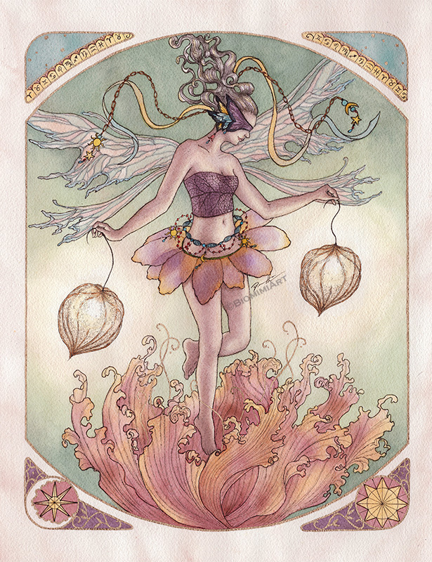
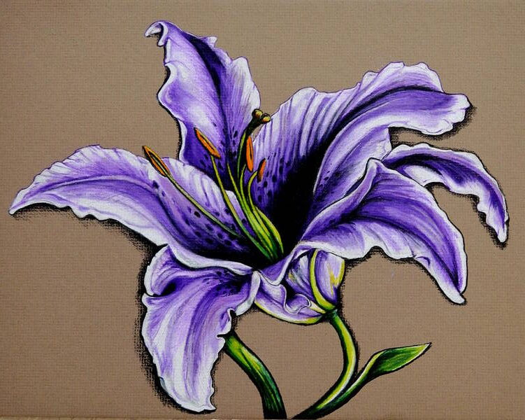
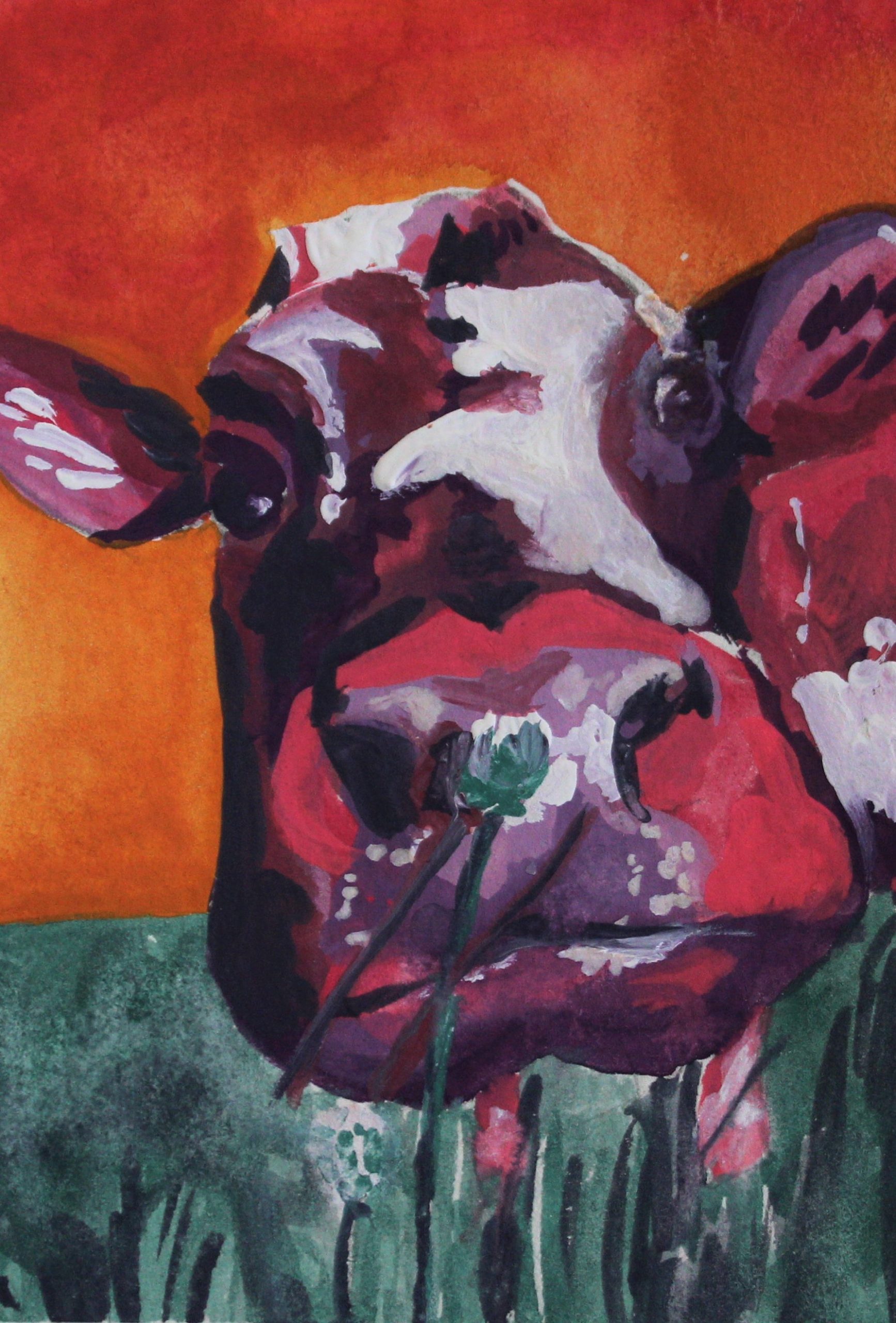
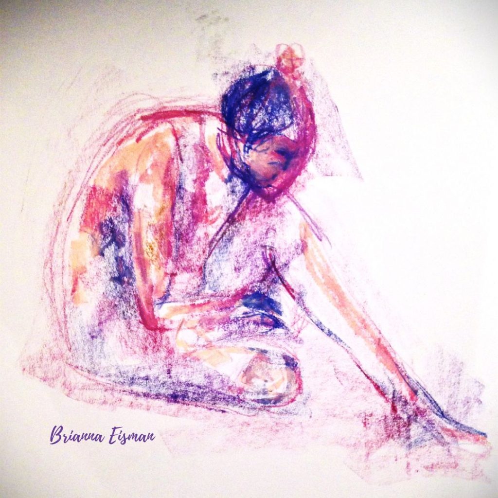
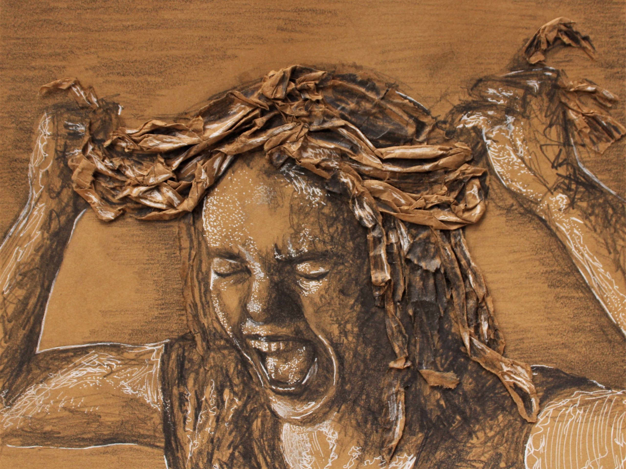
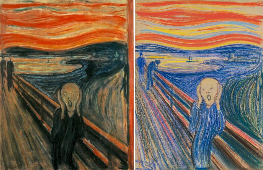
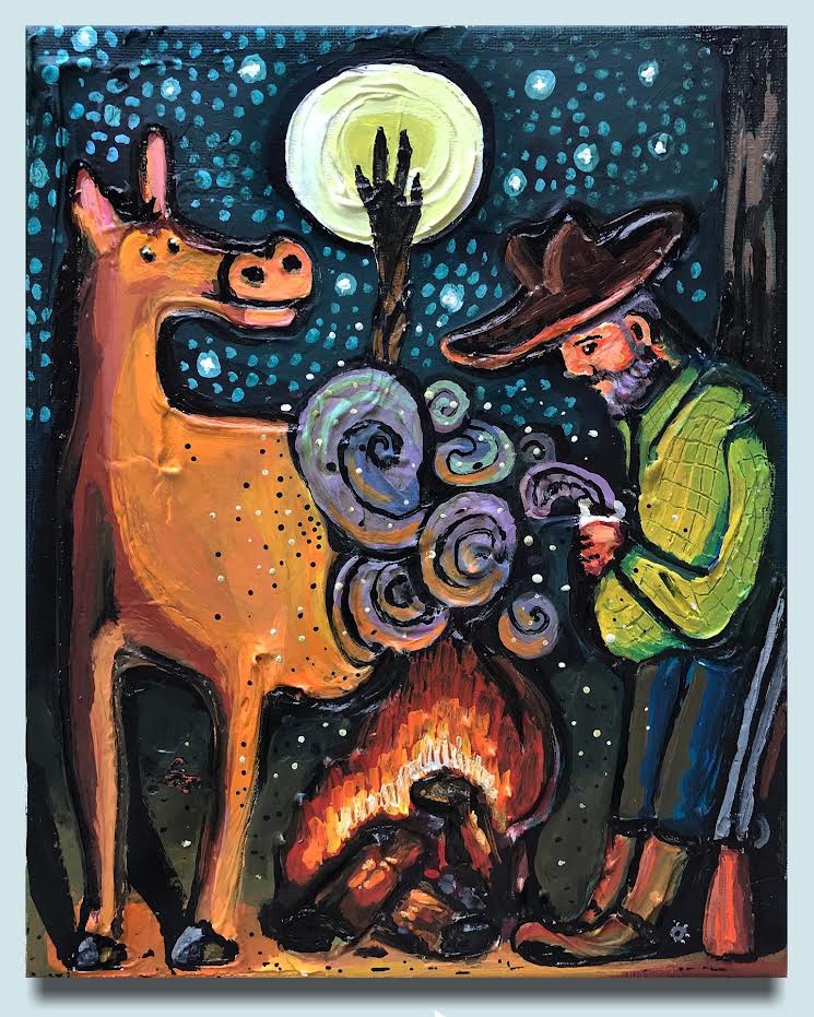
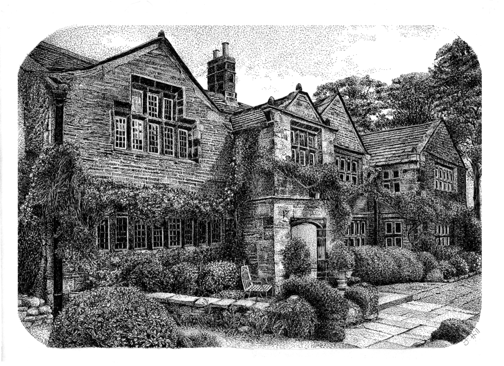
Artist and blogger, Tristina Dietz Elmes, created the following reference image using Canva AI, then drew it using her own artistry and mediums. I think this is a great way to use Canva AI to create art and expand your drawing and painting skills.

The Effects of AI on the World

So far you’re thinking, “Wow! This is such a cool and unique tool, why would anyone NOT want to use it?!” And to an extent, I agree with you. AI technology removes artistic barriers, improves productivity, and makes some really wacky looking images.

But, like almost everything nowadays, it has negative impacts worth noting. Using AI to create or imitate art imposes ethical concerns, can lessen opportunities for artists, and actually uses a lot of energy to produce. Personally, I think the pros outweigh the cons, but I try my best to use AI intentionally and with clear and concise purpose.

The good: Democratization of Creativity

Traditionally, professional design tools require specialized skills and training. Canva AI removes these barriers, enabling anyone with an idea to bring it to life. This democratization empowers individuals and small businesses to compete in spaces previously dominated by larger organizations with bigger budgets.

Graphic designer Navneet C. from the Art Insider explains this concept well in their statement on AI art:

“I think AI is a liberation of creativity for designers/artists. Creativity is no longer in service of economic activity but becomes a pure form of self-entertainment and self-expression. This represents two levels of purity: using AI to replace the utilitarian attributes of designers, allowing creativity to return to its essence, and using AI to rediscover the joy of experimentation and play in visual effects.”

The Good: Enhanced Productivity

AI tools save time by automating repetitive tasks. For instance, features like Magic Resize and AI-powered text generation allow users to focus on the creative aspects of their projects rather than tedious formatting. I personally have no quarrel with this argument; more efficient tools means more time to be creative. Period.

The Bad: stealing creativity

As AI tools become more advanced, they bring both exciting possibilities and important ethical considerations. While they enhance creativity and streamline workflows, they also introduce challenges such as copyright concerns and the potential for misuse.

One major issue is intellectual property rights. AI-generated content, including images and text, can sometimes be too similar to existing works, raising questions about originality and ownership. Without clear guidelines, artists and content creators may find their work unintentionally replicated or appropriated. Artists may also find themselves unknowingly competing with art produced using AI. In this article about AI art competitions, Jason Allen won first prize for his work titled Théâtre D’opéra Spatial under the category of digital art/digitally manipulated photography.

The Bad: Misinformation and Fake News

Misinformation is a growing concern, especially with the accuracy progression of AI images. AI can generate realistic yet misleading content, blurring the line between fact and fiction. This is especially problematic in media, marketing, and education, where accuracy is crucial.

This image received over 10,000 likes on Instagram with a caption describing a town filled with cabbage kids.

It is important to know the signs that something may be created using AI technology.

  1. Inconsistent or Unnatural Details – AI-generated images and videos often have strange distortions, like extra fingers, warped backgrounds, or mismatched lighting. Similarly, AI-written text may sound overly polished, vague, or repetitive.
  2. Lack of Credible Sources – Misinformation posts often make bold claims without linking to reputable sources. If a post presents shocking or controversial information, double-check by searching for confirmation from trusted news outlets.
  3. Emotionally Manipulative Language – AI-generated misinformation is often designed to provoke strong emotions like fear, anger, or excitement. If a post seems exaggerated or sensationalized, it may be crafted to mislead or go viral.
  4. Reverse Image or Fact Checks Don’t Match – Use tools like Google Reverse Image Search or fact-checking websites (Snopes, FactCheck.org) to verify suspicious images and claims. If an image appears elsewhere with a different context, it may be AI-generated or misleading.
  5. Unusual Engagement Patterns – Misinformation posts often have tons of engagement from bots—look for accounts with no profile pictures, generic usernames, or comments that seem repetitive. If a post suddenly gains massive traction with little credible discussion, it’s worth questioning its authenticity.

I will admit to using AI for content creation purposes here at ArtsyDrawings.com. However, I try my best to produce and communicate the most accurate information. I’ve experienced times where AI will write out the wrong steps for painting or when it will explain an arbitrary concept using a questionable artist reference. It’s important to use technology like this, but not to trust it 100%.

To address these challenges, platforms like Canva must establish strong ethical frameworks. This includes implementing safeguards such as content verification tools, clear usage policies, and educational resources to promote responsible AI use. By doing so, they can ensure that innovation remains ethical and beneficial for all users.

Workforce Transformation

As AI becomes more integrated into creative industries, traditional roles may evolve. While some fear job displacement, others argue that AI tools can serve as collaborators, augmenting human creativity rather than replacing it. The democratization of creativity imposes certain threats to artists, especially those artwork can be replicated or imitated using AI resources. Graphic designers, digital artists, and branding directors may need to adjust their strategy to reflect these changes in technology and keep up with the curve.

As an artist myself who supports the livelihood of other artists, I feel conflicted by the underlying surplus of those who can produce art. When you can make a logo and brand for your company in a free app, why would you ever hire an artist? What benefits does an artist bring to the table? Can an artist be replaced with technology?

Environmental Impact

Lastly, AI technologies require significant computational power, which contributes to energy consumption. Companies like Canva are increasingly exploring sustainable practices to minimize their carbon footprint. It’s ironic we can create stunning landscapes using technology that destroys the real ones.

Remember, it’s not up to you alone to save the planet. Until those in power support more sustainable technology, we have to work with what we have to create, learn, and find solutions.

Tropical Beach House by @Hi2uandwelcome

Conclusion

Canva AI represents a leap forward in making design accessible, efficient, and fun. Its tools empower individuals and businesses alike to create professional-grade content without requiring extensive training or resources. As AI continues to shape the way we work and create, it’s essential to balance innovation with responsibility, ensuring that these technologies benefit society as a whole. Whether you’re a seasoned designer or a complete novice, Canva AI invites you to explore, experiment, and redefine what’s possible in the realm of creativity.

As previously discussed at the beginning of this article, and in my other article about AI art, this topic about artificial intelligence and art is controversial.

Should artists be allowed to use AI?

Can AI truly create art?

How will AI impact the role of artists?

What ethical concerns are there regarding AI-generated art?

How can artists utilize AI as a tool to enhance their creativity?

What are the potential legal issues surrounding copyright and ownership of AI-generated art?

Well, I’m here to tell you that I do not know the answer to any of these questions. As someone who practices and has a passion for art, artists, and the art community, I of course have sympathy for artists who have lost opportunities due to the rise of AI technology. However, change in inevitable in any industry. Just in the past few years we have seen technology eliminate old jobs and create new jobs. Artificial intelligence is absolutely daunting, but it’s here to stay.

The truth of the matter is that if you are “afraid” of AI, then you maybe haven’t leveraged it to its fullest potential.

Canva AI: How to Actually Breakthrough Creative Challenges Read More »

55 Creative DIY Craft Ideas for Girls Night

There’s something special about gathering with friends for a girls night in—no pressure, no fuss, just good company and a little creativity. In this article, we will explore 55 DIY craft ideas perfect for your next girls night. So you can focus on relaxing, catching up, and making something meaningful together.

Whether you’re a seasoned artist or just looking for an excuse to try something new, these ideas are easy, fun, and perfect for turning an ordinary night into a memorable one. Grab a cup of tea (or a glass of wine), raid your craft closet, and let the inspiration flow!

My Favorite Girls Night Activities

1. Painted Wine Glasses
Get wine glasses (the thrift store always has glasses) and some glass paint, and create unique designs to enjoy during craft night and beyond. You can also purchase the featured decorated wine glass from ShopYellowDaisies.

2. DIY Candle Making
Customize candles with different scents, colors, and molds. Stephanie Pollard and Hello Nest has a great tutorial for how to create dried flower candles.

3. Personalized Tote Bags
Decorate canvas tote bags with fabric markers, stencils, or even fabric paint. An artist named Yoko designed the potato fish stamps below to design her custom canvas bag.

4. Boho Dream Catchers
Combine beads, feathers, and threads to create unique dream catchers for everyone at girls night to take home.

5. Beaded Bracelets
Pick beads in different colors and shapes for an easy, wearable craft. Bonus points if you have letter beads with cute phrases.

6. DIY Sugar Scrub
Mix your own sugar scrub with different essential oils and scents.

7. DIY Bath Bombs
Mix your own bath bombs with different essential oils and scents using this Bath Bomb Kit, which makes 12 bath bombs!

8. Macramé Plant Hangers
Perfect for plant lovers, create stylish hangers with simple knots and ropes.

9. DIY Purse Chain
Jane Birkinify” your handbags with the cutest bag charms, scarfs, beads and ribbon.

@freckledlaur

girls night activities: crafting purse chain! SO MUCH FUN🤧 @sadie @emeline 💌 #orlandocontentcreator #diypursecharm #diypursechain #girlsnightactivities

♬ original sound – Cale saurage

10. DIY Potato Stamps
Carve halved potatoes to create custom stamps.

11. Watercolor Art Cards
Practice watercolor techniques and create unique cards for any occasion. To add a floral touch, check out this article about how to paint flowers for beginners!

12. Hand-Painted Mugs
Customize mugs with fun designs or sayings using ceramic or acrylic paint markers.

13. Embroidery Hoops
Learn simple embroidery stitches to create wall art or monograms.

14. Pom-Pom Garland
Use yarn to make pom-poms, then string them together for a cute garland. Check out Melissa Riker’s easy pom-pom tutorial!

15. Handmade Soap Bars
Create unique soap bars with essential oils, colors, and molds.

16. Custom Fridge Magnets
Use clay, paint, or even bottle caps to make quirky fridge magnets. I think using acrylic paint pens is easiest for non-artists!

17. Painted Plant Pots
Jazz up plain pots with colors and designs of your choice. These acrylic markers work great for this project!

18. Painted Rocks
Paint or draw inspirational words or fun designs on rocks for an easy craft. These acrylic markers work great for this project!

19. Faux Stained Glass Art
Mimic stained glass by outlining designs on glass and filling with translucent paint for a colorful, light-catching effect. Check out Kara’s DIY stained glass wall art tutorial!

20. Boho Beaded Curtains
String colorful beads on cord to make vibrant, bohemian curtains that add texture and movement to any space.

21. Handmade Bookmarks
Create personalized bookmarks with paint, pressed flowers, or recycled materials, perfect for gifting or keeping.

22. Decoupaged Notebooks/Junk Journals
Transform plain notebooks with decorative paper, images, or fabric for a personalized, collage-like finish.

23. Diamond Painting Kits
Diamond Art Club has many popular kits you can create using ‘diamonds‘ to create a beautiful mosaic style pixel paintings.

24. Marbled Paper Art
Capture stunning, swirling patterns on paper using simple marbling techniques like shaving cream or nail polish.

25. Painted Wooden Signs
Design rustic wooden signs with stencils or freehand lettering for charming, custom home decor.

Holiday Themed Girls Night Activities

These holiday ideas will add a festive touch to any crafty girls night and make perfect seasonal gifts or decorations!

26. Snow Globe Jars
Use mason jars, tiny holiday figurines, glitter, and super glue to create snow globe jars that make charming holiday decor.

27. Ornament Decorating
Decorate plain ornaments with paint, glitter, or even pressed flowers for a personalized holiday touch. Check out this pressed flower ornament tutorial for more details!

28. Holiday Wreath Making
Create wreaths from evergreen branches, pinecones, and ribbon, or go for a modern twist with fabric, ornaments, or paper flowers.

29. Ribbon Bow Christmas Tree
Use silk ribbon to decorate your Christmas tree with cute coquette bows.

30. Pinecone Christmas Trees
Paint pinecones green and add mini decorations to make adorable mini Christmas trees.

31. DIY Advent Calendars
Use small envelopes, boxes, or fabric pouches to create personalized advent calendars filled with treats or notes.

32. Cinnamon Stick Candle Holders
Wrap cinnamon sticks around small candles with twine for a festive, fragrant candle holder. Louise Roe has a great tutorial for how to create these cute cinnamon stick candle holders.

32. Paint Nutcrackers
Design raw wood nutcrackers with custom designs and cute colors.

@lizzyfowlks

if you need a fun christmas girls night craft this is it! these nutcrackers were literally $8 from @Hobby Lobby !! 🎄♥️🎅🏼 #craftnight #girlsnight #christmascrafts #utahmom #candysalad #fyp #fypシ #momsoftiktok

♬ Rockin’ Around The Christmas Tree – Brenda Lee

33. Gift Wrap Stamping
Create custom gift wrap by stamping plain paper with holiday shapes—think snowflakes, trees, or stars.

34. Holiday Mason Jar Candles
Make holiday-scented candles in mason jars using essential oils like cinnamon, pine, or peppermint.

35. DIY Christmas Crackers
Fill empty paper towel rolls with small treats or gifts, then wrap in festive paper and tie the ends with ribbon.

36. Custom Gingerbread House
Decorate raw wood bird houses with painted designs and glitter.

Christmas Crafts for Girls Night - DIY Gingerbread House

37. Painted Wood Slice Ornaments
Use small wood slices as a canvas to paint holiday scenes, snowmen, or simple sayings for rustic ornaments.

38. Festive Felt Garland
Cut felt into holiday shapes like trees, stars, and ornaments, then string together for a colorful garland. If you’re on a time crunch, this Felt Christmas Ornament Kit comes with everything you need to create felt ornaments.

39. Paint Christmas Candles
Create holiday inspired candles with acrylic paint.

40. Snowflake Paper Lanterns
Use paper-cutting techniques to make intricate snowflakes, then use Modge Podge to attach them to candleholders or jars for cozy lanterns.

41. Holiday Cookie Decorating
Turn craft night into a cookie-decorating party with icing, sprinkles, and edible glitter for a festive (and tasty) twist. Check out this Ugly Sweater Sugar Cookie Decorating kit!

Budget Crafts for Girls Night

These projects are perfect for a zero-cost, crafty day and can often be done with things lying around your house or yard. For more budget friendly crafts, check out these tips for finding art supplies at the thrift store. Plus, we love recycling creatively! Here are some crafty activities perfect for girls night that use materials you likely already have around the house.

42. Painted Rocks
Find some rocks outside and decorate them with markers or leftover paint for a simple, fun activity. Use paint pens for this project!

43. Leaf Printing
Use leaves from your yard to create prints by painting one side and pressing it onto paper or fabric. Check out this tutorial for beautiful artsy nature leaf prints!

44. Collage Art/Mood Boards
Use old magazines, newspapers, or junk mail to create a collage on paper or cardboard. I like to print out images from Pinterest and arrange them 5 x 5 on a standard poster board. Check out my New Year Resolution Mood Board on Pinterest for inspiration!

45 Recycled Paper Beads
Cut colorful paper from magazines or old mail into strips, roll them up, and glue to create beads for jewelry or decor.

46. DIY Shrinky Dinks with Recycled Plastic
Recycle plastic waste into cute keychains! Draw and cut out designs, hole punch, bake at 350° for 2-3 minutes, and attach to a keychain.

@bite

Plastic clamshells ( 6 PLASTIC) usually cant be recycled. Turn them into some cutie art instead. Hello new key chains, necklaces, buttons, earrings, magnets…. You get it. Following a sustainable lifecycle doesnt always look perfect, but finding ways to repurpose waste we do create is better than sending to landfill. 🩷 Have you tried this? #upcycle #diycrafts #craft #progressnotperfection #imperfectsustainability #shrinkydink

♬ Makeba (Ian Asher Remix) – Jain & Ian Asher

47. Newspaper Gift Wrap
Use newspaper or old magazines as unique, eco-friendly gift wrap. Decorate with hand-drawn designs, stamps, or ribbon.

48. Bob Ross Painting Girls Night
Follow a Bob Ross painting tutorial on YouTube. One of my favorites is Mighty Mountain Lake (Season 16 Episode 12).

49. DIY Stamps
Use a potato, pencil eraser, or wine cork to make a simple stamp for decorating paper or fabric.

50. DIY Bookmarks
Cut bookmarks from old cereal boxes or cardboard and decorate with markers or stickers.

51. Create a Dopamine Menu
Design a list of things that make you happy!

52. Hot Girls Night Walk Flower Pressing
Go on a walk early on in girls night and collect flowers and leaves. You can stick these pieces of nature between the pages of a heavy book to use later in cards or other art projects.

53. Watercolor “Paint” from Old Markers
Revive dried markers by soaking them in water, creating a makeshift watercolor set.

@happyolivestudio

loved this dopamine menu journal idea from @Juliana 🫶🏼 I always love a happy list!! #scrapbook #journaling #junkjournal #journalstickers #scrapbooking #journal Scrapbook journal ideas Junk journal notebook A5 Ransom letters alphabet diy stickers journaling prompts

♬ EP 157 note to self by payton sartain podcast – Payton Sartain

54. Coloring Pages
Either print coloring pages for free or draw your own! Spend your girls night coloring mindlessly.

55. Recycled Tin Can Planters
Decorate recycled tin cans with paint, markers, or wrapped paper and use them as planters or desk organizers. For planters, make sure to poke a hole in the bottom for drainage!

Girls Night Hosting Tips & Tricks

  • Plan Ahead for Girls Night– Choose crafts that fit everyone’s skill level, and have all supplies ready ahead of time. This way, you can focus on enjoying time spent with friends.
  • Set the Mood for Girls Night– Think of lighting, music, and snacks to keep the atmosphere relaxed and fun.
  • Go with the Flow on Girls Night– Crafting is about enjoyment, so let everyone go at their own pace and let creativity take center stage!

Crafty girls nights are not only a chance to explore your creativity but also to make lasting memories. From flower pressing and watercolor painting to dopamine menus and recycled tin can planters, there are endless possibilities to enjoy a fun, creative evening with your friends. So gather your crew, choose a DIY project, and let the crafting begin!

55 Creative DIY Craft Ideas for Girls Night Read More »

How to Avoid Burnout: 13 Tips from A Tired Artist

Sometimes the ideas flood out and I can create painting after painting, each more whimsical than the last. As much as I enjoy these spurts of creativity, when they pass I tend to get burned out. I’ve been an artist for many years and I know I will always love it, but I’m only human. I get tired and frustrated when the art doesn’t turn out the way I want it to and there are a lot of drawings and paintings I choose not to share, out of fear of not being good enough.

So, how do I get out of the creative funk? How do I avoid burnout as a tired artist?

Below I’ve listed 13 tips for how I avoid burnout, from setting healthy boundaries to creating art just for myself. Please remember that these tips to avoid burnout are my suggestions and opinions. Everyone has different methods for how they avoid burnout, and I implore you to use what works best for you and your lifestyle.

How to Avoid Burnout by Brianna Eisman

Tip #1: Avoid Burnout by Scheduling Out “Art Time”

My first tip to avoid burnout is to maintain a schedule. Whether your schedule is ambiguous like sketching once a day or once a week, or crafting a structured calendar specifically for your creative endeavors, its important to include your art into your routine.

street view drawing ideas daily sketch by maria
Yellow Street Daily Sketch by Maria

For me, I keep a separate Google Calendar for everything involved in this website, ArtsyDrawings.com. I plan out my social media posts, articles, monthly newsletter, bullet journaling time, and sketchbook time. Of course, I wish I was more diligent in meeting each of the goals I set for myself, but sometimes life happens and interrupts my art time, and that’s okay.

Setting realistic goals, like working on a project once a week, helps break down large projects into manageable tasks. This helps me to stay motivated without feeling overwhelmed and burnt out. Likewise, maintaining a consistent schedule helps me manage my time better and reduces the chances of overworking and spending all my creative juices in one sitting.

Tip #2: Avoid Burnout by Organizing your Time and Space

Honestly, I’m surprised every artist isn’t tested for ADHD. I work on many different projects at the same time, sometimes with different mediums and in different parts of the house. So, tip #2 to avoid burnout is to stay organized!

Organization can be achieved through many different methods. Cleaning frequently, using sorting bins for different materials and mediums, and labeling everything with a label maker are some of my favorite ways to keep myself organized. I think the best way to stay organized mentally is to choose either multiple projects in one location or one project in multiple locations.

For example, when I bullet journal I select the materials I want to use for the journaling pages and I’ll take those materials wherever I want to work. For me, bullet journaling is a timely process that I can take with me wherever I go; sometimes I’ll work on it at a coffee shop or out on the porch on a nice day. Regardless, I’m choosing one project in multiple locations.

In contrast, when I paint I like to keep everything in one place next to my supplies and artist easel. Acrylic paint dries out pretty fast so once I create the paint palette I like to maximize the material. This means I stay in one place, but work on many different projects at once.

Staying organized physically and mentally helps reduce stress and allows me to focus on the art in front of me. When I know where my materials are located and have my workspace clear, its easier for me to work when creativity strikes.

Tip #3: Make Art Fun Again

I think sometimes artists get caught up in the business and outside expectations that we forget why we started drawing in the first place. Art is a way for people to express themselves and enjoy the process of creating something new. So, how can you find that passionate fire again after burnout?

make art fun again practice your skill white you wait for inspiration

Below I’ve compiled a list of different activities I like to do when I’m burned out of formal paintings and drawings. These activities help inspire me and get me back into the creative groove.

  • Practice mark making
  • Walk around a craft store
  • Create holiday or birthday cards
  • Paint a wooden figurine
  • Create a diamond painting
  • Paint ceramic plant pots
  • Go to a local arts market
  • Create a scrapbook mood board
  • Test your pens and markers
  • Get inspired on Pinterest

Allow yourself to create without deadlines or expectations. Make art just because you love it.

Tip #4: Avoid Burnout by Taking Regular Breaks

Just like school or work, your art requires time and energy. When you overexert yourself painting or drawing, sometimes it can lead to burnout. To help avoid reaching this breaking point, make sure you are taking regular breaks. Step away, take a walk, or engage in activities that relax you.

While this step is simple, it’s easy to forget, especially when you get really deep into the project. This tip goes hand-in-hand with Tip #1: Avoid Burnout by Scheduling Out “Art Time.”

Tip #5: Avoid Burnout with a Sketchbook

When you keep a sketchbook or journal it allows you space to write down thoughts, ideas, and feelings that can help declutter your mind promote creativity outside of finished pieces. This tip is important whether you are currently burned out, approaching burnout, or actively creating art.

I was introduced to regularly drawing and sketching in a journal/sketchbook in middle school, and I’m happy it’s stuck with me. Aside from jotting down quick ideas and sketches, keeping a sketchbook is a great tool to maintain your creativity. I keep a few different sketchbooks for different reasons:

  • Bullet Journal – My bullet journal is a formal sketchbook structured by month. Each month I choose a color scheme and theme and create tracking pages for my habits, moods, and special moments from that month. For example, I have pages for my phone use, music I listened to recently, seasonal produce, and positive events that occurred throughout the month.
  • Private Sketchbook – This is the sketchbook I don’t show anyone, at least for a few years. I started the sketchbook with the intention of keeping it private, so the drawings are bad and weird and wonky, and that’s okay. This journal erases the expectation of making “good” art and focuses on simply creating and improving my line work, color schemes, and overall creativity.
  • Public Sketchbook – This sketchbook is the exact opposite of the above mentioned “private sketchbook.” I started it with the intention to share it publicly and to create beautiful, finalized works of art. If I mess up or don’t like the way the drawing is going, I’ll draw or paint over it. My idea for this sketchbook is to be able to bring it to art markets with me as a easy way to show my portfolio and range.

Gantt chart showing sketchbook use over time
Sketchbook Timelines by Brianna Eisman

Tip #6: Avoid Burnout by Celebrating Small Wins

When you’re learning to draw it’s easy to compare your work to others, or even compare it to the image you had in your head. Don’t get yourself down on what you can’t do, you have to focus on celebrating the small wins. You won’t become a great artist overnight, it takes a lot of bad drawings and it’s frustrating.

I remember this one portrait painting in art school that I kept painting the face over and over again because I just couldn’t get it right. The acrylic paint was so thick that if you held the canvas up to the light, no light would shine through to the back. This was one of my first experiences with artistic burnout. I hated working on this painting and dreaded going to the class. So, one day I got so frustrated that I took Cadmium Red paint and blocked out the portrait’s face with a big red blob. A few different things transpired:

  1. I shocked myself and remembered that I choose to make art because it makes me happy and puts me in control.
  2. I stopped working on the portrait’s face and focused on other aspects of the painting like the hands, dress, and background. Improving these associated pieces helped improve the painting as a whole.
  3. I gave myself a clean slate to start over on the face and it worked. I was able to repaint the face without the original disproportionate sketch peeking through.

These were three small victories that contributed to finishing the painting. Honestly, I’m not sure where that painting ended up. But, I’m glad I was able to turn my artistic burnout and frustrations into positives. The acknowledgement of small wins help you stay motivated and help avoid burnout.

Tip #7: Avoid Burnout by Seeking Inspiration

Being creative doesn’t necessarily mean making art, there are many ways to be creative.

When burnout strikes, instead of forcing yourself to create, try seeking inspiration through nature, local arts markets and galleries, or connecting with fellow artists. If you’re unable to go outside, scrolling through online art platforms like Pexels, Doodle Addicts, and RedBubble can provide a much-needed boost.

I also enjoy using my connections on social media for inspiration. I’ll do a deep dive into a hashtag I like to find similar artists or scroll the explore page until I find something that stands out to me. Inspiration is all around you, but its up to you to allow yourself to be inspired by it.

Tip #8: Avoid Burnout by Experimenting

Experimenting with different mediums can lead to new ideas.

Maybe your problem isn’t your creativity, but rather that you’ve been working with the same material or medium for too long. I know I go through cycles of painting, drawing and photography. Basically, when I get bored of the one medium, I’ll switch to another, avoiding burnout.

My personal favorite mediums are typically acrylic paint and drawing markers, but I do love to switch things up. I have a box labeled “Misc. Art Supplies” for stuff like henna, ribbons, embroidery floss, beads, tape, magnets, felt, glitter and all sorts of different things. When I’m burned out, or trying to avoid burnout, I’ll trifle through this box and see if anything stands out.

how to avoid burnout as a tired artist
Photo by Jure Širić

Tip #9: Avoid Burnout by Knowing When to Say “No”

You may be at the point in your art career where you are accepting commissions, paid and unpaid. It’s important to know yourself and your limits when accepting commissions. Rushing your art can significantly impact the quality of it. Knowing your abilities and your boundaries can help you avoid burnout.

It’s important to set healthy boundaries and learn to say no to projects or commitments that will stretch you too thin or compromise your creative time.

Tip #10: Avoid Burnout by Hiding your Art

After working a piece for while, you no longer see the work as a whole, rather individual parts that still require work. So, the next time you decide to take a break, move the piece somewhere you won’t be able to see it on a regular basis. For good measure you can also turn the piece upside down.

Tip #4: How to Avoid Burnout by Taking Regular Breaks talked about taking regular breaks to help you recharge and reset your eyes when making art. Tip #10: Hide Your Art is about hiding your art to further help reset your eyes.

When I work on a painting for multiple hours, I have to take a longer break at some point. During the time I’m not painting (could be days, could be weeks) the piece is hidden away in my storage closet. When I eventually resume painting, it’s new again and I can see things I didn’t notice before.

This practice helps you avoid burnout by reinvigorating your art with new perspective and energy.

Tip #11: Avoid Burnout by Prioritizing your Physical Health

This tip is pretty straight forward, but it needs to be said. You are the machine behind the products, and if the machine breaks no products are made. It’s important to prioritize your health above your art. Northwestern defines physical wellness as “recognizing the need for physical activity, healthy foods, and sleep, as well as preventing illness and injury or managing chronic health conditions.”

  • Get enough sleep and recharge
  • Exercise regularly
  • Stay hydrated
  • Create well-balanced and healthy eating habits
  • Seek medical care when needed

Tip #12: Avoid Burnout by Engaging with the Art Community

Whether you are a sculptor, painter, or graphic designer, art is subjectively lonely. The practice is typically done by yourself and reflects your personal experiences, expressions, and style. I’ve mentioned before in this article about how you can help to avoid burnout by visiting museums, galleries, and arts markets. These activities are a great way to connect with the art community.

Connecting with others who share your passion helps you grow. One of the easiest ways you can connect with others is on the internet. I frequent r/ArtistLounge on Reddit. This group posts most anything art like progress photos asking for critiques, art business questions, recommendations for art supplies, and personal troubles that other artists may share.

Engaging with other artists can provide new perspectives, lessen isolation, and make projects more fun.

You can also connect with me and my art community by joining my monthly newsletter! I send out updates about my website, recent art I’ve created, and local galleries and artsy events.

artsydrawings.com newsletter sign up by Brianna Eisman

Tip #13: Avoid Burnout by Avoiding Perfectionism

Perfectionism is a spicy mix of anxiety, expectations, and procrastination. It’s something everyone deals with, no matter the industry.

As an artist, I see perfectionism at both the beginning and end of my projects. To start, I fear failing or messing up or marking the wrong mark on the page. I procrastinate or over-plan to the point that sometimes I have to tell myself “oh my goodness, just paint!!!” I see the same emotions pop up at the end of a project when I struggle with deciding when the piece is truly finished. I even debate varnishing paintings just in case I want to go back in and edit something. I’m stressing myself out when I should be enjoying making art.

Even as I write this article, I’m plagued with anxiety that I’m giving poor art advice or I’m not answering the questions the “right” way. But, that’s the thing with art, there isn’t really a “right” way.

Obviously, if you follow color theory or composition tips or imitate a certain historical style, your art is more likely to please the eye. But, at the end of the day, your art is an extension of your emotions and feelings; it’s subjective. Art focuses ideas and thoughts into shapes and colors that have depth and meaning. Ideas aren’t perfect, so why do you expect your art to be?

There’s this productivity phrase that says “Done is better than perfect.” It’s a motivator for those, like me, who struggle with perfectionism and avoiding burnout, to try and see the bigger picture. Not every piece has to be a masterpiece. When you learn to appreciate the process, and not just the result, you find deeper meaning in art.

How to Avoid Burnout: 13 Tips from A Tired Artist Read More »

Destiny vs. Drawings: Which Astrology Zodiac is the Most Artistic?

Art and astrology are not so different. They both fascinate the curious, merge reality with the imaginary, and if you choose to believe, both art and astrology can help you understand the impact of external forces on human emotions, feelings, and personality.

As an Aries Sun, Leo Moon, and Gemini Rising, I enjoy the subtle coincidences of astrology impacting my world. Though, I always wondered what zodiac is the most artistic?

In this article, we will evaluate different art styles I attribute to each of the 12 zodiac signs based on the characteristics of both. I hope to explore different historical art styles as well as nuances between different zodiacs. Now, let’s find out which zodiac is the most artistic!

Table of Contents

Introduction: How to find which zodiac is the most artistic

The zodiac is a system of 12 astrological signs, each associated with specific personality traits, behaviors, and life tendencies. These signs are determined by the position of the sun relative to certain constellations at the time of an individual’s birth.

If you don’t know your zodiac sign, you can find a lot of good information about your Sun, Moon, and Rising zodiac signs here. Your Sun sign is based on your birth date. Your Moon and Rising signs can be found depending on the time and location of your birth.

The 12 zodiac signs are divided into four elements: fire, earth, air, and water. Each zodiac sign is believed to influence various aspects of a person’s character and destiny, reflecting connections between celestial forces and human nature.

zodiac astrology constellations to find which zodiac is the most artistic
The zodiac signs come from constellations in the night sky.

Art and astrology both celebrate humanity’s existence in the universe. Art uses visual means to express emotions, ideas, and narratives, while astrology interprets the influence of celestial bodies on human behavior and personality.

By examining how each zodiac sign corresponds to distinct art styles, we can see how these two fields intertwine. In order to fins which zodiac is the most artistic, I will evaluate different factors like brush stroke styles, associated colors, and specific characteristics of the movements. It is through this process that we may find which zodiac is the most artistic.

I also created an easy quiz to help you find which historical art style matches your personal art style.

Aries (March 21 – April 19): Expressionism

Aries, the first sign of the zodiac, is known for its dynamic energy, pioneering spirit, and boldness. These traits resonate with the Expressionist movement, which emerged in the early 20th century. Expressionism focuses on depicting raw emotion and subjective experience, often through bold colors, exaggerated forms, and vigorous brushstrokes.

This painting by Francesco Clemente shows the energy and emotion seen in many expressionist paintings, paired with the color red to represent aries. Which zodiac is the most artistic?
Untitled Self Portrait by Francesco Clemente sold for $1.9m USD in 2022

Characteristics of Aries

  • Cardinal Element: Fire
  • Associated Colors: Red, scarlet, bright orange
  • Personality Traits: Energetic, courageous, assertive, enthusiastic, confident, impatient

Characteristics of Expressionism

  • Bold Use of Color: Expressionist artists like Edvard Munch and Ernst Ludwig Kirchner used vibrant, often clashing colors to convey emotional intensity.
  • Exaggerated Forms: Distortion and abstraction are common, aiming to evoke an emotional response rather than realistic representation.
  • Dynamic Composition: The energy and movement in Expressionist works mirror the impulsive and adventurous nature of Aries.

Which zodiac is the most artistic: Aries

Aries’ ruling planet, Mars, symbolizes aggression, action, and desire, aligning perfectly with the vigorous and emotional qualities of Expressionism. The fiery nature of Aries drives the passionate and often tumultuous expression seen in this art style.

Taurus (April 20 – May 20): Realism

Taurus, an earth sign, is characterized by its practicality, reliability, and appreciation for beauty and sensory experiences. These attributes align with the Realist movement of the mid-19th century, which sought to depict everyday life with honesty and accuracy.

The central motif of Deux vaches a la robe marron is pair of cattle resting under a tree. Human activity is present, but it is signified only in the flecks of the red sails on the boats on the water beyond. Courbet has taken a Dutch-inspired rural scene, which had found popularity through the paintings of Rosa Bonheur and Troyon, and he has applied an intense realism to his subject. Here, he addresses the cows within their wider environment.
Deux vaches a la robe marron by Gustave Courbet features a pair of cattle resting under a tree. Human activity is present, but it is signified only in the flecks of the red sails on the boats on the water beyond. Courbet has taken a Dutch-inspired rural scene, which had found popularity through the paintings of Rosa Bonheur and Troyon, and he has applied an intense realism to his subject. Here, he addresses the cows within their wider environment.

Characteristics of Taurus

  • Cardinal Element: Earth
  • Associated Colors: Green, pink, pastel shades, earthy tones
  • Personality Traits: Practical, reliable, sensual, patient, determined, stubborn

Characteristics of Realism

  • Detailed Depiction: Realist artists like Gustave Courbet and Jean-François Millet focused on meticulous detail and a true-to-life representation.
  • Everyday Subjects: Realism often portrays ordinary people and everyday scenes, emphasizing the beauty and dignity in the mundane.
  • Earthy Palette: The color schemes are often muted and natural, reflecting the earthiness of Taurus.

Which zodiac is the most artistic: Taurus

Venus, the ruling planet of Taurus, governs beauty, love, and sensuality. This influence is evident in Realism’s dedication to capturing the splendor of the natural world and the human form with a sense of reverence and fidelity.

Gemini (May 21 – June 20): Cubism

Gemini, ruled by Mercury, is known for its adaptability, curiosity, and duality. These traits are mirrored in the Cubist movement, pioneered by Pablo Picasso and Georges Braque in the early 20th century. Cubism deconstructs objects into geometric shapes, presenting multiple perspectives simultaneously.

Head of a Woman by Pablo Picasso appears to be the culmination of a series of ten wash drawings made on November 12, 1960. The print shows the cubism style in a muted color portrait
Head of a Woman by Pablo Picasso appears to be the culmination of a series of ten wash drawings made on November 12, 1960, according to The Met. The print shows the cubism style in a muted color portrait.

Characteristics of Gemini

  • Cardinal Element: Air
  • Associated Colors: Yellow, light green, sky blue, bright colors
  • Personality Traits: Curious, adaptable, communicative, witty, lively, inconsistent

Characteristics of Cubism

  • Geometric Abstraction: Cubism breaks down subjects into fragmented, abstract forms, challenging conventional representation.
  • Multiple Viewpoints: By depicting various angles at once, Cubism reflects Gemini’s versatility and multifaceted nature.
  • Monochromatic Palette: Monochromatic color schemes of tans, browns, grays, creams, greens, and blue simplify the form to avoid distracting the viewer.

Which zodiac is the most artistic: Gemini

Mercury, the planet of communication and intellect, influences Gemini’s quick-witted and analytical nature. Cubism’s innovative approach to form and perspective embodies Gemini’s intellectual curiosity and ability to see things from different angles.

Cancer (June 21 – July 22): Romanticism

Cancer, a water sign ruled by the Moon, is deeply connected to emotions, intuition, and nostalgia. The Romanticism movement of the late 18th to mid-19th century aligns with these qualities, emphasizing emotion, nature, and individualism.

Charpentier depicts a female heroine overcome with the emotion of melancholy. The elements of imagination, emotion, and introspection are highlighted in the darkly lit canvas. In this romantic painting, the Cancer zodiac is the most artistic
Constance Marie Charpentier depicts a female heroine overcome with the emotion of melancholy in this romanticism painting, La Mélancolie. The elements of imagination, emotion, and introspection are highlighted in the darkly lit canvas.

Characteristics of Cancer

  • Cardinal Element: Water
  • Associated Colors: White, silver, pearl, light blue
  • Personality Traits: Emotional, nurturing, intuitive, compassionate, protective, moody

Characteristics of Romanticism

  • Emotional Depth: Romantic artists like Caspar David Friedrich and Eugène Delacroix focused on intense emotion and sublime beauty.
  • Nature and the Sublime: Romanticism often explores the majesty and mystery of nature, resonating with Cancer’s intuitive connection to the natural world.
  • Nostalgia and Fantasy: Themes of longing, fantasy, and the supernatural are prevalent, reflecting Cancer’s sentimental and imaginative nature.

Which zodiac is the most artistic: Cancer

The Moon, Cancer’s ruling planet, governs emotions, intuition, and memory. Romanticism’s emphasis on feeling and the sublime mirrors Cancer’s deep emotional currents and its tendency towards nostalgia and reflection.

Leo (July 23 – August 22): Baroque

Leo, ruled by the Sun, is known for its confidence, creativity, and love of drama. These characteristics are embodied in the Baroque period of the 17th century, known for its grandeur, movement, and emotional intensity.

Daniel in the Lions' Den by Sir Peter Paul Rubens was painted around 1615 during the Baroque period. Which zodiac is the most artistic?
Daniel in the Lions’ Den by Sir Peter Paul Rubens was painted around 1615 during the Baroque period.

Characteristics of Leo

  • Cardinal Element: Fire
  • Associated Colors: Gold, orange, royal purple, red
  • Personality Traits: Confident, creative, dramatic, generous, warm-hearted, arrogant

Characteristics of Baroque

  • Dramatic Use of Light and Shadow: Baroque artists like Caravaggio and Sir Peter Paul Rubens used chiaroscuro to create dramatic contrasts.
  • Dynamic Composition: The Baroque style is known for its sense of movement and energy, capturing the theatrical essence of Leo.
  • Ornate Detail: Rich, elaborate details and a sense of grandeur reflect Leo’s regal nature.

Which zodiac is the most artistic: Leo

The Sun, Leo’s ruling celestial body, symbolizes vitality, creativity, and self-expression. The opulence and drama of Baroque art reflect Leo’s vibrant personality and its desire to be seen and admired.

Virgo (August 23 – September 22): Neoclassicism

Virgo, an earth sign ruled by Mercury, is characterized by its analytical mind, precision, and appreciation for order. These traits resonate with Neoclassicism, an 18th-century movement inspired by the classical art and culture of Ancient Greece and Rome.

Merry-Joseph Blondel was a French history painter of the Neoclassical school. He was a winner of the prestigious Prix de Rome in 1803. After the salon of 1824, he was bestowed with the rank of Knight in the order of the Legion d'Honneur by Charles X of France and offered a professorship at the École nationale supérieure des Beaux-Arts: a position in which he remained until his death in 1853. In 1832, he was elected to a seat at the Académie des Beaux-Arts in Paris. Which zodiac is the most artistic?
Portrait of Félicité-Louise-Julie-Constance de Durfort,
Maréchale de Beurnonville
by Merry-Joseph Blondel exhibited in the Paris Salon in 1808.

Characteristics of Virgo

  • Cardinal Element: Earth
  • Associated Colors: Navy blue, grey, beige, earthy greens
  • Personality Traits: Analytical, meticulous, practical, reliable, modest, critical

Characteristics of Neoclassicism

  • Emphasis on Line and Form: Neoclassical artists like Jacques-Louis David focused on clean lines and idealized forms.
  • Clarity and Simplicity: The style is marked by simplicity, symmetry, and a sense of discipline, reflecting Virgo’s meticulous nature.
  • Moral and Intellectual Themes: Neoclassicism often explores themes of duty, virtue, and rationality, aligning with Virgo’s analytical and ethical tendencies.

Which zodiac is the most artistic: Virgo

Mercury’s influence on Virgo emphasizes intellect, detail, and order. Neoclassicism’s structured approach and reverence for classical ideals mirror Virgo’s quest for perfection and clarity.

Libra (September 23 – October 22): Art Nouveau

Libra, an air sign ruled by Venus, is associated with beauty, harmony, and balance. These qualities are reflected in the Art Nouveau movement of the late 19th and early 20th centuries, which focused on organic forms, decorative arts, and the integration of art and life.

art nouveau print by Priscilla Lee of Libra zodiac sign
Art Nouveau was made popular by artists like Alphonse Mucha in the late 1800’s to early 1900’s. Priscilla M Lee draws inspiration from this movement, creating artworks that echo its elegance, while simultaneously injecting her own modern twist.

Characteristics of Libra

  • Cardinal Element: Air
  • Associated Colors: Blue, pink, pastel shades, lavender
  • Personality Traits: Diplomatic, graceful, fair-minded, sociable, charming, indecisive

Characteristics of Art Nouveau

  • Flowing Lines and Organic Forms: Art Nouveau is known for its sinuous, flowing lines and natural motifs, embodying Libra’s love of beauty and harmony.
  • Decorative Elegance: The movement embraced the decorative arts, from architecture to jewelry, reflecting Libra’s refined taste.
  • Unity of Art and Life: Art Nouveau aimed to blur the boundaries between fine and applied arts, mirroring Libra’s desire for balance and integration.

Which zodiac is the most artistic: Libra

Venus, the planet of love and beauty, influences Libra’s aesthetic sensibilities and quest for harmony. Art Nouveau’s emphasis on elegance and its holistic approach to art resonate with Libra’s values.

Scorpio (October 23 – November 21): Surrealism

Scorpio, a water sign ruled by Pluto, is known for its intensity, mystery, and transformative nature. These characteristics are embodied in the Surrealist movement of the early 20th century, which sought to explore the unconscious mind and transcend reality.

Which zodiac is the most artistic?  Scorpio by Vasko Taskovski shows the surrealism style featuring a scorpion, like the zodiac sign Scorpio.
Scorpio by Vasko Taskovski shows the surrealism style featuring a scorpion, like the zodiac sign Scorpio.

Characteristics of Scorpio

  • Cardinal Element: Water
  • Associated Colors: Black, dark red, maroon, deep purple
  • Personality Traits: Intense, passionate, mysterious, resourceful, determined, jealous

Characteristics of Surrealism

  • Dreamlike Imagery: Surrealist artists like Salvador Dalí and Max Ernst created fantastical, often bizarre imagery that taps into the subconscious.
  • Symbolism and Metaphor: Surrealism is rich in symbolic content, reflecting Scorpio’s depth and complexity.
  • Exploration of the Unconscious: The movement delves into dreams, desires, and the irrational, mirroring Scorpio’s fascination with the hidden and transformative aspects of life.

Which zodiac is the most artistic: Scorpio

Pluto’s influence on Scorpio emphasizes transformation, power, and the exploration of the unknown. Surrealism’s focus on the unconscious and its boundary-pushing creativity align with Scorpio’s intense and mysterious nature.

Sagittarius (November 22 – December 21): Impressionism

Sagittarius, a fire sign ruled by Jupiter, is characterized by its adventurous spirit, optimism, and love of freedom. These traits resonate with the Impressionist movement of the late 19th century, which broke away from traditional techniques to capture the fleeting effects of light and color.

Cliff Walk at Pourville by Claude Monet features an impressionist sunny nature scene at the edge of a cliff. It's adventurous and free spirited both in subject and style. Which zodiac is the most artistic?
Cliff Walk at Pourville by Claude Monet features an impressionist sunny nature scene at the edge of a cliff. It’s adventurous and free spirited both in subject and style.

Characteristics of Sagittarius

  • Cardinal Element: Fire
  • Associated Colors: Purple, royal blue, rich colors
  • Personality Traits: Adventurous, optimistic, philosophical, enthusiastic, independent, reckless

Characteristics of Impressionism

  • Focus on Light and Color: Impressionist artists like Claude Monet and Pierre-Auguste Renoir emphasized the changing qualities of light and color.
  • Loose Brushwork: The movement is known for its spontaneous and loose brushstrokes, reflecting Sagittarius’s free-spirited nature.
  • Scenes of Everyday Life: Impressionism often depicts casual, everyday scenes, mirroring Sagittarius’s love for exploration and new experiences.

Which zodiac is the most artistic: Sagittarius

Jupiter, the planet of expansion and adventure, influences Sagittarius’s optimistic and exploratory nature. Impressionism’s innovative approach and its celebration of the moment align with Sagittarius’s enthusiasm and quest for new horizons.

Capricorn (December 22 – January 19): Renaissance

Capricorn, an earth sign ruled by Saturn, is known for its discipline, ambition, and appreciation for tradition. These qualities are embodied in the Renaissance, a period of revival in art and culture from the 14th to the 17th century, which focused on humanism, classical learning, and artistic mastery.

Which zodiac is the most artistic? The Presentation of the Virgin in the Temple by Fra Carnevale was painted during the Renaissance in 1467 and is currently located in the Museum of Fine Arts in Boston.
The Presentation of the Virgin in the Temple by Fra Carnevale was painted during the Renaissance in 1467 and is currently located in the Museum of Fine Arts in Boston.

Characteristics of Capricorn

  • Cardinal Element: Earth
  • Associated Colors: Brown, grey, black, dark green
  • Personality Traits: Ambitious, disciplined, practical, patient, responsible, reserved

Characteristics of Renaissance

  • Emphasis on Proportion and Perspective: Renaissance artists like Leonardo da Vinci and Michelangelo focused on realistic proportions and linear perspective, reflecting Capricorn’s appreciation for structure and order.
  • Humanism and Classical Inspiration: The Renaissance drew heavily on classical antiquity, emphasizing human potential and achievement, aligning with Capricorn’s ambitious and disciplined nature.
  • Technical Mastery: The period is renowned for its technical brilliance and meticulous craftsmanship, mirroring Capricorn’s dedication to excellence and hard work.

Which zodiac is the most artistic: Capricorn

Saturn’s influence on Capricorn emphasizes structure, discipline, and tradition. The Renaissance’s revival of classical ideals and its emphasis on technical skill and mastery resonate with Capricorn’s values of hard work and achievement.

Aquarius (January 20 – February 18): Futurism

Aquarius, an air sign ruled by Uranus, is known for its innovation, originality, and progressive thinking. These characteristics align with the Futurist movement of the early 20th century, which celebrated technology, modernity, and the dynamism of the future.

Which zodiac is the most artistic? Entrancing freedom of flight by Tullio Crali praises technology and flight engineering with the futurism art style. This blue sky features a distorted plane flying right at the viewer
Entrancing freedom of flight by Tullio Crali praises technology and flight engineering with the futurism art style.

Characteristics of Aquarius

  • Cardinal Element: Air
  • Associated Colors: Electric blue, turquoise, silver, aqua
  • Personality Traits: Innovative, independent, humanitarian, inventive, unconventional, aloof

Characteristics of Futurism

  • Emphasis on Movement and Speed: Futurist artists like Umberto Boccioni and Giacomo Balla focused on dynamic movement and the energy of modern life.
  • Technological Themes: The movement embraced the industrial age, depicting machines and urban landscapes, reflecting Aquarius’s forward-thinking and innovative nature.
  • Abstract Forms: Futurism often utilized abstract forms to convey motion and change, mirroring Aquarius’s unconventional and visionary outlook.

Which zodiac is the most artistic: Aquarius

Uranus, the planet of innovation and rebellion, influences Aquarius’s progressive and unconventional nature. Futurism’s celebration of modernity and its radical departure from traditional forms align with Aquarius’s desire for change and advancement.

Pisces (February 19 – March 20): Symbolism

Pisces, a water sign ruled by Neptune, is associated with imagination, intuition, and spirituality. These traits are embodied in the Symbolist movement of the late 19th century, which sought to express the ineffable and the mystical through symbolic imagery.

Odilon Redon executed this pastel portrait of the wife of his patron and friend, Baron Robert de Domecy. Reflecting Redon's fascination with underwater life, like the zodiac Pisces, the ethereal blues,  greens and purples, also create an aquatic world with hidden depths, representative of the symbolist art style. Which zodiac is the most artistic?
Baronne de Domecy by Odilon Redon reflects the ethereal colors and imaginative style of symbolism with background subjects which take on almost an aquatic look.

Characteristics of Pisces

  • Cardinal Element: Water
  • Associated Colors: Sea green, lavender, soft blues, pale pink
  • Personality Traits: Imaginative, empathetic, mystical, compassionate, artistic, escapist

Characteristics of Symbolism

  • Mystical and Dreamlike Imagery: Symbolist artists like Gustave Moreau and Odilon Redon created ethereal, often otherworldly works that evoke a sense of mystery and transcendence.
  • Rich Symbolism: The movement is characterized by its use of symbolic content to convey deeper, often spiritual meanings, reflecting Pisces’s intuitive and mystical nature.
  • Emphasis on Emotion and Imagination: Symbolism prioritizes the expression of inner experience over realistic representation, mirroring Pisces’s imaginative and empathetic qualities.

Which zodiac is the most artistic: Pisces

Neptune’s influence on Pisces emphasizes dreams, intuition, and spirituality. Symbolism’s focus on the mystical and its use of evocative imagery align with Pisces’s depth of feeling and its connection to the unseen and the transcendent.

Conclusion: Which zodiac is the most artistic

Exploring the relationship between the zodiac signs and various art movements reveals a rich tapestry of human expression. Each sign’s unique qualities match characteristics in different artistic styles, illustrating a connection between our celestial influences and creative endeavors. As an artist, understanding these connections enhances my appreciation for both art and astrology. By evaluating which zodiac is the most artistic, I can better understand nuances between zodiac signs and between art history movements.

So, what zodiac is the most artistic? Maybe it’s Cancer with their deep emotions or Sagittarius and their adventurous spirit. I know it may seem a lame answer, but artistry really depends on many factors, and cannot be determined by when you were born. To be creative takes an imaginative spirit. To be an artist takes determination and practice. No one becomes a master overnight, and art is a skill as much as it is talent.

Furthermore, in order to best understand what makes something ‘artistic’ requires deep critical evaluation. You can discover how to describe art or learn how to write an artist statement.

Whatever you believe, I hope you enjoyed the comparisons made in this article to try to find which zodiac is the most artistic. I think it’s fun to see similarities between our personalities and the stars in the sky. It gives a sense of perspective, and reminds us to not take things so seriously all the time.


Did you enjoy this article? Do you disagree with my analysis for which zodiac is the most artistic? Comment your thoughts below and be sure to read more about artsy topics or check out my portfolio!

Destiny vs. Drawings: Which Astrology Zodiac is the Most Artistic? Read More »

How to Make the Color Purple

The Hypnotic And Rich Historical Backstory Of How Simple Purple Became Periwinkle, Indigo, Maroon, And Lavender Color.

The color purple is a mesmerizing hue and has captured the imagination of artists, designers, and enthusiasts for centuries. The color purple is a color of intrigue, luxury, creativity, and spirit. And it comes in many shades, tints, and tones, from mauve to grape to a stunning pastel lavender color.

According to color theory, purple is a secondary color and a mixture of red and blue. But I think it’s much more than that, and I think you do too. Let’s get into the mysteries of the color purple.

the color purple lily flower drawing by Kathleen Fiorito with vibrant lavender color
Drawing by Kathleen Fiorito

In this article, we’ll explore the world of the color purple: its rich history, the art of mixing and creating it, and its significance in various industries. We’ll also explore a spectrum of 30 distinct shades of purples, violets and lavender color, from periwinkle to plum, and where you can find them in different aspects of our world.

A Journey Through Art History: the Royal Past of the color purple

The regal reputation of the color purple goes back centuries. In ancient times, the production of purple dye was a laborious and costly process, making it a symbol of wealth and status.

Phoenician traders extracted violet dye from the glands of mollusks in the Mediterranean Sea. The product was called “Tyrian purple.”

This exhibit in the Museum of Natural History in Vienna features fabrics dyed from different species of sea snail, similar to how ancient people extracted the purple color.

In fact, according to an article by Kristine Ballard, over 9,000 snail mollusks produced a single gram of the precious Tyrian purple dye. This rarity made the color purple especially valuable.

The term “purple” comes from the Greek πορφύρα (porphura) and Latin purpura.

The Romans reserved the color purple for emperors and high-ranking officials. Similarly, the Byzantine Empire used purple as a privilege exclusively for the imperial family.

During the Renaissance, artists like Leonardo da Vinci, Titian, and Veronese utilized various shades of lavender color in their works to symbolize nobility and spirituality. In the 18th and 19th centuries, purple represented mysticism and the spiritual, often appearing in paintings with religious or symbolic themes.

During the Renaissance Violet featured throughout many religious paintings. Angels and the Virgin Mary were often portrayed wearing violet robes. Many painters of the 19th century experimented with the uses of the colour violet to capture the subtle effects of light.
Madonna and Child by Giotto. Tempera on panel, 1320-30.

The Perfect Purple, Maroon, or Lavender Color

To create the perfect shade of purple, one must combine red and blue. As discussed in a preliminary article regarding color theory and the color wheel, you must mix two primary colors to produce a secondary color, like purple.

The proportion of each color will determine the tone, from a delicate lavender to a deep violet. Experiment with different ratios to achieve your desired hue. Introducing white will lighten the shade, while black or optical black will darken it. You can also adjust the tone, saturation and vibrancy using other colors on the wheel. Keep in mind that the specific red and blue you use will influence the final result.

For more color theory tips and tricks, check out these artsy articles on color knowledge tips and color theory for beginners.

colorful pink and the color purple cow surreal gouache paint painting with orange sky
Sweet Cow by Brianna Eisman
4″x6″ acrylic on paper

The Many Shades of the color Purple and Their Applications

Depending on how you choose to mix the color purple, the outcome can be very different. Even though you mix red and blue colors, your purple can vary significantly. Next, I’ll determine the differences between 30 different colors of purple and their origins.

Overall, it’s important to keep in mind that colors are extremely variable. The hue derived from the origin, like a flower or fruit, may not match the HEX or color code exactly. Likewise, you may interpret the color differently in your head than how I interpret the color in this article.

There are so many lavender color flowers!

Firstly, the best way to organize these colors is by their origin. I found nine of out 30 come from flowers, so let’s start with the color purple derived from plants and flowers.

Lavender: #A684C2

This light purple is often associated with tranquility and can be seen in interior design for bedrooms and spa settings. Like its namesake flower, the lavender color provides a calm feeling with its pastel quality and slightly bluer hue.

Lilac: #B889BB

A soft, pale purple used in springtime floral arrangements. Similar to the lavender color, the name lilac originates from the flower’s color. I think lilac is slightly more red and pink than the lavender color, though.

Periwinkle: #CCCCFF

A soft and charming, periwinkle is the color purple shade used in children’s products and fashion.

Heather: #A484AC

A muted purple with a gray undertone, often found in interior design.

Iris: #5D3FD3

A medium purple, perfect for adding a pop of color to clothing or accessories.

Orchid: #DA70D6

This vivid and exotic shade is sourced from the vibrant flower and used in cosmetics and fashion. Additionally, clothing designer Halston was known for populating his studio with live orchid flowers as inspiration. He had a $150,000 yearly orchid budget! Aside from their brilliant pinky-purple hue and meanings of love, luxury, beauty and strength, orchids are innately provocative, much like Halston’s lines.

Thistle: #D8BFD8

A pale purple with a touch of gray, ideal for sophisticated design projects.

Pansy: #78184a

A vibrant and bold purple often found in gardening and horticulture.

Wisteria: #c9a0dc

A pale and delicate purple often used in weddings and floral design.

What are Spectral Colors?

Next, violet and indigo deserve their own sub-section as these are some of the most pure colors in the human visible light spectrum.

Both violet and indigo colors are found on the visible light spectrum.
Both violet and indigo are on the visible light spectrum.
Violet: #8F00FF

Violet is a type of flower and what is known as a spectral color. The hue has its own wavelength at the end of the spectrum of light identified by Isaac Newton.

In the art community, the color violet is often interchangeable with “purple.” This confusion comes from the formal color wheel, Roy G. Biv, where the last two letters stand for indigo and violet. This original color wheel was created by Isaac Newton himself in 1666.

Visually, a purple marker and violet marker are the same color. Scientifically, violet is a spectral color with a wavelength of 400nm and purple is a combination of two spectral colors, red and blue, and has no wavelength.

Indigo: #4B0082

Indigo is another spectral color with its own wavelength. It is a deep, dark purple-blue, perfect for textiles and dyeing. According to Muzli Colors, indigo dye is derived from the Indigofera tinctoria plant and its first recorded use was in 1289.

Purple berries, fruits, and sweet treats!

Many purple colors come from berries and fruit in nature. These hues tend to be darker in color, but are definitely still classified as purple.

Eggplant: #614051

A rich and dark purple often used in cooking and home décor.

Aubergine: #472C4C

A rich and elegant shade found in gourmet cuisine and interior design. Actually, color wise, aubergine is the same color purple as eggplant. The difference is merely regional. ‘Eggplant’ is the term in American English, while ‘aubergine’ is used in British English.

Plum: #673147

A deep and luxurious purple often used in clothing and accessories. As expected, this color gets its name from the sweet fruit.

Mulberry: #c54b8c

A dark, reddish-purple shade often found in autumn-themed artwork.

Purple colors from food items like mulberry fruit on vines.
Mulberry purple comes from the mulberry fruit.
Boysenberry: #873260

A dark and fruity purple often found in food products and branding.

Grape: #6f2da8

This is really close to what I envision when I immediately think of the color purple. Even though the name of this color matches the fruit, this is not the color of grapes. Instead, the color purple ‘grape’ represents branding for candy in this flavor. It’s nostalgic for me in a sense. This color purple is a vibrant and playful purple used in branding for sweets and children’s products.

Fashion Forward Lavender Color

These colors typically more artificial and fabricated specifically for fashion and products. They can be perceived as more vibrant and rich than floral or berry purples.

Mauve: #C77398

This color purple is a dusty purple often used in fashion for a vintage, romantic feel. Mauve is actually the color of the first synthetic dye, created in 1856 by 18-year-old William Perkin. Within five years of the chemical creation, 28 dye factories opened, revolutionizing the fashion world and forever changing color production. Today, according to The American Scholar, there are over 10,000 synthetic dyes, from clothing to car paint to children’s’ toys and even shampoo.

Mauve is a dusty purple often used in fashion for a vintage, romantic feel. Mauve is actually the color of the first synthetic dye, created in 1856 by 18-year-old William Perkin. Within five years of the chemical creation, 28 dye factories opened, revolutionizing the fashion world and forever changing color production. Today, according to The American Scholar, there are over 10,000 synthetic dyes, from clothing to car paint to children's' toys and even shampoo.
Perkin’s original mauve dye from 1856.
Amethyst: #9966cc

Probably the most natural purple on this list, amethyst is a deep and vibrant purple taken from the crystal with the same name. Often used in jewelry design, this color has a more regal and wealthy appearance.

Probably the most natural purple on this list, amethyst is a deep and vibrant purple taken from the crystal with the same name. Often used in jewelry design, this color has a more regal and wealthy appearance.
While the gemstone comes in a variety of colors, typically, the color amethyst most closely resembles the popular African Amethyst (first image).
Magenta: #FF00FF

A bold and intense purple often found in advertising and packaging. While magenta is typically categorized as a pink, it is created by mixing blue and red, and can fall into the category of purple colors.

Jazzberry Jam: #a50b5e

I love the name of this color! Jazzberry jam is a playful, intense purple-pink commonly found in children’s products. Crayola has a crayon in this vibrant color.

A playful, intense purple commonly found in children's products. Crayola has a crayon in this vibrant color.
Jazzberry Jam is a fun pinky-magenta purple color with the Hex code #A50B5E.
Heliotrope: #df73ff

A soft and romantic purple used in cosmetics and fashion.

Grape Soda: #b498aa

Unlike the grape color, Grape Soda is manufactured by Kelly Moore paints and is typically used as house or wall paint. Kelly Moore describes the color as a “medium light shade of magenta-pink.”

Liseran Purple: #DE6FA1

Probably closer to a pink, this color is a bright, synthetic purple-pink used in textiles and plastics.

Regalia: #522d80

A rich, royal purple often found in academic regalia and ceremonial attire.

Taylor Swift in regalia purple attire speaking at NYU graduation
Taylor Swift wore a regalia purple attire when speaking at Spring 2022 NYU graduation ceremony.
Royal Purple: #7851a9

Historically, royal purple is associated with royalty. Similar to ancient Tyrian purple, the color is used in ceremonial and regal settings.

Byzantium: #702963

A dark, imperial purple used in art and historical reenactments.

Palatinate Purple: #682860

Not to be confused with Emperor Palpatine, palatinate purple is a bright, eye-catching purple. It’s used in sports branding and uniforms, as well as university ceremonial robes.

Remember that Emperor Palpatine is not palatinate purple!
Electric Purple: #bf00ff

A striking and intense shade, this brilliant hue generally appears in technology and digital design.

Blue-Purple (Cool Purple): #8a2be2

A cool-toned purple often used in contemporary design and art.

The Significance of the color Purple in the Modern World

The color purple still holds a unique place in our lives. It signifies creativity, individuality, and extravagance. Plus, it’s pretty!

For this gesture drawing, I chose a purple themed color scheme. I chose indigo, magenta, and peach colored soft pastels to create the illusion of a rich regalia violet color. This was created by Brianna Eisman for Artsy Drawings.
Purple Gesture Drawing by Brianna Eisman

For this gesture drawing, I chose a purple themed color scheme. I chose indigo, magenta, and peach colored soft pastels to create the illusion of a rich regalia violet color.

In branding, purple and lavender color invokes a sense of luxury, elegance, spirituality, creativity and uniqueness. So, you’ll find brands like Cadbury and NYU in deep rich regal purples. In the same way, you’ll see brands like Discord and Teams in more indigo and electric blue-purples.

In art and design, the color purple conveys a wide range of emotions and moods, from serenity to drama.

Purple lavender color is used in a variety of branding logos.
Purple is used in a variety of branding logos.

By all means, the color purple is more than just a color; it’s a symbol of history, luxury, and creative expression. Understanding the various shades of lavender and magenta and their intrinsic value to design and history can allow artists and creators to better utilize the color purple in their work.

As you explore the world of the color purple, remember the rich history, the art of creating the hue, and the ever-present mystique of this enchanting lavender color in our lives.

How to Make the Color Purple Read More »

My 5 Favorite Artistic Mediums: How to Paint and Draw like a Pro

Art is a powerful means of self-expression that allows individuals to convey emotions, ideas, and experiences. Within the vast realm of art, various artistic mediums offer unique possibilities for artists to translate their visions onto the canvas.

In this Artsy Drawings blog post, we delve into five fascinating artistic mediums that have captured the hearts of many: acrylic, mixed media, watercolor, pencil, and gouache. I chose the order by which are my personal favorite artistic mediums. So, let’s explore the distinct qualities and creative potential of each of the five artistic mediums and discover why they are beloved by artists worldwide.

I also created a list of my Favorite Art Supplies, from brush pens to gouache paint.

Acrylic – my all time favorite of the artistic mediums

  1. Acrylic: Versatility and Vibrancy

I want to start with my favorite artistic medium: acrylic paint. This medium is becoming increasingly popular due to its versatility and vibrant color range. Many artists, like myself, appreciate the quick drying time of acrylics, which allows for layering and blending techniques. Rather than waiting around all day, (approximately 24 hours) for oil paint to dry, I can work much faster with acrylic paint, which can dry within 20-30 minutes. For example, the painting below, Pretty Plants #2, was completed in four total hours, mostly because I didn’t want to waste paint.

pretty green fern style plant painting in acrylic on canvas with red to white gradient background
Pretty Plants #2 by Brianna Eisman is part of an acrylic on canvas series featuring different plants on gradient backgrounds.

Also, I love the versatility of acrylic paint. You can change the consistency by adding water or acrylic mediums. These additions allow you to create transparent glazes or thick impasto textures. The fast-drying nature of acrylics makes it easier to correct mistakes or make alterations during the painting process.

This technique is great for impressionist styles. I had to use it often for paintings during my art classes, as I had limited time to work. When the class ended, I had to clean up quickly so my paints wouldn’t dry out. As a result, my early paintings had a lot of small strokes layered on top of each other, giving them an impressionist look. For example, the painting below, inspired by Edgar Degas’s dancers, has multiple layers of colors and strokes, especially in the tutu skirts, creating depth with a light yellow base and blues and pinks added on top.

Not sure what your art style resembles? Check out this art style quiz to help you find which historical art style matches your artwork!

this is a acrylic painting on canvas of two dancers wearing black leotards and fluffy white blue tutus. The dancers are stretching while seated on a wooden bench. The style is similar to Edgar Degas. The painting describes the use of favorite artistic mediums in which acrylic is one of my favorites for its impressionistic abilities.
Dancers Stretching by Brianna Eisman was inspired by impressionist painter Edgar Degas. I used acrylic paint on stretched canvas for this painting.

One of the key advantages of acrylics is its ability to mimic other artistic mediums. It can resemble watercolor when diluted or take on the characteristics of oil paint when applied with a heavy body. Acrylic paint can be used on a variety of surfaces, including canvas, wood, paper, and even glass or metal. These broad possibilities add acrylic paint to the list of favorited artistic mediums for many artists.

For me, I have built my acrylic paint arsenal over many years of experience. I prefer Liquitex Basics for my white paint (I use Titanium White more than any other color). I also like Lukas CRYL Studio Paints, although they’re a little more expensive.

Lastly, I like DecoArt Acrylic Paints for projects under 24″x 36″. DecoArt paint typically comes in smaller containers, but I find they are easier to store than larger tube style paints. The brand also just released an environmentally friendly acrylic paint set!

Mixed Media – Making me a trash monster, one sticker at a time

  1. Mixed Media: Limitless Creativity

Mixed media art involves the combination of different artistic mediums and techniques to create unique visual experiences. This next medium truly puts “artistic” in the artistic mediums list. Mixed media encourages artists to think beyond the boundaries of traditional artistic approaches. Mixed media, literally mixes artistic mediums. It allows for the incorporation of diverse elements such as paper, fabric, found objects, photographs, and even digital media. You can also classify the use of both paint and pens in the same piece as mixed media, as you are ‘mixing’ the artistic mediums.

Many of my sketchbooks use mixed media. Sometimes, I feel like a trash monster. I collect fortune cookie quotes and receipts and ticket stubs and stickers. I arrange them all in specific sketchbooks as a document of my life, my mental health, and my travels.

Hand of God by Brianna Eisman is a mixed media work featuring watercolor paint, ink, magazine cutouts, and stickers. This piece was created for Artsydrawings.com at Artsy Drawings. The reference material is for the blog about mixed media and favorite art mediums.
Hand of God by Brianna Eisman is a mixed media work featuring watercolor paint, ink, magazine cutouts, and stickers.

The beauty of mixed media art lies in its limitless possibilities and the freedom it provides for artistic expression. Artists can explore texture, depth, and layers, creating rich and multidimensional artworks with an unlimited number of artistic mediums.

I also think mixed media is one of the most environmentally friendly types of art. As I mentioned above, I sometimes feel like a trash monster, but you really can save money on art supplies by using mixed media. My colleague Emily wrote a great article about how to thrift art supplies, and I think second-hand art supplies could make for the best type of textured found-object artwork.

These limitless mixtures of artistic mediums invite experimentation and encourages artists to step outside their comfort zones, leading to innovative and thought-provoking creations.

Watercolor

  1. Watercolor: Elegance and Serenity

Watercolor paint has an ethereal and delicate quality, often capturing the essence of light, translucency, and fluidity. Artists love the subtle nuances and atmospheric effects achieved with this medium. So, the transparent nature of watercolor allows for luminous washes and seamless gradients.

I also find watercolor to be one of the more accessible art mediums. I absolutely love my cheap Crayola watercolor paints! All you need for watercolor is the paint kit, water in a cup, a brush, and maybe a paper towel or two.

This painting was done in my sketchbook in watercolor paint by Brianna Eisman for Artsy Drawings for Artsydrawings.com. The painting features my desk with my laptop open, clock, pens, sticky notes, water cup, phone, and salt lamp. The study was a quick exercise while watching a movie and I like it a lot.
Desk in Watercolor by Brianna Eisman was painted on a lonely night when all I wanted to do was paint and watch a rom-com on my computer. So I did just that.

Watercolor’s unpredictability adds an element of spontaneity and excitement to the painting process. The artist must adapt and work with the flow of water and pigment, resulting in charming imperfections and unique characteristics. This medium is perfect for capturing landscapes, still life arrangements, and expressive portraits, evoking a sense of tranquility and serenity.

Pencil Drawings

  1. Pencil: Timeless Precision

Pencil is one of the most fundamental artistic mediums, cherished for its simplicity and versatility. With just a simple pencil and paper, artists can create intricate drawings, detailed sketches, and realistic portraits. Likewise, the graphite shades offer a wide tonal range, enabling artists to achieve a remarkable level of precision and detail.

The following image features Design 3, the third design commissioned for a custom floral engagement ring. The patron chose a graphite medium to show fine details and edit the design as needed throughout the workflow of the project.

The following image features Design 3, the third design commissioned for a custom floral engagement ring. The patron chose a graphite medium to show fine details and edit the design as needed throughout the workflow of the project.
Design 3 by Brianna Eisman is a graphite sketch for a custom engagement ring design.

Pencil drawings possess a timeless quality, and the monochromatic nature of graphite pencil adds a sense of elegance and understated beauty. Overall, this medium is perfect for capturing textures, shading, and creating stunning grayscale compositions. Pencil art allows artists to focus on the essentials, emphasizing form, and exploring the interplay of light and shadow. It is also a good starting point for many artists, making it one of the most popular artistic mediums.

Gouache

  1. Gouache: Boldness and Opacity

Last but not least, is gouache paint! Gouache is still new to me, but one of the more powerful artistic mediums. I see this medium growing in popularity and I want to experiment with it more. Gouache paint combines aspects of both watercolor and acrylic and allows for many opaque layers added on throughout the process, especially at the end with a fine tip brush.

The following painting by me, inspired by the infamous Klimt masterpiece, uses gouache paint and features a couple embracing in a beautiful and intimate kiss. I bought this exact gouache paint set and I really loved it for a starter set. I will admit that I used the white quickly, but I always use white paint more than any other color. For the price and ease, this is a great paint set for any artist wanting to get into gouache.

Inspired by the Kiss by Gustav Klimt, this painting was created in gouache paint and features a couple embracing in a beautiful and intimate kiss. the style has many dots and lines, a stylistic technique I enjoy. This painting is done by Brianna Eisman as part of Artsy Drawings.
The Kiss by Brianna Eisman was inspired by the Kiss by Gustav Klimt.

Gouache’s unique opacity and matte finish give it a distinct aesthetic appeal. Gouache has this masterful ability to provide solid, vibrant colors. Artists can easily apply the paint to various surfaces, including paper, canvas, and illustration boards. The opaque nature of gouache allows artists to correct mistakes or make revisions by simply layering additional paint over the existing layers. Gouache allows for layering and reworking, making it ideal for illustrative works.

One of the key advantages of gouache is its versatility in creating both fine details and bold, graphic elements. Artists can achieve crisp edges, intricate patterns, and precise lines, making it a popular choice among illustrators and designers.

Beautiful Forest by Brianna Eisman was painted using gouache in a sketchbook. The painting was done through Artsy Drawings on artsydrawings.com. The painting shows a green dense forest with large mossy trees and lots of foliage. There is a single brown trail leading through the forest.
Beautiful Forest by Brianna Eisman uses gouache in a sketchbook.

Another noteworthy aspect of gouache is its rewetting properties. As a sustainable artist, this is one of my favorite parts! Unlike acrylics or oil paint, gouache can be reactivated with water, even after it has dried. This makes it possible to rework areas of the painting or blend colors seamlessly, providing artists with greater control and flexibility.

Furthermore, gouache’s quick-drying nature makes it convenient for artists who prefer to work in layers or require shorter drying times for their projects. This quality allows for efficient workflow, enabling artists to build up layers of color and detail without extended waiting periods.

I bought this exact gouache paint set and I really love it!

Conclusion – Favorite Artistic Mediums

Each of these artistic mediums possesses its own unique qualities and appeal, attracting artists with different preferences and artistic goals. Acrylics offer versatility and vibrancy, mixed media enables limitless creativity, watercolor exudes elegance and serenity, pencils provide timeless precision, and gouache showcases boldness and opacity.

These favorite artistic mediums — acrylic, mixed media, watercolor, pencil, and gouache — have captured the hearts of countless artists worldwide, including my own heart. Their distinct characteristics, creative potential, and ability to evoke emotions and narratives make them powerful tools for artistic expression. Please check out my Favorite Art Supplies list and comment below your favorite supplies!

Whether you are drawn to the vibrant colors of acrylics, the multidimensional possibilities of mixed media, the ethereal beauty of watercolor, the precise detailing of pencils, or the boldness of gouache, each medium offers a unique journey of artistic exploration. So, pick up your preferred medium, let your creativity flow, and embark on a captivating artistic adventure.

Not sure which artistic medium matches your art style? Take this quick quiz to better understand your art style!

My 5 Favorite Artistic Mediums: How to Paint and Draw like a Pro Read More »

Words to Describe Art: Discover 8 Tips to talk about art

I love the process of creating art. I love the brainstorming session with terrible stick figure drawings, the ‘practice stage’ of drawing the same thing over and over again, and feeling accomplishment you get from the final design. Through every tedious planning stage, I love how those small wobbly drawings in your sketchbook come to life in a beautiful masterpiece.

You know what the art means to you, but how do you describe it to others? How do you talk about it? Where do you find the words to describe art, something so subjective and intangible? 

In this article, I hope to provide some clarity and tips for how to talk about art and which words to describe art. I will define a formal artist statement, analyze how others create artist statements and content captions, and list out the best words to describe art.

desk painted in watercolor
Desk Check by Brianna Eisman
As someone who moves rather frequently I document my travels with what I like to call a “Desk Check.” I will draw, paint, photograph, and ultimately document everything on my desk at a certain point in time. This type of artwork displays an intimate snapshot into my life.

What is an artist statement?

“[An artist statement is a] piece of writing by you that helps the audience access or understand your artistic work.” 

School of the Art Institute of Chicago (SAIC)

Basically, an artist statement is a formal way of using words to describe art. It is a way for you, the artist, to express the message you are trying to convey visually. Words to describe art are used in many ways: from social media and website promotion to galleries, exhibitions, grant applications, teaching position applications, and fellowships.

Generally, I frequently write and rewrite my artist statements. Please check out my social media to see how I describe my own art.

Gesture Drawings of figures sitting and doing normal human things.
Gesture Figure Drawings by Brianna Eisman
Gesture drawings are quick studies of the human form and one of the easiest ways to practice your line work and accurately sketching figures.
~
After visiting the Rijksmuseum in Amsterdam, I sketched a few people sitting around the fountain. I used my brown paper sketchbook to create a mid-tone base, a black pen for shadows, and a white pen for highlights. Not only did these gesture drawings improve my understanding of the human form, but I was able to capture light in a quick and cool manner.

What are the best ways to write a strong artist statement?

Writing an artist statement is more complex than simply using random words to describe art. First, write in first person POV, remember to keep your audience in mind while writing, and follow the acronym K.I.S.S. (Keep It Simple, Stupid). Lastly, I included some good questions to think about when brainstorming your artist statement. Hopefully, these tips to choosing the right words to describe art will help you communicate clearly.

color knowledge example using a marker test with rainbow colors arranged in a color scheme pattern
Marker Test (Earth Sucks) by Brianna Eisman
About once a year I set aside a page in my sketchbook, or bullet journal, to do a marker test. First, I go through every pen I own including Sharpies, highlighters, Bic Permanent Markers, Crayola markers, Stabilo pens, Expo dry erase markers and everything in between. I document the quality and determine whether to keep or toss the utensil. It’s easy to collect art materials, especially when you’re like me and switch mediums regularly. It is important to know that when I reach for a certain pen or marker, it’s going to work the way I want it to. I do keep a page at the back of my sketchbook open for testing mediums, but it’s an important part of the process of creating art to go with the flow and just draw.

Tip 1: Write in First Person Point-of-View

Structurally, the SAIC recommends to write the artist statement in first person. This advice contrasts artist biographies which are typically written in third person. 

For instance, you can say “I created this work to represent…” and “my mother influenced this…”. These examples work well because they help define an intimate connection between the art and the viewer.

Typically, you don’t personally know the viewer, so establishing personalized meaning can add substance to your art. Supporting the connections between the viewer and the artwork is vital in helping people really understand your work.

Tension by Brianna Eisman
As art students, we were tasked with creating a work of art, recycling brown paper bags, and expressing ‘tension.’ In the midst of high school drama and stressful testing seasons, I created this mixed media drawing of a woman silently screaming and pulling at her hair, which is made of delicate paper.

Tip 2: Know your Audience & keep them in mind

Remember who your audience is. Who did you create this artwork for? What type of people would you imagine in the gallery looking at this artwork? Who would buy this painting? If you post it online, who is interacting with the post?

The artist statement is sometimes published on social media platforms or printed next to the painting in a gallery. You may be writing to someone who has never held a paintbrush in their life, so keep these thoughts in mind when writing an artist statement. Carefully choose words to describe art that make sense to your audience.

Some words to describe art are different for artists versus non artists. For example, saying a work is impressionistic could mean in reference to the impressionism painting style of the 19th century. In contrast, impressionistic could represent the work’s capability in leaving an impression, or a lasting memory, on the viewer. Learning art history is a great method to improve your art lingo. For instance, maybe learn how the difference between modern and contemporary, and how in the art world, they are not synonymous. If you are curious about which art style best matches your artwork, check out this quiz!

The specialized art jargon, referred to as “art speak,” is great for the critique, though try to avoid it for the artist statement.

modern art words to describe art
The terms ‘modern art’ and ‘contemporary art’ are easily confused, but each refers to its own distinct period in art history,” according to  Rosie Lesso of The Collector

Tip 3: The KISS Method – Keep it Simple, Stupid

Try to be concise, straightforward, and as clear as you can. A good rule of thumb is to avoid using too many complex words to describe art, and stick to what you know. I like using certain words to describe art like colors, shapes, and patterns.

If you are optimizing your artwork for digital marketing purposes, sometimes describing the art is better than describing the meaning or the feeling. Understanding nuances in color theory help when describing your art, so make sure you read my article: Color Knowledge Tips That Will Make You a Better Artist

Stylized Poppies by Brianna Eisman
This sketchbook spread features a stylized pattern of colorful poppy flowers. The garden of flowers includes leaves of green, yellow and peach. The flowers are yellow with blue stems. The drawing as a whole has a whimsical and playful feel with a bright color scheme, polka dots and organic squiggle shapes, and blobs of seemingly random colors.

Tip 4: Actually think it over before you write

Yes, brain dump writing is healthy, but your artist statement should not be a brain dump. You need to really think about your art and ask yourself certain questions prior to writing. Be selective in your words to describe art. Below are some important questions to ask yourself throughout the brainstorming process. Your answers to these questions can include words to describe art and how you created the art.

  • What are the key ideas, issues, struggles, and goals within your work?
  • Does your work have a thematic focus (goals, purposes, intentions, and explorations)?
  • What is the content of work, including themes, ideas, and subject matter? 
  • How were you influenced culturally, historically, theoretically, artistically, personally, and biographically?  
  • Who is your audience? Who will be looking at your work? What do you imagine they feel when viewing it? 
  • How would your audience use words to describe art?
  • How did you create the work? What materials, processes, traditions, and styles did you use in your work?
  • Can you use your senses to describe the art? What does the work look, sound or feel (impasto) like?
  • How can you make your art work easier to understand?

Finally, have a friend or teacher review your artist statement when you finish writing it. You may think the statement makes sense, but it may not be clear to someone who hasn’t spent hours working on the artwork. 

How do artists describe their art?

Tip 5: Study how the masters used words to describe art

Edvard Munch

Many famous artists write artist statements describing their masterful artwork. Some are available in museums, some are available online.

For instance, Edvard Munch’s The Scream has a vivid artist statement full of life and emotion, similar to the visuals seen in the work itself. The artist chose relatively simple words to describe art, but written with dashes, like parsed thoughts coursing through the artist’s head.

The Scream by Edvard Munch
I was walking along a path with two friends – the sun was setting – suddenly the sky turned blood red – I paused, feeling exhausted, and leaned on the fence – there were blood and tongues of fire above the blue-black fjord and the city – my friends walked on, and I stood there trembling with anxiety – and I sensed an infinite scream passing through nature.
Jackson Pollock

Jackson Pollock is fantastic artist, despite criticism for his work’s abstracted features. Pollock chose words to describe art that was not subjective, and much more emotive.

words to describe art jackson pollock artist statement
Convergence by Jackson Pollock
I want to express my feelings rather than illustrate them. It doesn’t matter how the paint is put on, as long as something is said. On the floor, I am more at ease. I feel nearer, more part of the painting, since this way I can walk around it, work from the four sides and literally be in the painting. When I’m painting, I’m not aware of what I’m doing. It’s only after a get-acquainted period that I see what I’ve been about. I’ve no fears about making changes for the painting has a life of its own.
Louise Bourgeois

Louise Bourgeois’s massive spider sculptures are really cool and worth sharing. She started creating these steel structures in the 1990s, contrasting her previous styles. The words she chose to describe her art explain the metaphorical allegory behind the sculpture.

Spider by Louise Bourgeois
I’ve drawn my whole life. My parents were in the tapestry restoration business, and as a young girl, I would draw in the missing parts of the tapestry that needed to be re-woven. My ability to draw made me indispensable to my parents. I came from a family of repairers. The spider is a repairer. If you bash into the web of a spider, she doesn’t get mad. She weaves and repairs it. ‘The Spider’ is an ode to my mother. She was my best friend. Like a spider, my mother was a weaver. . . Like spiders, my mother was very clever. Spiders are friendly presences that eat mosquitoes. So, spiders are helpful and protective, just like my mother.

Many of these masters use words to describe art with passion, flame, and emotion. Notice how they use first person POV, relatively simple diction, and still manage to communicate what the art is about and what it means to them.

Tip 6: Get inspired by Underrated Artists

I want to include some artist statements of underrated artists as well. I’ve met many talented and creative individuals, and I would like to share their art and artist statements in this section.

August Lamm

August Lamm is an incredible portrait artist, and I’m very excited to share her artwork. She typically uses ink and oil paints. In this piece, I especially love the use of complementary colors in the man’s face, the contrast of detail versus an almost unfinished impressionistic appearance, and of course, the simplicity of the artist statement. It’s very painterly and I love it. Be sure to check out more of August’s works on her Instagram!

The artist statement included in this painting is short and simple compared to others in this article. Regardless of length, it is powerful and emotional and allows the viewer to connect with the artist, and maybe even the subject, on a more intimate level.

Murray by August Lamm
Sometimes you paint over an old painting and wonder why you waited so long to let go
Erika Wilson

I first discovered Erika Wilson at a local arts market. Her work was captivating and I wanted to learn more about this incredible artist. Erika provided two artist statements, proving her knowledge of writing to a certain audience.

In the first artist statement, notice the purpose is primarily for social media, and make sure to follow her Instagram! Erika uses first person POV and includes the dimensions and mediums used in the work. She also includes emojis and middle dots between paragraphs, a common spacing technique for Instagram, showing that she knows her audience.

There Is Still Time by Erika Wilson
So often I am eager for the future, reminiscent of the past, and losing track of the time in between. Feeling afraid or anxious that I don’t have time for everything. The weighty pressure of needing to make each day count.
.
This painting reminds me that a day is LONG when we are present for it, and immeasurably valuable regardless of what I do during it. Some days are filled with intentional time and mindfulness, some days I am meaninglessly busy and pointlessly stressed out, and some days I indulge in doing nothing at all. All are good days, and there is still time ✨️
.
.
.
“There is Still Time”
22″ x 28″ acrylic on canvas
Available

The next artist statement is noticeably more professional. In particular, notice how Erika adapted the bullet points into dashes and uses clear spacing, giving a cleaner appearance, similar to a resume. Erika’s use of words to describe art discuss her inspiration, techniques, and purpose in under 100 words. It’s simple, effective, and one of the best artist statements I’ve seen.

——————-

Hello! I’m Erika Wilson, a visual artist based in Salt Lake City, UT.

My work is deeply inspired by natural wilderness and the lush, strange, beauty of the botanical world. Equally, my artwork draws from cultivated nature found in urban spaces: gardens, houseplants, and roadside scrub alike.

I use vibrant color and dramatic line to create imagery that provokes wonderment, engages curiosity, and invites viewers to experience their senses unreservedly.

At its foundation, my artwork is a celebration of our intimate connection to nature, in the many forms we may find it, no matter how ordinary or unusual.

———————-

My website: https://erikawilsonart.square.site/

My Instagram: @erika.wilson.art

Kyle Drury

Kyle and I actually went to the same arts high school. We both studied Visual Arts and I’m really proud to see how he has grown as an artist. Please go follow his Instagram account here!

Kyle has a stunning impasto painting technique that really gives life to contrasting flat cartoon-like characters. His works are animated and fun to look at, as well as visually interesting.

Kyle’s artist statement uses first person POV to describe his thoughts and organizes the paragraphs increasing in size. He also continues to deliver contrasting elements. The whimsical and colorful style conveys comfort, in this “cozy painting,” unlike the realities in the life of a western cowboy, portrayed in the serious face and stature of the man.

Campfire Cowboy by Kyle Drury
The Campfire Cowboy is part of a series of paintings I call Worsterns.

I’m thinking about the bad things that could and maybe should have happened to old time cowboys. They’re dramatic paintings of cowboys falling victim to the dangers of the wild west. 


The danger is less obvious in Campfire Cowboy. It’s a cozy painting of a well-fed fella and his horse relaxing and drinking coffee by the fire. Its more about having a feeling that something bad is about to happen instead of witnessing it firsthand.
Julia Hill

I found Julia’s artwork on Instagram and I was awestruck, definitely make sure to give her a follow! She uses fine pens to create stunning realistic and hyper detailed landscape drawings. Her artist statement is also written in first person POV and describes her medium of choice, thoughts behind her style and technique, and how her personal background impacts her artwork. The words to describe art express her talent and experience with the medium, her knowledge of principals and elements of design, and the contextual origin of the content.

Truly, Julia’s words describe the artwork better than I could ever analyze it. This is a perfect example of the importance of an artist statement and how it can compliment the visual artistry of the work.

Holdsworth House - A Place in Time by Julia Hill
Holdsworth House – A Place in Time by Julia Hill
As an Illustrator, I predominantly use fine liners to create my images. I use 0.03, 0.05 and 0.1 black uni pens. I find drawing using a single black line extremely therapeutic and somewhat fascinating. I am driven by the constant complexities of creating depth, texture, light and shadow within my work using only a single black line.  Holdsworth House presented itself to me as a challenge, to combine the solidity of a beautiful structure and the softness of the environment it sits within. 

Nature, the environment, wildlife and botanicals form the basis of all of my personal work. The natural environment has held a particular fascination for me since I was a child. The intricacy of my drawing allows me to connect to each subject on a much deeper level. ‘Seeing’ the intricacy within a form and recreating it with a mix of lines, dots and patterns to create an overall visual effect. My work is not just a simple depiction of the subject I have chosen, but rather a visual expression of my emotional and spiritual connection to what I am drawing.

What are some artsy words to describe art?

In this final section, I want to recall the elements and principles of art and design. These are the building blocks of aesthetically pleasing work, and great references to use when describing your own art. The list of elements and principles of art are generally a good place to start when looking for words to describe art. Basically, there are six elements of art and eight principles of art. 

Tip 7: Use the Elements of Art and Design

  • Color: Generally associated with hue, value, and intensity, color is one of my personal favorite elements of art. Check out examples of color in my art here.
  • Shape: Associated with height and width, shape can be organic and/or geometric.
  • Form: I associate this element with volume, height, width, depth. It can be two or three dimensional because it gives an illusion of value (drawing) or real value (sculpture).
  • Line: This element is generally associated with being implied, abstracted, parallel, or crossed.
  • Space: This element is generally associated with positive (subject matter) and negative (background) areas. Space creates the illusion of depth through value.
  • Texture: This element is generally associated with how the art feels or looks like it feels (soft, bumpy, hard, slick, squishy, sharp, smooth).

Tip 8: Use The Principles of Art and Design

  • Rhythm: This principle of art and design is generally associated with patterns, movement, repetition, tempo, and beat.
  • Harmony: This principle is generally associated with unification, familiarity, and connection.
  • Balance: This principle of art is generally characterized by symmetrical, asymmetrical, and radial.
  • Contrast: This principle is generally used to highlight the focal point, or the subject, of a work of art. Pop art is a great example of using contrasting colors, especially complementary colors (colors opposite each other on the color wheel i.e. orange and blue).
  • Movement: This principle is generally associated with dynamism and action and helps to guide the viewer’s eye to the focal point.
  • Pattern: Similar to rhythm, this principle of design is generally associated with duplication.
  • Proportion: Relativity is a huge part of this principle of art and design. It is also related to relationships and size.  
  • Variety: Generally associated with diversity and interest, variety captures attention, similar to contrast. Variety partners with unity to establish balance.

Conclusion: best words to describe art

In this article we defined an artist statement, discovered tips to effectively use words to describe art, and reviewed examples of artist statements in the wild.

You can choose to describe art in any way you want, because it’s your art. You can call it ugly or nonsensical just as easily as you call it stunning and deep and impressive. Adjectives are subjective in the same way you and your artwork are subjective.

However, if you want people to understand your artwork, you may need to clearly communicate what it means. Using artistic terms helps to encourage the viewer to look past the image and think about the process, materials, backstory, and time dedicated to create the art. Use art words to describe art.

50 Ways to Spend Time Alone by Brianna Eisman
After I graduated college, I felt especially lonely. You go from being surrounded by many curious and exotic people to a much smaller group. And then, you realize working 9-5 means you have even less time to spend with friends. I found this list of 50 Ways to Spend Time Alone on Pinterest. I hope you can use it and learn to love spending time alone as much as I have.

In this sense, writing a clear, optimized, and creative artist statement can add value to your artwork. There are many words to describe art, but an artist statement is unique because it comes directly from the creator. These are your words to describe art.

You, the artist, have the chance to tell the world what your art really means. You are the one to give your art value.

Words to Describe Art: Discover 8 Tips to talk about art Read More »

Scroll to Top
Cart
0
Add Coupon Code
Subtotal