Introduction to Perspective in Art
Ever wondered why your mountain sketches look a little flat, almost like cardboard cutouts stacked on top of each other? The secret isn’t that you’re bad at art, but you may need some fine tuning when it comes to perspective.
Basically, this article is all about gaslighting.
How do you convince your viewer that a flat sheet of paper is a immersive world, filled with distance, depth, and atmosphere? Perspective in art is that magical mix of size, placement, color and contrast that makes your drawings feel lifelike. Without perspective, you’re stuck with paper cutouts or a very sad painting.
In this artsy article, I’ll break down the best tips for drawing depth in landscapes, using mountains as our main example. You’ll learn how to use atmospheric perspective (light, contrast, and color shifts), as well as linear perspective (vanishing points and angles) to create believable spaces. We’ll explore bird’s-eye view, worm’s-eye view, one-point and two-point perspective, and reference resources from other artists to give you a foundation you can actually use. Still not convinced? Check out this other article about why drawing is important.
Table of Contents
Art Supplies for Learning Perspective (Most to Least Essential)
As a professional artist of over 20 years, I feel as though I can fairly accurately provide insight and advice for those wanting to purchase art supplies. I have drawn with mechanical pencils, #2 pencils, professional graphite sets, raw graphite, and chalk. For a list of my favorite art mediums, check out my article listing out my top art supplies.
Of course, take my advice with a grain of salt. Not everything that works for me will work for you. Be an artist, experiment with your materials and find what works best for you.
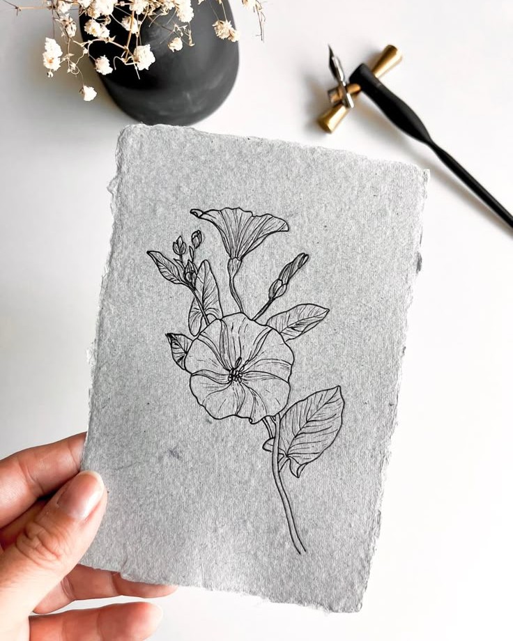
- Graphite Pencils Set – Core tool for sketching all types of perspective. Affordable sets are widely available and versatile. This Faber Castell 6 pack will last you years.
- Sketchbooks – Essential for practicing consistently. Spiral-bound, acid-free options are reasonably priced for students. They come in all shapes, sizes and paper types. Use what works best for you, but I like this sketchbook brand.
- Erasers – Kneaded and precision erasers are inexpensive but crucial for correcting mistakes while learning perspective. Try out this Prismacolor kneaded rubber eraser.
- Rulers & Triangles – Simple, inexpensive tools that make drawing straight lines and accurate angles much easier. This ruler/protractor/geometry kit comes in its own cute box. A yard stick comes in handy for bigger projects!
- Colored Pencils or Markers – Helps teach depth and atmospheric perspective; moderate cost and highly versatile. Prismacolor is the best on the market. Get the 24 count and expand from there. Trust me.
- Drawing Pens & Fine line Pens – Optional for adding crisp lines or refining perspective sketches; mid-range price. For expert level, I suggest the Faber Castell Pitt or the YISAN drawing set for a more affordable versatile set under $10.
The Greatest Hits of Perspective in Art

According to Wikipedia, in French, the name “le Lorrain” is sometimes used for him.
Here’s a guide to the main types of perspective in art and how artists can use them to make the viewer feel like looking through a window to another reality.
Artists have long experimented with these techniques to evoke emotion, guide the viewer’s eye, or highlight certain elements. Claude Lorrain, for example, used atmospheric perspective in his golden-hued landscapes, letting hazy light and softened edges create a sense of infinite distance and tranquility. His skies often bleed into the horizon with delicate warmth, making the viewer feel as if they’re peering into an endless, sunlit world.
One-Point Perspective
With one-point perspective in art, all lines in a drawing lead to a single vanishing point on the horizon, to create the illusion of depth (see? gaslighting.) Picture a road stretching straight for miles until it disappears into the horizon. Think about how everything from trees and fences to shadows all seem to funnel back to that one spot.
It’s a simple trick, but it makes a flat surface feel like a real space.
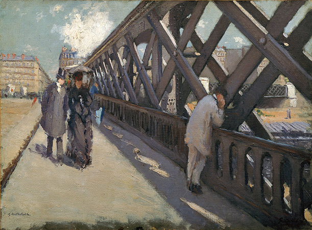
Two-Point Perspective

Two-point perspective in art uses two vanishing points on the horizon, which is perfect for showing objects at an angle. Imagine a mountain ridge stretching off in two directions, or a cabin set in front of the peaks—everything seems to recede toward two separate spots. It’s a simple way to make angled views feel realistic and grounded.
I also recommend you take a look at this article on architectural sketches or why I think people hate modern architecture.
The magic of two-point perspective in art is how it makes a scene feel alive. Even simple lines and shapes suddenly suggest space, movement, and depth. By guiding the viewer’s eye along two vanishing points, artists can create tension, drama, or even a quiet sense of harmony. It’s like giving your drawing a heartbeat, showing that every edge and corner exists in a real, believable world.
Three-Point Perspective

BudisArch on Youtube
Three point perspective in art is a type of linear perspective in art in which parallel lines along the width of an object meet at two separate points on the horizon and vertical lines on the object meet at a point on the perpendicular bisector of the horizon line. It makes a triangle.
The thrill of three-point perspective is how it transforms ordinary scenes into something cinematic. Buildings soar, mountains plummet, and even a simple street corner can feel like it’s alive with scale and drama. By adding that extra vanishing point, artists can control not just distance but vertical tension, making viewers feel tiny, grand, or entirely disoriented—all at once. It’s a bold tool, but when used well, it makes a drawing feel like a world you could step into.
Bird’s-Eye View
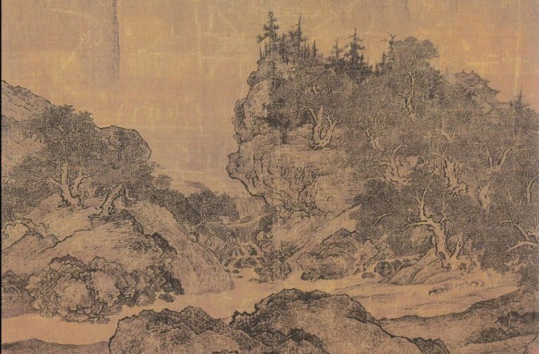
The German phrase “Vogelperspektive architektur” translates to bird’s-eye view architecture. It refers to an aerial view of a building or a city, as if seen from a great height like a bird. This type of perspective in art is essentially looking down from above. You see ridges, valleys, rivers, even how mountains chain together.
Fan Kuan is often seen as one of the great masters of Chinese landscape painting. His work captures how atmosphere, weather, and the changing seasons shape the natural world. His masterpiece, Travelers Among Mountains and Streams, embodies this vision—it’s a monumental scene that conveys the solemn grandeur of towering mountains and the smallness of humanity within them.
In art, this technique is powerful because it instantly changes scale—mountains shrink into patterns, cities turn into grids, and people become small figures in a vast space. It’s often used to show the relationship between objects and their surroundings, giving a sense of overview and grandeur. Artists and illustrators love the bird’s-eye view because it tells the story of space itself, not just the subject inside it.
Worm’s-Eye View

“Froschperspektive” translates from German to English as “worm’s-eye view” or “frog’s-eye view.” Figuratively, it can also mean a “blinkered view” or a narrow outlook, suggesting a limited perspective. In film and photography, it refers to a low-angle shot taken from below the subject. So, in this type of perspective in art you would be looking up from below.
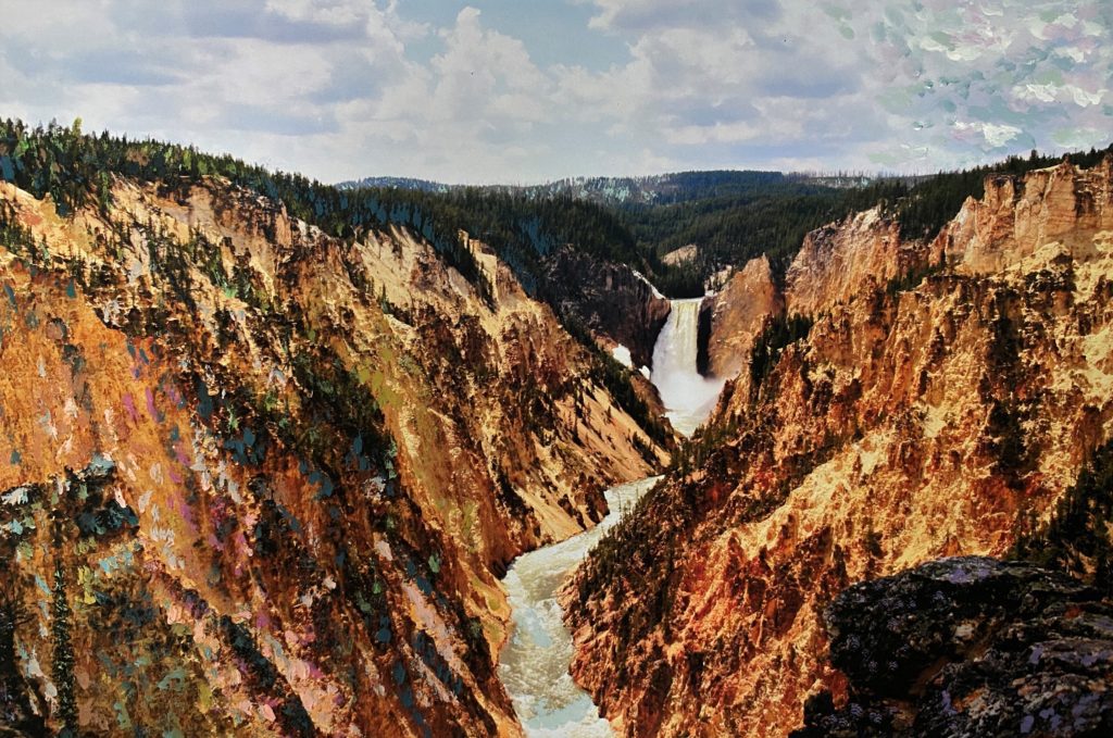
Think about how mountains look monstrous, looming, like they could squash you with a single explosion from Yellowstone volcano. You’re insignificant, an ant. Now remember why you’re an artist and use that power for good. Your hands were made for color, not combat.
Example: Stand at the base of Yosemite’s El Capitan, look up, and try not to faint.
Artists: Romantic painters (hello again, Friedrich) milked this for drama.
Atmospheric (Aerial) Perspective

According to art auction house Invaluable.com, “The term was first coined by [Leonardo] da Vinci, who observed in his Treatise on Painting that colors “become weaker in proportion to their distance from the person who is looking at them.” In other words, objects that are further away have blurry edges and appear lighter in color.” What does that mean? It means its not about lines and annoying rulers, it’s about air. The farther away something is, the lighter, bluer, and softer it looks.
Example: Foreground mountains have crunchy detail; distant peaks fade into pastel smudges.
Artists: From Leo’s silly metaphoric artistry to any romantic painter, including one of my all time favorite artists (Will Turner!!)
Some say Turner’s foggy landscapes are textbook. Though, personally, I think J.M.W. Turner’s landscapes are ethereal and soft. One of my favorite artists, English painter WILLIAM Turner (yes, like Orlando Bloom’s pirate alter ego) was a central figure of the Romantic era. He is often regarded as one of the greatest English Romantic artists, whose work embodied the movement’s themes of emotion, individualism, and the sublime power of nature.
Bonus: Overlapping Planes

When closer to the subject, the image will be larger, and when
further away from the subject, the image will be smaller or subject size.
Overlapping planes, while technically not a type of perspective, is still a good technique for creating depth (if all else fails). You create the illusion of depth and dimension on a flat surface by having one object partially or completely cover another.
Sometimes overlooked, but vital. When one mountain covers part of another, boom—instant depth. For example, you could layer three different ranges (foreground, middle, background) and you’ve created a believable world.
How to Use These Types of Perspective in Your Own Work
Once you know the menu, you can mix and match. You don’t need to use all seven at once. Pick the perspective that tells the story you want, and go from there.
- Start with a horizon line to set your eye level.
- Decide your viewpoint (bird, worm, or human-on-a-hike).
- Block in overlapping mountain ranges.
- Use linear perspective for paths, fences, or valleys that guide the eye back.
- Apply atmospheric perspective to knock back the distant peaks.
- Add details up front; let the background breathe.
Seasonality in Perspective
While I was researching perspective in art for this artsy article, I noticed a weird trend. Google searches for “perspective drawing” and “perspective in art” spike in August, September, and October way more than any other time of year. Likewise, the search traffic dips in June and July.
For those of you who know my background, you know I love some good seasonal analysis. Likewise fi you don’t know my background, check out my About page!

Here’s my theory for the seasonality in perspective in art: the jumps in searches correlate with when school is in session. During August, September and October, every art teacher from Utah to Florida is cracking open the “How to Draw Perspective” chapter. I also recommend you take a look at this article on architectural sketches or why I think people hate modern architecture.
Let’s take a look at Google searches over the past 15 years in the U.S. for “examples of perspective,” “types of perspective” and “perspective in art.” Seasonally, these keywords spike in fall and again in spring way more than any other time of year. Likewise, the search traffic dips in June and July and the last two weeks of December, typically when most schools are out for the summer and winter breaks.
It makes sense, perspective is one of those fundamentals that gets hammered in early, so the internet fills up with frantic students Googling “why are my boxes broken” and “two-point perspective easy.” Honestly, I think it’s kind of cool how search data mirrors the school year. If you are a student wrestling with perspective right now, comment below or DM me on social media, I’d love to see if my theory holds up.
Also, if you are struggling to even get in the right mindset to make art, you may like this article: How to Avoid Burnout: 13 Tips from A Tired Artist.
And trust me, I get it. I absolutely struggled through perspective lessons in school. My sketchbook was full of warped drawings of buildings that looked like they’d been microwaved. But now, as a landscape painter, I use perspective in art constantly, especially atmospheric perspective to push mountains back or linear perspective when sketching paths that lead into a valley. It’s funny how the thing that once gave me headaches is now second nature in my artwork. Perspective in art is just one of those lessons that feels painful when you’re learning it, but eventually, you realize it’s the backbone of nearly everything you draw.
Conclusion to Perspective in Art
Perspective in art is not just about rulers and geometry—it’s about storytelling. Perspective in art is what decides whether your mountains look grand, serene, intimidating, or flat as pancakes. By experimenting with one-point, two-point, three-point, bird’s-eye, worm’s-eye, atmospheric, and overlapping planes, you start to see depth not as a mystery but as a set of tools you can play with.
Remember these tips for noticing and using perspective in art:
- Foreground = detail, background = vibes/bokeh.
- Squint at your reference photo: what vanishes first? That’s what needs to be lightest and softest.
- Use three planes (foreground, middle-ground, background).
- Warm colors pop forward, cool colors recede. Vincent Van Gogh’s fields vs. his skies? (I won’t talk about Gainsborough here but you can read about why he’s a baddie here.)
- Don’t overwork your background. Turner didn’t, he just let the fog do the work.
So grab your pencil and ask yourself: Am I going for towering drama, wide-open serenity, or misty mystery? Once you pick the perspective, the mood falls into place. Because at the end of the day, perspective isn’t about rules—it’s about deciding how you want your viewer to experience your world.
And remember: perspective isn’t a prison of rules, it’s a playground. Once you understand it, you can bend it, break it, or exaggerate it like the best artists always have.

Youur style is really unique compared to other people I’ve read
stuff from. Thanks for posting when you have the opportunity.
Guess I will just bookmark this site.
Cool + ty for the post
Thank you to the artsydrawings.com Administrator!