Why is pixel art so popular?
I’ve been going back and forth on writing on this topic. I’ve taken painting and drawing classes, I’m a photographer, I’ve dabbled in sculpture and printmaking and even some digital art in Procreate on my iPad. So, this is your disclaimer — I have never attempted pixel art nor am I a pixel artist. I know very little about the subject, except that it is absolutely mesmerizing.
That being said, much of this article is research, opinion, and hearsay. But I don’t think that devalues the article. If anything, it makes it more human. I used websites and forums, talked to friends and strangers, people who had never heard of pixel art and others who were studying game development. So, here’s my compilation of thoughts about the art form.
I bought a Nintendo Switch last year and fell in love with a game called Stardew Valley. For those who don’t know, Stardew Valley is a cute pixelated farming game where you can grow crops, take care of animals, and fight monsters in the caves. There was something nostalgic about the game, I felt it with Pokémon Violet too; something that reminded me of Minecraft and Flappy Bird.
This pixelated style brought me back to a simpler time, and maybe that’s just how nostalgia works. But, growing up in the early 2000s, where your generation saw Nokia phones turn into iPhones, tends to make you nostalgic for low quality video games and well, pixels.
Table of Contents
Introduction: What is pixel art?
Pixel art is defined by Max Trewhitt as “an art form that uses singular pixels to build a digital 2D image block by block.” Skeddles on Lospec defined it as “a digital art where pieces are created through a unique process of manipulating the individual pixels of an image document using minimal size and number of colors.”
From a traditional artist’s standpoint, I think it’s more challenging than painting or drawing, but others see differently. Many find pixel art is a more accessible and feasible art style for games and game developers. It requires minimal tools, has a forgiving learning curve, and is efficient for digital and game-related applications.
Where did pixel art come from?
Some say that mosaics and embroidery could be considered “non-digital counterparts or predecessors,” but where did pixel art really come from? Digital pixel art first emerged in the late 1970s in video games like “Space Invaders (1978) and Pac-Man (1980).” It was a practical solution for early computer graphics and video games, with low-resolution screens and limited color palettes.
Games like Super Mario Bros helped defined the aesthetic of pixel art. It’s said that “artists had to rely on their creativity and ingenuity to create recognizable images using the limited resources available.” From “strategic choices in color usage” to “meticulous attention to detail,” I completely think early video game designers were artists.
As technology advanced in the 1990s, 16-bit consoles like the Super Nintendo and Sega Genesis introduced more detailed and colorful pixel-based graphics, pushing the medium’s artistic potential. However, the rise of 3D graphics in the 2000s led to a decline in mainstream pixel art. It wasn’t until the 2010s when we saw the indie game boom (and a fear of an “indiepocalypse”) which brought back pixel art as a deliberate style choice.
Today, pixel art continues to thrive in gaming, digital art, and animation, celebrated for its nostalgic charm, efficiency, and unique artistic appeal.
How ConcernedApe changed the pixel art game: The Indie Game Boom
ConcernedApe, aka Eric Barone, is the genius behind Stardew Valley, one of the most beloved indie games of the decade. Released in 2016, the game quickly became a hit thanks to its relaxing gameplay, engaging story, and—let’s not forget—the stunning pixel art.
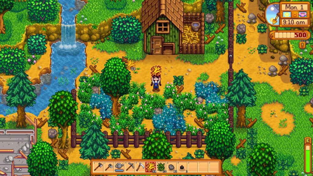
What makes Barone’s work so impressive is that he did it all himself: the programming, art, music, and writing. His pixel art, in particular, stood out. Barone’s approach to pixel art has become a game-changer, proving that you don’t need a huge team or budget to create something visually stunning.
Barone’s pixel art revolutionized the boundaries of what the medium could do. The way the game transitions through different times of day and seasons, the way characters move, and even the subtle animations in the background all show pixel art can be more than just static images. Barone made the mundane tasks of farming, like planting crops or fishing, visually engaging, making each moment feel rewarding. His animations, though simple, have a fluidity that was rarely seen in pixel art before Stardew Valley, and that’s what helped make the game feel so immersive.
Barone’s success with Stardew Valley has had a lasting impact on the indie game world. It showed that pixel art isn’t just a relic of the past—it’s still a powerful storytelling tool. Since the game’s release, countless indie developers have embraced this style, inspired by how Barone used it to create such a memorable and emotionally resonant experience. His work on Stardew Valley has proven that pixel art can not only be beautiful and nostalgic, but also dynamic and deeply expressive.
The trend of pixel art’s popularity sparked an indie game boom and a flourish of experimental design, diversity and innovation.
R/Place and the pixel art community
In my search for a more comprehensive perspective of pixel art, I was introduced to an internet phenomenon many call a “great experiment.” r/Place is a subreddit on the platform Reddit where individuals are invited to participate in a community canvas.
Everyone has one block to place on a blank page of 4 million pixel squares, and together a great work is created.
According to Medium.com, “the experiment lasted around 3 days with over 1 million Redditors placing around over 16 million pixels in 2017 and over 10 million Redditors placing over 160 million pixels in 2022.” It broke records and created community and advertised, inspired, and protested. r/Place eventually ended in 2023 due to targeted hate speech towards the Reddit CEO for controversial decisions.
Many wonder if r/Place will ever return, though I found another rendition on the internet called CryptoCanvas.
I also found a topographical visualization of the 2022 version, created in Minecraft and recorded in the video below. Each tower represents the literal stacking of colors on top of others.
Regardless of its continuance, r/Place was a massive work of art. It embodied community and conversation and served as a place of free speech, which is kinda the whole point of art. I’d be curious to explore this concept further in a follow up article to see if there are other “places” that can compare to r/Place.
Pixel art in Minecraft
Speaking of Minecraft, pixel art has become a significant form of creative expression, leveraging the game’s block-based structure to mimic pixel-by-pixel digital art. Since each block in Minecraft acts as a “pixel,” players can create massive, detailed artworks by carefully selecting and placing colored blocks like wool, terracotta, and concrete. This approach allows artists to recreate classic pixel art designs, original characters, and even dynamic shading effects within the game’s three-dimensional world.
One notable artist in the Minecraft pixel art community is BismuthEif, aka the “Gradient Guy.” He specializes in hyper-detailed, high-resolution artwork that often resemble traditional digital pixel art, showing an advanced understanding of shading and color theory using Minecraft’s limited block palette. His creations stand as a testament to how Minecraft is not just a sandbox game but can be viewed as an artistic medium, allowing players to transform simple blocks into intricate masterpieces.
For those who want to get into pixel creations on Minecraft, I found the Minecraft Image Converter tool. It allows players to create Minecraft block-based designs from images. It works by analyzing an image and mapping each pixel to the closest matching Minecraft block based on color. This automation significantly reduces the time and effort required to create large-scale pixel art within the game, making it a popular tool among builders and artists.
Players can upload an image, adjust parameters such as resolution and block types, and then generate a schematic or blueprint to recreate the image in Minecraft. Some advanced converters like WorldEdit or Litematica enable instant in-game construction. While manually placing blocks offers more artistic control, the Minecraft Image Converter makes high-quality pixel art accessible to those who may not have the time or patience for block-by-block placement.
This tool has been widely used for recreating famous artworks, logos, and even photorealistic portraits in Minecraft, further proving how the game serves as a canvas for digital creativity.
Physical types of pixel art
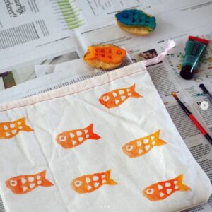
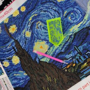
Pixel art extends beyond digital screens, finding a place in various hands-on crafts. I mentioned a couple of these crafts in the introduction as precursors to the modern digital idea of pixel art. However, you can make all of these at home. I linked crafting kits to each title, so go get creative!
- Diamond Painting – small resin “diamonds” are placed onto a pre-printed adhesive canvas, much like placing pixels in digital art.
- Embroidery – follows a similar grid system, where each stitch acts as a pixel, allowing for detailed designs using thread instead of pixels.
- Mosaics – made from tiles, beads, or other small materials, also follow a pixelated format, using placement and color variation to build larger images.
Crafts like diamond painting, embroidery, and mosaics are a great way to introduce your kids to pixel art, without the digital aspect. For more crafting ideas, check out my list of DIY girls night craft ideas!
The trend of pixel art
So, why is pixel art popular? Throughout all the research and conversations, I think I’ve narrowed it down to a few key possibilities:
- It’s nostalgic and reminds us of a simpler time
- The medium is widely accessible and relatively inexpensive
- Simple graphics allow for more detailed gameplay
- Constraints like colors and shape promote creativity and innovation
Ironically, “pixel art” is currently trending higher than “art history” on Google Trends. As someone who enjoys traditional art and art history, I find this really funny and strangely progressive. I mentioned briefly the indie game boom in the 2010s, and I think now in 2025 we see more of a general acceptance of pixel art as an actual art style.
I also think it’s notable that on this graph of searches for “pixel art” since 2004, there are spikes in March of 2020 and March of 2022, possibly correlating with popularity of r/Place.
So, is it art?
From graffiti to bullet journals, if you know my website ArtsyDrawings.com, you know I like to discuss different forms of art, and their credibility to the age old question: is it art?
When I started this article, I chose the SEO keyword “pixel art” in order to rank well, but now I think I chose it because I subconsciously believe pixel art is art. Many of the works I’ve found follow the elements and principles of design, they follow techniques of traditional fine art, and are aesthetically pleasing to the eye.
Pixel art promotes deep contemplation and emotional responses. It inspires.
André Schulze is an artist who merges pixel design with still life oil paintings. He started out as a painting conservator, restoring old artworks, but eventually began adding his own creative spin—taking vintage thrift store paintings and overlaying them with pixelated elements, almost like a glitch in time. His work creates a cool contrast between the old and the digital, making classic landscapes and still lifes feel fresh and unexpected.
His work reflects the style of pixel art in a traditional medium, seamlessly merging the digitization of our modern world with the photorealistic style of the past.
I personally think he is successful at evolving the definition of art.
Pixel art in the age of AI
When you define art, it’s important to mention artificial intelligence (AI) and the evolution of the definition of art.
I’ve written a couple articles now about the rise of AI in the art community and some controversial opinions surrounding it. Many artists despise AI and fear it will steal jobs and threaten creativity, while others believe it promotes creativity. As I discussed in my previous AI article, it’s not going away, so artists have a choice to either accept it and adapt, or get left behind.
Both AI art and pixel art have this futuristic aura that applies pressure to change the game and redefine the meaning of art. They’re in the same boat, rocking against the waves of defined art styles like impressionism or classicism. I think they’re onto something, and the popularity I see on the internet confirms my suspicions.
Throughout art history, great artists strive for change and challenge the norm. Caravaggio defined Baroque painting with sharp lighting and startling compositions. Turner shocked audiences with stormy weather landscapes, when everyone else was painting sunny days. Kilmt challenged authority. Khalo showed pain and suffering. Close strapped a paint brush to his wrist after paralyzing his hand.
Artists willingly accept criticism and defeat; they triumph through pain and challenge those who try to put them down. Those who create pixel art are just in their trauma era. Mediums are changing, art is actively being redefined, and movements are formed in suffering.
The world may not see it yet, maybe because we aren’t ready or we’re scared of a robot apocalypse, but I beg you, please keep going. Keep making art.
Conclusion
In conclusion, pixel art’s popularity comes down to its mix of nostalgia, creativity, and accessibility. It’s a style that indie game developers can use to create stunning games without massive budgets, while still feeling fresh and engaging. The simple, clean visuals make games easy to enjoy.
In the art world, pixel art is becoming more renowned and admired. It’s no longer just a gaming medium, pixel art has established itself as a creative style allowing room for more artists to grow.
Whether it’s the vintage appeal or the unique creativity it inspires, pixel art has earned its place in the art world and shows no signs of fading away.
Why is pixel art so popular? Read More »