Destiny vs. Drawings: Which Astrology Zodiac is the Most Artistic?
Art and astrology are not so different. They both fascinate the curious, merge reality with the imaginary, and if you choose to believe, both art and astrology can help you understand the impact of external forces on human emotions, feelings, and personality.
As an Aries Sun, Leo Moon, and Gemini Rising, I enjoy the subtle coincidences of astrology impacting my world. Though, I always wondered what zodiac is the most artistic?
In this article, we will evaluate different art styles I attribute to each of the 12 zodiac signs based on the characteristics of both. I hope to explore different historical art styles as well as nuances between different zodiacs. Now, let’s find out which zodiac is the most artistic!
Table of Contents
Introduction: How to find which zodiac is the most artistic
The zodiac is a system of 12 astrological signs, each associated with specific personality traits, behaviors, and life tendencies. These signs are determined by the position of the sun relative to certain constellations at the time of an individual’s birth.
If you don’t know your zodiac sign, you can find a lot of good information about your Sun, Moon, and Rising zodiac signs here. Your Sun sign is based on your birth date. Your Moon and Rising signs can be found depending on the time and location of your birth.
The 12 zodiac signs are divided into four elements: fire, earth, air, and water. Each zodiac sign is believed to influence various aspects of a person’s character and destiny, reflecting connections between celestial forces and human nature.
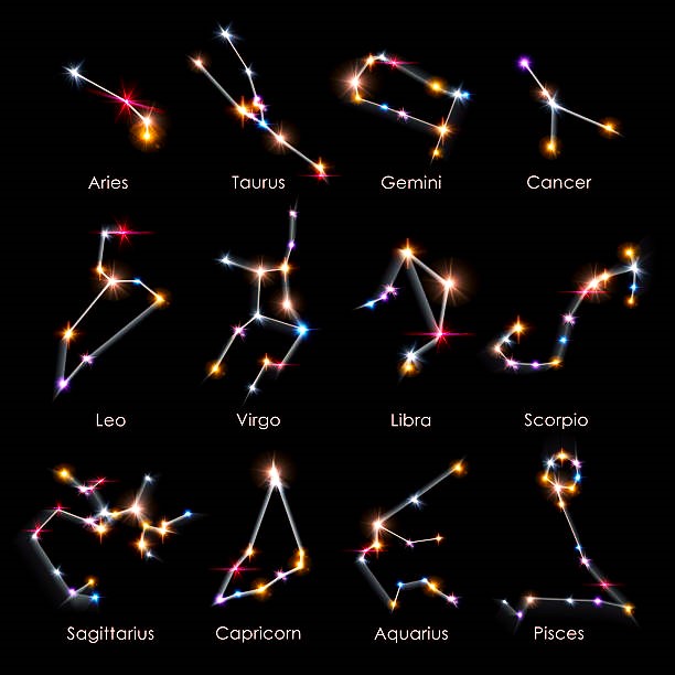
Art and astrology both celebrate humanity’s existence in the universe. Art uses visual means to express emotions, ideas, and narratives, while astrology interprets the influence of celestial bodies on human behavior and personality.
By examining how each zodiac sign corresponds to distinct art styles, we can see how these two fields intertwine. In order to fins which zodiac is the most artistic, I will evaluate different factors like brush stroke styles, associated colors, and specific characteristics of the movements. It is through this process that we may find which zodiac is the most artistic.
I also created an easy quiz to help you find which historical art style matches your personal art style.
Aries (March 21 – April 19): Expressionism
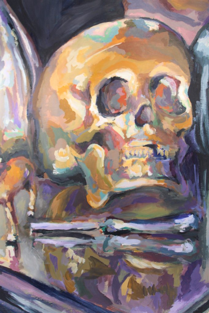
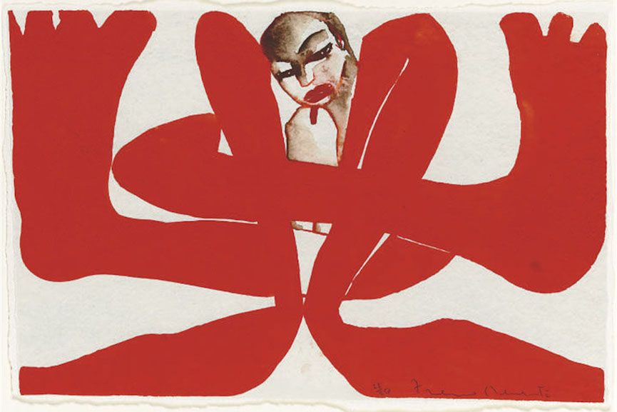
Aries, the first sign of the zodiac, is known for its dynamic energy, pioneering spirit, and boldness. These traits resonate with the Expressionist movement, which emerged in the early 20th century. Expressionism focuses on depicting raw emotion and subjective experience, often through bold colors, exaggerated forms, and vigorous brushstrokes.
Characteristics of Aries
- Cardinal Element: Fire
- Associated Colors: Red, scarlet, bright orange
- Personality Traits: Energetic, courageous, assertive, enthusiastic, confident, impatient
Characteristics of Expressionism
- Bold Use of Color: Expressionist artists like Edvard Munch and Ernst Ludwig Kirchner used vibrant, often clashing colors to convey emotional intensity.
- Exaggerated Forms: Distortion and abstraction are common, aiming to evoke an emotional response rather than realistic representation.
- Dynamic Composition: The energy and movement in Expressionist works mirror the impulsive and adventurous nature of Aries.
Which zodiac is the most artistic: Aries
Aries’ ruling planet, Mars, symbolizes aggression, action, and desire, aligning perfectly with the vigorous and emotional qualities of Expressionism. The fiery nature of Aries drives the passionate and often tumultuous expression seen in this art style.
Taurus (April 20 – May 20): Realism
Taurus, an earth sign, is characterized by its practicality, reliability, and appreciation for beauty and sensory experiences. These attributes align with the Realist movement of the mid-19th century, which sought to depict everyday life with honesty and accuracy.

Characteristics of Taurus
- Cardinal Element: Earth
- Associated Colors: Green, pink, pastel shades, earthy tones
- Personality Traits: Practical, reliable, sensual, patient, determined, stubborn
Characteristics of Realism
- Detailed Depiction: Realist artists like Gustave Courbet and Jean-François Millet focused on meticulous detail and a true-to-life representation.
- Everyday Subjects: Realism often portrays ordinary people and everyday scenes, emphasizing the beauty and dignity in the mundane.
- Earthy Palette: The color schemes are often muted and natural, reflecting the earthiness of Taurus.
Which zodiac is the most artistic: Taurus
Venus, the ruling planet of Taurus, governs beauty, love, and sensuality. This influence is evident in Realism’s dedication to capturing the splendor of the natural world and the human form with a sense of reverence and fidelity.
Gemini (May 21 – June 20): Cubism
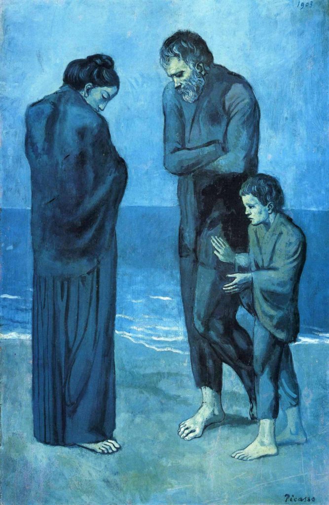
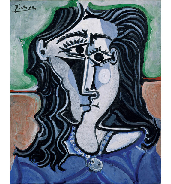
Gemini, ruled by Mercury, is known for its adaptability, curiosity, and duality. These traits are mirrored in the Cubist movement, pioneered by Pablo Picasso and Georges Braque in the early 20th century. Cubism deconstructs objects into geometric shapes, presenting multiple perspectives simultaneously.
Characteristics of Gemini
- Cardinal Element: Air
- Associated Colors: Yellow, light green, sky blue, bright colors
- Personality Traits: Curious, adaptable, communicative, witty, lively, inconsistent
Characteristics of Cubism
- Geometric Abstraction: Cubism breaks down subjects into fragmented, abstract forms, challenging conventional representation.
- Multiple Viewpoints: By depicting various angles at once, Cubism reflects Gemini’s versatility and multifaceted nature.
- Monochromatic Palette: Monochromatic color schemes of tans, browns, grays, creams, greens, and blue simplify the form to avoid distracting the viewer.
Which zodiac is the most artistic: Gemini
Mercury, the planet of communication and intellect, influences Gemini’s quick-witted and analytical nature. Cubism’s innovative approach to form and perspective embodies Gemini’s intellectual curiosity and ability to see things from different angles.
Cancer (June 21 – July 22): Romanticism
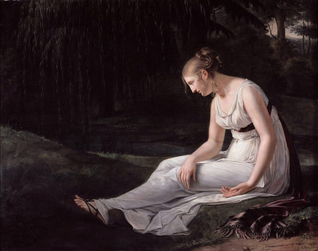
Cancer, a water sign ruled by the Moon, is deeply connected to emotions, intuition, and nostalgia. The Romanticism movement of the late 18th to mid-19th century aligns with these qualities, emphasizing emotion, nature, and individualism.
Characteristics of Cancer
- Cardinal Element: Water
- Associated Colors: White, silver, pearl, light blue
- Personality Traits: Emotional, nurturing, intuitive, compassionate, protective, moody
Characteristics of Romanticism
- Emotional Depth: Romantic artists like Caspar David Friedrich and Eugène Delacroix focused on intense emotion and sublime beauty.
- Nature and the Sublime: Romanticism often explores the majesty and mystery of nature, resonating with Cancer’s intuitive connection to the natural world.
- Nostalgia and Fantasy: Themes of longing, fantasy, and the supernatural are prevalent, reflecting Cancer’s sentimental and imaginative nature.
Which zodiac is the most artistic: Cancer
The Moon, Cancer’s ruling planet, governs emotions, intuition, and memory. Romanticism’s emphasis on feeling and the sublime mirrors Cancer’s deep emotional currents and its tendency towards nostalgia and reflection.
Leo (July 23 – August 22): Baroque
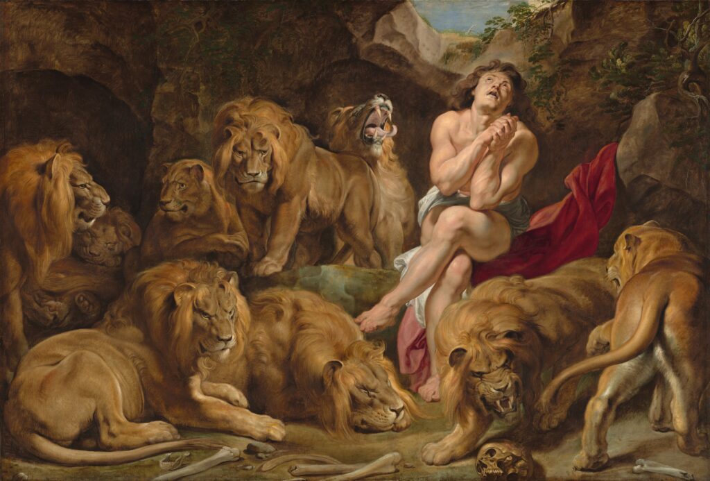
Leo, ruled by the Sun, is known for its confidence, creativity, and love of drama. These characteristics are embodied in the Baroque period of the 17th century, known for its grandeur, movement, and emotional intensity.
Characteristics of Leo
- Cardinal Element: Fire
- Associated Colors: Gold, orange, royal purple, red
- Personality Traits: Confident, creative, dramatic, generous, warm-hearted, arrogant
Characteristics of Baroque
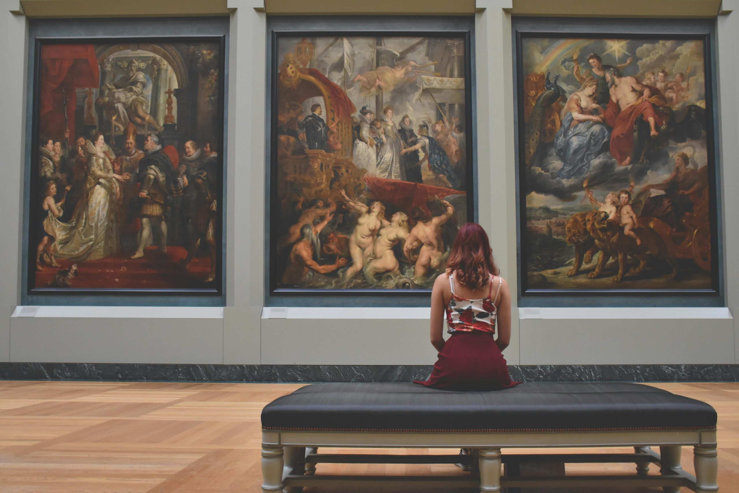
- Dramatic Use of Light and Shadow: Baroque artists like Caravaggio and Sir Peter Paul Rubens used chiaroscuro to create dramatic contrasts.
- Dynamic Composition: The Baroque style is known for its sense of movement and energy, capturing the theatrical essence of Leo.
- Ornate Detail: Rich, elaborate details and a sense of grandeur reflect Leo’s regal nature.
Which zodiac is the most artistic: Leo
The Sun, Leo’s ruling celestial body, symbolizes vitality, creativity, and self-expression. The opulence and drama of Baroque art reflect Leo’s vibrant personality and its desire to be seen and admired.
Virgo (August 23 – September 22): Neoclassicism
Virgo, an earth sign ruled by Mercury, is characterized by its analytical mind, precision, and appreciation for order. These traits resonate with Neoclassicism, an 18th-century movement inspired by the classical art and culture of Ancient Greece and Rome.
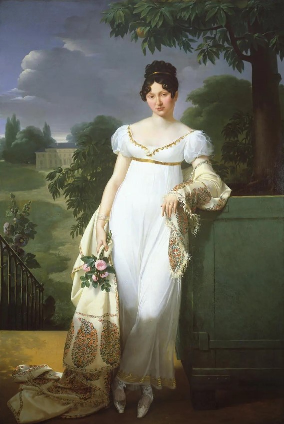
Maréchale de Beurnonville by Merry-Joseph Blondel exhibited in the Paris Salon in 1808.
Characteristics of Virgo
- Cardinal Element: Earth
- Associated Colors: Navy blue, grey, beige, earthy greens
- Personality Traits: Analytical, meticulous, practical, reliable, modest, critical
Characteristics of Neoclassicism
- Emphasis on Line and Form: Neoclassical artists like Jacques-Louis David focused on clean lines and idealized forms.
- Clarity and Simplicity: The style is marked by simplicity, symmetry, and a sense of discipline, reflecting Virgo’s meticulous nature.
- Moral and Intellectual Themes: Neoclassicism often explores themes of duty, virtue, and rationality, aligning with Virgo’s analytical and ethical tendencies.
Which zodiac is the most artistic: Virgo
Mercury’s influence on Virgo emphasizes intellect, detail, and order. Neoclassicism’s structured approach and reverence for classical ideals mirror Virgo’s quest for perfection and clarity.
Libra (September 23 – October 22): Art Nouveau
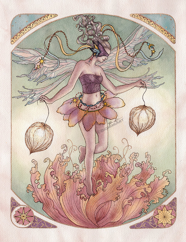
Libra, an air sign ruled by Venus, is associated with beauty, harmony, and balance. These qualities are reflected in the Art Nouveau movement of the late 19th and early 20th centuries, which focused on organic forms, decorative arts, and the integration of art and life.
Characteristics of Libra
- Cardinal Element: Air
- Associated Colors: Blue, pink, pastel shades, lavender
- Personality Traits: Diplomatic, graceful, fair-minded, sociable, charming, indecisive
Characteristics of Art Nouveau
- Flowing Lines and Organic Forms: Art Nouveau is known for its sinuous, flowing lines and natural motifs, embodying Libra’s love of beauty and harmony.
- Decorative Elegance: The movement embraced the decorative arts, from architecture to jewelry, reflecting Libra’s refined taste.
- Unity of Art and Life: Art Nouveau aimed to blur the boundaries between fine and applied arts, mirroring Libra’s desire for balance and integration.
Which zodiac is the most artistic: Libra
Venus, the planet of love and beauty, influences Libra’s aesthetic sensibilities and quest for harmony. Art Nouveau’s emphasis on elegance and its holistic approach to art resonate with Libra’s values.
Scorpio (October 23 – November 21): Surrealism
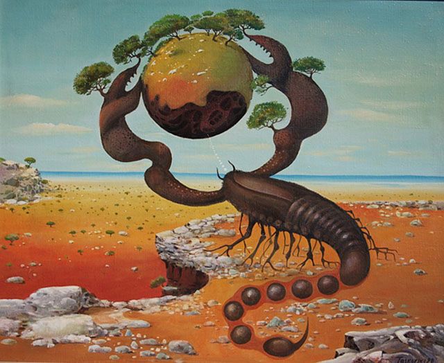
Scorpio, a water sign ruled by Pluto, is known for its intensity, mystery, and transformative nature. These characteristics are embodied in the Surrealist movement of the early 20th century, which sought to explore the unconscious mind and transcend reality.
Characteristics of Scorpio
- Cardinal Element: Water
- Associated Colors: Black, dark red, maroon, deep purple
- Personality Traits: Intense, passionate, mysterious, resourceful, determined, jealous
Characteristics of Surrealism
- Dreamlike Imagery: Surrealist artists like Salvador Dalí and Max Ernst created fantastical, often bizarre imagery that taps into the subconscious.
- Symbolism and Metaphor: Surrealism is rich in symbolic content, reflecting Scorpio’s depth and complexity.
- Exploration of the Unconscious: The movement delves into dreams, desires, and the irrational, mirroring Scorpio’s fascination with the hidden and transformative aspects of life.
Which zodiac is the most artistic: Scorpio
Pluto’s influence on Scorpio emphasizes transformation, power, and the exploration of the unknown. Surrealism’s focus on the unconscious and its boundary-pushing creativity align with Scorpio’s intense and mysterious nature.
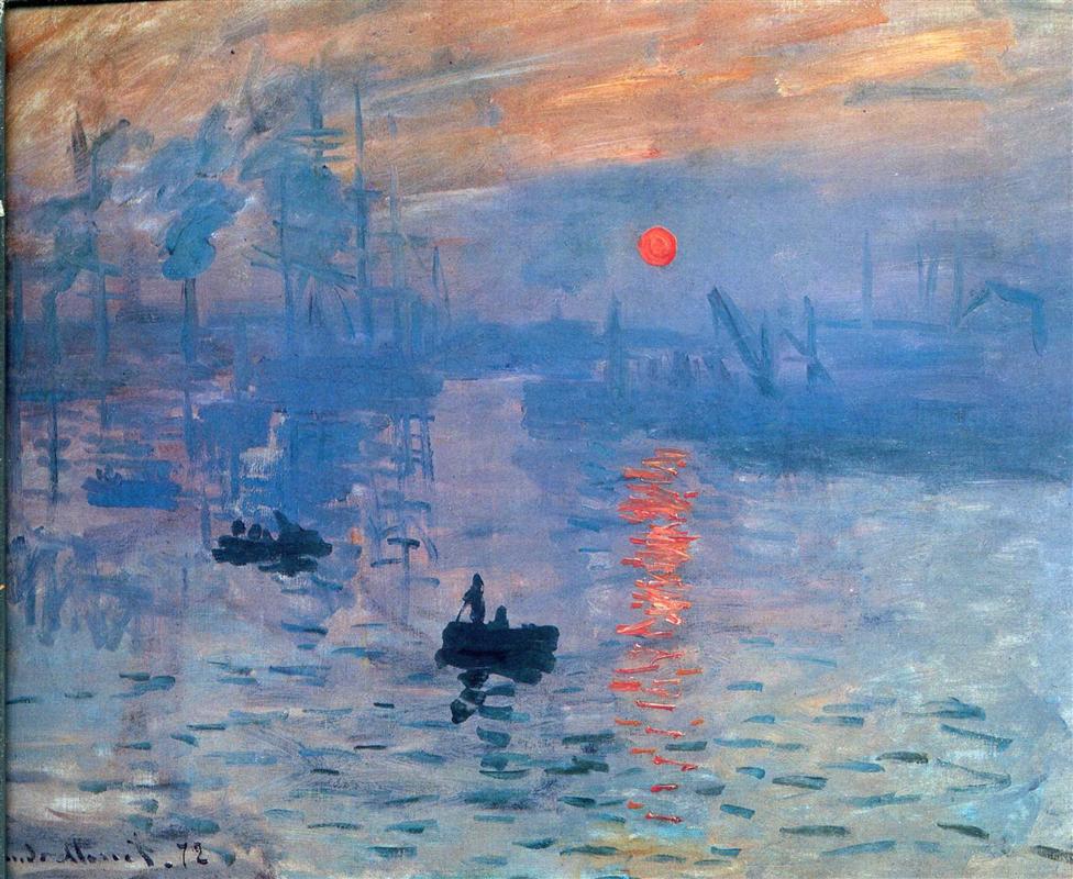
Sagittarius (November 22 – December 21): Impressionism
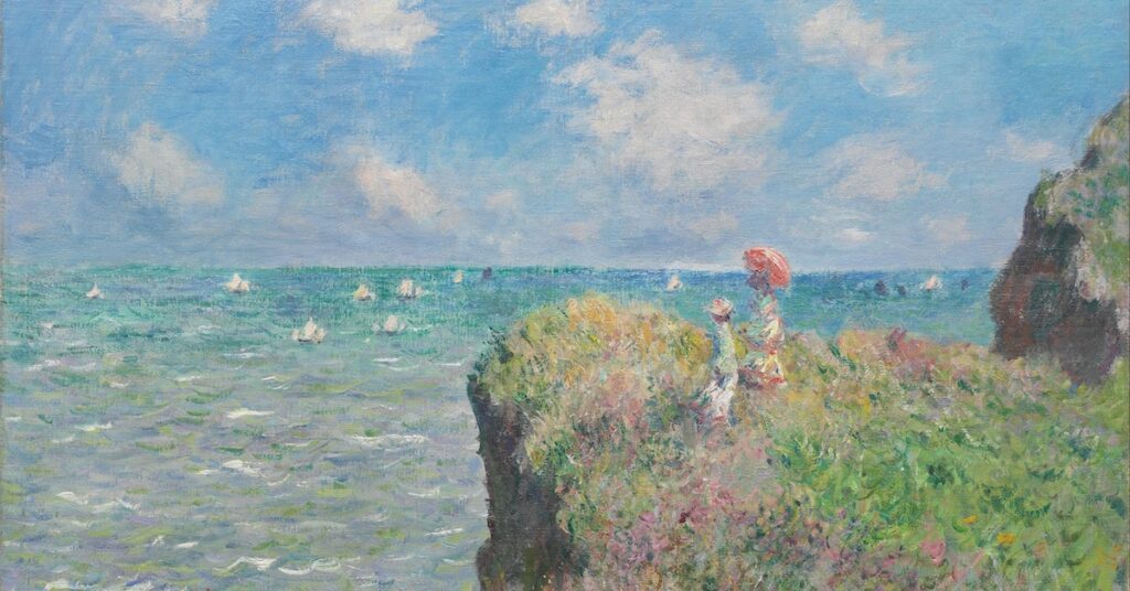
Sagittarius, a fire sign ruled by Jupiter, is characterized by its adventurous spirit, optimism, and love of freedom. These traits resonate with the Impressionist movement of the late 19th century, which broke away from traditional techniques to capture the fleeting effects of light and color.
Characteristics of Sagittarius
- Cardinal Element: Fire
- Associated Colors: Purple, royal blue, rich colors
- Personality Traits: Adventurous, optimistic, philosophical, enthusiastic, independent, reckless
Characteristics of Impressionism
- Focus on Light and Color: Impressionist artists like Claude Monet and Pierre-Auguste Renoir emphasized the changing qualities of light and color.
- Loose Brushwork: The movement is known for its spontaneous and loose brushstrokes, reflecting Sagittarius’s free-spirited nature.
- Scenes of Everyday Life: Impressionism often depicts casual, everyday scenes, mirroring Sagittarius’s love for exploration and new experiences.
Which zodiac is the most artistic: Sagittarius
Jupiter, the planet of expansion and adventure, influences Sagittarius’s optimistic and exploratory nature. Impressionism’s innovative approach and its celebration of the moment align with Sagittarius’s enthusiasm and quest for new horizons.
Capricorn (December 22 – January 19): Renaissance
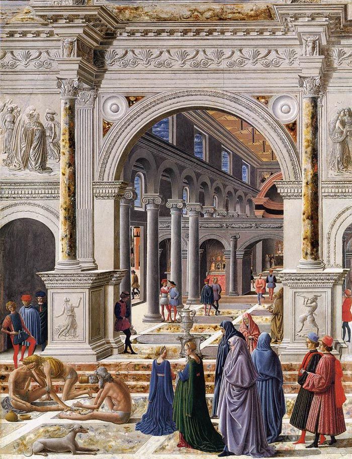
Capricorn, an earth sign ruled by Saturn, is known for its discipline, ambition, and appreciation for tradition. These qualities are embodied in the Renaissance, a period of revival in art and culture from the 14th to the 17th century, which focused on humanism, classical learning, and artistic mastery.
Characteristics of Capricorn
- Cardinal Element: Earth
- Associated Colors: Brown, grey, black, dark green
- Personality Traits: Ambitious, disciplined, practical, patient, responsible, reserved
Characteristics of Renaissance
- Emphasis on Proportion and Perspective: Renaissance artists like Leonardo da Vinci and Michelangelo focused on realistic proportions and linear perspective, reflecting Capricorn’s appreciation for structure and order.
- Humanism and Classical Inspiration: The Renaissance drew heavily on classical antiquity, emphasizing human potential and achievement, aligning with Capricorn’s ambitious and disciplined nature.
- Technical Mastery: The period is renowned for its technical brilliance and meticulous craftsmanship, mirroring Capricorn’s dedication to excellence and hard work.
Which zodiac is the most artistic: Capricorn
Saturn’s influence on Capricorn emphasizes structure, discipline, and tradition. The Renaissance’s revival of classical ideals and its emphasis on technical skill and mastery resonate with Capricorn’s values of hard work and achievement.
Aquarius (January 20 – February 18): Futurism
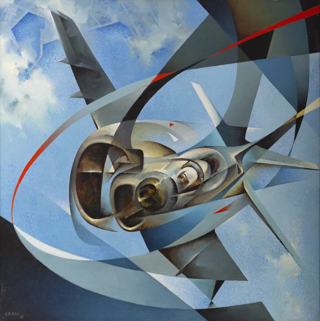
Aquarius, an air sign ruled by Uranus, is known for its innovation, originality, and progressive thinking. These characteristics align with the Futurist movement of the early 20th century, which celebrated technology, modernity, and the dynamism of the future.
Characteristics of Aquarius
- Cardinal Element: Air
- Associated Colors: Electric blue, turquoise, silver, aqua
- Personality Traits: Innovative, independent, humanitarian, inventive, unconventional, aloof
Characteristics of Futurism
- Emphasis on Movement and Speed: Futurist artists like Umberto Boccioni and Giacomo Balla focused on dynamic movement and the energy of modern life.
- Technological Themes: The movement embraced the industrial age, depicting machines and urban landscapes, reflecting Aquarius’s forward-thinking and innovative nature.
- Abstract Forms: Futurism often utilized abstract forms to convey motion and change, mirroring Aquarius’s unconventional and visionary outlook.
Which zodiac is the most artistic: Aquarius
Uranus, the planet of innovation and rebellion, influences Aquarius’s progressive and unconventional nature. Futurism’s celebration of modernity and its radical departure from traditional forms align with Aquarius’s desire for change and advancement.
Pisces (February 19 – March 20): Symbolism
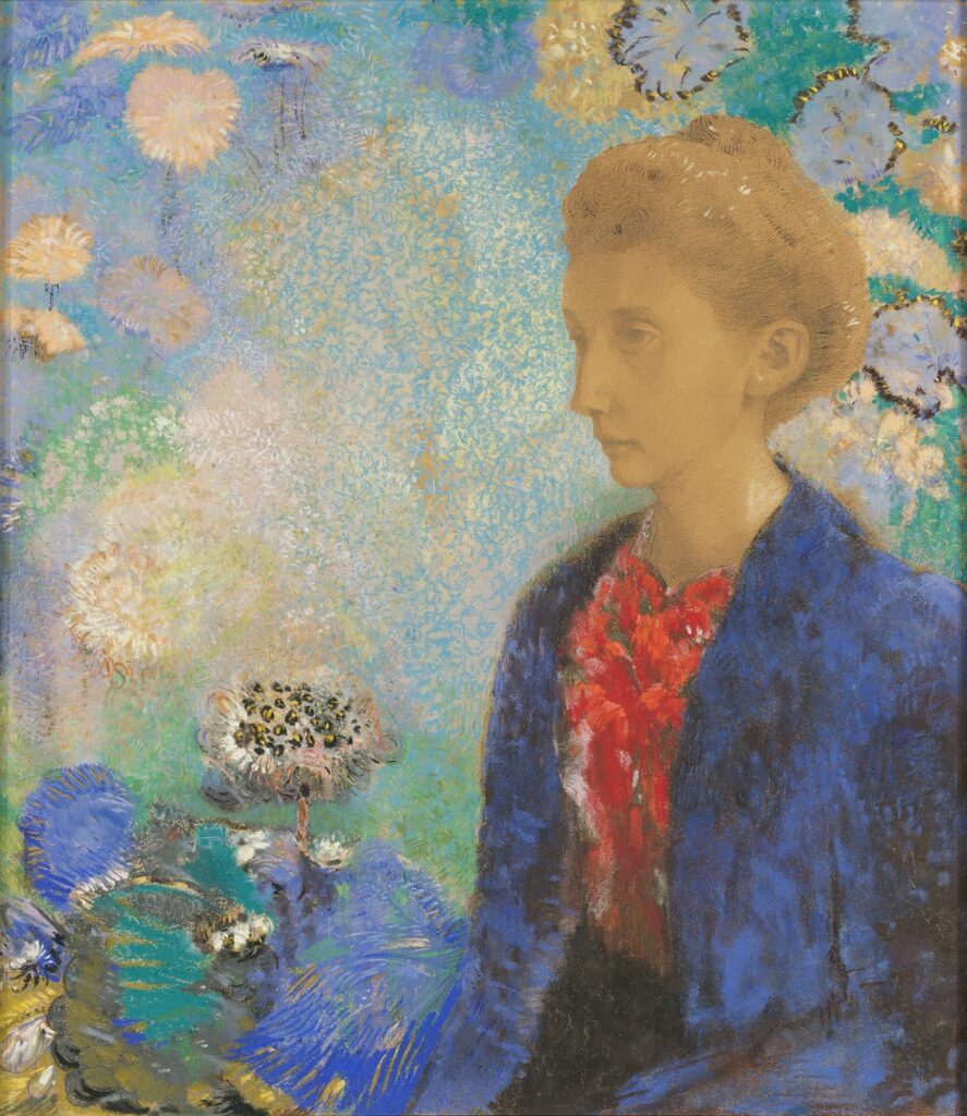
Pisces, a water sign ruled by Neptune, is associated with imagination, intuition, and spirituality. These traits are embodied in the Symbolist movement of the late 19th century, which sought to express the ineffable and the mystical through symbolic imagery.
Characteristics of Pisces
- Cardinal Element: Water
- Associated Colors: Sea green, lavender, soft blues, pale pink
- Personality Traits: Imaginative, empathetic, mystical, compassionate, artistic, escapist
Characteristics of Symbolism
- Mystical and Dreamlike Imagery: Symbolist artists like Gustave Moreau and Odilon Redon created ethereal, often otherworldly works that evoke a sense of mystery and transcendence.
- Rich Symbolism: The movement is characterized by its use of symbolic content to convey deeper, often spiritual meanings, reflecting Pisces’s intuitive and mystical nature.
- Emphasis on Emotion and Imagination: Symbolism prioritizes the expression of inner experience over realistic representation, mirroring Pisces’s imaginative and empathetic qualities.
Which zodiac is the most artistic: Pisces
Neptune’s influence on Pisces emphasizes dreams, intuition, and spirituality. Symbolism’s focus on the mystical and its use of evocative imagery align with Pisces’s depth of feeling and its connection to the unseen and the transcendent.
Conclusion: Which zodiac is the most artistic
Exploring the relationship between the zodiac signs and various art movements reveals a rich tapestry of human expression. Each sign’s unique qualities match characteristics in different artistic styles, illustrating a connection between our celestial influences and creative endeavors. As an artist, understanding these connections enhances my appreciation for both art and astrology. By evaluating which zodiac is the most artistic, I can better understand nuances between zodiac signs and between art history movements.
So, what zodiac is the most artistic? Maybe it’s Cancer with their deep emotions or Sagittarius and their adventurous spirit. I know it may seem a lame answer, but artistry really depends on many factors, and cannot be determined by when you were born. To be creative takes an imaginative spirit. To be an artist takes determination and practice. No one becomes a master overnight, and art is a skill as much as it is talent.
Furthermore, in order to best understand what makes something ‘artistic’ requires deep critical evaluation. You can discover how to describe art or learn how to write an artist statement.
Whatever you believe, I hope you enjoyed the comparisons made in this article to try to find which zodiac is the most artistic. I think it’s fun to see similarities between our personalities and the stars in the sky. It gives a sense of perspective, and reminds us to not take things so seriously all the time.
Did you enjoy this article? Do you disagree with my analysis for which zodiac is the most artistic? Comment your thoughts below and be sure to read more about artsy topics or check out my portfolio!
Destiny vs. Drawings: Which Astrology Zodiac is the Most Artistic? Read More »
