This article may be a little different from others on this website. Typically, I try to write about art history, unique styles and creative techniques, and while data visualization feels somewhat foreign to a traditional painting and drawing artist, I believe it’s a necessary skill for the future of promoting and sharing art.
I have my Masters of Science degree in Business Analytics, and took classes in data analytics, visualization, and programming. However, I understand that many artists pursue art degrees. So I’m here to explain, as best I can, why artists should learn data visualization skills and how to merge creativity, color theory, and analytics to visualize data as an artist.
Visualize data part 1: What is data visualization
I assume you know what data is; heck, you probably learned Excel before cursive. Data visualization is essentially the process of transferring records of information into a summary chart or graph.
When you paint with acrylics, you build the painting. You start with the underpainting and add shadows and mid-tones and lights to eventually tell a story. To visualize data, you use a similar process, except with pieces of information, added one by one, to tell a story.
I keep track of when I start and end my sketchbooks, and in Fall 2023, I recorded the data in a Gantt chart, seen below.
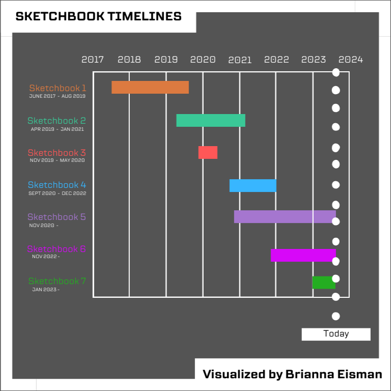
This visualization shows that since 2017, I take around 2 years to complete a sketchbook, and work on 2-3 sketchbooks at a time. During the pandemic, I completed Sketchbook 3 in about 7 months, and started 2 other sketchbooks during 2020. But, why does this matter?
I visualize data to tell a story to improve my skills. This visual allows me to clearly see the speed at which I complete sketchbooks; this is the story. These sketchbooks are around the same size, with the same number of pages, so I can estimate how much artwork I can produce in a given amount of time. In order to expand my art business, this is a necessary metric to know in order to manage my time appropriately.
Visualize data part 2: Why is data visualization important
In truth, you don’t need to know how to visualize data to be a good artist. But, if you want to make money with your art, it may be a good skill to learn.
I adopted a social media marketing strategy and use app-provided analytics. I use many platforms, but in this article I will focus majority on Instagram and Pinterest. Social media platforms typically record insights like accounts reached, accounts engaged, profile activity, and advertising results.
Let’s break this section down into three parts: growth, engagement, and connections.
1. Growth
The first step in building a brand or starting a business is growth. You want people exposed to you and your product. Personally, I chose a digital marketing strategy. I built my website, ArtsyDrawings.com, and directed everything to this one place. I also started many platforms including Instagram, Pinterest, TikTok, RedBubble, Doodle Addicts, Pexels, Reddit, and Buy Me a Coffee.
To learn more about how I built my brand, check out my article 19 Ways to Improve Your Personal Brand.
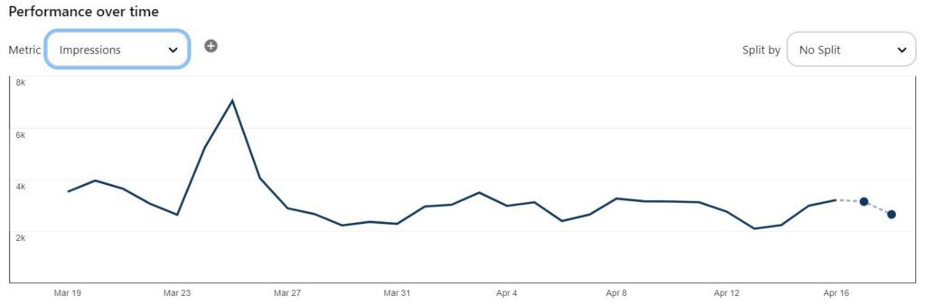
Growth is measured by impressions, and I’m proud to show 98,000 impressions over the past month on Pinterest.
2. Engagement
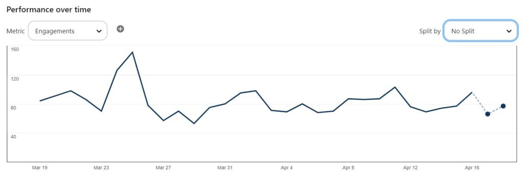
Growth is important, but so is engagement. On Pinterest, engagements are “saves, Pin clicks, outbound clicks, carousel card swipes, clicking a link,” etc.
While my Pinterest shows 98,000 impressions, it also shows only 2,500 engagements over the same period. So roughly 2.5% of my impressions are leading to engagements. And wait… that’s interesting…this line graph looks very similar to the impressions line graph above. This data visualization shows a possible correlation between impressions and engagement.
So, then how do I improve my engagement rate? This starts with finding your target audience and marketing your business towards them.
Both Pinterest and Instagram visualize data insights for your target audience’s age and gender. These are called audience demographics.
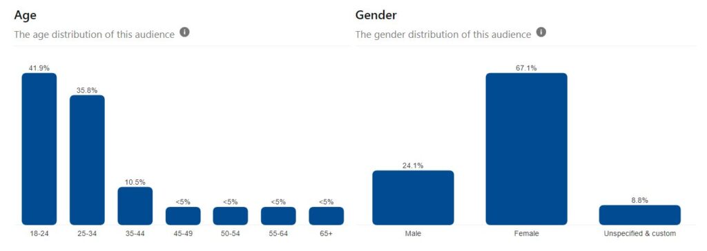
Pinterest shows 77.7% of my audience between the ages of 18-34 and Instagram shows 85.6% of my audience between the ages of 18-34. Both accounts also show my audience is majority women.
3. Connections
Once I was able to target my audience, I tuned my business to accommodate this group of people. Establishing and growing these connections led to more business.
First, I realized that I fall into my target audience in terms of age and gender, and I assumed many of my followers were friends, family, peers, and coworkers I had met in person over the years.
Next, I created a free email subscription for people who want to know me on a more personal level. Every month I send out an Artsy Drawings Newsletter highlighting the art I created recently and updates to my website. For this newsletter, I’ve recorded a 64% open rate and a 12% click rate since August of 2023.
If you are interested in joining my Artsy Drawings Newsletter, please subscribe below!
By better understanding my target audience and app-provided visualizations, I’m able to share my art with people who support me. This is one of many ways how I benefit from knowing how to visualize data as an artist.
Visualize data part 3: Social Media is not on your side
I want to be honest with you. Social media is a nice serotonin boost for my ego, and it did help me understand my target audience. However, social media metrics are designed to confuse you, and tend to tell the story you want to hear, not the actual story.
I recently learned Instagram does not record insights in your time zone. So, when you look at the app-provided insights, the bar graph showing the most popular times for your audience, may not be recorded accurately. Instead, “Facebook and Instagram’s APIs format all of their data to match the time zone at their headquarters (UTC -8:00 or UTC -7:00 during daylight saving time).” Ironically, this tidbit is not listed in the help section of Instagram.
Likewise, Instagram lacks certain details when they visualize data. The app tends to leave out axis titles and specific units of measure. While I can see that my followers are most active between the hours of 6am-6pm, the visual does not specify the unit of measure. What metric represents activity?
Recording your own data is necessary to beat the algorithm
So, if social media is not providing accurate data, then I must rely on my own data collection. As an artist, I find knowing how to visualize data effectively and accurately is a necessary skill to beat social media algorithms.
According to Instagram Insights, the best day for me to post is Saturday, with Monday as a close second. According to my personal data collection, and the visual I created below, Thursday is by far the best day for me to post. Instagram is most likely inaccurate because the data can only pull 90 days back, while my records started August 2023, around 260 days ago.
Seasonality, posting frequency, holidays, media type, and changes in the algorithm can all impact this data, so having more data is more accurate. Recording my own information helps maintain my accuracy when I visualize data.
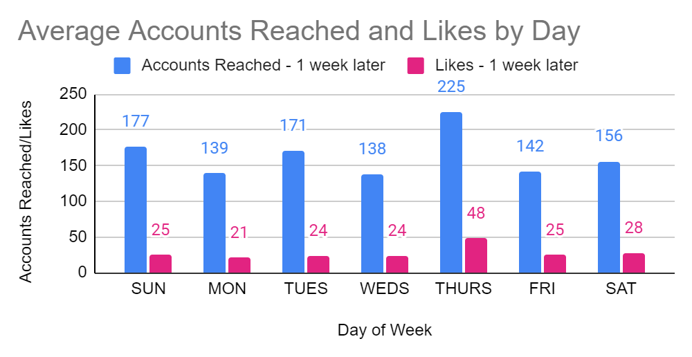
You’ll also notice on the above graph that my Accounts Reached averages significantly more than the likes I’m receiving. I’ve done extensive research, and the best theory I have to justify this trend is changes in the Instagram algorithm. You see, I solely use organic search on social media, meaning I don’t buy ads to promote my posts and I don’t buy followers or likes. My theory is that the platform wants me to spend money and is reducing my reach until I do.
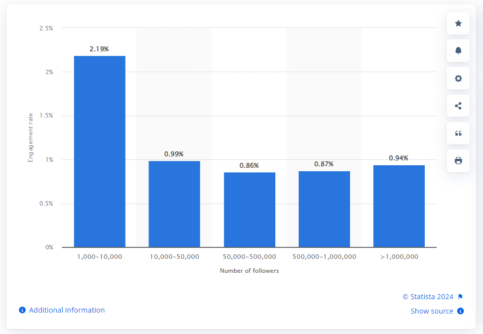
There’s no way to prove why my engagement appears low compared to my impressions, but compared to larger accounts, my rates are actually high. The below visualization shows global Instagram engagement rates in 2023 for accounts with 1000+ followers. Comparably, my average engagement rate is currently 15.4%.
Visualize data part 4: How to start recording data
So how do you record data? I think the best advice I can provide is to try different methods and see what works best for you. One of my favorite parts of data visualization, is that you choose the question and the data will tell the story. You can ask about social media metrics or website performance or how many times you eat vegetables in a month. You can record how long it takes you to complete a painting. You can record how many paintbrushes you own and which types you use the most.
Data visualization is a beautiful technology that we have access to. It’s a way of recording behavior and showing trends in contributing factors.
Recording online data
Personally, for website and social media metrics, I like Google Sheets or Excel and create visuals using internal charts and Pivot tables. If you collect big data, programs like Tableau, Power BI and JMP may be better options for visualizing your data.
I create a different worksheet for each platform and columns describing the metrics that platform uses. Keep in mind, it’s not wise to compare different platforms’ metrics to one another. For example, you should not compare Instagram likes to Pinterest saves to Reddit upvotes, there are just too many variables involved.
I tend to choose a date once a week to record my data. This helps me manage my time best, and not overwhelm myself by feeling I have to record everything all the time. I use Google Calendar to schedule posting, data collection, and email newsletters.
As an artist, I strive for beauty in my creations, and this remains true for when I visualize data. I enjoy choosing how to format the data in a visually pleasing and effective way. Here are some tips to visualize data:
- Use branded colors to your advantage
- Use colors that work well together (color theory)
- Remember that pie charts are visually hard to understand if the numbers are close
- Use San Serif fonts for headers and Serif fonts for paragraphs
- Add axis titles to clarify units of measure
Recording personal data
One of my favorite ways to record and visualize data is through a bullet journal (BUJO). As an artist, I like physically drawing the charts and calendars, choosing color schemes, and having a bit more flexibility when it comes to the actual data visualization side of things.
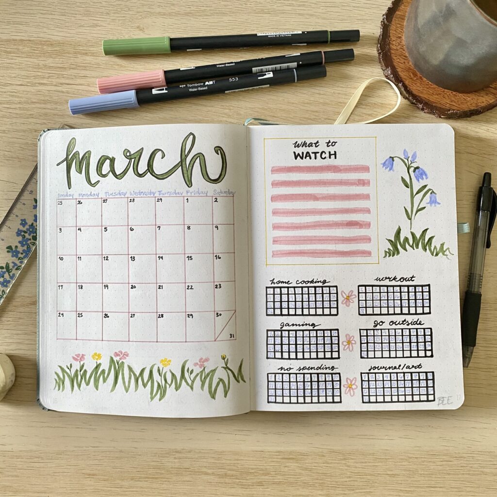
In my bullet journal, I record metrics like Pinterest trends, daily habits, mood trackers, workout schedules and songs I listened to that month. I scrapbook my vacations and trips, my fortunes from fortune cookies, and random scraps of paper from my life. By the end of the bullet journal, I have a beautiful record of my feelings, habits, printed photos of friends and family, and essentially a visual snapshot of my life.
Conclusion
Data visualization is an incredible technology for understanding behavior and factors involved in change. As artists, you have the keen abilities to make visuals aesthetically pleasing, which is often taken for granted in the business and technology world. It is my hope that you will use these skills to visualize data to make yourself and your art more valuable.


Some genuinely fantastic info, glad I found this. “The trick is to make sure you don’t die waiting for prosperity to come.” by Lee Iacocca.
Hi there! I simply would like to give a huge thumbs up for the good data you’ve here on this post. I will probably be coming back to your weblog for extra soon.
Of course, what a great website and informative posts, I definitely will bookmark your blog.Best Regards!
Hey very nice blog!! Man .. Beautiful .. Amazing .. I’ll bookmark your web site and take the feeds also…I am happy to find numerous useful information here in the post, we need develop more strategies in this regard, thanks for sharing. . . . . .
I conceive this website holds some really good information for everyone :D. “Calamity is the test of integrity.” by Samuel Richardson.
Greetings from Los angeles! I’m bored to death at work so I decided to browse your blog on my iphone during lunch break. I love the knowledge you provide here and can’t wait to take a look when I get home. I’m surprised at how quick your blog loaded on my mobile .. I’m not even using WIFI, just 3G .. Anyhow, good blog!
Great line up. We will be linking to this great article on our site. Keep up the good writing.
This design is wicked! You obviously know how to keep a reader entertained. Between your wit and your drawings, I was almost moved to start my own blog (well, almost…HaHa!) Excellent job. I really enjoyed what you had to say, and more than that, how you presented it. Too cool!
You can certainly see your expertise in the work you write. The world hopes for even more passionate writers like you who are not afraid to say how they believe. Always go after your heart.